Correlation Plots
Note: This entry revolves specifically around Correlation Plots, including Scatter Plots, Line charts and Correlograms. For more general information on quantitative data visualisation, please refer to Introduction to statistical figures. For more info on Data distributions, please refer to the entry on Data distribution.
In short: Correlations describe the mutual relationship between two variables. They provide the possibility
to measure the relation between any kind of quantitative data - may it be continuous, discrete and interval data, yet there are even correlations for ordinal data, although these shall be less relevant for us. In this entry you will learn about how to build correlation plots in R. To learn more about correlations in theoretical terms, please refer to the entry on Correlations. To learn about Partial Correlations, please refer to this entry.
Contents
What are correlation plots?
If you want to know more about the relationship of two or more variables, correlation plots are the right tool from your toolbox. And always have in mind, correlations can tell you whether two variables are related, but cannot tell you anything about the causality between the variables!
With a bit experience, you can recognize quite fast, if there is a relationship between the variables. It is also possible to see, if the relationship is weak or strong and if there is a positive, negative or sometimes even no relationship. You can visualize correlation in many different ways, here we will have a look at the following visualizations:
- Scatter Plot
- Scatter Plot Matrix
- Line chart
- Correlogram
A note on calculating the correlation coefficient:
Generally, there are three main methods to calculate the correlation coefficient: Pearson's correlation coefficient, Spearman's rank correlation coefficient and Kendall's rank coefficient.
Pearson's correlation coefficient is the most popular among them. This measure only allows the input of continuous data and is sensitive to linear relationships.
While Pearson's correlation coefficient is a parametric measure, the other two are non-parametric methods based on ranks. Therefore, they are more sensitive to non-linear relationships and measure the monotonic association - either positive or negative. Spearman's rank correlation coefficient calculates the rank order of the variables' values using a monotonic function whereas Kendall's rank correlation coefficient computes the degree of similarity between two sets of ranks introducing concordant and discordant pairs.
Since Pearson's correlation coefficient is the most frequently used one among the correlation coefficients, the examples shown later based on this correlation method.
Scatter Plot
Definition
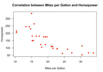
Scatter plots are easy to build and the right way to go, if you have two numeric variables. They show every observation as a dot in the graph and the further the dots scatter, the less they explain. The position of the dot on the x- and y-axis represent the values of the two numeric variables.
R Code
#Fig.1
data("mtcars")
#Plotting the scatter plot
plot(x = mtcars$mpg,
     y = mtcars$hp,
     main = "Correlation between Miles per Gallon and Horsepower",
     xlab = "Miles per Gallon",
     ylab = "Horsepower",
     pch = 16,
     col = "red",
     las = 1,
     xlim = c(min(mtcars$mpg), max(mtcars$mpg)),
     ylim = c(min(mtcars$hp), max(mtcars$hp)))
In this scatter plot you can easily recognize a strong negative relationship between the variables “mpg” and “hp” from the “mtcars” dataset. The Pearson's correlation coefficient is -0.7761684.
#Calculating the coefficient
cor(mtcars$hp,mtcars$mpg)

## Output: [1] -0.7761684
To create such a scatter plot, you need the plot() function and define several graphical parameter arguments. In this example, the following parameters were defined:
- x: variable, that will be displayed on the x-axis.
- y: variable, that will be displayed on the y-axis.
- xlab: title for the x-axis.
- ylab: title for the y-axis.
- pch: shape and size of the plotted observations, in this case, filled circles. Here you can find an overview of the different possibilities.
- col: plotting color. You can either write the name of the color or use the color number.
- las: style of axis labels. By default it is always parallel to the axis. 1 is always horizontal, 2 is always perpendicular and 3 is always vertical to the axis.
- xlim: set the limit of the x-axis.
- ylim: set the limit of the y-axis.
- abline: this function creates a regression line for the two variables.
Scatter Plot Matrix
Definition
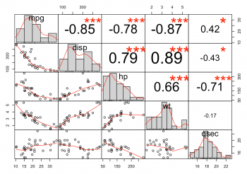
The normal scatter plot is only useful if you want to know the relationship between two variables, but often you are interested in more than two variables. A convenient way to visualize multiple variables in a scatter plot matrix is offered by the PerformanceAnalytics package. To access the scatter plot matrix from this package, you have to install the package and import the library. After doing that, you can start to select the variables which will be displayed in the plot.
R Code
#Fig.2
library(PerformanceAnalytics)

# Now calling the chart.Correlation() function and defining a few parameters.
data <- mtcars[, c(1,3,4,6,7)]
chart.Correlation(data, histogram = TRUE)
The scatter plot matrix from this package is already very nice by default. It splits the plot into an upper, lower and diagonal part. The upper part consists of the correlation coefficients for the different variables. The red stars show you the results of the implemented correlation test. There is a range from zero to three stars and the higher the number of stars, the higher is the significance of the results for the test. In the diagonal part of the plot are histograms for every variable and show you the distribution of the variable. The bivariate scatter plots can be found on the lower part of the plot and contain a fitted line by default.
Line chart
Definition
A line chart can help show how quantitative values for different categories have changed over time. They are typically structured around a temporal x-axis with equal intervals from the earliest to latest point in time. Quantitative values are plotted using joined-up lines that effectively connect consecutive points positioned along a y-axis. The resulting slopes formed between the two ends of each line provide an indication of the local trends between points in time. As this sequence is extended to plot all values across the time frame it forms an overall line representative of the quantitative change over time story for a single categorical value.
Multiple categories can be displayed in the same view, each represented by a unique line. Sometimes a point (circle/dot) is also used to substantiate the visibility of individual values. The lines used in a line chart will generally be straight. However, sometimes curved line interpolation may be used as a method of estimating values between known data points. This approach can be useful to help emphasise a general trend. While this might slightly compromise the visual accuracy of discrete values if you already have approximations, this will have less impact.
R Code
We will first plot a basic line chart based on a built-in dataset called EuStockMarkets. The data set contains data on the closing stock prices of different European stock indices over the years 1991 to 1998.
To make things easier, we will first transform the built-in dataset into a data frame object. Then, we will use that data frame to create the plot.
The table that contains information about the different market indices looks like this:
| DAX | SMI | CAC | FTSE |
|---|---|---|---|
| 1628.75 | 1678.1 | 1772.8 | 2443.6 |
| 1613.63 | 1688.5 | 1750.5 | 2460.2 |
| 1606.51 | 1678.6 | 1718.0 | 2448.2 |
| ... | ... | ... | ... |
Here, the data for all the columns are numeric.
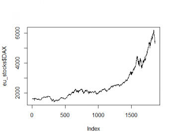
The following line chart shows how the DAX index from the table from previous section.
# Fig.3
#read the data as a data frame
eu_stocks <- as.data.frame(EuStockMarkets)

# Plot a basic line chart
plot(eu_stocks$DAX,  # simply select a stock index
     type='l')       # choose 'l' for line chart
As you can see, the plot is very simple. We can enhance the way this plot looks by making a few tweaks, making it more informative and aesthetically pleasing.
# Fig.4
# get the data
eu_stocks <- as.data.frame(EuStockMarkets)

# Plot a basic line chart
plot(eu_stocks$DAX, # select the data
     type='l',      # choose 'l' for line chart
     col='blue',    # choose the color of the line
     lwd = 2,       # choose the line width
     main = 'Line Chart of DAX Index (1991-1998)',         # title of the plot
     xlab = 'Time (1991 to 1998)', ylab = 'Prices in EUR') # x- and y-axis labels
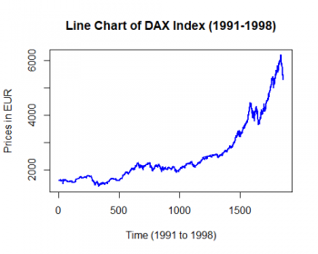
You can see that this plot looks much more informative and attractive.
Correlogram
Definition
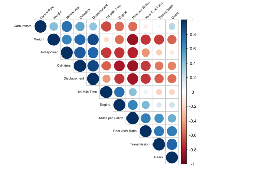
The correlogram visualizes the calculated correlation coefficients for more than two variables. You can quickly determine whether there is a relationship between the variables or not. The different colors give you also the strength and the direction of the relationship. To create such a correlogram, you need to install the R package corrplot and import the library. Before we start to create and customize the correlogram, we can calculate the correlation coefficients of the variables and store it in a variable. It is also possible to calculate it when creating the plot, but this makes your code more clear.
R Code
library(corrplot)
correlations <- cor(mtcars)
Clear and meaningful coding and plots are important. In order to achieve this, we have to change the names of the variables from the “mtcars” dataset into something meaningful. One way to do this, is to change the names of the columns and rows of the correlation variable.
correlations <- cor(mtcars)[1:11, 1:11]
colnames(correlations) <- c("Miles per Gallon", "Cylinders",
                            "Displacement", "Horsepower", "Rear Axle Ratio",
                            "Weight", "1/4 Mile Time", "Engine", "Transmission",
                            "Gears", "Carburetors")
rownames(correlations) <- c("Miles per Gallon", "Cylinders",
                            "Displacement", "Horsepower", "Rear Axle Ratio",
                            "Weight", "1/4 Mile Time", "Engine", "Transmission",
                            "Gears", "Carburetors")
Now, we are ready to customize and plot the correlogram.
# Fig.5
corrplot(correlations,
         method = "circle",
         type = "upper",
         order = "hclust",
         tl.col = "black",
         tl.srt = 45,
         tl.cex = 0.6)
The parameters are different from the previous scatter plots. Obviously, here you need the corrplot() function and define your parameters, regarding to your preferred taste, in this function. Some of the parameters will be explained briefly.
- method: which method should be used to visualize your correlation matrix. There are seven different methods (“circle”, “square”, “ellipse”, “number”, “shade”, “color”, “pie”), “circle” is called by default and shows the correlation between the variables in different colors and sizes for the circles.
- type: how the correlation matrix will be displayed. It can either be “upper”, “lower” or “full”. Full is called by default.
- order: order method for the correlation coefficients. The “hclust” method orders them in hierarchical order, but it also possible to order them alphabetical (“alphabetical”) or with a principal component analysis (“PCA”).
- tl.col: color of the labels.
- tl.srt: rotation of the labels in degrees.
- tl.cex: size of the labels.
Visualisation with ggplot
Overview
R code
COMING SOON
As you can see, there are many different ways to visualize correlations between variables. The right correlation plot depends on your data and on the number of variables you want to analyze. But never forget, correlation plots show you only the relationship between the variables and nothing about the causality.
References
- https://sustainabilitymethods.org/index.php/Causality_and_correlation
- https://en.wikipedia.org/wiki/Correlation_and_dependence
- https://codingwithmax.com/correlation-vs-causation-examples/
- https://towardsdatascience.com/what-it-takes-to-be-correlated-ce41ad0d8d7f
- http://www.r-tutor.com/elementary-statistics/numerical-measures/correlation-coefficient
A nice example that shows how easy it is to create a spurious correlation:
The author of this entry is Henrik von Wehrden and ?.
