Difference between revisions of "Scatterplots in Python"
(Created page with "THIS ARTICLE IS STILL IN EDITING MODE ==Introduction== Scatterplot is a helpful tool in data visualization for observing the relationship (also called correlation) between t...") |
|||
| Line 89: | Line 89: | ||
[https://sustainabilitymethods.org/index.php/Regression,_Correlation,_and_Ordinary_Least_Squares_Estimator_in_Python Wiki entry on Correlation, Regression and Least Squares Estimators in Python] | [https://sustainabilitymethods.org/index.php/Regression,_Correlation,_and_Ordinary_Least_Squares_Estimator_in_Python Wiki entry on Correlation, Regression and Least Squares Estimators in Python] | ||
| − | The author of this entry is Hedda Fiedler | + | The author of this entry is Hedda Fiedler. |
| + | |||
| + | [[Category:Statistics]] | ||
| + | [[Category:Python basics]] | ||
Revision as of 11:04, 27 February 2024
THIS ARTICLE IS STILL IN EDITING MODE
Contents
Introduction
Scatterplot is a helpful tool in data visualization for observing the relationship (also called correlation) between two variables. In the following we will go through the steps to create scatterplots in Python with the help of the Matplotlib and Seaborn libraries and how to interpret them.
In a scatterplot, the variable on the horizontal (or x) axis is the independent one, also called the predictor. The one on the vertical (or y) axis is the dependent variable (or response). The scatterplot visually displays how the independent variable influences the dependent (Jerimi, 2017).
Basic Scatterplot of Two Variables
As an example, we will use the Iris dataset. We can load it using scikit-learn module.
from sklearn.datasets import load_iris
iris_data = load_iris()
df_iris = pd.DataFrame(iris_data.data, columns=iris_data.feature_names)
df_iris.head()

# Create a scatterplot of two variables (sepal length and sepal width)
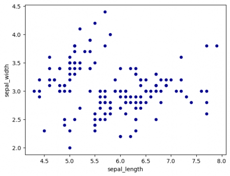
df_iris.plot.scatter(x='sepal_length', y='sepal_width', color='DarkBlue')
plt.show() # Figure 1

Figure 1: Scatterplot of sepal`s length and width
Adding the Distribution of the two Variables to the Scatterplot
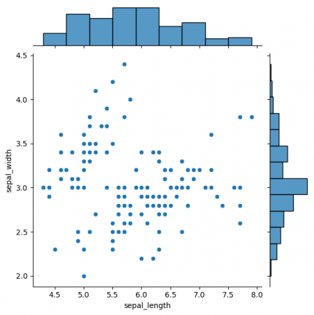
In order to understand the two variables better, it can be helpful to add their respective distributions. With that, the central tendency, shape and width is visible, which is important for understanding the relationship of two variables in further detail (Hehman & Xie, 2021). For more information on the distribution of data, look into Data distribution wiki entry.
For the visualization we need to import the seaborn library, which can be done with the following code. For more information on the code you can visit the documentation.
import seaborn as sns
sns.jointplot(data=df_iris, x='sepal_length', y='sepal_width', kind='scatter')
plt.show() # Figure 2

Figure 2: Jointplot of sepal`s length and width
Displaying a Whole Dataset in One Plot
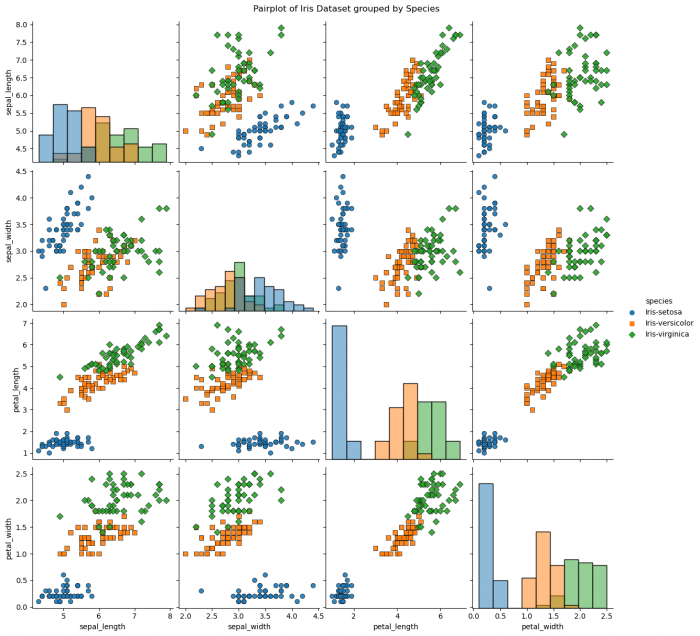
If you want to have it all in one, there is the Seaborn pairplot, which gives you the scatterplots and distributions of all numeric variables. There are some specifications to consider, when going for a pairplot:
- Color the data in different groups with the
hue = 'variable'keyword. - Specify what visual you want to display the distribution of the data with
diag_kind = 'kde'. - With the keyword
markeschange the shape of the groups to better distinguish them. - For the "plot_kws" a dictionary of keyword arguments is used that is passed to the underlying plotting function (scatterplot). Here, 'alpha' controls the transparency of the markers, 's' sets the size of the markers, and 'edgecolor' sets the color of the edges of the markers.
- The keyword "height" sets the height of each facet in inches and the keyword "size" the width (Koehrsen, 2018).
Even though this visual is very powerful, be careful to use it on datasets with many numeric variables, as is gets too crowded and eventually hard to interpret. For further details on the code, have a look into the documentation.
sns.pairplot(df_iris, hue='species', diag_kind = 'hist', markers=["o", "s", "D"],
             plot_kws = {'alpha': 0.9, 's': 40, 'edgecolor': 'k'}, height= 3)
plt.suptitle('Pairplot of Iris Dataset grouped by Species', y=1.01) # Sets a Title above the plot
plt.show() # Figure 3

Figure 3: Pairplot of Iris Dataset grouped by Species
Interpreting Scatterplots
When analysing scatterplots, we can take into consideration different aspects:
- Direction: A trend that appears to rise suggests a positive relationship, while a falling trend suggests a negative relationship.
- Pattern: The shape of the pattern suggest the type of relationship, e.g. a line hints at a linear relationship, a more complex pattern might suggest a non-linear relationship. If there is no pattern visible, it often implies no linear correlation.
- Strength: How closely the points fit the shape (for example a line) indicates the strength of the association.
- Outliers: Points that fall far from the main cloud of points may indicate anomalies in the data. (Wilke, 2019, p.118) (Jerimi, 2017)
By grouping the data, as done in the pairplot, we can even go one step further and add a layer of understanding the relation. In the Iris dataset, we see, that in some scatterplots the species are easily separable, which we can use e.g. for classification.
Sources (recommended to read for a deep dive)
1. Hehman, E., & Xie, S. Y. (2021). Doing better data visualization. Advances in Methods and Practices in Psychological Science, 4(4), 251524592110453. https://doi.org/10.1177/25152459211045334
2. Jerimi. (2017, June 3). Reading scatterplots - MathBootCamps. Retrieved from https://www.mathbootcamps.com/reading-scatterplots/
3. Koehrsen, W. (2018, July 6). Visualizing Data with Pairs Plots in Python - Towards Data Science. Medium. Retrieved from https://towardsdatascience.com
4. Wilke, C. O. (2019). Fundamentals of data visualization: A primer on making informative and compelling figures. (Can be downloaded here: https://data.vk.edu.ee/powerbi/opikud/Fundamentals_of_Data_Visualization.pdf) (Further reading on data visualization in general and on scatterplots in particuar from page 117 on)
Recommended Related Topics
Wiki entry on Correlation and Causality
Wiki entry on Correlation, Regression and Least Squares Estimators in Python
The author of this entry is Hedda Fiedler.