Introduction to Seaborn
THIS ARTICLE IS STILL IN EDITING MODE
Contents
Introduction
Seaborn is a library for making statistical graphics in Python. Its tutorial and documentation contain diverse examples. This Wiki entry will help you to start working with this library, explore both basic and complicated instances of visualizations and provide the connections of specific tasks and suitable for them graphs.
Installation and set up
pip install seaborn
For the comprehensive coverage of seabron`s possibilities it is recommended to (install and) import matplotlib and pandas libraries. For some specific plots and examples numpy, scipy, or scikit-learn libraries could be also necessary.
import seaborn as sns
import matplotlib.pyplot as plt
import pandas as pd
import numpy as np
We will use pre-loaded datasets for some following examples. Seaborn function load_dataset() makes the connection to GitHub repository. However, it was created to maintain the documentation and the files can be modified or removed.
df = sns.load_dataset('iris')
Another way to get the data is to load it from sklearn.datasets:
from sklearn.datasets import load_iris
df = pd.DataFrame(load_iris().data, columns=load_iris().feature_names)
We will be working mostly with pandas dataframes. It is worth to notice, that seaborn collaborates with pandas well.
In some cases it would be necessary to set up the theme of plots. By default, current values of the matplotlib rcParams are utilized. In order to switch the theme to seaborn`s default one, function sns.set_theme() has to be called. All the plots of the project will be effected, even those that were not made with seaborn. More information about available themes can be found here.
If you are not working with Jupiter Notebook file, you have to call function plt.show() to see the plot.
Plots
Basic plots
histplot
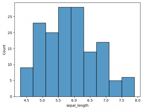
To show the distribution of variables (features / columns) a histogram is a good choice (learn more about histograms and its characteristics here). You can choose one of the columns of your dataframe, when you call the function histplot().
sns.histplot(df["sepal_width"])
plt.show()
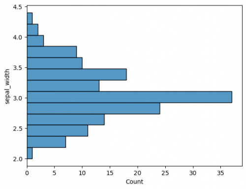
The plot has default parameters and takes the name of the columns for axes. You may specify the axes to change from vertical to horisontal view. This is also applied for other plots.
sns.histplot(y=df["sepal_width"])
There are some parameters, that you can alter on the plot, including title, names and limits of axes, plotting color / palette, markers, position, legend and many other with respect to the called graphics. Some of these parameters are changed via matplotlib methods and functions. We will include new parameters gradually, depending on the plots and tasks.
# histplot - Example I
sns.histplot(df["sepal_length"],color="#3eb489", bins=15)
plt.xlabel('Sepal length, sm')
plt.ylabel('Number of samples')
plt.xlim(4,8)
plt.ylim(0,25)
plt.title("Distribution of Sepal length. Iris dataset", fontsize = 14)
# histplot - Example II
sns.histplot(df["sepal_length"],color="#ffeeee", bins=40,element="poly")
plt.ylabel('Number of samples',fontsize = 5)
plt.xlim(-5,10)
plt.ylim(0,9)
y_ticks = np.arange(0, 9.2, 0.2)
plt.yticks(y_ticks)
plt.xticks(range(-5,10,5))
plt.title("Histogram of Iris dataset")
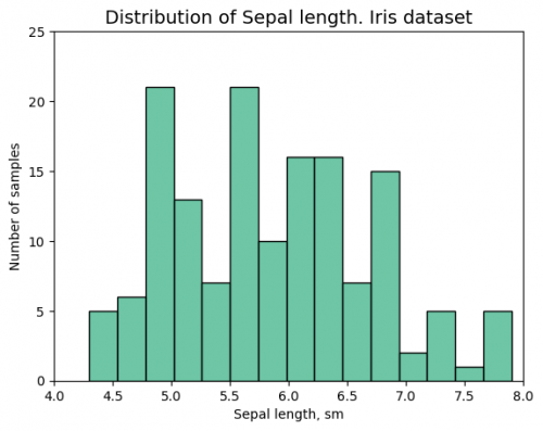
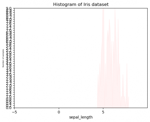
Compare these two graphs, using the same data. You probably already have the preference and think, that it is impossible to create Example II unintentionally. It is true, that we exaggerated this for the comparison, however, when the plots will become more complicated and will include more and more features, colors or other measurements, it will be set to the graph automatically, so sometimes, we will need to undertake some actions to bring it to the suitable and adequate conditions. This graph has several mistakes, which can easily appear:
- Title: title does not reflect the message of the figure, sometimes there is no title at all and it is hard to umderstand, what this plot is for. Try to not write the kind of plot (you can see, that it is a histogram), instead you may point out relationships or dependences of variables.
- Axes:
- labels:
-
x does not have units of measure, it can be easily mistaken with other units;
-
y is hard to read, when the font size it too small - always keep the balance;
-
x does not have units of measure, it can be easily mistaken with other units;
- limits:
- length (x) cannot have negative numbers, moreover, the measurements start only after 4 and end around 8. There is too much unnecessary space, it also shifts the graph to the right side;
-
y axis`s limit is too short, so the entire graph cannot be placed on the plot. It is not only the mistake of the visualization, but also the logical one. It is impossible for the viewer to make a conclusion about the highest number of this histogram;
- length (x) cannot have negative numbers, moreover, the measurements start only after 4 and end around 8. There is too much unnecessary space, it also shifts the graph to the right side;
- ticks:
- sometimes we have to set our own range of axes, but in this case x intervals are too wide and we cannot say exactly, where the measurements start or end;
-
y has too small intervals and it is again hard to read. Moreover, the count does not have decimal numbers.
- sometimes we have to set our own range of axes, but in this case x intervals are too wide and we cannot say exactly, where the measurements start or end;
- labels:
- Plot`s kind: be careful with the kind of plotting. What do these picks mean? It also can be confused with the line plot.
- Color palette: the colors of the plot have to be visible and distinguishable (when more than 2 features). Select a suitable palette.
At the same time Example I has the title that reflects the graph; the font size is appropriate, including axes; the viewer can undersatnd the measurements and see the whole plot in the center of the figure. The color and type of the histogram are reasonable.
Note: Never underestimate plots at your project and do not think that they are necessary only to impress your team on the dashboard. They contain sufficient amount of information, when done properly. Therefore, try to stick with the good clarification of your figures. How to Lie with Statistics provides extra explanation on this topic.
boxplot
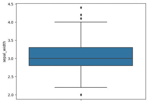
Due to a boxplot we may observe following six characteristics of a dataset: minimum, first quartile, median, third quartile, maximum and outliers (learn more about boxplots and its characteristics here).
sns.boxplot(y=df["sepal_width"])
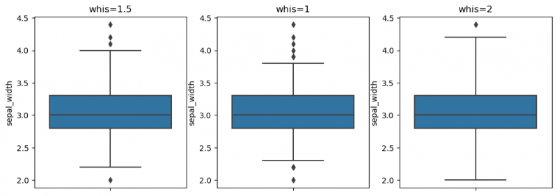
The whiskers to the farthest non-outlier point are calculated based on IQR (Interquartile range: Q3-Q1) with the default parameter 1.5: The upper whisker: Q3 + whis*IQR; the lower whisker: Q1 - whis*IQR. Beyond the whiskers, data are considered as outliers and are plotted as individual points. On the previous plot we may find some outliers. The reachness of whisker can be modified by the parameter whis (smaller the parameter`s value - shorter the whisker). For more information use this link.
fig, ax = plt.subplots(1, 3, figsize=(12, 4))
sns.boxplot(y=df["sepal_width"], ax=ax[0])
ax[0].set_title("whis=1.5")
sns.boxplot(y=df["sepal_width"], whis=1,ax=ax[1])
ax[1].set_title("whis=1")
sns.boxplot(y=df["sepal_width"], whis=2,ax=ax[2])
ax[2].set_title("whis=2")
plt.show()
Handling outliers via IQR (Interquartile range) method
In some cases, the outliers have to be removed from the dataset or replaced. One of the ways is IQR (Interquartile range) method. We will set the upper and lower gate to consider the data point as an outlier. The steps are:
1. Calculate the characteristics of the data:
df_iqr = pd.DataFrame(df["sepal_width"]) # create another dataframe, if needed

p0=df_iqr.sepal_width.min() # minimum of observations
p100=df_iqr.sepal_width.max() # maximum of observations
q1=df_iqr.sepal_width.quantile(0.25) # first quartile
q2=df_iqr.sepal_width.quantile(0.5) # second quartile
q3=df_iqr.sepal_width.quantile(0.75) # third quartile
iqr=q3-q1 # 50% of values in the dataset are at interquartile range
lc = q1 - 1.5*iqr # lower cutoff / outlier gate
uc = q3 + 1.5*iqr # upper cutoff / outlier gate

print( "p0 = " , p0 ,", p100 = " , p100 ,", lc = " , lc ,", uc = " , uc)
p0 = 2.0 , p100 = 4.4 , lc = 2.05 , uc = 4.05
2. Check outliers before IQR method replacement:
df_iqr.sepal_width[df_iqr.sepal_width < 2.2]
60 2.0
3. Replace outliers by lower / upper cutoff:
df_iqr.sepal_width.clip(upper=uc,inplace=True)
df_iqr.sepal_width.clip(lower=lc,inplace=True)
4. Check outliers after IQR method replacement:
df_iqr.sepal_width[df_iqr.sepal_width < 2.2]
60 2.05
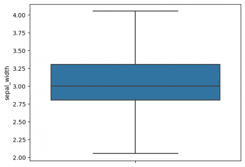
5. Plot the boxplot with replaced outliers:
sns.boxplot(y=df_iqr["sepal_width"])
The whiskers were not changed and we replaced outliers by lower and upper cutoff, therefore, these data points are already included in whiskers` range.
relplot
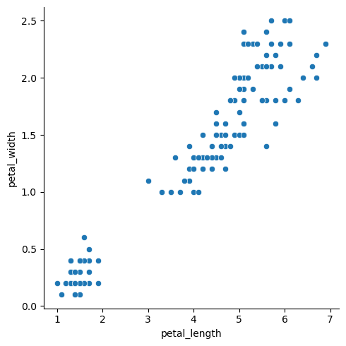
If we would like to explore the relationship of numberic variable, we often use Scatter plots. The visualization of two variables on the 2D graphs is the most convinient way to see it. There are already Wiki entries on Exploring Different Correlation Coefficients and Plotting Correlations in Python and Scatterplots in Python. Here we focus on seaborn`s relplot. It is a combination of scatterplot() and lineplot() functions, one of which can be selected via the parameter kind. Note, that default is kind="scatter". This plot requires x and y variables. Another examples can be found in the next sections.
sns.relplot(x="petal_length", y="petal_width", data=df)
hue
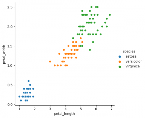
One of the important parameters of most plotting functions is hue. It allows to separate different classes of the data by grouping the variables and using the color to distinct the groups, represented by column, where several categories exist. Most likely you will include this "hue" parameter in your plots to find out, how the groups distinguish from each other in specific settings.
sns.relplot(x="petal_length", y="petal_width", data=df, hue="species")
style / markers
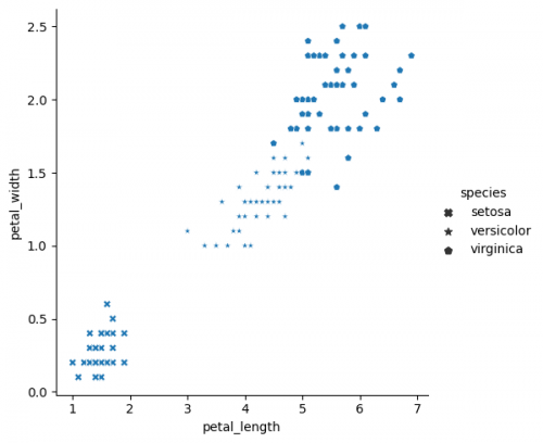
There is a style parameter in replot function, which can be compared with hue in terms of grouping variables. We can define the columns, on which this parameter depends. Different style of dots (instead of color with hue) will be associated with the category in this column. You may determine your own markers by sending the list or dictinary to the parameter. Seaborn borrowed markers from matplotlib. We also can combine both of them in one plot to see two groupings of variables. However, you need always to keep in mind, that some complicated graphics can be separated into more easier ones for better comprehension.
sns.relplot(x="petal_length", y="petal_width", data=df, style="species", markers=['X', '*', 'p'])
size
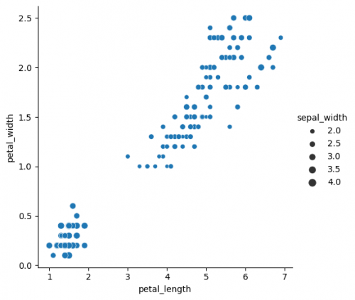
With the parameter size you are able to not only group the variables, but also incorporate another numerical feature into the plot. Thus, we can see the sepal length additionly to petal`s features. You can also use the size for grouping variables into classes, as it was done with help of parameters hue and style. Otherwise, the intervals will be defined automatically.
sns.relplot(x="petal_length", y="petal_width", data=df, size="sepal_width")
conditions
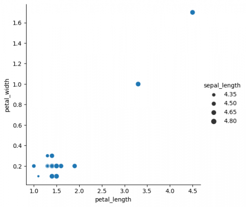
Having our previous example we may also set the conditions of the data, we would like to see at the plot. It can be done independently from the plotting function via pandas methods. Here we will create a condition for one of the features using pandas method where() directly in seaborn function. Looking at the plot you should see the altered presentation of the data.
sns.relplot(x="petal_length", y="petal_width", data=df.where(df["sepal_length"]<5), size="sepal_length")
catplot
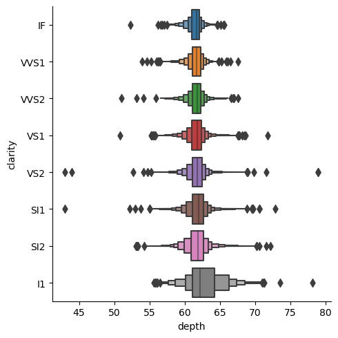
catplot() with different values of parameter kind can be used for the categorical data visualization. It is a combination of various plots (as mentioned earlier relplot).
df_cat = sns.load_dataset('diamonds')
sns.catplot(data=df_cat, x="depth", y="clarity", kind="boxen")
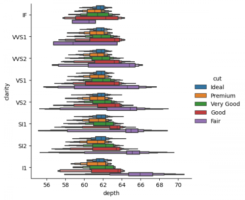
Now we can show the boxplots for each cut via parameter hue. We may also make the alteration of specific parameters, which have to be addressed to the specific kind of plot. In case of kind="boxen" the arguments will be passed to boxenplot in a dictionary with ** symbols. Thus, we will not show outliers, turning corresponding parameter to False.
sns.catplot(data=df_cat, x="depth", y="clarity", kind="boxen", hue="cut", **{'showfliers':False})
As it was noted at the replot section, the overwhelming graphs may distruct the observer, and lead to the misundestaning or missing the main takeaway. But maybe in this case we can make some conclusions about the fair cut and its relations with depth and clarity separatly from other types, and create less complecated graphs on the second step only with specific categories.
Grid
We can do a comparison of different features, having them on a grid (multi-plot grid).
FacetGrid
We will present a grid, where many plots are located with respect to their positions. One of the ways to implement this is to use function FacetGrid(). In the following example, each species of one column will be shown separately. In order to put the plots on the grid, method map is called, it also determines the kind of the plot and includes its parameters.
my_plots = sns.FacetGrid(df, col="species")
my_plots.map(sns.histplot,"sepal_width")
Now we provide more complicated plot, which has all columns of the dataset and each histplot shows species, differentiated by color via parameter hue. However, some data preparation is needed. Pandas method melt() augments the dataset to a long format, so it will be easier to create a graph. More information can be found here.
df_melted = df.melt(id_vars=['species'], value_vars=['sepal_length', 'sepal_width', 'petal_length', 'petal_width'])
| species | variable | value | |
|---|---|---|---|
| 0 | setosa | sepal_length | 5.1 |
| 1 | setosa | sepal_length | 4.9 |
| 2 | setosa | sepal_length | 4.7 |
The column "variable" reflects the features from the initial dataset with connected values.
As the data is prepared, it is possible now to select columns and parameters for the graph. Thus, we define with parameter col='variable', that each column of the grid will represent each column (feature) of the initial dataset. Then the histplot for every subplot will contain the information about the distribution of values for each species.
This graph function does not assume the legend, therefore, we will create the legend ourselves, using the palette colors and module patches from matplotlib. It will allow us to place the legend on the graph.
First of all, it is necessary to understand, what kind of palette is used at the graph (in this case it is "pastel"). Use the documentation to explore more. The colors of the palette "pastel" are provided below.
print(sns.color_palette("pastel").as_hex())
['#a1c9f4', '#ffb482', '#8de5a1', '#ff9f9b', '#d0bbff', '#debb9b', '#fab0e4', '#cfcfcf', '#fffea3', '#b9f2f0']
After that, first three colors of this palette will be taken (because the column "species" has three catergories) and will be used for parameter handles in the method add_legend().
import matplotlib.patches as mpatches

# mapping each species to the color
setosa_patch = mpatches.Patch(color=sns.color_palette("pastel").as_hex()[0], label='setosa')
versicolor_patch = mpatches.Patch(color=sns.color_palette("pastel").as_hex()[1], label='versicolor')
virginica_patch = mpatches.Patch(color=sns.color_palette("pastel").as_hex()[2], label='virginica')
g = sns.FacetGrid(df_melted, col='variable')
g.map_dataframe(sns.histplot, x='value', hue="species", bins=10)
g.add_legend(title="Species", handles=[setosa_patch, versicolor_patch, virginica_patch])
Now we can compare the distribution of all species (divided by color) from each feature from the initial dataset. If you run the next code snippet, you will get a similar graph, however, some parameters had to be adjusted beforehand. This is another way to reproduce the grid by setting the subplots. Remember, you can always make a loop for the repetitive actions, for instance, for the long list of features.
fig, axes = plt.subplots(1, 4,figsize=(15, 3.5))
#create chart in each subplot
sns.histplot(data = df, x="sepal_length",hue='species',ax=axes[0], bins=10,legend=False)
sns.histplot(data = df, x="sepal_width",hue='species',ax=axes[1], bins=10,legend=False)
sns.histplot(data = df, x="petal_length",hue='species',ax=axes[2], bins=10,legend=False)
sns.histplot(data = df, x="petal_width",hue='species',ax=axes[3], bins=10)
for el in range(0,4):
    axes[el].set_ylim(0,45)
    axes[el].set_xlim(0,8)
Pairplot
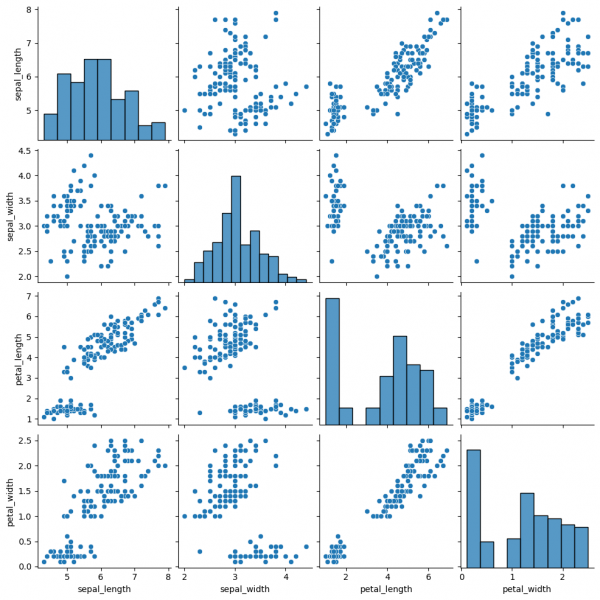
Pairplot is a subplot grid for showing pairwise relationships in a dataset. This is a high-level interface for PairGrid. The latter provides more flexibility and customization, while pairplot may help to save some time, using simple (one-line) commands for standard visulalizations.
sns.pairplot(data=df)
This graph contains pairwise scatterplots of features (columns) and the diagonal presents the distribution of each feature. The parameters for the style customization still can be utilized, including hue, markers and others. corner=True will remove the upper triangle of the plot.
Jointgrid
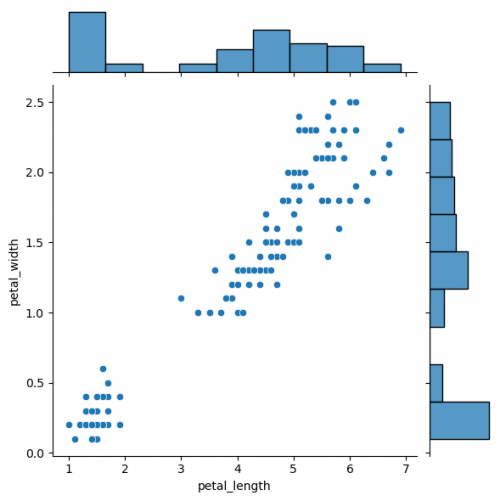
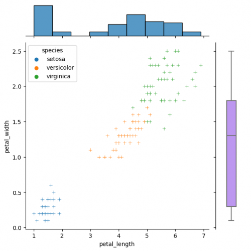
Jointgrid is used for drawing a bivariate plot with marginal univariate graphs. Jointgrid and jointplot have the same mechanism as pairgrid and pairplot. Let us now create the example with jointgrid, so we will provide better customization and more control.
# difference in syntaxes for jointplot and JointGrid

# sns.jointplot(data=df, x="petal_length", y="petal_width")

g_joint = sns.JointGrid(data=df, x="petal_length", y="petal_width")
g_joint.plot(sns.scatterplot, sns.histplot)
You can create same simple plot via jointplot() and JointGrid() functions. On the one hand, jointplot uses default parameters for scatter- and histplot; on the other hand, JointGrid requires defining the grid and setting up the plots manually. Next example shows how to customize the joint plot (ax_joint), which refers to the center part of the entire graph and marginal top and right plots (ax_marg_x, ax_marg_y), which are specified with help of axes. Each section has own parameters / arguments to pass, but it is always important to remember about the overall picture.
g_joint = sns.JointGrid()
x,y = df.petal_length, df.petal_width
sns.scatterplot(x=x, y=y, hue=df.species, marker="+", ax=g_joint.ax_joint)
sns.histplot(x=x, ax=g_joint.ax_marg_x)
sns.boxplot(y=y, width=0.3, color="#bb88ff", ax=g_joint.ax_marg_y)
Diverse marginal plots may be beneficial, when we would like to see different data characteristics for each variables. These features, in turn, may have varying formats (e.g., continuous and discrete). Combining carefully the charts without overwealming the viewer is a key of this process.
Plots for specific tasks
This section will gather some important plots, which could be helpful for specific tasks, while performing data analysis or accomplishing machine learning challenges. Some graph functions can be called directly for the particular problem, sometimes it is necessary to add and combine some parameters or even overlap different plots. We will consider both cases.
Task-parameters relation
For the following methods you may save the parameters of the simple plots, some of them we discussed previously.
Anova
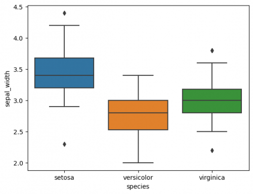
In previous sections we talked about a single boxplot, with seaborn we are able to put several boxplots on the same graph, which is helpful to compare groups, namely it is possible to perform Anova (analysis of variance). We will take only one column of the dataset (axis Y) and compare the distribution of species (3 categories of column 'species'). The main rule is to correctly define the axes and a responsible variable.
sns.boxplot(data=df, x="species", y="sepal_width")
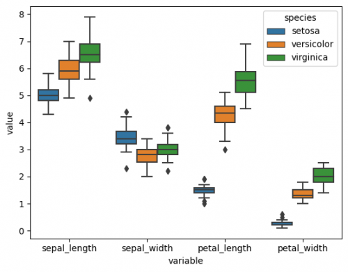
Here we can compare 3 groups. It is also possible to include two or more factors, in other words, to perform two way ANOVA. As a small preparation, the features have to be combined into one column, for this we will call method melt(), as it was done at FacetGrid Section. Let us set the column 'variable' as axis X and add the factor 'species' with the parameter hue. It divides the categories with respect to another effect by colour. It is worth noticing, that it is usually more difficult to comprehend the visualization of 3 or especially more factors.
df_melted = df.melt(id_vars=['species'],value_vars=['sepal_length', 'sepal_width', 'petal_length', 'petal_width'])
sns.boxplot(data=df_melted, x="variable", y="value", hue= "species")
Now we can see distributions of each measurement catrgory, distinguished by species on the one graph. In other situations there will be factors that can be easily extracted from columns, therefore, there will be no need to change the dataset.
Regression
Regression defines the relationship between the dependent and independent variables. For more explanation of the concept, please, refer these Wiki entries: Linear Regression in Python, Regression Analysis. To visualize this relationship scatterplot with the line could be one of the ways. In turn, seaborn provides the functions, which already include the parameters to make the code writing easier, there is also a tutorial on this topic.
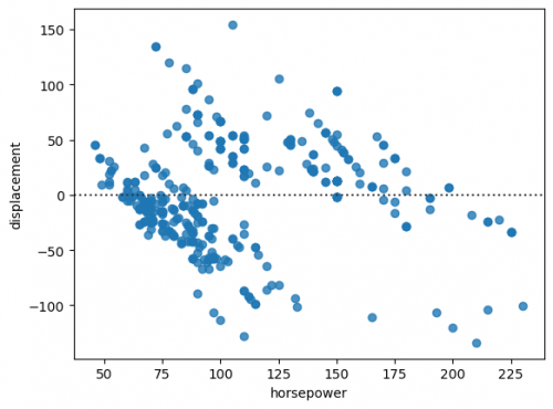
regplot() function plots the line together with the data points. We will load another dataset, that describes the parameters of cars. In addtion, seaborn has residplot, that shows the structure of the residuals. Let us first check this assumption to find out, can we use the simple linear regression or not.
df_mpg = sns.load_dataset('mpg')

sns.residplot(data=df_mpg, x="horsepower", y="displacement")
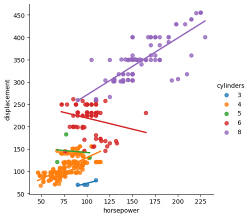
We can clearly see the structure of the residuals, in other words, they are not randomly scattered at the graph, thus, we cannot use regplot for simple linear regression. Let us now create a plot for multiple regression. Instead of an axes-level function regplot() we call a figure-level function lmplot(). The main difference of these two types is that an axes-level function focuses more on the single plot, while the latter is oriented on the creation of the entire figure, including the subplots. It support more complex visualization, however, less customization of the single plot. lmplot() fits linear regression with respect to the category via parameter hue.
sns.lmplot(x="horsepower",y="displacement",data=df_mpg, hue="cylinders", ci=None)
At the figure we can see how the multiple regression fit works. With seaborn library it is much easier to visualize it by matching the appropriate features with the parameters.
You may compare two figures and see how they are different from each other. Pay attention to the regression line.
# sns.regplot(x="horsepower", y="displacement", data=df_mpg,ci=None)
Values comparison
Sometimes it is necessary to compare values of two or more various groups one by one. For instance, it can be comparison of "before" and "after", "true values" and "predictions", impact of several different factors on one variables. Thus, we can set the axis X as an index of data points and the axix Y as their values. There are some ways to visualize it, and it also depends on the task and the type of data. Therefore, let us create the plot that shows values from the designed model (model predictions) and true values. We will use lineplot() function to draw two lines with data points, using markers.
First, we will make the model to find the price based on the size of the diamond from the previous dataset we used. We will import MLPRegressor from scikit-learn library, standardize the data and predict the price values. We will take first 100 data points to see them better on the plot.
# import libraries to make the model
from sklearn.neural_network import MLPRegressor
from sklearn.preprocessing import StandardScaler
from sklearn.model_selection import train_test_split

# train / test data split
x_train, x_test, y_train, y_test = train_test_split(df_diamonds.loc[:,['x','y','z']],df_diamonds.loc[:,['price']])

# standardization of input data
scaler = StandardScaler()
x_train=scaler.fit_transform(x_train)
x_test=scaler.transform(x_test)

# create model and fit input and true values in train phase
model = MLPRegressor(max_iter=1000, hidden_layer_sizes = (60,70,20))
model.fit(x_train, y_train)

# predict the output from test data
predictions = model.predict(x_test)

# for better view only first 100 data points of true test values and predictions will be taken
y_test_100 = np.squeeze(y_test[0:100])
predictions_100 = np.squeeze(predictions[0:100])
We separately make two lines and set index on the axis X.
fig= plt.subplots(figsize = (20,5))
sns.lineplot(range(100),y_test_100, label='true values', marker='o')
sns.lineplot(range(100), predictions_100, label='predictions', marker='o')
plt.legend()
With this graph we can see how close the values are.
Task-plot relation
There are special plots, that we can use exactly for the specific task.
Correlation
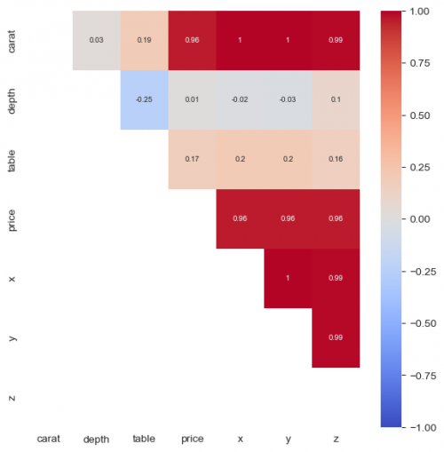
Heatmap is a good choice to visualize a correlation map of variables, however, first we need to call method corr() in order to compute the coefficients. Without the heatmap we will get the matrix with numbers. For the graph, we set the limits to [-1;1], colors to red and blue with cmap='coolwarm' and center=0, which means - "no correlation". For more explanation refer to the documentation.
plt.figure(figsize = (7,7))
sns.heatmap(round(df_diamonds.corr(method = 'spearman'),2), mask = np.tril(df_diamonds.corr(method = 'spearman')), vmax=1, vmin=-1,
            center=0,cmap='coolwarm', annot=True, annot_kws={"size": 7})
In this situation we may see a clear positive correlation between size, price and carat.
Clustering
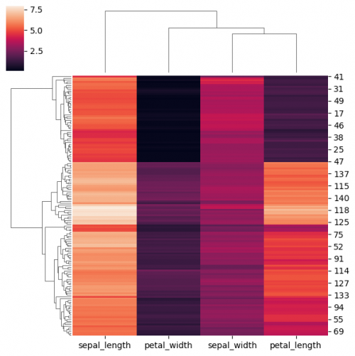
clustermap() function is similar to heatmap(). The main difference is that clustermap() will also make and represent a hierarchical clustering for the rows and the columns of the data. You may also standardisize and normalize the data directly in the function using parameters. In order to perform clustering we will drop the column "species" and transpose the dataset in order to have a usual form of the plot.
df_no_species = df.copy()
df_no_species.drop(columns=['species'],inplace = True)
sns.clustermap(df_no_species,figsize=(6, 6))
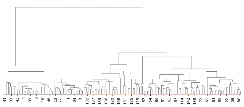
In addition, we will set row_cluster=False to avoid row clustering for transposed data.
g=sns.clustermap(df_no_species.transpose(),dendrogram_ratio=(0, 0.999),row_cluster=False,figsize=(9, 4))

g.cax.remove()  # remove the color bar
Unfortunately, clustering via seaborn requires to have heatmap and the only way to eliminate it is to enhance the ratio of the dendrogram by setting the responsible parameter to the value, close to 1 dendrogram_ratio=(0, 0.999). Often scikit-learn library is used to perform cluster analysis and then to plot the dendrogram independently. It also includes paramter to cut the levels on the graph.
K-means clustering visualization can be implemented via relplot, when the categories are defined by other methods, for example, using scikit-learn library. hue or size separation matches the respective categories via manually settings.
The author of this entry is Evgeniya Zakharova.
