Exploring Different Correlation Coefficients and Plotting Correlations in Python
THIS ARTICLE IS STILL IN EDITING MODE
Contents
Introduction
There are three types of correlation coefficients, namely Pearson correlation, Spearman's rho and Kendall's tau. The main difference that should be considered, which correlation coefficient to use, is that the Pearson correlation is based on the assumption that the data is normally distributed, linearly related and equally distributed about the regression line (homoscedasticity). On the other hand, Spearman's rho and Kendall's tau do not require any type of distribution of the data. In the following we will explore how the different types of correlations vary, depending on the distribution of the data, missing values, outliers and noise in the data. This helps to understand which properties of the data effect the correlation coefficient in which way.
For a deeper background about correlations, please refer to Correlations.
Exploring and Comparing the Different Correlation Coefficients
Effect of differently distributed data on correlation coefficients
In the beginning the necessary libraries will be imported.
import pandas as pd
import numpy as np
import seaborn as sns
import matplotlib.pyplot as plt
from matplotlib import pyplot as plt
import scipy.stats
from scipy.stats import pearsonr, spearmanr, kendalltau
from scipy.stats import linregress
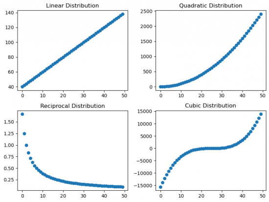
First of all the data have to be simulated. Different distributions can be created as follows:
x = np.arange(0, 50)
# Linear distribution
l = np.array([n * 2 + 40 for n in x])
# Quadratic distribution
q = np.array([n ** 2 for n in x])
# Reciprocal distribution
r = np.array([5 / (n + 3) for n in x])
# Cubic distribution
c = np.array([(n - 25) ** 3 for n in x])
Then the scatter plots for all distributions are made.
# Create a 2x2 grid of subplots
fig, axes = plt.subplots(nrows=2, ncols=2)

# Plot linear distribution
axes[0, 0].scatter(x, l)
axes[0, 0].set_title('Linear Distribution')
# Plot quadratic distribution
axes[0, 1].scatter(x, q)
axes[0, 1].set_title('Quadratic Distribution')
# Plot reciprocal distribution
axes[1, 0].scatter(x, r)
axes[1, 0].set_title('Reciprocal Distribution')
# Plot cubic distribution
axes[1, 1].scatter(x, c)
axes[1, 1].set_title('Cubic Distribution')

# Adjust layout to prevent overlapping
plt.tight_layout()
plt.show() # Figure 1
There are different ways to store the correlation coefficients for the further comparison. This case is using a dataframe.
# Create a DataFrame to store correlation coefficients
correlations = pd.DataFrame(index=['Pearson', 'Spearman', 'Kendall'], columns=['linear', 'quadratic', 'reciprocal', 'cubic'])

# Calculate correlations for x and each distribution
for col in correlations.columns:
    pearson_corr, _ = pearsonr(x, eval(col[0]))
    spearman_corr, _ = spearmanr(x, eval(col[0]))
    kendall_corr, _ = kendalltau(x, eval(col[0]))

    correlations.at['Pearson', col] = pearson_corr
    correlations.at['Spearman', col] = spearman_corr
    correlations.at['Kendall', col] = kendall_corr

# Display the DataFrame
print("Correlation Coefficients:")
print(correlations)
Correlation Coefficients:
| linear | quadratic | reciprocal | cubic | |
|---|---|---|---|---|
| Pearson | 1.0 | 0.967051 | -0.751652 | 0.916029 |
| Spearman | 1.0 | 1.0 | -1.0 | 1.0 |
| Kendall | 1.0 | 1.0 | -1.0 | 1.0 |
When looking at the correlation coeffiecients for the different distributions, we can see that the Pearson correlation varies depending on the type of distribution, while the Spearman and Kendall coefficients reflect high either positive or negative correlation.
To interprete this it is important to notice, that all of the distributions are monotonously increasing or in case of the reciprocal distribution monotonously decreasing. As the Spearman and Kendall coefficients are based on ranks, the type of distribution does not change the absolute value of the correlation coefficient. Pearson on the other hand assumes a linear distribution and therefore the correlation coefficient decreases (in absolute values) as soon as it differentiates from a linear distribution.
Effect of outliers on correlation coefficients
The quadratic distribution from previous example was taken to show the effect of outliers on correlation coefficients. Various number of outliers will be created manually by changing the values of some datapoints from the initial distribution. The results are reflected at the scatter plots (Figure 2).
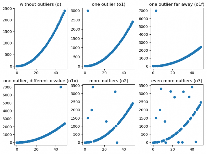
Figure 2: Scatter plots with different outlier effect
Correlation coefficients:
| q | o1 | o1f | o1x | o2 | o3 | |
|---|---|---|---|---|---|---|
| Pearson | 0.967051 | 0.788446 | 0.442784 | 0.755311 | 0.622115 | 0.498832 |
| Spearman | 1.0 | 0.896182 | 0.896182 | 0.99904 | 0.730822 | 0.587255 |
| Kendall | 1.0 | 0.924898 | 0.924898 | 0.993469 | 0.731727 | 0.540033 |
When exploring how outliers effect the correlation coefficients, we can see that the number of outliers and position(s) of the outlier(s) effect the absolute value of the coefficient. The Pearson Coefficient seems to be more sensitive to the distiance of the outlier. This can be seen when comparing o1 and o1f. The outlier being more far away from the distribution does not change the correlation coefficient according to Spearman or Kendall. The Pearson correlation however drops from 0.79 to 0.44. One can even see that this one outlier being very far away effects the Pearson coefficient stronger than many outliers being relatively close (compare o1f and o2). Generally adding more outliers (o2 to o3) similarly effects all correlation coefficients.
Effect of noise on correlation coefficients
At the next step the noise will be added to the linear distribution. Here random samples from a normal (Gaussian) distribution with various values of standard deviation(2, 20, 80) are implemented: np.array([n * 2 + 40 for n in x]) + np.random.normal(0,2,x.shape).
Figure 3 represents a different degree of noise.
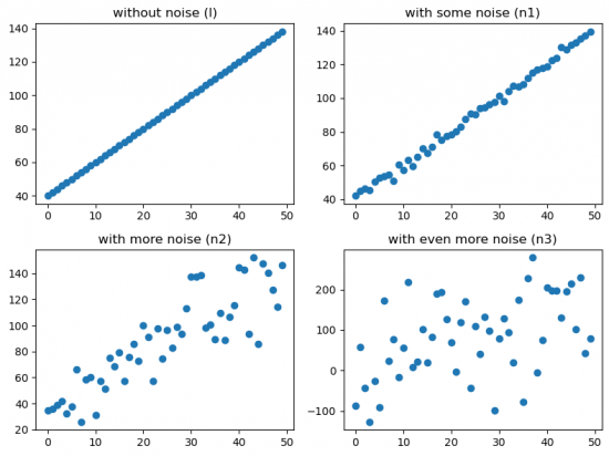
Figure 3: Scatter plots with different noise effect
Correlation coefficients:
| l | n1 | n2 | n3 | |
|---|---|---|---|---|
| Pearson | 1.0 | 0.997644 | 0.870757 | 0.465237 |
| Spearman | 1.0 | 0.997791 | 0.87563 | 0.471789 |
| Kendall | 1.0 | 0.97551 | 0.691429 | 0.32898 |
Here it is quite clear to see that adding noise effects the correlation coefficients by decreasing its absolute value. Kendall's tau seems to be the most sensitive coeffecient regarding noise.
Effect of missing values on correaltion coefficients
Some values will be removed from the Cubic distribution, imitating missing values (scatter plots are illustrated in figure 4).
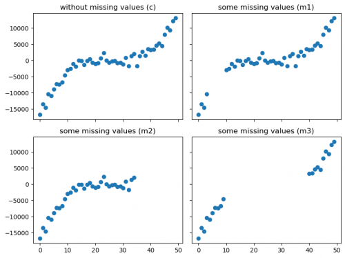
Figure 4: Scatter plots with different missing values effect
Correlation coefficients:
| c | m1 | m2 | m3 | |
|---|---|---|---|---|
| Pearson | 0.891438 | 0.867976 | 0.821374 | 0.967922 |
| Spearman | 0.90108 | 0.855109 | 0.793557 | 0.989474 |
| Kendall | 0.776327 | 0.714588 | 0.643697 | 0.936842 |
By looking at the Correlation coefficients table, we can see that deleting of values does have an effect on the correlation, depending on which datapoints were removed. For example, the Pearson coefficient is the highest for the deletion m2, while for the deletion m3 the Spearman coefficient is the highest.
Summary
The most important understanding of this exploration should be how the Pearson coefficient differs from the Spaerman and Kendall coefficients due to the assumption of a normal distribution. This assumption makes it more sensitive for varying underlying distributions and outliers. Whenever your underlying distribution is not a normal distribution, you should therefore prefer the Spearman or Kendall coefficient over the Pearson coefficient. The Spearman correlation coefficient is the more widely used one.
Visualising Correlations
After exploring how different properties of the distribution of the data might effect the correlation coefficient, let us now have a look at different ways of visualising correlations. This will be done in Python. Please refer to this entry on correlation plots if you want to get an overview on visualisations using R.
Line Chart
We have already seen that we can get an intuituion of the correlation by simply looking at the scatter plot of two variables. If you want to explicitly map the correlation within this scatter plot you can do this by adding a regression line. Addintionaly, you can put the value of the correlation coefficient in the title of the plot.
The following example will use the dataset, reflects the relationship between income and happiness of 111 countries (Kaggle Income and Happiness Correlation).
# Scatter plot for income and happyScore
plt.scatter(happy_data['avg_income'], happy_data['happyScore'])

# Add a regression line
slope, intercept, r_value, p_value, std_err = linregress(happy_data['avg_income'], happy_data['happyScore'])
# Create a regression line using the slope and intercept
regression_line = slope * happy_data["avg_income"] + intercept
# Plot the regression line
plt.plot(happy_data['avg_income'], regression_line, color='red')

# Add the correlation coefficient in the title
plt.title('spearman correlation='+str(round(scipy.stats.spearmanr(happy_data['avg_income'], happy_data['happyScore'])[0],2)))

# Add labels for x and y axis
plt.xlabel('Average Income')
plt.ylabel('Happy Score')
plt.show() # Figure 5
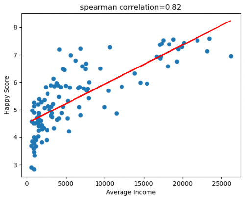
Figure 5: Scatter plot of HappyScore and Average Income with regression line
Scatterplot Matrix
If we want to get an overview of scatter plots for all numeric variables in our dataset, we can do so by simply using the command sns.pairplot(name_of_dataset).
If you want to edit the pairplot, you can find further information about the seaborn.pairplot here.
For example, you can select the variables that should be included, by using the command vars.
# Plot the scatterplot matrix for selected variables
sns.pairplot(happy_data, vars=["adjusted_satisfaction", "avg_income", "income_inequality", "happyScore", "GDP"]) # Figure 6
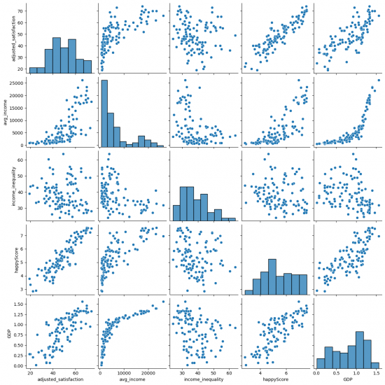
Figure 6: Pairplot of happy_data
Correlation Matrix / Heatmap
Lastly, we will have a look at the heatmap in Seaborn. Here you can find further information about the searborn.heatmap. The heatmap is suitable for getting a first impression of the data and getting an overview of which variables might be related.
For instance, you can:
- specify the type of correlation:
method="spearman"; - add values to the cells:
annot=True; - change the colour map:
cmap="coolwarm"; - add lines between the ceels with specific width:
linewidths=0.5.
# Plot the heatmap according to the adjustments
sns.heatmap(happy_data.corr(method = 'spearman', numeric_only=True), annot=True,cmap='coolwarm', linewidths=0.5) # Figure 7
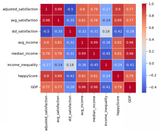
Figure 7: Correlation Matrix of happy_data
Conclusion
This entry helps to gain a deeper understanding of correlation coefficients, with respect to which properties might effect them and how to plot them. You might want to follow this link for further insides about the connection between causality and correlation.
The author of this entry is Nina Dürfeldt.
