Difference between revisions of "Introduction to statistical figures"
| Line 23: | Line 23: | ||
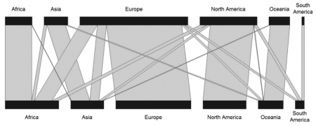
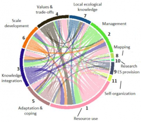
[[File:Introduction to Statistical Figures - Circular Network Plots.png|450px|thumb|center|'''A circular network plot showing how sub-topics of social-ecological processes were represented in articles assessed in a systematic review. The proportion of the circle represents a topic's importance in the research, and the connections show if topics were covered alongside each other.''' Source: Partelow et al. 2018. A sustainability agenda for tropical marine science.]] | [[File:Introduction to Statistical Figures - Circular Network Plots.png|450px|thumb|center|'''A circular network plot showing how sub-topics of social-ecological processes were represented in articles assessed in a systematic review. The proportion of the circle represents a topic's importance in the research, and the connections show if topics were covered alongside each other.''' Source: Partelow et al. 2018. A sustainability agenda for tropical marine science.]] | ||
| + | |||
| + | [[File:Introduction to Statistical Figures - Ordination example.png|450px|thumb|center|'''An Ordination plot (Principal Component Analysis) in which analyzed villages (colored abbreviations) in Transylvania are located according to their natural capital assets alongside two main axes, explaining 50% and 18% of the variance.''' Source: Hanspach et al 2014. A holistic approach to studying social-ecological systems and its application to southern Transylvania.]] | ||
Multivariate data can be principally shown by three ways of graphical representation: '''ordination plots''', '''cluster diagrams''' or '''network plots'''. Ordination plots may encapsulate such diverse approaches as decorana plots, principal component analysis plots, or results from a non-metric dimensional scaling. Typically, the first two most important axis are shown, and additional information can be added post hoc. While these plots show continuous patterns, cluster dendrogramms show the grouping of data. These plots are often helpful to show hierarchical structures in data. Network plots show diverse interactions between different parts of the data. While these can have underlying statistical analysis embedded, such network plots are often more graphical representations than statistical tests. | Multivariate data can be principally shown by three ways of graphical representation: '''ordination plots''', '''cluster diagrams''' or '''network plots'''. Ordination plots may encapsulate such diverse approaches as decorana plots, principal component analysis plots, or results from a non-metric dimensional scaling. Typically, the first two most important axis are shown, and additional information can be added post hoc. While these plots show continuous patterns, cluster dendrogramms show the grouping of data. These plots are often helpful to show hierarchical structures in data. Network plots show diverse interactions between different parts of the data. While these can have underlying statistical analysis embedded, such network plots are often more graphical representations than statistical tests. | ||
Revision as of 09:49, 20 May 2021
Contents
Basic forms of data visualisation
This section introduces you to the most relevant forms of data visualisation. For R examples, please check the section below.
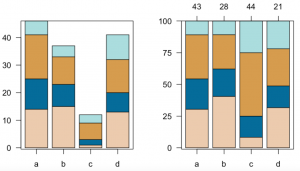
The easiest way to represent count information are basically barplots. They are a bit over simplistic if they contain only one level of information such as three groups and their abundance, and can be more advanced if they contain two levels of information such as in stacked barplots. These can be shown as either absolute numbers or proportions, which may make a dramatic difference for the analysis or interpretation.
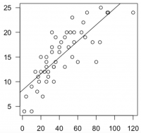
Correlation plots ('xyplots') are the next staple in statistical graphics and most often the graphical representation of a correlation. Further, often also a regression is implemented to show effect strengths and variance. Fitting a regression line is often the most important visual aid to showcase the trend. Through point size or color can another information level be added, making this a really powerful tool, where one needs to keep a keen eye on the relation between correlation and causality. Such plots may also serve to show fluctuations in data over time, showing trends within data as well as harmonic patterns.
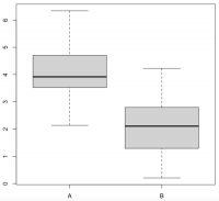
Boxplots are the last in what I would call the trinity of statistical figures. Showing the variance of continuous data across different factor levels is what these plots are made of. While histograms reveal more details and information, boxplots are a solid graphical representation of the Analysis of Variance. A rule of thumb is that if one box is higher or lower than the median (the black line) of the other box, the difference may be signifiant.
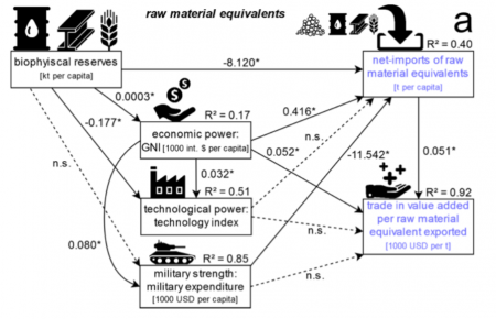
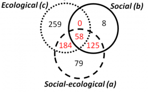
Simple pie charts are not really ideal, as they camouflage the real proportions of the data they show. Venn diagrams are a simple way to compare 2-4 groups and their overlaps, allowing for multiple hits. Larger co-connections can either be represented by a bipartite plot, if the levels are within two groups, or, if multiple interconnections exist, then a structural equation model representation is valuable for more deductive approaches, while rather inductive approaches can be shown by circular network plots.
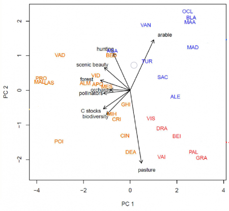
Multivariate data can be principally shown by three ways of graphical representation: ordination plots, cluster diagrams or network plots. Ordination plots may encapsulate such diverse approaches as decorana plots, principal component analysis plots, or results from a non-metric dimensional scaling. Typically, the first two most important axis are shown, and additional information can be added post hoc. While these plots show continuous patterns, cluster dendrogramms show the grouping of data. These plots are often helpful to show hierarchical structures in data. Network plots show diverse interactions between different parts of the data. While these can have underlying statistical analysis embedded, such network plots are often more graphical representations than statistical tests.
Descriptive Infographics can be a fantastic way to summarise general information. A lot of information can be packed in one figure, basically all single variable information that is either proportional or absolute can be presented like this. It can be tricky if the number of categories is very high, which is when a miscellaneous category could be added to a part of an infographic. Infographics are a fine art, since the balance of information and aesthetics demands a high level of experience, a clear understanding of the data, and knowledge in the deeper design of graphical representation.
Of course, there is more. While the figures introduced above represent a vast share of the visual representations of data that you will encounter, there are different forms that have not yet been touched. We have found the website "From data to Viz" to be extremely helpful when choosing appropriate data visualisation. You can select the type of data you have (numeric, categoric, or both), and click through the exemplified figures. There is also R code examples.
How to visualize data in R
The following section provides some examples and R code for simple forms of data visualisation. For more info on data formats, please refer to Data formats.
Barplot
Description
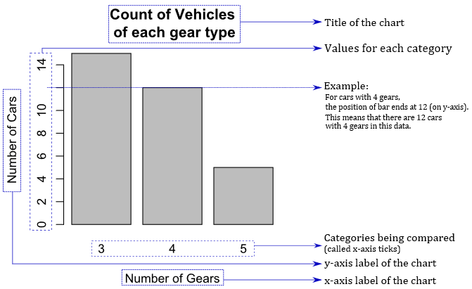
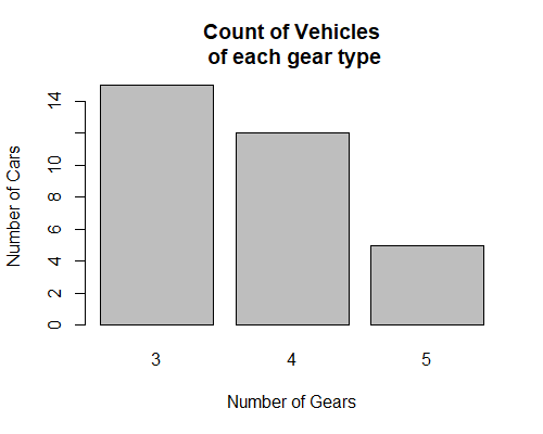
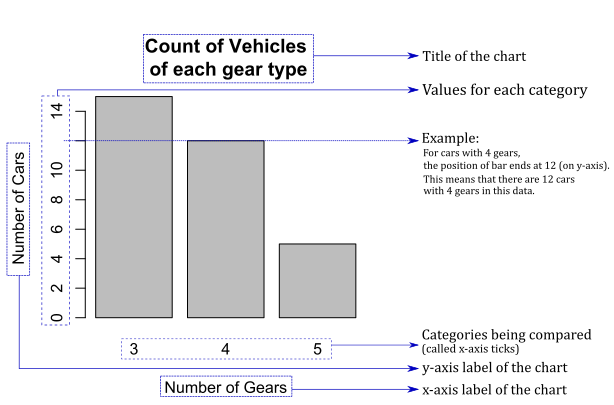
A barplot(also known as 'bar chart' or 'column chart') displays quantitative values for different categories. The chart comprises line marks (bars) – not rectangular areas – with the size attribute (length or height) used to represent the quantitative value for each category.
R Code
We will plot a basic bar chart based on a dataset built-in to R called mtcars. The data set contains data on specifications of different cars. One such specification is the number of gears a given car's transmission has.
We will first create a summary table that contains the number of cars for a given count of gears. Then, we will use that table to create the plot.
The table that contains information about the frequency of cars for a given number of gears looks like this:
| gears | freq |
|---|---|
| 3 | 15 |
| 4 | 12 |
| 5 | 5 |
| ... | ... |
Here, the data for gears column are categories, and the data for freq columns are numeric.
# get the data
gears <- table(mtcars$gear)

# Plot a basic bar chart with a title and labels
barplot(gears,
        main = "Frequency of Vehicles of each Gear Type",   # title of the plot
        xlab = "Number of Gears", ylab = "Number of Cars")  # labels of the plot
For more on Barplots, please refer to the entry on Stacked Barplots.
Scatter Plot
Description
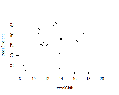
Scatter plots can be useful for showing the relationship between two things, because they allow you to encode data simultaneously on a horizontal x‐axis and vertical y‐axis to see whether - and which kind of - a relationship exists.
You can create scatter plots if you have a pair of continuous (or numeric) data.
R Code
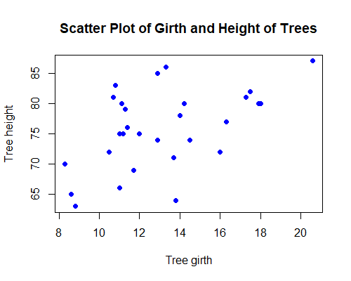
First, we will create a basic Scatter Plot based on a dataset that comes built-in with R, called trees. This data set contains data on the girth, height and the volume of different trees.
The data frame for trees dataset looks like this:
| Girth | Height | Volume |
|---|---|---|
| 8.3 | 70 | 10.3 |
| 8.6 | 65 | 10.3 |
| 8.8 | 63 | 10.2 |
| ... | ... | ... |
Here, the data for all the columns are numeric. So, no further data transformation is necessary.
# Plot a basic scatter plot
plot(x = trees$Girth, y = trees$Height)
Now, we can take this plot and customize it by changing the shape and color of the points, and by adding a title and x- and y-axis labels to the plot.
# Create a scatter plot with labels and colors
plot(x=trees$Girth, y=trees$Height, # choose the x- and y-values
     pch=16,                        # choose how points look on the plot
     col='blue',                    # choose the color of the points
     main='Scatter Plot of Girth and Height of Trees', # main header of the plot
     xlab='Tree girth', ylab='Tree height')            # x- and y-axis labels
These minor customizations make the plot look more professional and understandable.
Line chart
Description
A line chart is a shows how quantitative values for different categories have changed over time. They are typically structured around a temporal x-axis with equal intervals from the earliest to latest point in time. Quantitative values are plotted using joined-up lines that effectively connect consecutive points positioned along a y-axis. The resulting slopes formed between the two ends of each line provide an indication of the local trends between points in time. As this sequence is extended to plot all values across the time frame it forms an overall line representative of the quantitative change over time story for a single categorical value.
Multiple categories can be displayed in the same view, each represented by a unique line. Sometimes a point (circle/dot) is also used to substantiate the visibility of individual values. The lines used in a line chart will generally be straight. However, sometimes curved line interpolation may be used as a method of estimating values between known data points. This approach can be useful to help emphasise a general trend. While this might slightly compromise the visual accuracy of discrete values if you already have approximations, this will have less impact.
R Code
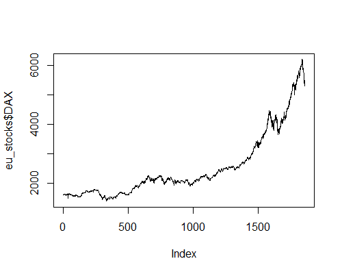
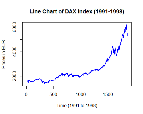
We will first plot a basic line chart based on a built-in dataset called EuStockMarkets. The data set contains data on the closing stock prices of different European stock indices over the years 1991 to 1998.
To make things easier, we will first transform the built-in dataset into a data frame object. Then, we will use that data frame to create the plot.
The table that contains information about the different market indices looks like this:
| DAX | SMI | CAC | FTSE |
|---|---|---|---|
| 1628.75 | 1678.1 | 1772.8 | 2443.6 |
| 1613.63 | 1688.5 | 1750.5 | 2460.2 |
| 1606.51 | 1678.6 | 1718.0 | 2448.2 |
| ... | ... | ... | ... |
Here, the data for all the columns are numeric.
The following line chart shows how the DAX index from the table from previous section.
# read the data as a data frame
eu_stocks <- as.data.frame(EuStockMarkets)

# Plot a basic line chart
plot(eu_stocks$DAX,  # simply select a stock index
     type='l')       # choose 'l' for line chart
As you can see, the plot is very simple. We can enhance the way this plot looks by making a few tweaks, making it more informative and aesthetically pleasing.
# get the data
eu_stocks <- as.data.frame(EuStockMarkets)

# Plot a basic line chart
plot(eu_stocks$DAX, # select the data
     type='l',      # choose 'l' for line chart
     col='blue',    # choose the color of the line
     lwd = 2,       # choose the line width
     main = 'Line Chart of DAX Index (1991-1998)',         # title of the plot
     xlab = 'Time (1991 to 1998)', ylab = 'Prices in EUR') # x- and y-axis labels
You can see that this plot looks much more informative and attractive.
ggplot
Description
R Code
COMING SOON
Boxplot
Description
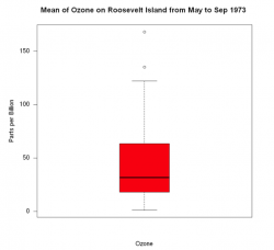
Boxplot show data as a box on a x-y-scale, with information on the distribution of the data as well as outliers. For more information on boxplots, please refer to the entry on Histograms and Boxplots.
R Code
boxplot(airquality$Ozone,
        main = "Mean of Ozone on Roosevelt Island from May to Sep 1973 ",
        xlab="Ozone",
        ylab="Parts per Billion",
        boxwex = 0.5,     # defines width of box
        las = 1,          # flips labels on y-axis into horizontal position
        col="red",        # defines colour of box
        border = "black"  # turns frame and median of box to black
        )
By default, box plots are plotted vertically. It can be flipped into a horizontal position, by passing the argument horizontal and setting it to TRUE. Furthermore, the box can be equipped with a notch, by passing the argument notch and setting it to TRUE.
Histogram
Description
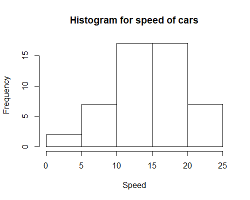
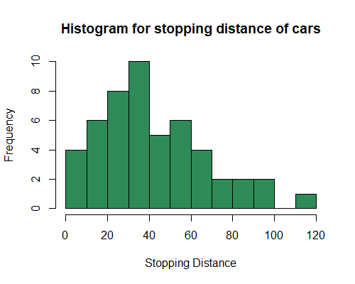
A histogram is a graphical display of data using bars (also called buckets or bins) of different height, where each bar groups numbers into ranges. Histograms reveal a lot of useful information about numerical data with a single explanatory variable. Histograms are used for getting a sense about the distribution of data, its median, and skewness. For more on Histograms, please refer to the entry on Histograms and Boxplots.
R Code
We will first plot a histogram based on a built-in dataset called cars. This data set contains data on stopping distance of different cars at different speeds.
The table that contains information about the stopping distance of different cars at a given speed looks like this:
| speed | dist |
|---|---|
| 4 | 2 |
| 4 | 10 |
| 7 | 4 |
| 7 | 22 |
| 8 | 16 |
| 9 | 10 |
| ... | ... |
Here, the data for both speed and dist columns are numeric. Therefore, we don't need to transform the data in any way in order to plot a histogram.
(with speed variable)
# data that we are going to use
View(cars)

# Plot a basic histogram
hist(cars$speed,
     main = "Histogram for speed of cars", # main title
     xlab = "Speed") # x-axis label
We can now make this look better.
(with dist variable)
# data that we are going to use
View(cars)

# Plot a basic histogram
hist(cars$dist,
     breaks = 15, # define the number of bins you want in the histogram
     col = 'seagreen', # define the color of the bars in the histogram
     main = "Histogram for stopping distance of cars", # main title
     xlab = "Stopping Distance") # x-axis label
Venn diagrams
Description
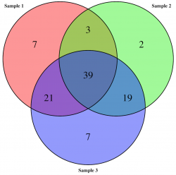
Venn diagrams are a simple way to compare 2-4 groups and their overlaps, allowing for multiple hits. This kind of visualisation allows to see logical relationships between data sets, where each is represented by a circle. The overlaps indicate elements common to both data sets.
R Code
Venn Diagrams are the most useful to visualise relationships between 2-3 datasets, otherwise the diagram becomes difficult to read if used to represent more groups.
The VennDiagram package in R allows to build Venn Diagrams with the help of its in-built function venn.diagram().
#First download and install the VennDiagramm package
install.packages("VennDiagram")
library(VennDiagram)

# let's generate three datasets. Each set would represent a sample
# with identified insect species. The first sample includes 70 insects,
# the second samples includes 63 insects, and the third one includes
# 86 insects.
sample1 <- paste(rep("species_", 70), sample(c(1:100), 70, replace=F), sep="")
sample2 <- paste(rep("species_", 63), sample(c(1:100), 63, replace=F), sep="")
sample3 <- paste(rep("species_", 86), sample(c(1:100), 86, replace=F), sep="")

# Now let's create a venn diagram visualising these three data sets and the number of items
# they have in common. The file with your Venn Diagram will be saved on your hard disk,
# so you can view and use it seperately.
venn.diagram(
  x <- list(sample1, sample2, sample3),
  category.names = c("Sample 1" , "Sample 2 " , "Sample 3"),
  file = "Insects_Vann_diagram1.PNG",
  fill = c("red", "green", "blue"),
  alpha = c(0.5, 0.5, 0.5),
  cex = 2,
  cat.fontface = 2,
  lwd = 2,
)
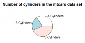
Pie chart
Description
Pie charts represent parts of a whole in a circle. This is done by dividing the circle into multiple slices. The area of each slice is proportional to the quantity it represents. These slices of the circle are reminiscent of a cake or a pie hence the name. 1801 was the oldest known pie chart published by William Playfairs in the book The Statistical Breviary.
Why pie charts shouldn’t be used?
Pie charts are frequently used in non-scientific journals. However, the use of pie charts is especially in the scientific context discouraged. Often they contain so little information that one sentence in the text would have been sufficient instead. In other cases where they could contain more information, (stacked) bar charts have proven to be superior.
Compared to stacked bar charts, pie charts are slower to interpret and more mistakes are made when interpreting them. One explanation for this is the following: only the length of the individual parts of the bar chart have to be considered to determine their share of the whole while for pie charts the area of the slices has to be considered. Since the human eye and brain can more easily determine the lengths than the size of areas, especially when one side of the area is curved as it is the case with pie charts, stacked bar charts are superior.
In a nutshell: The use of pie charts should be well considered and avoided in most cases.
R Code
The R documentation is not found of the pie chart either and advises against using it. The pie charts in R are not actual circles but polygons (by default with 200 edges) which approximate a circle. You can see by yourself that this circle does not look smooth.
#read in the dataset
data("mtcars")
#count how often each cylinder type appears in the data set
cylinders <- table(mtcars$cyl)
#creating a pie chart that displays the number of cylinders
pie(cylinders,
    labels = c("4 Cylinders", "6 Cylinders", "8 Cylinders"),
    main = "Number of cylinders in the mtcars data set")
#This gives us a really basic pie chart
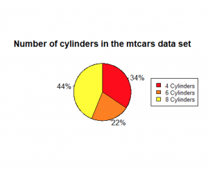
#Now we create a more sophisticated pie chart
#read in the dataset
data("mtcars")
#count how often each cylinder type appears in the data set
cylinders <- table(mtcars$cyl)
#calculate % values
percent<- round(100*cylinders/sum(cylinders), 0)
#create % labels
percent_labels <- paste(percent, "%", sep = "")
#add the % labels
#add a colour scheme
#increase the size of the pie chart
#increase the smoothness of the circle
#change the order of the pieces to clockwise
pie(cylinders,
    labels = percent_labels,
    col = heat.colors(3),
    radius = 1,
    edges = 1000,
    clockwise = TRUE,
    main = "Number of cylinders in the mtcars data set")
#adding a legend on the right side of the pie chart with the same colors
#cex scales the size of the legend
legend("right", c("4 Cylinders", "6 Cylinders", "8 Cylinders"),
       cex = 0.8, fill = heat.colors(3))
#This pie chart looks a lot better than the previous one.
#But the problem remains that this pie chart only shows 3 different categories.
#A sentence or a representation as a bar chart would be more appropriate.
Other statistical figures
As mentioned above, we have found the website "From data to Viz" to be extremely helpful when choosing appropriate data visualisation. You can select the type of data you have (numeric, categoric, or both), and click through the exemplified figures. There is also R code examples.
Further visualisation examples on this Wiki:
- Clustering entry.
- LINK TO ORDINATION AND NETWORK ENTRIES
- Chord Diagram
- Kernel density plot
Graphical etiquette – a rough guide how to make scientific quantitative figures
There is an almost uncountable amount of scientific figures out there. While diversity is great, it can often be overwhelming to consider which graphics to do with data, and which other types of figures can be beneficial. In addition, there are some general norms and conventions to consider when making graphics. Let us start with these. While these are mere suggestions, and reflect my own style and experience, they may serve as a reflection basis for others.
1) Only show data in a figure that contains enough information to justify a figure Many barplots I have seen contain 2 values. Could these not be fit into a sub-sentence? A graphic is to this end downright trivial, and wastes a lot of space. The same is also true for a piechart, but even worse, because it can look like a Pacman, and pie-charts are just generally misleading. Hence consider how many values you want to show, and if these really justify the journal space.
2) One should not show plots that violate the statistics
A common example are barplots. There can be good reasons to show barplots with error bars, however the majority of data is better represented by a boxplot. Boxplots show more values, and are sensible for data that contains a range of integers. A typical borderline case is the Likert Scale, which is often shown in boxplots. While this is not entirely wrong, it is a bit strange, as the scale contains five values, and a boxplot is constructed of five parts at least. Another example is the standard fitted loess line in a ggplot. If you show non-linear statistics, there should be a reason for it. Some of these trends show nothing at all, and follow no assumption beside adding some graphical interest. Scientific figures are however not only about aesthetics, but also about soundness and validity.
3) Avoid empty spaces in plots. After all, your graphics are no Zen garden
Speaking of aesthetics, your plots should be balanced, and should not contain open spaces. Try to set the x and y axes in a way that empty space is avoided. Such space could be ideal for a legend, or maybe some other additional information. Often people use weird short names in the legend, and then explain them in the figure caption. This should be avoided at all costs. Try to create legends that are self-explanatory. Make sure that the density of the information that is being shown is balanced, at least as long as the data and analysis allows for this. If figures contain much open space you can still definitely try to make them smaller, and maybe even combine several of these in a panel plot. In certain graphics such as clearcut correlations empty space is hard to avoid. This is a good indicator that maybe this figure is not needed at all, but instead can be replaced by some relevant values (e.g. p-value, R2 ) in the text.
4) Use diverse, but also non-confusing colours
I am colourblind, so I am in the privileged position to judge on the diversity of colours in a plot. Actually, no test ever picked up any colour blindness, but I definitely have some problem there. Hence I would say that colours should be diverse, and ideally brightness and hue allow also to differentiate groups. Figures become problematic if there are too many colours, and I define this threshold for me at around 8. In addition, consider using colours that have proven their value when combined. I can endorse weandersonpalette as a really cool package that gives you a pleasing combination of colours.
5) Label orientation goes a long way
Most label orientations in most plots are wrong. Try to bring your labels -if space permit- into a horizontal orientation. quite often tables are too densely packed on the x-axis then, yet you could also consider making them in a 45 ° fashion. As much as a 90 ° label orientation can offer a little stretch for the neck, it is also a one-sided exercise. Hence consider flipping the labels whenever possible.
6) Compose the figure right to its intended size
One of the most common mistakes in the creation of figures is the proportion of different parts of the figure. Often the axes labels are really small, but the heading is massive. Ideally when designing a figure, one should consider to size with which this figure should be printed. If you know that a figure is only 6x6 centimetres, you need to make the labels sufficiently large and sparse to be readable, and orderly. A larger figure has different proportions. Hence design your figures in the right composition interns of the different text sizes.
7) Use one font only
Ok, font types are like borderline religion, but still I guess we can all agree that one should only use one font in a figure. If you want to make a typesetter cry you may use one font with serifs and another one without serifs, but otherwise do not do that. It can make sense to use a narrow font (iei. Arial narrow) if you do not have enough space in your figure.
8) Occam's razor applies to scientific figures, too
A good figure is balanced, and ideally contains as much information as possible, but not more. You can however also decide to make figures that contain more information, and are borderline like mandalas. This is really cool if you have complex information to show for, and maybe the result basically says that it's complex. Other figures may be graspable in a split second, which is very cool if you want people to understand something quickly. In between is the Occam's razor sweet spot, where you need a few seconds with the figure, but then you kind of got it. To this send, let it be known that this sweet spot is different for different people.
The author of this entry is Henrik von Wehrden.
