Stacked Barplots
In short: Stacked bar plots show the quantitative relationship that exists between a main category and its subcategories. This entry helps visualise two different types of stacked bar plots, Simple Stacked Plots and Proportions Stacked Plots, and explains the difference between them. For more on the basics of barplots, please refer to the Barplots, Histograms and Boxplots entry.
Stacked Barplots: Proportions vs. Absolute Values
Stacked bar plots show the quantitative relationship that exists between a main category and its subcategories. Each bar represents a principal category and it is divided into segments representing subcategories of a second categorical variable. The chart shows not only the quantitative relationship between the different subcategories with each other but also with the main category as a whole. They are also used to show how the composition of the subcategories changes over time.
Stacked bar plots should be used for Comparisons and Proportions but with emphasis on Composition. This composition analysis can be static for a certain moment in time, or dynamic for a determined period of time.
Stacked bar Plots are two-dimensional with two axes: one axis shows categories, the other axis shows numerical values. The axis where the categories are indicated does not have a scale (*) to highlight that it refers to discrete (mutually exclusive) groups. The axis with numerical values must have a scale with its corresponding measurements units.
When you should use a stacked bar plot
The main objective of a standard bar chart is to compare numeric values between levels of a categorical variable. One bar is plotted for each level of the categorical variable, each bar’s length indicating numeric value. A stacked bar chart also achieves this objective, but also targets a second goal.
We want to move to a stacked bar chart when we care about the relative decomposition of each primary bar based on the levels of a second categorical variable. Each bar is now comprised of a number of sub-bars, each one corresponding with a level of a secondary categorical variable. The total length of each stacked bar is the same as before, but now we can see how the secondary groups contributed to that total.
Two types of Stacked Barplots
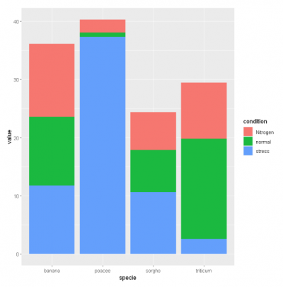
1. Simple Stacked Plots place the absolute value of each subcategory after or over the previous one. The numerical axis has a scale of numerical values. The graph shows the absolute value of each subcategory and the sum of these values indicates the total for the category. Usually, the principal bars have different final heights or lengths.
We use simple stacked plots when relative and absolute differences matter. Ideal for comparing the total amounts across each group/segmented bar.
# library
library(ggplot2)

# create a dataset
specie <- c(rep("sorgho" , 3) , rep("poacee" , 3) , rep("banana" , 3) , rep("triticum" , 3) )
condition <- rep(c("normal" , "stress" , "Nitrogen") , 4)
value <- abs(rnorm(12 , 0 , 15))
data <- data.frame(specie,condition,value)

# Stacked
ggplot(data, aes(fill=condition, y=value, x=specie)) +
    geom_bar(position="stack", stat="identity")
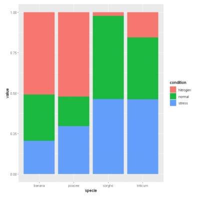
2. Proportions Stacked Plots place the percentage of each subcategory after or over the previous one. The numerical axis has a scale of percentage figures. The graph shows the percentage of each segment referred to the total of the category. All the principal bars have the same height.
In proportions stacked plots the emphasis is on the percentage composition of each subcategory since the totals by category are not shown; in other words, they are used when the key message is the percentage of composition and not the total within the categories. We use proportions stacked plots only when relative differences matter.
# library
library(ggplot2)

# create a dataset
species <- c(rep("sorgho" , 3) , rep("poacee" , 3) , rep("banana" , 3) , rep("triticum" , 3) )
condition <- rep(c("normal" , "stress" , "Nitrogen") , 4)
value <- abs(rnorm(12 , 0 , 15))
data <- data.frame(species,condition,value)

# Stacked + percent
ggplot(data, aes(fill=condition, y=value, x=species)) +
    geom_bar(position="fill", stat="identity")

