Difference between revisions of "Correlations"
| (38 intermediate revisions by 4 users not shown) | |||
| Line 1: | Line 1: | ||
| − | [[File: | + | [[File:Quan dedu indu indi syst glob past pres futu.png|thumb|right|[[Design Criteria of Methods|Method Categorisation:]]<br> |
| + | '''Quantitative''' - Qualitative<br> | ||
| + | '''Deductive''' - '''Inductive'''<br> | ||
| + | '''Individual''' - '''System''' - '''Global'''<br> | ||
| + | '''Past''' - '''Present''' - '''Future''']] | ||
| + | '''In short:''' Correlation analysis examines the statistical relationship between two continuous variables. For R examples on Correlations, please refer to [[Correlation Plots]]. | ||
| + | |||
| + | == Background == | ||
| + | [[File:Correlation.png|400px|thumb|right|'''SCOPUS hits per year for Correlations until 2020.''' Search terms: 'Correlation' in Title, Abstract, Keywords. Source: own.]] | ||
| + | |||
| + | Karl Pearson is considered to be the founding father of mathematical statistics; hence it is no surprise that one of the central methods in statistics - to test the relationship between two continuous variables - was invented by him at the brink of the 20th century (see Karl Pearson's "Notes on regression and inheritance in the case of two parents" from 1895). His contribution was based on work from Francis Galton and Auguste Bravais. With more data becoming available and the need for an “exact science” as part of the industrialization and the rise of modern science, the Pearson correlation paved the road to modern statistics at the beginning of the 20th century. While other approaches such as the t-test or the Analysis of Variance ([[ANOVA]]) by Pearson's arch-enemy Fisher demanded an experimental approach, the correlation simply required data with a continuous measurement level. Hence it appealed to the demand for an analysis that could be conducted based solely on measurements done in engineering, or on counting as in economics, without being preoccupied too deeply with the reasoning on why variables correlated. '''Pearson recognized the predictive power of his discovery, and the correlation analysis became one of the most abundantly used statistical approaches in diverse disciplines such as economics, ecology, psychology and social sciences.''' Later came the regression analysis, which implies a causal link between two continuous variables. This makes it different from a correlation, where two variables are related, but not necessarily causally linked. This article focuses on correlation analysis and only touches upon regressions. For more, please refer to the entry on [[Regression Analysis]].) | ||
| + | |||
| + | |||
| + | == What the method does == | ||
| + | Correlation analysis examines the relationship between two [[Data formats|continuous variables]], and test whether the relation is statistically significant. For this, correlation analysis takes the sample size and the strength of the relation between the two variables into account. The so-called ''correlation coefficient'' indicates the strength of the relation, and ranges from -1 to 1. A coefficient close to 0 indicates a weak correlation. A coefficient close to 1 indicates a strong positive correlation, and a coefficient close to -1 indicates a strong negative correlation. | ||
| + | |||
| + | Correlations can be applied to all kinds of quantitative continuous data from all spatial and temporal scales, from diverse methodological origins including [[Survey]]s and Census data, ecological measurements, economical measurements, GIS and more. Correlations are also used in both inductive and deductive approaches. This versatility makes correlation analysis one of the most frequently used quantitative methods to date. | ||
| + | |||
| + | '''There are different forms of correlation analysis.''' The Pearson correlation is usually applied to normally distributed data, or more precisely, data that shows a [https://365datascience.com/students-t-distribution/ Student's t-distribution]. Alternative correlation measures like [https://www.statisticssolutions.com/kendalls-tau-and-spearmans-rank-correlation-coefficient/ Kendall's tau and Spearman's rho] are usually applied to variables that are not normally distributed. I recommend you just look them up, and keep as a rule of thumb that Spearman's rho is the most robust correlation measure when it comes to non-normally distributed data. | ||
| + | |||
| + | ==== Calculating Pearson's correlation coefficient r ==== | ||
| + | The formula to calculate [https://www.youtube.com/watch?v=2B_UW-RweSE a Pearson correlation coefficient] is fairly simple. You just need to keep in mind that you have two variables or samples, called x and y, and their respective means (m). | ||
| + | [[File:Bildschirmfoto 2020-05-02 um 09.46.54.png|400px|center|thumb|This is the formula for calculating the Pearson correlation coefficient r.]] | ||
<br/> | <br/> | ||
| − | |||
| − | |||
| − | |||
| − | |||
| − | |||
| − | |||
| − | |||
| − | |||
| − | |||
| − | |||
| − | |||
| − | |||
| − | <br/> | + | === Conducting and reading correlations === |
| − | ''' | + | There are some core questions related to the application and reading of correlations. These can be of interest whenever you have the correlation coefficient at hand - for example, in a statistical software - or when you see a correlation plot.<br/> |
| + | |||
| + | '''1) Is the relationship between two variables positive or negative?''' If one variable increases, and the other one increases, too, we have a positive ("+") correlation. This is also true if both variables decrease. For instance, being taller leads to a significant increase in [https://www.ncbi.nlm.nih.gov/pmc/articles/PMC3534609/ body weight]. On the other hand, if one variable increases, and the other decreases, the correlation is negative ("-"): for example, the relationship between 'pizza eaten' and 'pizza left' is negative. The more pizza slices are eaten, the fewer slices are still there. This direction of the relationship tells you a lot about how two variables might be logically connected. The normative value of a positive or negative relation typically has strong implications, especially if both directions are theoretically possible. Therefore it is vital to be able to interpret the direction of a correlative relationship. | ||
| + | |||
| + | '''2) Is the correlation coefficient small or large?''' It can range from -1 to +1, and is an important measure when we evaluate the strength of a statistical relationship. Data points may scatter widely in a [[Correlation_Plots#Scatter_Plot|scatter plot,]] or there may be a rather linear relationship - and everything in between. An example for a perfect positive correlation (with a correlation coefficient ''r'' of +1) is the relationship between temperature in [[To_Rule_And_To_Measure#Celsius_vs_Fahrenheit_vs_Kelvin|Celsius and Fahrenheit]]. This should not be surprising, since Fahrenheit is defined as 32 + 1.8° C. Therefore, their relationship is perfectly linear, which results in such a strong correlation coefficient. We can thus say that 100% of the variation in temperature in Fahrenheit is explained by the temperature in Celsius. | ||
| + | |||
| + | On the other hand, you might encounter data of two variables that is scattered all the way in a scatter plot and you cannot find a significant relationship. The correlation coefficient ''r'' might be around 0.1, or 0.2. Here, you can assume that there is no strong relationship between these two variables, and that one variable does not explain the other one. | ||
| + | |||
| + | The stronger the correlation coefficient of a relation is, the more may these relations matter, some may argue. If the points are distributed like stars in the sky, then the relationship is probably not significant and interesting. Of course this is not entirely generalisable, but it is definitely true that a neutral relation only tells you, that the relation does not matter. At the same time, even weaker relations may give important initial insights into the data, and if two variables show any kind of relation, it is good to know the strength. By practising to quickly grasp the strength of a correlation, you become really fast in understanding relationships in data. Having this kind of skill is essential for anyone interested in approximating facts through quantitative data. | ||
| + | |||
| + | '''3) What does the relationship between two variables explain?''' | ||
| + | This is already an advanced skill, and is rather related to regression analysis. So if you have looked at the strength of a correlation, and its direction, you are good to go generally. But sometimes, these measures change in different parts of the data. | ||
| + | |||
| + | To illustrate this, let us have a look at the example of the percentage of people working in [https://ourworldindata.org/employment-in-agriculture?source=post_page--------------------------- Agriculture] within individual countries. Across the world, people at a low income (<5000 Dollar/year) have a high variability in terms of agricultural employment: half of the population of the Chad work in agriculture, while in Zimbabwe it is only 10 %. However, at an income above 15000 Dollar/year, there is hardly any variance in the percentage of people that work in agriculture: it is always very low. If you plotted this, you would see that the data points are rather broadly spread in the lower x-values (with x as the income), but are more linearly spread in the higher income areas (= x values). This has reasons, and there are probably one or several variables that explain this variability. Maybe there are other factors that have a stronger influence on the percentage of farmers in lower income groups than for higher incomes, where the income is a good predictor. | ||
| − | + | A correlation analysis helps us identify such variances in the data relationship, and we should look at correlation coefficients and the direction of the relationship for different parts of the data. We often have a stronger relation across parts of the dataset, and a weaker relation across other parts of the dataset. These differences are important, as they hint at underlying influencing variables or factors that we did not understand yet. | |
| − | |||
| + | [[File:Bildschirmfoto 2019-10-18 um 10.38.48.png|400px|thumb|center|'''This graph shows the positive correlation between global nutrition and the life expectancy.''' Source: Gapminder]] | ||
| − | + | [[File:Bildschirmfoto 2019-10-18 um 10.51.34.png|400px|thumb|center|'''By comparison, life expectancy and agricultural land have no correlation - which obviously makes sense.''' Source: Gapminder]] | |
| − | + | ||
| + | [[File:Bildschirmfoto 2019-10-18 um 10.30.35.png|400px|thumb|center|'''Income does have an impact on how much CO2 a country emits.''' Source: Gapminder]] | ||
| − | |||
| − | ''' | + | === A quick introduction to regression lines === |
| − | + | As you can see, '''correlation analysis is first and foremost a matter of identifying ''if'' and ''how'' two variables are related.''' We do not necessarily assume that we can predict the value of one variable based on the value of the other variable - we only see how they are related. People often show a correlation in a scatter plot - the x-axis is one variable, the y-axis the other one. You can see this in the example below. Then, they put a line on the data. This line - the "regression line" - represents the correlation coefficient. It is the best approximation for all data points. This means that this line has the minimum distance to all data points. If all data points are exactly on the line, we have a correlation of +1 or -1 (depending on the direction of the line). However, the further the data points are from the line, the closer the correlation coefficient is to 0, and the less meaningful the correlation is. | |
| − | + | [[File:Correlation coefficient examples.png|600px|thumb|center|'''Examples for the correlation coefficient.''' Source: Wikipedia, Kiatdd, CC BY-SA 3.0]] | |
| + | <br> | ||
| + | '''It is however important to know two things:'''<br> | ||
| + | 1) Do not confuse the slope of this line (the 'regression coefficient') - i.e. the number of y-values that the regression line steps per x-value - with the correlation coefficient. They are not the same, and this often leads to confusion. The regression coefficient of the line can easily be 5 or 10, but the correlation coefficient will always be between -1 and +1. | ||
| − | + | 2) Regressions only really make sense if there is some kind of causal explanation for the relationship. We can create a regression line for all correlations of all pairs of two variables, but we might end up suggesting a causal relationship when there really is none. As an example, have a look at the correlation below. There is no regression line here, but the visualisation implies that there is some connection, right? However, it does not really make sense that the divorce rate in Maine and the margarine consumption are related, even though their correlation coefficient is obviously quite high! So you should always question correlations, and ask yourself which kinds of variables are tested for their relationship, and if you can derive meaningful results from doing so. | |
| + | [[File:860-header-explainer-correlationchart.jpg|500px|thumb|center|'''Correlations can be deceitful'''. Source: [http://www.tylervigen.com/spurious-correlations Spurious Correlations]]] | ||
| + | <br> | ||
== Strengths & Challenges == | == Strengths & Challenges == | ||
| − | * | + | * Correlation analysis can be a powerful tool both for inductive reasoning, without a theoretical foundation; or deductive reasoning, which is based on theory. This makes it versatile and has enabled new discoveries as well as the support of existing theories. |
| + | * The versatility of the method expands over all spatial and temporal scales, and basically any discipline that uses continuous data. This makes it clear why correlation analysis has become such a powerhorse for many researchers over time, and is so prevalent also in public debates. | ||
* Correlations are rather easy to apply, and most software allows to derive simple scatterplots that can then be analyzed using correlations. However, you need some minimal knowledge about data distribution, since for instance the Pearson correlation is based on data that is normally distributed. | * Correlations are rather easy to apply, and most software allows to derive simple scatterplots that can then be analyzed using correlations. However, you need some minimal knowledge about data distribution, since for instance the Pearson correlation is based on data that is normally distributed. | ||
| − | |||
== Normativity == | == Normativity == | ||
| − | * | + | * With the power of correlations comes a great responsibility for the researcher. It can be tempting to infer causality and a logical relatoinship between two variables purely from the results of correlations. Economics and other fields have a long history of causal interpretation based on observed associations from the results of correlation analyses. However, researchers should always question whether there is a plausible connection between two variables, even if - or especially when - the correlation seems so clear. A regression analysis, that allows for the prediction of data beyond what can be observed, should especially only be done if there is a logical underlying connection. Keep in mind that regression = correlation + causality. For more thoughts on the connection between correlations and causality, have a look at this entry: [[Causality and correlation]]. |
| − | * Another normative problem of correlations is rooted in so called statistical fishing. With more and more data becoming available, there is an increasing chance that certain correlations are just significant by chance, for which there is a corrective procedure available called Bonferroni correction. However, this is | + | * Another normative problem of correlations is rooted in so called statistical fishing. With more and more data becoming available, there is an increasing chance that certain correlations are just significant by chance, for which there is a corrective procedure available called [https://www.youtube.com/watch?v=HLzS5wPqWR0 Bonferroni correction]. However, this is seldom applied. Today, p-value-driven statistics are increasingly seen critical, and the resulting correlations should be seen as no more than an initial form of a mostly inductive analysis. With some practice, p-value-driven statistics can be a robust tool to compare statistical relations in continuous data, but more complex methods may be useful to better understand the relationships in the data. |
| + | * There is an endless debate about what constitutes a meaninful, strong correlation. Yet, this depends widely on the context and the field of research - for some disciplines, topics, or research questions, a correlation of +0.4 may be meaningful, while it is mostly irrelevant in others. It is a matter of experience and contextualisation how much meaning we infer on correlation coefficients. Furthermore, finding no correlation between two variables is an important statistical result, too. | ||
== Outlook == | == Outlook == | ||
| − | Correlations are | + | Correlations are among the foundational pillars of frequentist statistics. Nonetheless, with science engaging in more complex designs and analysis, correlations will increasingly become less important. As a robust working horse for initial analysis, however, they will remain a good starting point for many datasets. Time will tell whether other approaches - such as [[Bayesian Inference|Bayesian statistics]] and [[Machine Learning|machine learning]] - will ultimately become more abundant. Correlations may benefit from a clear comparison to results based on Bayesian statistics. Until then, we should all be aware of the possibilities and limits of correlations, and what they can - and cannot - tell us about data and its underlying relationships. |
== Key Publications == | == Key Publications == | ||
Hazewinkel, Michiel, ed. (2001). ''Correlation (in statistics)''. Encyclopedia of Mathematics, Springer Science+Business Media B.V. / Kluwer Academic Publishers. | Hazewinkel, Michiel, ed. (2001). ''Correlation (in statistics)''. Encyclopedia of Mathematics, Springer Science+Business Media B.V. / Kluwer Academic Publishers. | ||
| + | |||
| + | Babbie, Earl. 2016. ''The Practice of Social Research.'' 14th ed. Boston: Cengage Learning. | ||
| + | |||
| + | Neuman, W. Lawrence. 2014. ''Social Research Methods: Qualitative and Quantitative Approaches.'' 7th ed. Pearson. | ||
| + | |||
== Further Information == | == Further Information == | ||
| − | |||
* If you want to practise recognizing whether a correlation is weak or strong I recommend spending some time on this website. There you can guess the correlation coefficients based on graphs: http://guessthecorrelation.com/ | * If you want to practise recognizing whether a correlation is weak or strong I recommend spending some time on this website. There you can guess the correlation coefficients based on graphs: http://guessthecorrelation.com/ | ||
| Line 60: | Line 93: | ||
* [https://online.stat.psu.edu/stat501/lesson/1/1.7 The relationship of temperature in Celsius and Fahrenheit]: Several examples of interpreting the correlation coefficient | * [https://online.stat.psu.edu/stat501/lesson/1/1.7 The relationship of temperature in Celsius and Fahrenheit]: Several examples of interpreting the correlation coefficient | ||
| + | |||
| + | * [https://www.mathbootcamps.com/reading-scatterplots/ How to read scatter plots] | ||
* [https://ourworldindata.org/employment-in-agriculture?source=post_page--------------------------- Employment in Agriculture]: A detailed database | * [https://ourworldindata.org/employment-in-agriculture?source=post_page--------------------------- Employment in Agriculture]: A detailed database | ||
| Line 87: | Line 122: | ||
[[Category:Statistics]] | [[Category:Statistics]] | ||
| − | The [[Table of Contributors| | + | The [[Table of Contributors|authors]] of this entry are Henrik von Wehrden and Christopher Franz. |
| − | |||
| − | |||
| − | |||
| − | |||
| − | |||
| − | |||
| − | |||
| − | |||
| − | |||
| − | |||
| − | |||
| − | |||
| − | |||
| − | |||
| − | |||
| − | |||
| − | |||
| − | |||
| − | |||
| − | |||
| − | |||
| − | |||
| − | |||
| − | |||
| − | |||
| − | |||
| − | |||
| − | |||
| − | |||
| − | |||
| − | |||
| − | |||
| − | |||
| − | |||
| − | |||
| − | |||
| − | |||
| − | |||
| − | |||
| − | |||
| − | |||
| − | |||
| − | |||
| − | |||
| − | |||
| − | |||
| − | |||
| − | |||
| − | |||
| − | |||
| − | |||
| − | |||
| − | |||
| − | |||
| − | |||
| − | |||
| − | |||
| − | |||
| − | |||
| − | |||
| − | |||
| − | |||
| − | |||
| − | |||
| − | |||
| − | |||
| − | |||
| − | |||
| − | |||
| − | |||
| − | |||
| − | |||
| − | |||
| − | |||
| − | |||
| − | |||
| − | |||
| − | |||
| − | |||
| − | |||
| − | |||
| − | |||
| − | |||
| − | |||
| − | |||
| − | |||
| − | |||
| − | |||
| − | |||
| − | |||
| − | |||
| − | |||
| − | |||
| − | |||
| − | |||
| − | |||
| − | |||
| − | |||
| − | |||
| − | |||
| − | |||
| − | |||
| − | |||
| − | |||
| − | |||
| − | |||
| − | |||
| − | |||
| − | |||
| − | |||
| − | |||
| − | |||
| − | |||
| − | |||
| − | |||
| − | |||
| − | |||
| − | |||
| − | |||
| − | |||
| − | |||
| − | |||
| − | |||
| − | |||
| − | |||
| − | |||
| − | |||
| − | |||
| − | |||
| − | |||
| − | |||
| − | |||
| − | |||
| − | |||
| − | |||
| − | |||
| − | |||
| − | |||
| − | |||
| − | |||
| − | |||
| − | |||
| − | |||
| − | |||
| − | |||
| − | |||
| − | |||
| − | |||
| − | |||
| − | |||
| − | |||
| − | |||
| − | |||
| − | |||
| − | |||
| − | |||
| − | |||
| − | |||
| − | |||
| − | |||
| − | |||
| − | |||
| − | |||
| − | |||
| − | |||
| − | |||
| − | |||
| − | |||
| − | |||
Latest revision as of 12:36, 7 March 2024
Quantitative - Qualitative
Deductive - Inductive
Individual - System - Global
Past - Present - Future
In short: Correlation analysis examines the statistical relationship between two continuous variables. For R examples on Correlations, please refer to Correlation Plots.
Contents
Background
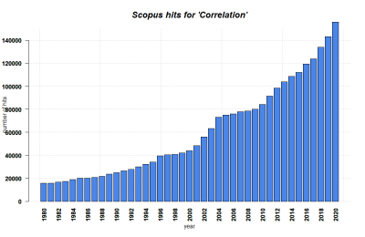
Karl Pearson is considered to be the founding father of mathematical statistics; hence it is no surprise that one of the central methods in statistics - to test the relationship between two continuous variables - was invented by him at the brink of the 20th century (see Karl Pearson's "Notes on regression and inheritance in the case of two parents" from 1895). His contribution was based on work from Francis Galton and Auguste Bravais. With more data becoming available and the need for an “exact science” as part of the industrialization and the rise of modern science, the Pearson correlation paved the road to modern statistics at the beginning of the 20th century. While other approaches such as the t-test or the Analysis of Variance (ANOVA) by Pearson's arch-enemy Fisher demanded an experimental approach, the correlation simply required data with a continuous measurement level. Hence it appealed to the demand for an analysis that could be conducted based solely on measurements done in engineering, or on counting as in economics, without being preoccupied too deeply with the reasoning on why variables correlated. Pearson recognized the predictive power of his discovery, and the correlation analysis became one of the most abundantly used statistical approaches in diverse disciplines such as economics, ecology, psychology and social sciences. Later came the regression analysis, which implies a causal link between two continuous variables. This makes it different from a correlation, where two variables are related, but not necessarily causally linked. This article focuses on correlation analysis and only touches upon regressions. For more, please refer to the entry on Regression Analysis.)
What the method does
Correlation analysis examines the relationship between two continuous variables, and test whether the relation is statistically significant. For this, correlation analysis takes the sample size and the strength of the relation between the two variables into account. The so-called correlation coefficient indicates the strength of the relation, and ranges from -1 to 1. A coefficient close to 0 indicates a weak correlation. A coefficient close to 1 indicates a strong positive correlation, and a coefficient close to -1 indicates a strong negative correlation.
Correlations can be applied to all kinds of quantitative continuous data from all spatial and temporal scales, from diverse methodological origins including Surveys and Census data, ecological measurements, economical measurements, GIS and more. Correlations are also used in both inductive and deductive approaches. This versatility makes correlation analysis one of the most frequently used quantitative methods to date.
There are different forms of correlation analysis. The Pearson correlation is usually applied to normally distributed data, or more precisely, data that shows a Student's t-distribution. Alternative correlation measures like Kendall's tau and Spearman's rho are usually applied to variables that are not normally distributed. I recommend you just look them up, and keep as a rule of thumb that Spearman's rho is the most robust correlation measure when it comes to non-normally distributed data.
Calculating Pearson's correlation coefficient r
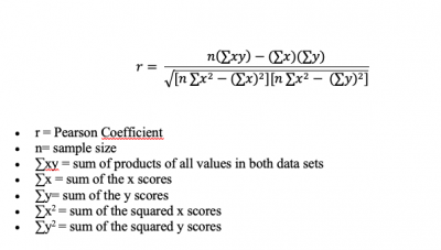
The formula to calculate a Pearson correlation coefficient is fairly simple. You just need to keep in mind that you have two variables or samples, called x and y, and their respective means (m).
Conducting and reading correlations
There are some core questions related to the application and reading of correlations. These can be of interest whenever you have the correlation coefficient at hand - for example, in a statistical software - or when you see a correlation plot.
1) Is the relationship between two variables positive or negative? If one variable increases, and the other one increases, too, we have a positive ("+") correlation. This is also true if both variables decrease. For instance, being taller leads to a significant increase in body weight. On the other hand, if one variable increases, and the other decreases, the correlation is negative ("-"): for example, the relationship between 'pizza eaten' and 'pizza left' is negative. The more pizza slices are eaten, the fewer slices are still there. This direction of the relationship tells you a lot about how two variables might be logically connected. The normative value of a positive or negative relation typically has strong implications, especially if both directions are theoretically possible. Therefore it is vital to be able to interpret the direction of a correlative relationship.
2) Is the correlation coefficient small or large? It can range from -1 to +1, and is an important measure when we evaluate the strength of a statistical relationship. Data points may scatter widely in a scatter plot, or there may be a rather linear relationship - and everything in between. An example for a perfect positive correlation (with a correlation coefficient r of +1) is the relationship between temperature in Celsius and Fahrenheit. This should not be surprising, since Fahrenheit is defined as 32 + 1.8° C. Therefore, their relationship is perfectly linear, which results in such a strong correlation coefficient. We can thus say that 100% of the variation in temperature in Fahrenheit is explained by the temperature in Celsius.
On the other hand, you might encounter data of two variables that is scattered all the way in a scatter plot and you cannot find a significant relationship. The correlation coefficient r might be around 0.1, or 0.2. Here, you can assume that there is no strong relationship between these two variables, and that one variable does not explain the other one.
The stronger the correlation coefficient of a relation is, the more may these relations matter, some may argue. If the points are distributed like stars in the sky, then the relationship is probably not significant and interesting. Of course this is not entirely generalisable, but it is definitely true that a neutral relation only tells you, that the relation does not matter. At the same time, even weaker relations may give important initial insights into the data, and if two variables show any kind of relation, it is good to know the strength. By practising to quickly grasp the strength of a correlation, you become really fast in understanding relationships in data. Having this kind of skill is essential for anyone interested in approximating facts through quantitative data.
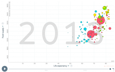
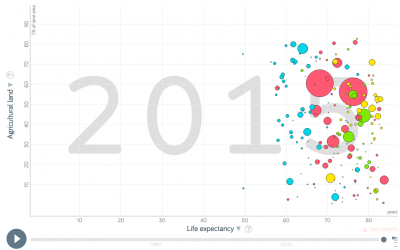
3) What does the relationship between two variables explain? This is already an advanced skill, and is rather related to regression analysis. So if you have looked at the strength of a correlation, and its direction, you are good to go generally. But sometimes, these measures change in different parts of the data.
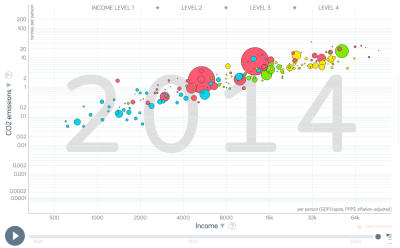
To illustrate this, let us have a look at the example of the percentage of people working in Agriculture within individual countries. Across the world, people at a low income (<5000 Dollar/year) have a high variability in terms of agricultural employment: half of the population of the Chad work in agriculture, while in Zimbabwe it is only 10 %. However, at an income above 15000 Dollar/year, there is hardly any variance in the percentage of people that work in agriculture: it is always very low. If you plotted this, you would see that the data points are rather broadly spread in the lower x-values (with x as the income), but are more linearly spread in the higher income areas (= x values). This has reasons, and there are probably one or several variables that explain this variability. Maybe there are other factors that have a stronger influence on the percentage of farmers in lower income groups than for higher incomes, where the income is a good predictor.
A correlation analysis helps us identify such variances in the data relationship, and we should look at correlation coefficients and the direction of the relationship for different parts of the data. We often have a stronger relation across parts of the dataset, and a weaker relation across other parts of the dataset. These differences are important, as they hint at underlying influencing variables or factors that we did not understand yet.
A quick introduction to regression lines
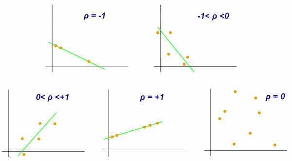
As you can see, correlation analysis is first and foremost a matter of identifying if and how two variables are related. We do not necessarily assume that we can predict the value of one variable based on the value of the other variable - we only see how they are related. People often show a correlation in a scatter plot - the x-axis is one variable, the y-axis the other one. You can see this in the example below. Then, they put a line on the data. This line - the "regression line" - represents the correlation coefficient. It is the best approximation for all data points. This means that this line has the minimum distance to all data points. If all data points are exactly on the line, we have a correlation of +1 or -1 (depending on the direction of the line). However, the further the data points are from the line, the closer the correlation coefficient is to 0, and the less meaningful the correlation is.
It is however important to know two things:
1) Do not confuse the slope of this line (the 'regression coefficient') - i.e. the number of y-values that the regression line steps per x-value - with the correlation coefficient. They are not the same, and this often leads to confusion. The regression coefficient of the line can easily be 5 or 10, but the correlation coefficient will always be between -1 and +1.
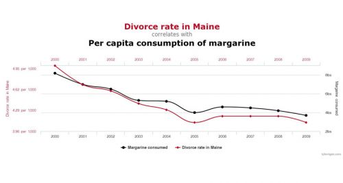
2) Regressions only really make sense if there is some kind of causal explanation for the relationship. We can create a regression line for all correlations of all pairs of two variables, but we might end up suggesting a causal relationship when there really is none. As an example, have a look at the correlation below. There is no regression line here, but the visualisation implies that there is some connection, right? However, it does not really make sense that the divorce rate in Maine and the margarine consumption are related, even though their correlation coefficient is obviously quite high! So you should always question correlations, and ask yourself which kinds of variables are tested for their relationship, and if you can derive meaningful results from doing so.
Strengths & Challenges
- Correlation analysis can be a powerful tool both for inductive reasoning, without a theoretical foundation; or deductive reasoning, which is based on theory. This makes it versatile and has enabled new discoveries as well as the support of existing theories.
- The versatility of the method expands over all spatial and temporal scales, and basically any discipline that uses continuous data. This makes it clear why correlation analysis has become such a powerhorse for many researchers over time, and is so prevalent also in public debates.
- Correlations are rather easy to apply, and most software allows to derive simple scatterplots that can then be analyzed using correlations. However, you need some minimal knowledge about data distribution, since for instance the Pearson correlation is based on data that is normally distributed.
Normativity
- With the power of correlations comes a great responsibility for the researcher. It can be tempting to infer causality and a logical relatoinship between two variables purely from the results of correlations. Economics and other fields have a long history of causal interpretation based on observed associations from the results of correlation analyses. However, researchers should always question whether there is a plausible connection between two variables, even if - or especially when - the correlation seems so clear. A regression analysis, that allows for the prediction of data beyond what can be observed, should especially only be done if there is a logical underlying connection. Keep in mind that regression = correlation + causality. For more thoughts on the connection between correlations and causality, have a look at this entry: Causality and correlation.
- Another normative problem of correlations is rooted in so called statistical fishing. With more and more data becoming available, there is an increasing chance that certain correlations are just significant by chance, for which there is a corrective procedure available called Bonferroni correction. However, this is seldom applied. Today, p-value-driven statistics are increasingly seen critical, and the resulting correlations should be seen as no more than an initial form of a mostly inductive analysis. With some practice, p-value-driven statistics can be a robust tool to compare statistical relations in continuous data, but more complex methods may be useful to better understand the relationships in the data.
- There is an endless debate about what constitutes a meaninful, strong correlation. Yet, this depends widely on the context and the field of research - for some disciplines, topics, or research questions, a correlation of +0.4 may be meaningful, while it is mostly irrelevant in others. It is a matter of experience and contextualisation how much meaning we infer on correlation coefficients. Furthermore, finding no correlation between two variables is an important statistical result, too.
Outlook
Correlations are among the foundational pillars of frequentist statistics. Nonetheless, with science engaging in more complex designs and analysis, correlations will increasingly become less important. As a robust working horse for initial analysis, however, they will remain a good starting point for many datasets. Time will tell whether other approaches - such as Bayesian statistics and machine learning - will ultimately become more abundant. Correlations may benefit from a clear comparison to results based on Bayesian statistics. Until then, we should all be aware of the possibilities and limits of correlations, and what they can - and cannot - tell us about data and its underlying relationships.
Key Publications
Hazewinkel, Michiel, ed. (2001). Correlation (in statistics). Encyclopedia of Mathematics, Springer Science+Business Media B.V. / Kluwer Academic Publishers.
Babbie, Earl. 2016. The Practice of Social Research. 14th ed. Boston: Cengage Learning.
Neuman, W. Lawrence. 2014. Social Research Methods: Qualitative and Quantitative Approaches. 7th ed. Pearson.
Further Information
- If you want to practise recognizing whether a correlation is weak or strong I recommend spending some time on this website. There you can guess the correlation coefficients based on graphs: http://guessthecorrelation.com/
- The correlation coefficient: A very detailed and vivid article
- The relationship of temperature in Celsius and Fahrenheit: Several examples of interpreting the correlation coefficient
- Employment in Agriculture: A detailed database
- Kendall's Tau & Spearman's Rank: Two examples for other forms of correlation
- Strength of Correlation Plots: Some examples
- History of antibiotics: An example for findings when using the inductive approach
- Pearson's correlation coefficient: Many examples
- Pearson correlation: A quick explanation
- Pearson's r Correlation: An example calculation
The authors of this entry are Henrik von Wehrden and Christopher Franz.
