Difference between revisions of "Introduction to statistical figures"
(Created page with "==Graphical etiquette – a rough guide how to make scientific quantitative figures== There is an almost uncountable amount of scientific figures out there. While diversity is...") |
|||
| (94 intermediate revisions by 3 users not shown) | |||
| Line 1: | Line 1: | ||
| − | + | '''In short:''' This entry introduces you to the most relevant forms of [[Glossary|data]] visualisation, and links to dedicated entries on specific visualisation forms with R examples. | |
| − | |||
| − | |||
| − | ''' | ||
| − | |||
| − | |||
| − | |||
| − | |||
| − | |||
| − | |||
| − | |||
| − | |||
| − | |||
| − | |||
| − | |||
| − | |||
| − | |||
| − | |||
| − | |||
| − | |||
| − | |||
| − | |||
| − | |||
| − | |||
| − | |||
| − | |||
| − | |||
| − | |||
| − | |||
| − | |||
| − | |||
| − | |||
| − | |||
| − | |||
== Basic forms of data visualisation == | == Basic forms of data visualisation == | ||
| − | + | __TOC__ | |
| − | |||
The easiest way to represent count information are basically '''barplots'''. They are a bit over simplistic if they contain only one level of information such as three groups and their abundance, and can be more advanced if they contain two levels of information such as in stacked barplots. These can be shown as either absolute numbers or proportions, which may make a dramatic difference for the analysis or interpretation. | The easiest way to represent count information are basically '''barplots'''. They are a bit over simplistic if they contain only one level of information such as three groups and their abundance, and can be more advanced if they contain two levels of information such as in stacked barplots. These can be shown as either absolute numbers or proportions, which may make a dramatic difference for the analysis or interpretation. | ||
| − | + | '''Correlation plots''' ('xyplots') are the next staple in statistical graphics and most often the graphical representation of a correlation. Further, often also a regression is implemented to show effect strengths and variance. Fitting a [[Regression Analysis|regression]] line is often the most important visual aid to showcase the trend. Through point size or color can another information level be added, making this a really powerful tool, where one needs to keep a keen eye on the relation between correlation and causality. Such plots may also serve to show fluctuations in data over time, showing trends within data as well as harmonic patterns. | |
| − | '''Correlation plots''' ('xyplots') are the next staple in statistical graphics | ||
| − | + | '''Boxplots''' are the last in what I would call the trinity of statistical figures. Showing the variance of continuous data across different factor levels is what these plots are made of. While histograms reveal more details and information, boxplots are a solid graphical representation of the Analysis of Variance. A rule of thumb is that if one box is higher or lower than the median (the black line) of the other box, the difference may be signifiant. | |
| − | '''Boxplots''' are the last in what I would call the trinity of statistical figures. Showing the variance of continuous data across different factor levels is what these plots are made of. While histograms reveal more details and information, boxplots are a solid graphical representation of the Analysis of Variance. A rule of thumb is that if one box is higher or lower than the median (the black line) of the other box, the difference may be signifiant. | ||
| − | + | [[File:Xyplot.png|250px|thumb|left|'''A Correlation plot.''' The line shows the regression, the dots are the data points.]] | |
| + | [[File:Boxplot3.png|250px|thumb|right|'''Boxplots.''']] | ||
| + | [[File:2Barplots.png|420px|thumb|center|'''Barplots.''' The left diagram shows absolute, the right one relative Barplots.]] | ||
| − | |||
| − | ''' | + | [[File:Histogram structure.png|300px|thumb|right|'''A Histogram.''']] |
| + | A '''histogram''' is a graphical display of data using bars (also called buckets or bins) of different height, where each bar groups numbers into ranges. They can help reveal a lot of useful information about numerical data with a single explanatory variable. Histograms are used for getting a sense about the distribution of data, its median, and skewness. | ||
| + | Simple '''pie charts''' are not really ideal, as they camouflage the real proportions of the data they show. '''Venn diagrams''' are a simple way to compare 2-4 groups and their overlaps, allowing for multiple hits. Larger co-connections can either be represented by a '''bipartite plot''', if the levels are within two groups, or, if multiple interconnections exist, then a '''structural equation model''' representation is valuable for more deductive approaches, while rather inductive approaches can be shown by '''circular network plots''' (aka [[Chord Diagram]]). | ||
| + | [[File:Introduction to Statistical Figures - Venn Diagram example.png|200px|thumb|left|'''A Venn Diagram showing the number of articles in a systematic review that revolve around one or more of three topics.''' Source: Partelow et al. 2018. A Sustainability Agenda for Tropical Marine Science.]] | ||
| + | [[File:Introduction to Statistical Figures - Bipartite Plot example.png|300px|thumb|right|'''A bipartite plot showing the affiliation of publication authors and the region where a study was conducted.''' Source: Brandt et al. 2013. A review of transdisciplinary research in sustainability science.]] | ||
| + | [[File:Introduction to Statistical Figures - Structural Equation Model.png|400px|thumb|center|'''A piecewise structural equation model quantifying hypothesized relationships between economic and technological power, military strength, biophysical reserves and net imports of resources as well as trade in value added per exported resource item in global trade in 2015.''' Source: Dorninger et al. 2021. Global patterns of ecologically unequal exchange: Implications for sustainability in the 21st century.]] | ||
| − | |||
| − | |||
| − | + | Multivariate data can be principally shown by three ways of graphical representation: '''ordination plots''', '''cluster diagrams''' or '''network plots'''. Ordination plots may encapsulate such diverse approaches as decorana plots, principal component analysis plots, or results from a non-metric dimensional scaling. Typically, the first two most important axis are shown, and additional information can be added post hoc. While these plots show continuous patterns, cluster dendrogramms show the grouping of data. These plots are often helpful to show hierarchical structures in data. Network plots show diverse interactions between different parts of the data. While these can have underlying statistical analysis embedded, such network plots are often more graphical representations than statistical tests. | |
| − | |||
| − | |||
| − | + | [[File:Introduction to Statistical Figures - Ordination example.png|450px|thumb|left|'''An Ordination plot (Principal Component Analysis) in which analyzed villages (colored abbreviations) in Transylvania are located according to their natural capital assets alongside two main axes, explaining 50% and 18% of the variance.''' Source: Hanspach et al 2014. A holistic approach to studying social-ecological systems and its application to southern Transylvania.]] | |
| − | + | [[File:Introduction to Statistical Figures - Circular Network Plots.png|530px|thumb|center|'''A circular network plot showing how sub-topics of social-ecological processes were represented in articles assessed in a systematic review. The proportion of the circle represents a topic's importance in the research, and the connections show if topics were covered alongside each other.''' Source: Partelow et al. 2018. A sustainability agenda for tropical marine science.]] | |
| − | |||
| − | + | '''Descriptive Infographics''' can be a fantastic way to summarise general information. A lot of information can be packed in one figure, basically all single variable information that is either proportional or absolute can be presented like this. It can be tricky if the number of categories is very high, which is when a miscellaneous category could be added to a part of an infographic. Infographics are a fine [[Glossary|art]], since the balance of information and aesthetics demands a high level of experience, a clear understanding of the data, and knowledge in the deeper design of graphical representation. | |
| − | |||
| − | |||
| − | |||
| − | |||
| − | |||
| − | |||
| − | |||
| − | |||
| − | |||
| − | |||
| − | |||
| − | |||
| − | |||
| − | + | '''Of course, there is more.''' While the figures introduced above represent a vast share of the visual representations of data that you will encounter, there are different forms that have not yet been touched. '''We have found the website [https://www.data-to-viz.com/#connectedscatter "From data to Viz"] to be extremely helpful when choosing appropriate data visualisation.''' You can select the type of data you have (numeric, categoric, or both), and click through the exemplified figures. There is also R code examples. | |
| − | |||
| − | |||
| − | |||
| − | |||
| − | |||
| − | + | == How to visualize data in R == | |
| + | '''The following overview includes all forms of data visualisation that we consider important.''' <br> | ||
| + | Based on your data, have a look which forms of visualisation might be relevant for you. Just hover over the individual visualisation type and it will show you its name. It will also show you a quick example which this kind of visualisation might be helpful for. '''By clicking, you will be redirected to a dedicated entry with exemplary R code.'''<br> | ||
| − | + | Tip: If you are unsure whether you have qualitative or quantitative data, have a look at the entry on [[Data formats]]. Keep in mind: categorical (qualitative) data that is counted in order to visualise each category's occurrence, is not quantitative (= numeric) data. It's still qualitative data that is just transformed into count data. So the visualisations on the left do indeed display some kind of quantitative information, but the underlying data was always qualitative. | |
| − | |||
| − | |||
| − | |||
| − | |||
| − | |||
| − | |||
| − | |||
| − | + | <imagemap>Image:Statistical Figures Overview 27.05.png|1050px|frameless|center| | |
| − | [[ | + | circle 120 201 61 [[Big problems for later|Factor analysis]] |
| + | circle 312 201 61 [[Venn Diagram|Venn Diagram, e.g. variables TREE SPECIES IN EUROPE, TREE SPECIES IN ASIA, TREE SPECIES IN AMERICA as three colors, with joint species in the overlaps]] | ||
| + | circle 516 190 67 [[Venn Diagram|Venn Diagram, e.g. variables TREE SPECIES IN EUROPE, TREE SPECIES IN ASIA as two colors, with joint species in the overlaps]] | ||
| + | circle 718 178 67 [[Stacked Barplots|Stacked Barplot, e.g. count data of different species (colors) for the variable TREES]] | ||
| + | circle 891 179 67 [[Barplots, Histograms and Boxplots#Barplots|Barplot, e.g. different kinds of trees (x) as count data (y) for the variable TREES]] | ||
| + | circle 1318 184 67 [[Barplots, Histograms and Boxplots#Histograms|Histogram, e.g. the variable EXAM POINTS as count data (y) per interval (x)]] | ||
| + | circle 1510 187 67 [[Correlation_Plots#Line_chart|Line Chart, e.g. TIME (x) and BITCOIN VALUE (y)]] | ||
| + | circle 1689 222 67 [[Bubble Plots|Bubble Plot, e.g. GDP (x), LIFE EXPECTANCY (y), POPULATION (bubble size)]] | ||
| + | circle 1896 238 67 [[Big problems for later|Ordination, e.g. numeric variables (AGE, INCOME, HEIGHT) are transformed into Principal Components (x & y) along which data points are arranged and explained]] | ||
| + | circle 202 326 67 [[Treemap|Treemap, e.g. FORESTS (colors) and count data of the included species (rectangles)]] | ||
| + | circle 410 323 67 [[Stacked Barplots|Simple Stacked Barplot, e.g. different species of trees (absolute count data per color) for the variables TREES in ASIA, TREES IN AMERICA, TREES IN AFRICA, TREES IN EUROPE (x)]] | ||
| + | circle 608 295 67 [[Stacked Barplots|Proportions Stacked Barplot, e.g. relative count data (y) of different species (colors) for the variables TREES in ASIA & TREES IN EUROPE (x)]] | ||
| + | circle 812 277 67 [[Pie Charts|Pie Chart, e.g. different kinds of trees (relative count data per color) for the variable TREE SPECIES]] | ||
| + | circle 1015 308 67 [[Barplots, Histograms and Boxplots#Boxplots|Boxplot, e.g. TREE HEIGHT (y) for beeches]] | ||
| + | circle 1228 287 67 [[Kernel density plot|Kernel Density Plot, e.g. count data (y) of EXAM POINTS per point (x)]] | ||
| + | circle 1422 294 67 [[Correlation_Plots#Scatter_Plot|Scatter Plot, e.g. RUNNER ENERGY LEVEL (y) per KILOMETERS (x)]] | ||
| + | circle 1574 379 67 [[Big problems for later|Heatmap with lines]] | ||
| + | circle 1788 401 67 [[Correlation_Plots#Correlogram|Correlogram, e.g. the CORRELATION COEFFICIENT (shade) for each pair of the numeric variables KILOMETERS PER LITER, CYLINDERS, HORSEPOWER, WEIGHT]] | ||
| + | circle 297 441 67 [[Wordcloud|Wordcloud]] | ||
| + | circle 516 434 67 [[Big problems for later|Spider Plot, e.g. relative count data of different species (shape) for the variables TREES IN EUROPE (green), TREES IN ASIA (blue), TREES IN AMERICA (red)]] | ||
| + | circle 710 402 67 [[Stacked Barplots|Simple Stacked Barplot, e.g. absolute count data (y) of different species (colors) for the variables TREES in ASIA & TREES IN EUROPE (x)]] | ||
| + | circle 1323 410 67 [[Regression Analysis#Simple linear regression in R|Linear Regression Plot, e.g. INCOME (y) per AGE (x)]] | ||
| + | circle 392 558 67 [[Chord Diagram, e.g. count data of FAVORITE SNACKS (colors) with the connections connecting shared favorites]] | ||
| + | circle 621 521 67 [[Sankey Diagrams|Sankey Diagram, e.g. count data of FAVORITE SNACKS (colors) with the connections connecting shared favorites (if connections are valued: 3 variables)]] | ||
| + | circle 853 496 67 [[Barplots, Histograms and Boxplots#Boxplots|Boxplot, e.g. different TREE SPECIES (x) and TREE HEIGHT (y)]] | ||
| + | circle 1014 521 67 [[Stacked Area Plot|Stacked Area Plot, e.g. INCOME (x) and count data (y) of BOUGHT ITEMS (colors) (if y is EXPENSES: three variables)]] | ||
| + | circle 1174 502 67 [[Kernel density plot|Kernel Density Plot, e.g. count data (y) of EXAM POINTS IN MATHS (blue) and EXAM POINTS in HISTORY (green) per point (x)]] | ||
| + | circle 1438 521 67 [[Big problems for later|Multiple Regression, e.g. INCOME (y) per AGE (x) in different COUNTRIES]] | ||
| + | circle 1657 554 67 [[Clustering Methods|Cluster Analysis, e.g. car data points are grouped by their similarity according to the numeric variables KILOMETERS PER LITER, CYLINDERS, HORSEPOWER, WEIGHT]] | ||
| + | circle 517 648 67 [[Sankey Diagrams|Sankey Diagram, e.g. count data of VOTER PREFERENCES (colors) with movements from Y1 to Y2 to Y3]] | ||
| + | circle 755 621 67 [[Stacked Barplots|Simple Stacked Barplot, e.g. absolute count data (y) of different species (colors) for the variables TREES in ASIA & TREES IN EUROPE (x), with numeric PHYLOGENETIC DIVERSITY (bar width)]] | ||
| + | circle 912 679 67 [[Barplots, Histograms and Boxplots#Boxplots|Boxplot, e.g. TREE SPECIES (x), TREE HEIGHT (y), COUNTRIES (colors)]] | ||
| + | circle 1095 693 67 [[Bubble Plots|Bubble Plot, e.g. GDP (x), LIFE EXPECTANCY (y), COUNTRY (bubble color)]] | ||
| + | circle 1267 645 67 [[Heatmap|Heatmap, e.g. TREE SPECIES (x) with FERTILIZER BRAND (y) and HEIGHT (colors)]] | ||
| + | circle 1509 696 67 [[Big problems for later|Network Plot, e.g. calculated connection strength (line width) between actors (nodes) based on LOCAL PROXIMITY, RATE OF INTERACTION, AGE, CASH FLOWS (nodes may be categorical)]] | ||
| + | circle 622 812 67 [[Clustering Methods|Cluster Analysis, e.g. car data points are grouped by their similarity according to the numeric variables KILOMETERS PER LITER, CYLINDERS, HORSEPOWER and categorical BRAND]] | ||
| + | circle 733 759 67 [[Bubble Plots|Bubble Plot, e.g. GDP (x), LIFE EXPECTANCY (y), COUNTRY (bubble color), POPULATION SIZE (bubble size)]] | ||
| + | circle 782 875 67 [[Big problems for later|Factor analysis]] | ||
| + | circle 1271 825 67 [[Big problems for later|Structural Equation Plot]] | ||
| + | circle 1394 771 67 [[Big problems for later|Ordination, e.g. numeric and categorical variables (AGE, INCOME, HEIGHT, PROFESSION) are transformed into Principal Components (x & y) along which data points are arranged and explained]] | ||
| + | </imagemap> | ||
| − | |||
| + | === Other statistical figures === | ||
| + | For further data types and visualisation exploration, we have found the website [https://www.data-to-viz.com/#connectedscatter "From data to Viz"] to be extremely helpful when choosing appropriate data visualisation. You can select the type of data you have (numeric, categoric, or both), and click through the exemplified figures. There is also R code examples. | ||
| − | + | '''Further visualisation examples on this Wiki:''' | |
| − | + | * [[Clustering Methods|Clustering methods]] | |
| − | + | * [[Big problems for later|Ordination and Network Analysis]] | |
| + | * [[Chord Diagram]] | ||
| + | * [[Kernel density plot]] | ||
| − | + | == Graphical etiquette – a rough guide how to make scientific quantitative figures == | |
| + | There is an almost uncountable amount of scientific figures out there. While diversity is great, it can often be overwhelming to consider which graphics to do with data, and which other types of figures can be beneficial. In addition, there are some general norms and conventions to consider when making graphics. Let us start with these. While these are mere suggestions, and reflect my own style and experience, they may serve as a reflection basis for others. | ||
| − | + | '''1) Only show data in a figure that contains enough information to justify a figure''' | |
| − | + | <br> | |
| − | + | Many barplots I have seen contain 2 values. Could these not be fit into a sub-sentence? A graphic is to this end downright trivial, and wastes a lot of space. The same is also true for a piechart, but even worse, because it can look like a Pacman, and pie-charts are just generally misleading. Hence consider how many values you want to show, and if these really justify the journal space. | |
| − | |||
| − | + | '''2) One should not show plots that violate the statistics'''<br> | |
| − | + | A common example are barplots. There can be good reasons to show barplots with error bars, however the majority of data is better represented by a boxplot. Boxplots show more values, and are sensible for data that contains a range of integers. A typical borderline case is the [[Likert Scale]], which is often shown in boxplots. While this is not entirely wrong, it is a bit strange, as the scale contains five values, and a boxplot is constructed of five parts at least. Another example is the standard fitted [https://www.statisticshowto.com/lowess-smoothing/ loess line] in a ggplot. If you show non-linear statistics, there should be a reason for it. Some of these trends show nothing at all, and follow no assumption beside adding some graphical interest. Scientific figures are however not only about aesthetics, but also about soundness and validity. | |
| − | |||
| − | |||
| − | |||
| − | |||
| − | |||
| − | |||
| − | |||
| − | |||
| − | |||
| − | |||
| − | |||
| − | < | + | '''3) Avoid empty spaces in plots. After all, your graphics are no Zen garden'''<br> |
| − | + | Speaking of aesthetics, your plots should be balanced, and should not contain open spaces. Try to set the x and y axes in a way that empty space is avoided. Such space could be ideal for a legend, or maybe some other additional information. Often people use weird short names in the legend, and then explain them in the figure caption. This should be avoided at all costs. Try to create legends that are self-explanatory. Make sure that the density of the information that is being shown is balanced, at least as long as the data and analysis allows for this. If figures contain much open space you can still definitely try to make them smaller, and maybe even combine several of these in a panel plot. In certain graphics such as clearcut correlations empty space is hard to avoid. This is a good indicator that maybe this figure is not needed at all, but instead can be replaced by some relevant values (e.g. p-value, R<sup>2</sup> ) in the text. | |
| − | |||
| − | |||
| − | |||
| − | |||
| − | |||
| − | |||
| − | ''' | + | '''4) Use diverse, but also non-confusing colours'''<br> |
| − | + | I am colourblind, so I am in the privileged position to judge on the diversity of colours in a plot. Actually, no test ever picked up any colour blindness, but I definitely have some problem there. Hence I would say that colours should be diverse, and ideally brightness and hue allow also to differentiate groups. Figures become problematic if there are too many colours, and I define this threshold for me at around 8. In addition, consider using colours that have proven their value when combined. I can endorse weandersonpalette as a really cool package that gives you a pleasing combination of colours. | |
| − | + | '''5) Label orientation goes a long way'''<br> | |
| − | + | Most label orientations in most plots are wrong. Try to bring your labels -if space permit- into a horizontal orientation. quite often tables are too densely packed on the x-axis then, yet you could also consider making them in a 45 ° fashion. As much as a 90 ° label orientation can offer a little stretch for the neck, it is also a one-sided exercise. Hence consider flipping the labels whenever possible. | |
| − | |||
| − | |||
| − | + | '''6) Compose the figure right to its intended size'''<br> | |
| − | + | One of the most common mistakes in the creation of figures is the proportion of different parts of the figure. Often the axes labels are really small, but the heading is massive. Ideally when designing a figure, one should consider to size with which this figure should be printed. If you know that a figure is only 6x6 centimetres, you need to make the labels sufficiently large and sparse to be readable, and orderly. A larger figure has different proportions. Hence design your figures in the right composition interns of the different text sizes. | |
| − | |||
| − | + | '''7) Use one font only'''<br> | |
| − | + | Ok, font types are like borderline religion, but still I guess we can all agree that one should only use one font in a figure. If you want to make a typesetter cry you may use one font with serifs and another one without serifs, but otherwise do not do that. It can make sense to use a narrow font (iei. Arial narrow) if you do not have enough space in your figure. | |
| − | |||
| − | |||
| − | |||
| − | |||
| − | |||
| − | |||
| − | |||
| − | |||
| − | |||
| − | |||
| − | |||
| − | |||
| − | |||
| − | |||
| − | |||
| − | |||
| − | |||
| − | + | '''8) Occam's razor applies to scientific figures, too'''<br> | |
| − | + | A good figure is balanced, and ideally contains as much information as possible, but not more. You can however also decide to make figures that contain more information, and are borderline like mandalas. This is really cool if you have complex information to show for, and maybe the result basically says that it's complex. Other figures may be graspable in a split second, which is very cool if you want people to understand something quickly. In between is the Occam's razor sweet spot, where you need a few seconds with the figure, but then you kind of got it. To this send, let it be known that this sweet spot is different for different people. | |
| − | |||
| − | |||
| − | |||
| − | |||
| − | |||
| − | |||
| − | |||
| − | |||
| − | |||
| − | |||
| − | ''' | ||
| − | |||
| − | |||
| − | |||
| − | |||
| − | |||
| − | |||
| − | |||
| − | |||
| − | |||
| − | |||
| − | |||
| − | |||
| − | |||
| − | |||
| − | |||
| − | |||
| − | < | ||
| − | |||
| − | |||
| − | |||
| − | |||
| − | |||
| − | |||
| − | |||
| − | |||
| − | |||
| − | |||
| − | |||
| − | |||
| − | |||
| − | |||
| − | |||
| − | |||
| − | |||
| − | |||
| − | |||
| − | |||
| − | |||
| − | |||
| − | |||
| − | |||
| − | |||
| − | |||
| − | |||
| − | |||
| − | |||
| − | |||
| − | |||
| − | |||
| − | |||
| − | |||
| − | |||
| − | To | ||
| − | |||
| − | |||
| − | |||
| − | |||
| − | |||
| − | |||
| − | |||
| − | |||
| − | |||
| − | |||
| − | |||
| − | |||
| − | |||
| − | |||
| − | |||
| − | |||
| − | |||
| − | |||
| − | |||
| − | |||
| − | |||
| − | |||
| − | |||
| − | |||
| − | |||
| − | |||
| − | |||
| − | |||
| − | |||
| − | |||
| − | |||
| − | |||
| − | |||
| − | |||
| − | |||
| − | |||
| − | |||
| − | |||
| − | |||
| − | |||
| − | |||
| − | |||
| − | |||
| − | |||
| − | |||
| − | |||
| − | |||
| − | |||
| − | |||
| − | |||
| − | |||
| − | |||
| − | |||
| − | |||
| − | |||
| − | |||
| − | |||
| − | |||
| − | |||
| − | |||
| − | |||
| − | |||
| − | |||
| − | |||
---- | ---- | ||
[[Category:Statistics]] | [[Category:Statistics]] | ||
[[Category:Normativity of Methods]] | [[Category:Normativity of Methods]] | ||
| + | [[Category:R examples]] | ||
The [[Table_of_Contributors|author]] of this entry is Henrik von Wehrden. | The [[Table_of_Contributors|author]] of this entry is Henrik von Wehrden. | ||
Latest revision as of 12:31, 13 April 2022
In short: This entry introduces you to the most relevant forms of data visualisation, and links to dedicated entries on specific visualisation forms with R examples.
Basic forms of data visualisation
Contents
The easiest way to represent count information are basically barplots. They are a bit over simplistic if they contain only one level of information such as three groups and their abundance, and can be more advanced if they contain two levels of information such as in stacked barplots. These can be shown as either absolute numbers or proportions, which may make a dramatic difference for the analysis or interpretation.
Correlation plots ('xyplots') are the next staple in statistical graphics and most often the graphical representation of a correlation. Further, often also a regression is implemented to show effect strengths and variance. Fitting a regression line is often the most important visual aid to showcase the trend. Through point size or color can another information level be added, making this a really powerful tool, where one needs to keep a keen eye on the relation between correlation and causality. Such plots may also serve to show fluctuations in data over time, showing trends within data as well as harmonic patterns.
Boxplots are the last in what I would call the trinity of statistical figures. Showing the variance of continuous data across different factor levels is what these plots are made of. While histograms reveal more details and information, boxplots are a solid graphical representation of the Analysis of Variance. A rule of thumb is that if one box is higher or lower than the median (the black line) of the other box, the difference may be signifiant.


A histogram is a graphical display of data using bars (also called buckets or bins) of different height, where each bar groups numbers into ranges. They can help reveal a lot of useful information about numerical data with a single explanatory variable. Histograms are used for getting a sense about the distribution of data, its median, and skewness.
Simple pie charts are not really ideal, as they camouflage the real proportions of the data they show. Venn diagrams are a simple way to compare 2-4 groups and their overlaps, allowing for multiple hits. Larger co-connections can either be represented by a bipartite plot, if the levels are within two groups, or, if multiple interconnections exist, then a structural equation model representation is valuable for more deductive approaches, while rather inductive approaches can be shown by circular network plots (aka Chord Diagram).


Multivariate data can be principally shown by three ways of graphical representation: ordination plots, cluster diagrams or network plots. Ordination plots may encapsulate such diverse approaches as decorana plots, principal component analysis plots, or results from a non-metric dimensional scaling. Typically, the first two most important axis are shown, and additional information can be added post hoc. While these plots show continuous patterns, cluster dendrogramms show the grouping of data. These plots are often helpful to show hierarchical structures in data. Network plots show diverse interactions between different parts of the data. While these can have underlying statistical analysis embedded, such network plots are often more graphical representations than statistical tests.


Descriptive Infographics can be a fantastic way to summarise general information. A lot of information can be packed in one figure, basically all single variable information that is either proportional or absolute can be presented like this. It can be tricky if the number of categories is very high, which is when a miscellaneous category could be added to a part of an infographic. Infographics are a fine art, since the balance of information and aesthetics demands a high level of experience, a clear understanding of the data, and knowledge in the deeper design of graphical representation.
Of course, there is more. While the figures introduced above represent a vast share of the visual representations of data that you will encounter, there are different forms that have not yet been touched. We have found the website "From data to Viz" to be extremely helpful when choosing appropriate data visualisation. You can select the type of data you have (numeric, categoric, or both), and click through the exemplified figures. There is also R code examples.
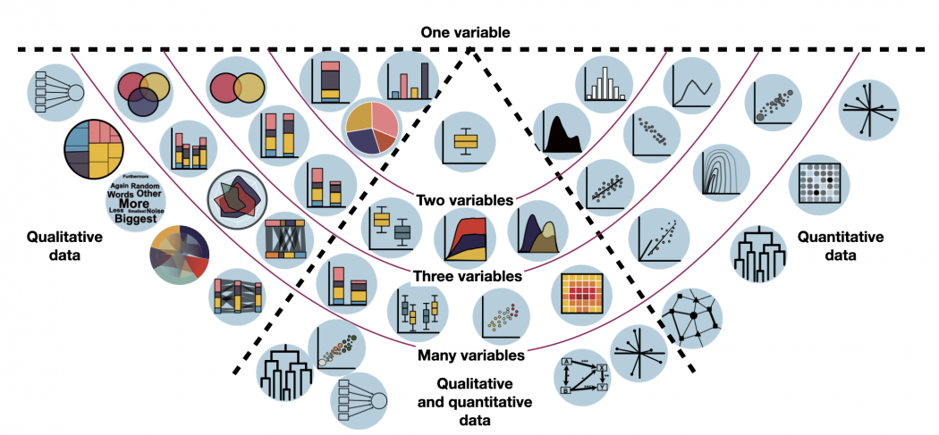
How to visualize data in R
The following overview includes all forms of data visualisation that we consider important.
Based on your data, have a look which forms of visualisation might be relevant for you. Just hover over the individual visualisation type and it will show you its name. It will also show you a quick example which this kind of visualisation might be helpful for. By clicking, you will be redirected to a dedicated entry with exemplary R code.
Tip: If you are unsure whether you have qualitative or quantitative data, have a look at the entry on Data formats. Keep in mind: categorical (qualitative) data that is counted in order to visualise each category's occurrence, is not quantitative (= numeric) data. It's still qualitative data that is just transformed into count data. So the visualisations on the left do indeed display some kind of quantitative information, but the underlying data was always qualitative.

Other statistical figures
For further data types and visualisation exploration, we have found the website "From data to Viz" to be extremely helpful when choosing appropriate data visualisation. You can select the type of data you have (numeric, categoric, or both), and click through the exemplified figures. There is also R code examples.
Further visualisation examples on this Wiki:
Graphical etiquette – a rough guide how to make scientific quantitative figures
There is an almost uncountable amount of scientific figures out there. While diversity is great, it can often be overwhelming to consider which graphics to do with data, and which other types of figures can be beneficial. In addition, there are some general norms and conventions to consider when making graphics. Let us start with these. While these are mere suggestions, and reflect my own style and experience, they may serve as a reflection basis for others.
1) Only show data in a figure that contains enough information to justify a figure
Many barplots I have seen contain 2 values. Could these not be fit into a sub-sentence? A graphic is to this end downright trivial, and wastes a lot of space. The same is also true for a piechart, but even worse, because it can look like a Pacman, and pie-charts are just generally misleading. Hence consider how many values you want to show, and if these really justify the journal space.
2) One should not show plots that violate the statistics
A common example are barplots. There can be good reasons to show barplots with error bars, however the majority of data is better represented by a boxplot. Boxplots show more values, and are sensible for data that contains a range of integers. A typical borderline case is the Likert Scale, which is often shown in boxplots. While this is not entirely wrong, it is a bit strange, as the scale contains five values, and a boxplot is constructed of five parts at least. Another example is the standard fitted loess line in a ggplot. If you show non-linear statistics, there should be a reason for it. Some of these trends show nothing at all, and follow no assumption beside adding some graphical interest. Scientific figures are however not only about aesthetics, but also about soundness and validity.
3) Avoid empty spaces in plots. After all, your graphics are no Zen garden
Speaking of aesthetics, your plots should be balanced, and should not contain open spaces. Try to set the x and y axes in a way that empty space is avoided. Such space could be ideal for a legend, or maybe some other additional information. Often people use weird short names in the legend, and then explain them in the figure caption. This should be avoided at all costs. Try to create legends that are self-explanatory. Make sure that the density of the information that is being shown is balanced, at least as long as the data and analysis allows for this. If figures contain much open space you can still definitely try to make them smaller, and maybe even combine several of these in a panel plot. In certain graphics such as clearcut correlations empty space is hard to avoid. This is a good indicator that maybe this figure is not needed at all, but instead can be replaced by some relevant values (e.g. p-value, R2 ) in the text.
4) Use diverse, but also non-confusing colours
I am colourblind, so I am in the privileged position to judge on the diversity of colours in a plot. Actually, no test ever picked up any colour blindness, but I definitely have some problem there. Hence I would say that colours should be diverse, and ideally brightness and hue allow also to differentiate groups. Figures become problematic if there are too many colours, and I define this threshold for me at around 8. In addition, consider using colours that have proven their value when combined. I can endorse weandersonpalette as a really cool package that gives you a pleasing combination of colours.
5) Label orientation goes a long way
Most label orientations in most plots are wrong. Try to bring your labels -if space permit- into a horizontal orientation. quite often tables are too densely packed on the x-axis then, yet you could also consider making them in a 45 ° fashion. As much as a 90 ° label orientation can offer a little stretch for the neck, it is also a one-sided exercise. Hence consider flipping the labels whenever possible.
6) Compose the figure right to its intended size
One of the most common mistakes in the creation of figures is the proportion of different parts of the figure. Often the axes labels are really small, but the heading is massive. Ideally when designing a figure, one should consider to size with which this figure should be printed. If you know that a figure is only 6x6 centimetres, you need to make the labels sufficiently large and sparse to be readable, and orderly. A larger figure has different proportions. Hence design your figures in the right composition interns of the different text sizes.
7) Use one font only
Ok, font types are like borderline religion, but still I guess we can all agree that one should only use one font in a figure. If you want to make a typesetter cry you may use one font with serifs and another one without serifs, but otherwise do not do that. It can make sense to use a narrow font (iei. Arial narrow) if you do not have enough space in your figure.
8) Occam's razor applies to scientific figures, too
A good figure is balanced, and ideally contains as much information as possible, but not more. You can however also decide to make figures that contain more information, and are borderline like mandalas. This is really cool if you have complex information to show for, and maybe the result basically says that it's complex. Other figures may be graspable in a split second, which is very cool if you want people to understand something quickly. In between is the Occam's razor sweet spot, where you need a few seconds with the figure, but then you kind of got it. To this send, let it be known that this sweet spot is different for different people.
The author of this entry is Henrik von Wehrden.