Difference between revisions of "Correlations"
| Line 175: | Line 175: | ||
[https://www.youtube.com/watch?v=2B_UW-RweSE Pearson's r Correlation]: An example calculation | [https://www.youtube.com/watch?v=2B_UW-RweSE Pearson's r Correlation]: An example calculation | ||
| + | |||
| + | The [[Table_of_Contributors| author]] of this entry is Henrik von Wehrden. | ||
Revision as of 10:09, 4 November 2020
Correlations
Propelled through the general development of science during the Enlightenment, numbers started piling up. With more technological possibilities to measure more and more information, and slow to store this information, people started wondering whether these numbers could lead to something. The increasing numbers had diverse sources, some were from science, such as Astronomy or other branches of natural sciences. Other prominent sources of numbers were from engineering, and even other from economics, such as double bookkeeping. It was thanks to the tandem efforts of Adrien-Marie Legendre and Carl Friedrich Gauss that mathematics offered with the methods of least squares the first approach to relate one line of data with another. "" How is one continuous variable related to another? Pandora's box was opened, and questions started to emerge. Economists were the first who utilised regression analysis at a larger scale, relating all sorts of economical and social indicators with each other, building an ever more complex controlling, management and maybe even understanding of statistical relations. The Gross domestic product -or GDP- became for quite some time kind of the favorite toy for many economists, and especially Growth became a core goal of many analysis to inform policy. What people basically did is ask themselves, how one variable is related to another variable.
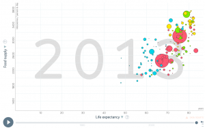
If nutrition of people increases, do they live longer (Yes, see above).
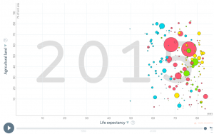
Does a high life expactancy relate to more agricultural land area within a country? (No, like you can see on the left).
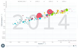
Is a higher income related to more Co2 emissions at a country scale (Yes, see right below).
As these relations started coming in the questions of whether two continuous variables are casually related becoming a nagging thought. With more and more data being available, correlation became a staple of modern statistics. There are some core questions related to the application of correlations.
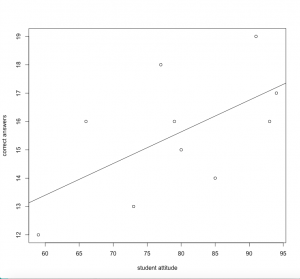
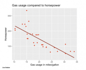
1) Are relations between two variables positive or negative? Relations between two variables can be positive or negative. Being taller leads to a significant increase in body weight. Being smaller leads to an overall lower gross calorie demand. The strength of this relation -what statisticians call the estimate- is an important measure when evaluating correlations and regressions. Is a relation positive or negative, and how strong is the estimate of the relation?
2) Does the relation show a significantly strong effect, or is it rather weak? In other words, can the regression explain a lot of variance of your data, or is the results rather weak regarding its explanatory power? The correlation coefficient explains how strong or weak the correlation is and if it is positive or negative. It can be between -1 and +1. The relationship of temperature in Celsius and Fahrenheit for example is pefectly linear, which should not be surprising as we know that Fahrenheit is defined as 32 + 1.8* Celsius. Furthermore we can say that 100% of the variation in temperatures in Fahrenheit is explained by the temperature in Celsius.
3) What does the relation between two variables explain? Relation can explain a lot of variance for some data, and less variance for other parts of the data. Take the percentage of people working in Agriculture within individual countries. At a low income (<5000 Dollar/year) there is a high variance. Half of the population of the Chad work in agriculture, while in Zimbabwe with a even slightly lower income its 10 %. At an income above 15000 Dollar/year, there is hardly any variance in the people that work in agriculture within a country. The proportion is very low. This has reasons, there is probably one or several variables that explain at least partly the high variance within different income segments. Finding such variance that explain partly unexplained variance is a key effort in doing correlation analysis.
#let's do some correlations with the swiss data set
#you find the corresponding plots for the calculations at the right

data(swiss)
#now we choose two columns and correlate them
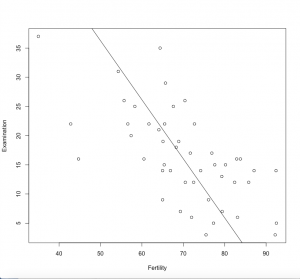
cor(swiss$Fertility,swiss$Examination)

# -0.65 - strong negative correlation

plot(swiss$Fertility,swiss$Examination, xlab = "Fertility", ylab = "Examination")
#let's try some more
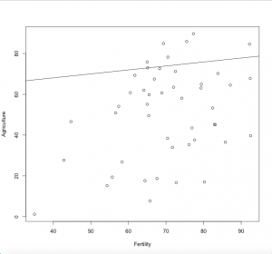
cor(swiss$Fertility,swiss$Agriculture)

# +0.35 - weak positive correlation
plot(swiss$Fertility, swiss$Agriculture,xlab = "Fertility",ylab = "Agriculture")

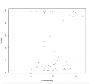
cor(swiss$Infant.Mortality, swiss$Catholic)

# +0.17 - very weak positive correlation, not correlated
plot(swiss$Infant.Mortality, swiss$Catholic, xlab = "Infant Mortality", ylab = "Catholic")
How do we now calculate a correlation?
The most abundantly used method of correlation is a Pearson correlation. For sake of simplicity we will build on this one, as it has the normal distribution at it’s heart, or more precisely, Student's t-distribution. Kendall tau and Spearman rho are other forms of distribution, but I recommend you just look them up, and keep as a rule of thumb that Spearman is more robust when it comes to non-normally distributed data.
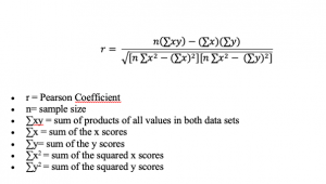
For people with an affinity to math, the formula for calculation a Person correlation is still tangible. You just need to be aware that you have two variables or samples, called x and y, and their respective means (m). The p-values to determine whether there is a significant relation between x and y can be calculated based on the so called degrees of freedom. These are the sample number minus 2, because there are two variables. In the example of the swiss data these are df=47-2, because we have 47 Kantone in the datasets, and any given correlation would build on 2 variables. By calculating the t-value and setting it in relation to the degrees of freedom, we get the significance level from a t-distribution table. This was an important breakthrough, since we now realise that our sample size, or better the degrees of freedom determine our p-value. A larger sample leads to a smaller p-value, which is no trivial information. In other words, more data leads to a clearer knowledge about whether our hypothesis is confirmed or not. Sample size matters!
In the swiss dataset, we can relate for instance the two variables examination and fertility. Both are fairly normally distributed. If we plot them we see a clear relation. But how is the relation in term of the r-value?
cor(swiss$Fertility,swiss$Examination)
-0.64, so there is certainly some sort of a relation, as we have seen before But is it significant? As a quick check some people tend to favour ggplots.
library("ggpubr")
ggscatter(swiss, x = "Fertility", y = "Examination",
          cor.coef = TRUE, cor.method = "pearson")
We can get a clearer calculation using
cor.test(swiss$Fertility,swiss$Examination)
Here, everything is neatly packed together, the t-value, the degrees of freedom, and the p-value. Also, the correlation coefficient is given. We see that there is a significant negative relation between the two variables. Before your brain now starts to interpret this, I urge you to develop a statistical literacy to read such plots. You need to become able to read correlation plots in your sleep, and be very sure about the relation between the variables, how strong it is, whether it is negative or positive, and whether it is significant. This is the bread and butter of any person versatile in statistics.
Reading correlation plots
One of the core skills regarding statistics is to quickly make sense out of snapshots of graphics that contain formation on correlations. Seeing a correlation plot and being able to read this plot quickly is the daily job of any data analyst.
There are three questiones that one should ask yourself whenever looking at a correlation plot:
1) How strong is the relation?
2) Is the relation positive or negative?
3) Does the relation change within parts of the data?
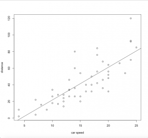
Regarding 1), it is good to practise. Once you get an eye for the strength of a correlation, you become really fast in understanding relations in data. This may be your first step towards a rather intuitive understanding of a method. Having this kind of skill is essential for anyone interested in approximating facts through quantitative data. Obviously, the further the points scatter, the less they explain. If the points are distributed like stars in the sky, then the relation is probably not significant. If they show however any kind of relation, it is good to know the strength.
If you want to practise recognizing whether a correlation is weak or strong I recommend spending some time on this website. There you can guess the correlation coefficients based on graphs.
Regarding 2), relations can be positive, or negative (or neutral). The stronger the estimate of a relation is, the more may these relations matters, some may argue. Of course this is not entirely generalisable, but it is definitely true that a neutral relation only tells you, that the relation does not matter. While this is trivial in itself, it is good to get an eye for the strength of estimates, and what they mean for the specific data being analysed. Even weaker relation may give important initial insights. In addition is the normative value of a positive or negative relation having typically strong implications, especially if both directions are theoretically possible. Therefore it is vital to be able to interpret the estimate of a correlation.
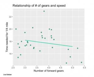
Regarding 3, the best advise is to look at the initial scatterplot, but also the residuals. If the scattering of all points is more or less equal across the whole relation, then you may realise that all errors are equally distributed across the relation. In reality, this is often not the case. Instead we often know less about one part of the data, and more about another part of the data. In addition to this we do often have a stronger relation across parts of the dataset, and a weaker understanding across other parts of the dataset. These differences are important, as they hint at underlying influencing variables or factors that we did not understand yet. Becoming versatile in reading scatter plots becomes a key skill here, as it allows you to rack biases and flaws in your dataset and analysis. This is probably the most advanced skill when it comes to reading a correlation plot.
Correlative relations
Correlations can tell us whether two variables are related. A correlation does not tell us however what this correlation means. This is important to note, as there are many correlations being calculated, but it is up to us to interpret these relations.
It is potentially within our normative capacity to derive hypothesis, but it can also be powerful to not derive hypothesis and have a purely inductive approach to a correlation. We live in a world of big data, and increasingly so. There is a wealth of information out there, and it is literally growing by the minute. While building on the power of hypothesis the enlightenment and then the modernity build a world of science, but this science was also limited. We know today that the powerful step of building hypothesis offers only a part of the picture, and powerful inventions and progress came from induction. Much progress in science was based on inductive approaches. Consider antibiotics, whose discovery was a mere accident.
With the predictive power of correlations and the rise of of machine learning and it's associated much more complex approaches a new world dawned upon us. Today, predictions based their heart on simple correlations power pattern recognition in the wealth of data we face. Although much of the actual mathematics are much more complicated, suggestions of prominent online shops on what you may want to buy next are in principle sophisticated elaborations of correlations. We do not understand why certain people that buy one thing buy also another thing, and while this is a relation that increases sales. Of course the world is more complicated, and once more these models cannot luckily explain everything. I know for myself, that as long as my music service suggests me to listen to Oasis -the worst insult to me- I am save from the total prediction of the machines. Still, with predictive power once more comes great responsibility, and we shall see how correlations and their predictive power will allow us to derive more theories based on our inductive perspective on data. Much is to be learned through the digitalisation of data, but it is still up to us to interpret correlations. This will be very hard to teach to a machine, hence it is our responsibility to interpret data analysis through reasoning.
Key messages
• Correlation coefficient ranges from -1 to 1
• Inspect the relation for flaws
• Correlations can be inductive and deductive
External links
Articles
Astronomy: Method of least squares
Natural sciences: Regression toward the mean
Double bookkeeping: An example from economics
Adrien Marie Legendre: The French rival of Carl Friedrich Gauss
Carl Friedrich Gauss: One of the greatest mathematicians of all time
Regression Analysis: The origin lies in economics
Gross domestic product: A detailed article
Body weight: An article on the relationship of body weight and energy intake
The correlation coefficient: A very detailed and vivid article
The relationship of temperature in Celsius and Fahrenheit: Several examples of interpreting the correlation coefficient
Employment in Agriculture: A detailed database
Student's T Distribution: An introduction
Kendall's Tau & Spearman's Rank: Two examples for other forms of correlation
Degrees of Freedom: A very explanatory article
Student t Distribution Table: Important link to safe!
Reading Scatterplots: Some instructions
Strength of Correlation Plots: Some examples
The History of Inductive Reasoning: A detailed article
History of antibiotics: An example for findings when using the inductive approach
How does Spotify know you so well?: A software engineer tries to explain this phenomenon
The amazon algorithm: A possible explanation
Videos
Pearson's correlation coefficient: Many examples
Pearson correlation: A quick explanation
Pearson's r Correlation: An example calculation
The author of this entry is Henrik von Wehrden.
