Histograms and Boxplots
Note: This entry revolves specifically around Histograms and Boxplots. For more general information on quantitative data visualisation, please refer to Introduction to statistical figures]. For more info on Data distributions, please refer to the entry on Data distribution.
Contents
In short: Both histograms and boxplots are commonly used in (descriptive) statistics to visualise distribution of numerical data with two variables (typically the response variable on the X axis and the categorical explanatory variable on the Y axis).
Histograms and Boxplots
Histograms
A histogram is a graphical display of data using bars (also called buckets or bins) of different height, where each bar groups numbers into ranges. Histograms reveal a lot of useful information about numerical data with a single explanatory variable. Histograms are used for getting a sense about the distribution of data, its median, and skewness.
#Fig.1
 par(mfrow = c(2,1))
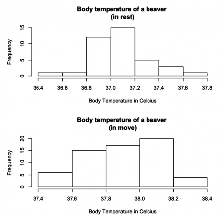
  hist(beaver2$temp[1:38], main = "Body temperature of a beaver (in rest)", xlab = "Body Temperature in Celcius", breaks = 5)
  hist(beaver2$temp[39:100], main = "Body temperature of a beaver (in move)", xlab = "Body Temperature in Celcius", breaks = 5)
The two histograms are plotted from the “beaver2” dataset and illustrate how a beaver’s body temperature changes when it starts moving. Both histograms resemble the bell-curved shape of normal distribution. We can see a change in the beaver’s body temperature from approximately 37 degrees to 38 degrees.
Identifying and interpreting histograms
Histograms Vs. Bar charts Histograms are different than bar charts, and one should not confuse them. A histogram does not have gaps between the bars, but a bar chart does. Histograms have the response variable on the X-axis, and the Y-axis shows the frequency (or the probability density). In contrast, the X-axis in a bar chart shows the frequency and the Y-axis shows the response variable.
Patterns Histograms display well how data is distributed. For instance, a the symmetric, unimodal pattern of a histogram represents a normal distribution. Likewise, skewed right and left patterns in histograms display skewness of data - asymmetry of the distribution of data around the mean. See “Histogram: Study the Shape” to learn more about histogram patterns.
#Fig.2
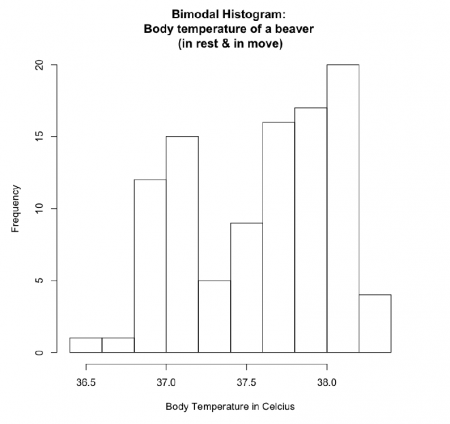
 hist(beaver2$temp, main = "Bimodal Histogram: Body temperature of a beaver (in rest & in move)", xlab = "Body Temperature in Celcius", breaks = 12)
If the beaver2 dataset plotted into one histogram, it takes bimodal pattern and represents binomial distribution as there are two means of sample points - the temperature of a beaver in rest and in the move.
Number and width of the bars (bins) Histograms can become confusing depending on how the bin margin is put. As it is said in The R Book, p231 - “Wide bins produce one picture, narrow bins produce a different picture, unequal bins produce confusion.” Choice of number and width of bins techniques can heavily influence a histogram’s appearance, and choice of bandwidth can heavily influence the appearance of a kernel density estimate. Therefore, it is suggested that the bins stay in the same width and that the number of the bins is selected carefully to best display pattern in data.
Boxplots
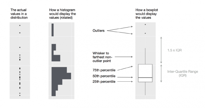
Boxplots are used to illustrate the scatter in the data and good at showing the distribution of data points around the median for several groups of sets of data. A boxplot displays the five number summary — minimum, first quartile, median, third quartile, and maximum — of a set of data. Another great thing about boxplots is that they display outliers, value points more than 1.5 times the range above the 75th percentile and more than 1.5 times the range below the 25th percentile. Hence, one would already argue that we a boxplot illustrates more details than a histogram. To understand boxplots better, let’s compare boxplots and histograms visually using an example from R for Data Science book, chapter 7.51:
Boxplot with notches
Simple boxplots are not very useful at illustrating if the median values between the groups of sets of data are significantly different. Therefore, we use boxplot with nothces to show the distribution of data points around the median and to see whether or not the median values are different between the groups. The notches are drawn as a ‘waist’ on either side of the median and are intended to give a rough impression of significance of the differences between two medians. Boxes in which the notches do not overlap are likely to prove to have significantly different medians under an appropriate statistical test (The R Book, p213).
The size of the notch increases with the magnitude of the interquartile range and declines with the square root of replication:
where ‘IQR’ is the interquartile range, and ‘n’ is the replication per sample. Notches are based on assumptions of asymptotic normality of the median and roughly equal sample sizes for two medians being compared and are said to be rather insensitive to the underlying distribution of the samples. The idea is to give roughly a 95% confidence interval for the difference if two medians. (The R Book, p213)
Here are the beaver2 data that was used earlier for plotting histograms:
#Fig.3
 par(mfrow = c(1,2))
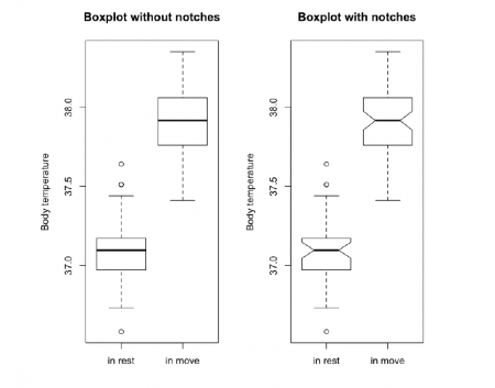
  boxplot(beaver2$temp[1:38],beaver2$temp[39:100], names = c("in rest", "in move"), ylab = "Body temperature", main = "Boxplot without notches")
  boxplot(beaver2$temp[1:38],beaver2$temp[39:100], names = c("in rest", "in move"), ylab = "Body temperature", notch = T, main = "Boxplot with notches")
Because the boxes do not overlap, it can be assumed that the difference in the median of the two data samples will be highly significant. However, the same cannot be said for the dataset plotted in the boxplots below.
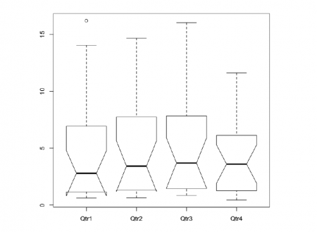
Below example JohnsonJohnson dataset in R contains quarterly earnings (dollars) per Johnson & Johnson shares share between 1960 and 1980.
#Fig.4
JnJ <- as.data.frame(type.convert(.preformat.ts(JohnsonJohnson)))
boxplot(JnJ,notch = T)
Warning message in bxp(list(stats = structure(c(0.61, 1.16, 2.79, 6.93, 14.04, 0.63, : “some notches went outside hinges ('box'): maybe set notch=FALSE”
The odd-looking boxplots The JohnsonJohnson boxplot also illustrates the notches’ curious behaviour in the boxes of the Qtr1 and Qtr2. The notches extended above 75th percentile and/or below the 25th percentile when the sample sizes are small and/or the within-sample variance is high. The notches act this way to warn of the likely invalidity of the test (The R Book, p214).
Conclusion
We can conclude that both histogram and boxplots are a great tool in displaying how our values are distributed. As stated in Introduction to statistical figures, boxplots compared to histogram show the variance of continuous data across different factor levels and are a solid graphical representation of the Analysis of Variance. One could see box plots less informative than a histogram or kernel density estimate but they take up less space and are better at comparing distributions between several groups or sets of data.
Further links & reading material
Practice more
If you do not have installed R or if you cannot run in on your computer, you can run R Code online with Snippets and folow the examples in below resources.
Cookbook for R
- Histogram and density plot in base R
- Boxplots in base R
- Plotting distributions with ggplot2
The author of this entry is Ilkin Bakhtiarov.
