Note: This entry revolves specifically around Pie charts. For more general information on quantitative data visualisation, please refer to Introduction to statistical figures. For more info on Data distributions, please refer to the entry on Data distribution.
Contents
Pie chart
Description
Pie charts represent parts of a whole in a circle. This is done by dividing the circle into multiple slices. The area of each slice is proportional to the quantity it represents. These slices of the circle are reminiscent of a cake or a pie hence the name. 1801 was the oldest known pie chart published by William Playfairs in the book The Statistical Breviary.
Why pie charts shouldn’t be used?
Pie charts are frequently used in non-scientific journals. However, the use of pie charts is especially in the scientific context discouraged. Often they contain so little information that one sentence in the text would have been sufficient instead. In other cases where they could contain more information, (stacked) bar charts have proven to be superior.
Compared to stacked bar charts, pie charts are slower to interpret and more mistakes are made when interpreting them. One explanation for this is the following: only the length of the individual parts of the bar chart have to be considered to determine their share of the whole while for pie charts the area of the slices has to be considered. Since the human eye and brain can more easily determine the lengths than the size of areas, especially when one side of the area is curved as it is the case with pie charts, stacked bar charts are superior.
In a nutshell: The use of pie charts should be well considered and avoided in most cases.
R Code
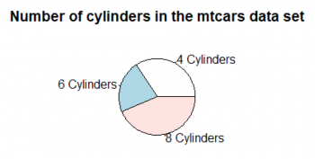
The R documentation is not found of the pie chart either and advises against using it. The pie charts in R are not actual circles but polygons (by default with 200 edges) which approximate a circle. You can see by yourself that this circle does not look smooth.
#Fig.1
#read in the dataset
data("mtcars")
#count how often each cylinder type appears in the data set
cylinders <- table(mtcars$cyl)
#creating a pie chart that displays the number of cylinders
pie(cylinders,
    labels = c("4 Cylinders", "6 Cylinders", "8 Cylinders"),
    main = "Number of cylinders in the mtcars data set")
#This gives us a really basic pie chart
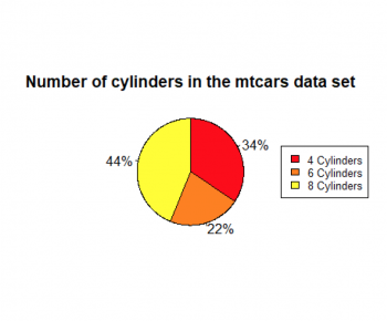
#Fig.2
#Now we create a more sophisticated pie chart
#read in the dataset
data("mtcars")
#count how often each cylinder type appears in the data set
cylinders <- table(mtcars$cyl)
#calculate % values
percent<- round(100*cylinders/sum(cylinders), 0)
#create % labels
percent_labels <- paste(percent, "%", sep = "")
#add the % labels
#add a colour scheme
#increase the size of the pie chart
#increase the smoothness of the circle
#change the order of the pieces to clockwise
pie(cylinders,
    labels = percent_labels,
    col = heat.colors(3),
    radius = 1,
    edges = 1000,
    clockwise = TRUE,
    main = "Number of cylinders in the mtcars data set")
#adding a legend on the right side of the pie chart with the same colors
#cex scales the size of the legend
legend("right", c("4 Cylinders", "6 Cylinders", "8 Cylinders"),
       cex = 0.8, fill = heat.colors(3))
#This pie chart looks a lot better than the previous one.
#But the problem remains that this pie chart only shows 3 different categories.
#A sentence or a representation as a bar chart would be more appropriate.
The author of this entry is ?.

