Data distribution
(The author of this entry is Henrik von Wehrden.)
Contents
Data distribution
Data distribution is the most basic and also fundamental step of analysis for any given data set. On the other hand, data distribution encompasses the most complex concepts in statistics, thereby including also a diversity of concepts that translates further into many different steps of analysis. Consequently, without understanding the basics of data distribution, it is next to impossible to understand any statistics down the road. Data distribution can be seen as the fundamentals, and we shall often return to these when building statistics further.
Types of distribution
The normal distribution
How wonderful, it is truly a miracle how almost everything that can be measured seems to be following the normal distribution. Overall, the is not only the most abundantly occurring, but also the earliest distribution that was known. It follows the premise that most data in any given dataset has its majority around a mean value, and only small amounts of the data are found at the extremes.
Just as the normal distribution, most phenomena we can observe follow a normal distribution. The fact that many do not want this to be true is I think associated to the fact that it makes us assume that the world is not complex, which is counterintuitive to many. While I believe that the world can be complex, there are many natural laws that explain many phenomena we investigate. Linear patterns describe such a natural law. Quite often if you increase one thing, an associated phenomena increases as well. If you make the oven more hot, your veggies in there will be done quicker. However, this linearity only works within a certain reasonable section of the data. It would be possible to put the oven on 100 °C and the veggies would cook much slower than at 150 °C. However, this does not mean that a very long time at -30 °C in the freezer would boil your veggies in the long run as well. Frost is a good example of a non-linear phenomena, actually one of the few examples I know. However, within a certain reasonable data section, you can often observe that one phenomena increases if another phenomena increases, and this relation follows a linear pattern. This is clearly logical, as for instance if you bike faster, you arrive faster. Many phenomena follow such a linear pattern. A prominent example is the Island Theory from Mac Arthur and Wilson. They counted species on island, and found out that the larger islands are, the more species they host. While this relation has a lot of complex underpinnings, it is -on a logarithmic scale- totally linear. Larger islands contain more species, with a clearly mathematical beauty. Phenomena that you can count are often linear on a log scale. Among coffee drinkers most coffee drinkers drink 1-2 cups per day, but few drink 10, which is probably good. Counting cup consumption per day in coffee drinker follows a log-linear distribution. The same hold for infections within an outbreak of a contagious disease. The Western African Ebola crisis was an incredibly complex and tragic event, but when we investigate the early increase in cases, the distribution is exponentially increasing -in this case-, and this increase follows an almost cruel linear pattern.
Take height. Most people have an average height, but only a few people are very tall, and a few people are very short. The majority of people have clearly an average height. Many such natural phenomenon follow the normal distribution. Just measure the weight of some spaghetti with a very precise balance. The majority will resolve around a mean value, and only some few will be much heavier or much lighter. While it may seem like a magic trick, it is actually true that many phenomena that can be measured will follow the normal distribution, at least when your sample is large enough. Consequently, much of the probabilistic statistics is built on the normal distribution.
See Tests for normal distributionto learn how to check if the data is normally distributed.
The Poisson distribution
Things that can be counted are often not normally distributed, but are instead skewed to the left. While this may seem curious, it actually makes a lot of sense. Take an example that coffee-drinkers may like. How many people do you think drink one or two cups of coffee per day? Quite many, I guess. How many drink 3-4 cups? Fewer people, I would say. Now how many drink 10 cups? Only a few, I hope. A similar and maybe more healthy example could be found in sports activities. How many people make 30 minute of sport per day? Quite many, maybe. But how many make 5 hours? Only some very few. In phenomenon that can be counted, such as sports activities in minutes per day, most people will tend to a lower amount of minutes, and few to a high amount of minutes. Now here comes the funny surprise. Transform the data following a Poisson distribution, and it will typically follow the normal distribution. Hence skewed data can be often transformed to match the normal distribution. While many people refrain from this, it actually may make sense in such examples as island biogeography. Discovered by MacArtur & Wilson, it is a prominent example of how the log of the numbers of species and the log of island size are closely related. While this is one of the fundamental basic of ecology, a statistician would have preferred the use of the Poisson distribution.
The Pareto distribution
Do you know that most people wear 20 % of their clothes 80 % of their time. This observation can be described by the Pareto distribution. For many phenomena that describe proportion within a given population, you often find that few make a lot, and many make few things. Unfortunately this is often the case for workloads, and we shall hope to change this. For such proportions the Pareto distribution is quite relevant. Consequently, it is rooted in income statistics. Many people have a small to average income, and few people have a large income. This makes this distribution so important for economics, and also for sustainability science.
Boxplots
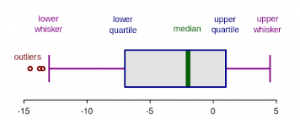
A nice way to visualize a data set is to draw a boxplot. You get a rough overview, how the data is distributed and moreover you can say at a glance if it’s normally distributed. But what are the components of a boxplot and what do they represent?
The median marks the exact middle of your data, which is something different than the mean. If you imagine a series of random numbers, e.g. 3, 5, 7, 12, 26, 34, 40, the median would be 12. But what if your data series comprises an even number of numbers, like 1, 6, 19, 25, 26, 55? You take the mean of the numbers in the middle, which is 22 and hence 22 is your median.
The box of the boxplot is divided in the lower and the upper quartile. In each quarter there are, obviously, a quarter of the data points. To define them, you split the data set in two halves (outgoing from the median) and calculate again the median of each half. In a random series of numbers (6, 7, 14, 15, 21, 43, 76, 81, 87, 89, 95) your median is 43, your lower quartile is 14 and your upper quartile 87.
The space between the lower quartile line and the upper quartile line (the box) is called the inner quartile range (IQR), which is important to define the length of the whiskers. The data points which are not in the range of the whiskers are called outliers, which could e.g. be a hint that they are due to measuring errors. To define the end of the upper whisker, you take the value of the upper quartile and add the product of 1,5 * IQR.
Sticking to our previous example: The IQR is the range between the lower (43) and the upper quartile (87), therefore 44. Multiply 44 by 1,5 and add it to the value of the upper quartile: 87 + 44 = 131
For the lower whisker, the procedure is nearly the same. Again, you use the product of 1,5*IQR, but this time you subtract the value of the lower whisker: Here is your lower whisker: 44 – 43 = 1 And as there are no values outside of the range of our whiskers, we have no outliers.
Detecting the normal distribution
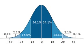
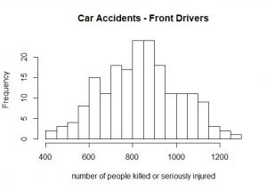
But when is data normally distributed and how to recognize it when you have a boxplot in front of you? Or a histogram? The best way to learn it, is to look at it. Always remember the ideal picture of the bell curve (you can see it above), especially if you look at histograms.
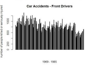
This barplot (at the right) represents the number of front-seat passengers that were killed or seriously injured annually from 1969 to 1985 in the UK. And here comes the magic trick: If you sort the annually number of people from the lowest to the highest (and slightly lower the resolution), a normal distribution evolves (histogram at the left).
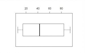
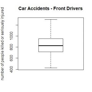
And this is how a boxplot of a normally distributed series of numbers looks like. Consequently, the whiskers have nearly the same length, and so have the quarters a similar range.

