Difference between revisions of "Data distribution"
| Line 101: | Line 101: | ||
and the regression line plotted like this. | and the regression line plotted like this. | ||
| − | [[File:Plot regression.png|thumb| | + | [[File:Plot regression.png|thumb|center |The regression model to test this would look like this |
lm(growth~tannin)]] | lm(growth~tannin)]] | ||
| − | + | The qqplot for this model looks good.Here the points are mostly on the line with point 4 and point 7 being slightly above and below the line | |
[[File:Qqplot2.png|thumb|left|The qqplot for this model looks good.Here the points are mostly on the line with point 4 and point 7 being slightly above and below the line. Still you would consider the residuals in this case to behave normal.]] | [[File:Qqplot2.png|thumb|left|The qqplot for this model looks good.Here the points are mostly on the line with point 4 and point 7 being slightly above and below the line. Still you would consider the residuals in this case to behave normal.]] | ||
Revision as of 14:19, 23 May 2021
Contents
Data distribution
Data distribution is the most basic and also a fundamental step of analysis for any given data set. On the other hand, data distribution encompasses the most complex concepts in statistics, thereby including also a diversity of concepts that translates further into many different steps of analysis. Consequently, without understanding the basics of data distribution, it is next to impossible to understand any statistics down the road. Data distribution can be seen as the fundamentals, and we shall often return to these when building statistics further.
The normal distribution
How wonderful, it is truly a miracle how almost everything that can be measured seems to be following the normal distribution. Overall, the normal distribution is not only the most abundantly occurring, but also the earliest distribution that was known. It follows the premise that most data in any given dataset has its majority around a mean value, and only small amounts of the data are found at the extremes.
Most phenomena we can observe follow a normal distribution. The fact that many do not want this to be true is I think associated to the fact that it makes us assume that the world is not complex, which is counterintuitive to many. While I believe that the world can be complex, there are many natural laws that explain many phenomena we investigate. The Gaussian normal distribution is such an example. Most things that can be measured in any sense (length, weight etc.) are normally distributed, meaning that if you measure many different items of the same thing, the data follows a normal distribution.
The easiest example is tallness of people. While there is a gender difference in terms of height, all people that would identify as e.g. females have a certain height. Most have a different height from each other, yet there are almost always many of a mean height, and few very small and few very tall females within a given population. There are of course exceptions, for instance due to selection biases. The members of a professional basketball team would for instance follow a selection bias, as these would need to be ideally tall. Within the normal population, people’s height follow the normal distribution. The same holds true for weight, and many other things that can be measured.
Sample size matters
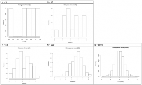
Most things in their natural state follow a normal distribution. If somebody tells you that something is not normally distributed, this person is either very clever or not very clever. A small sample can hamper you from finding a normal distribution. If you weigh five people you will hardly find a normal distribution, as the sample is obviously too small. While it may seem like a magic trick, it is actually true that many phenomena that can be measured will follow the normal distribution, at least when your sample is large enough. Consequently, much of the probabilistic statistics is built on the normal distribution.
Why some distributions are skewed
The most abundant reason for a deviance from the normal distribution is us. We changed the planet and ourselves, creating effects that may change everything, up to the normal distribution. Take weight. Today the human population shows a very complex pattern in terms of weight distribution across the globe, and there are many reasons why the weight distribution does not follow a normal distribution. There is no such thing as a normal weight, but studies from indigenous communities show a normal distribution in the weight found in their populations. Within our wider world, this is clearly different. Yet before we bash the Western diet, please remember that never before in the history of humans did we have a more steady stream of calories, which is not all bad.
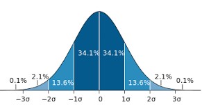
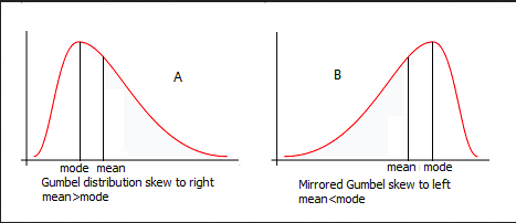
Distributions can have different skews. There is the symmetrical skew which is basically a normal distributions or bell curve that you can see on the picture. But normal distributions can also be skewed to the left or to the right depending on how mode, median and mean differ. For the symmetrical normal distribution they are of course all the same but for the right skewed distribution (mode < median < mean) it's different.
Detecting the normal distribution
But when is data normally distributed? And how can you recognize it when you have a boxplot in front of you? Or a histogram? The best way to learn it, is to look at it. Always remember the ideal picture of the bell curve (you can see it above), especially if you look at histograms. If the histogram of your data show a long tail to either side, or has multiple peaks, your data is not normally distributed. The same is the case if your boxplot's whiskers are largely uneven.
You can also use the Shapiro-Wilk test to check for normal distribution. If the test returns insignificant results (p-value > 0.05), we can assume normal distribution.
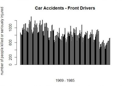
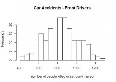
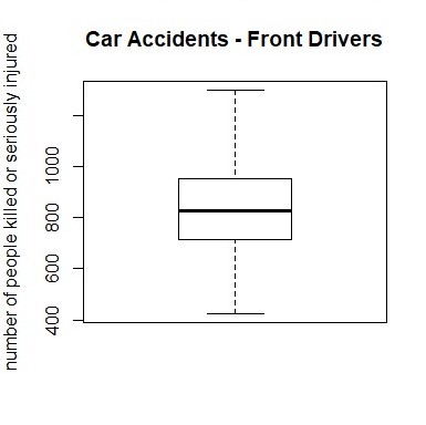
This barplot (at the left) represents the number of front-seat passengers that were killed or seriously injured annually from 1969 to 1985 in the UK. And here comes the magic trick: If you sort the annually number of people from the lowest to the highest (and slightly lower the resolution), a normal distribution evolves (histogram at the left).
If you would like to know how one can create the diagrams which you see here, this is the R code:
# If you want some general information about the "Seatbelt" dataset, at which we will have look, you can use the ?-function.
# As "Seatbelts" is a dataset in R, you can receive a lot of information here. You can see all datasets available in R by typing data().

?Seatbelts

# to have a look a the dataset "Seatbelts" you can use several commands

## str() to know what data type "Seatbelts" is (e.g. a Time-Series, a matrix, a dataframe...)
str(Seatbelts)

## use show() or just type the name of the dataset ("Seatbelts") to see the table and all data it's containing
show(Seatbelts)
# or
Seatbelts

## summary() to have the most crucial information for each variable: minimum/maximum value, median, mean...
summary(Seatbelts)


# As you saw when you used the str() function, "Seatbelts" is a Time-Series, which makes it hard to work with it. We should change it into a dataframe (as.data.frame()). We will also name the new dataframe "seat", which is more handy to work with.

seat<-as.data.frame(Seatbelts)

# To choose a single variable of the dataset, we use the '$' operator. If we want a barplot with all front drivers,
# who were killed or seriously injured:

barplot(seat$front)

# For a histogram:

hist(seat$front)

## To change the resolution of the histogram, you can use the "breaks"-argument of the hist-command, which states
## in how many increments the plot should be divided

hist(seat$front, breaks = 30)
hist(seat$front, breaks = 100)

# For a boxplot:

boxplot(seat$front)
The QQ-Plot
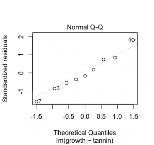
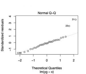
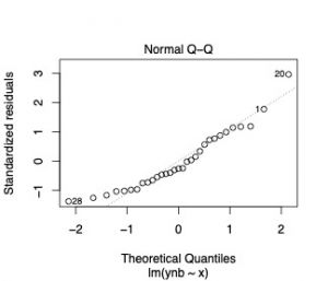
The command qqplot will return a Quantile-Quantile plot. This plot allows for a visual inspection on how your model residuals behave in relation to a normal distribution. On the y-axis are the standardised residuals and on the x-axis the theoretical quantiles. The simple answer is, if your data points are on this line you are fine, you have normal errors, and you can stop reading here. If you want to know more about the theory behind this please continue. Residuals is the difference of your response variable and the fitted values. (Residuals = response variable - fitted values) For a regression analysis this would be the difference of your data points to the regression line. The standardised residuals depend on the model function you are applying.
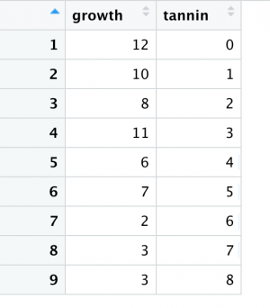
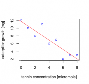
Here, the standardised residuals are the residuals divided by the standard deviation. Lets take the caterpillar data set as an example.Here is your data growth of caterpillars in relation to tannin content of their diet.
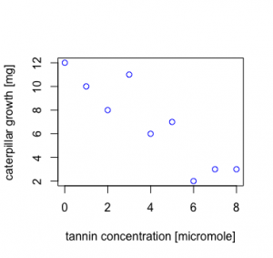
Plotting the data in an x-y plot already gives you an idea that growth probably depends on the tannin content.
The regression model to test this would look like this lm(growth~tannin) and the regression line plotted like this.
The qqplot for this model looks good.Here the points are mostly on the line with point 4 and point 7 being slightly above and below the line
Non-normal distributions
Sometimes the world is not normally distributed. At a closer examination, this makes perfect sense under the specific circumstances. It is therefore necessary to understand which reasons exists why data is not normally distributed.
The Poisson distribution
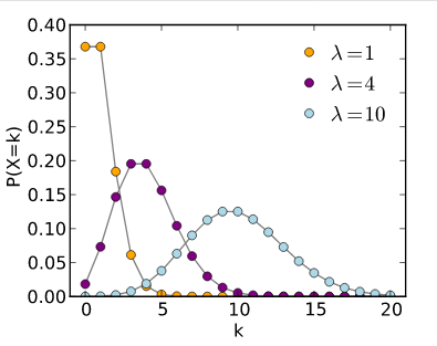
Things that can be counted are often not normally distributed, but are instead skewed to the right. While this may seem curious, it actually makes a lot of sense. Take an example that coffee-drinkers may like. How many people do you think drink one or two cups of coffee per day? Quite many, I guess. How many drink 3-4 cups? Fewer people, I would say. Now how many drink 10 cups? Only a few, I hope. A similar and maybe more healthy example could be found in sports activities. How many people make 30 minute of sport per day? Quite many, maybe. But how many make 5 hours? Only some very few. In phenomenon that can be counted, such as sports activities in minutes per day, most people will tend to a lower amount of minutes, and few to a high amount of minutes.
Now here comes the funny surprise. Transform the data following a Poisson distribution, and it will typically follow the normal distribution if you use the decadic logarithm (log). Hence skewed data can be often transformed to match the normal distribution. While many people refrain from this, it actually may make sense in such examples as island biogeography. Discovered by MacArtur & Wilson, it is a prominent example of how the log of the numbers of species and the log of island size are closely related. While this is one of the fundamental basic of ecology, a statistician would have preferred the use of the Poisson distribution.
Example for a log transformation of a Poisson distribution
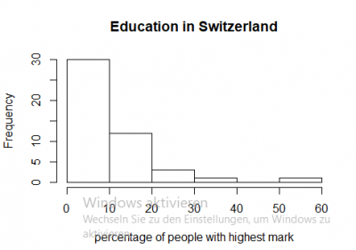
One example for skewed data can be found in the R data set “swiss”, it contains data about socio-economic indicators of about 50 provinces in Switzerland in 1888. The variable we would like to look at is “Education”, which shows how many men in the army (in %) have an education level beyond primary school. As you can see when you look at the first diagram, in 30 provinces only 10 percent of the people received education beyond the primary school.
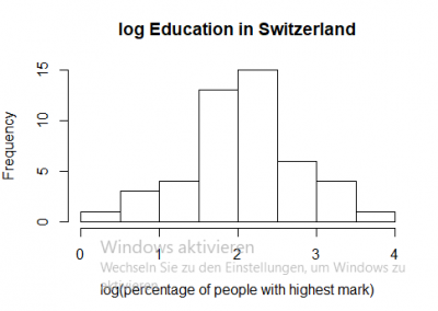
To obtain a normal distribution (which is useful for many statistical tests), we can use the natural logarithm.
If you would like to know, how to conduct an analysis like on the left-hand side, we uploaded the code right below:
# we will work with the swiss() dataset.
# to obtain a histogram of the variable Education, you type

hist(swiss$Education)

# you transform the data series with the natural logarithm by the use of log()

log_edu<-log(swiss$Education)
hist(log_edu)

# to make sure, that the data is normally distributed, you can use the shapiro wilk test

shapiro.test(log_edu)

# and as the p-value is higher than 0.05, log_edu is normally distributed
The Pareto distribution
Did you know that most people wear 20 % of their clothes 80 % of their time? This observation can be described by the Pareto distribution. For many phenomena that describe proportion within a given population, you often find that few make a lot, and many make few things. Unfortunately this is often the case for workloads, and we shall hope to change this. For such proportions the Pareto distribution is quite relevant. Consequently, it is rooted in income statistics. Many people have a small to average income, and few people have a large income. This makes this distribution so important for economics, and also for sustainability science.
Visualizing data: Boxplots
A nice way to visualize a data set is to draw a boxplot. You get a rough overview how the data is distributed and moreover you can say at a glance if it’s normally distributed. The same is true for histograms, but we will focus on the boxplot for now. For more information on both these forms of data visualisation, please refer to the entry on Barplots, Histograms and Boxplots.
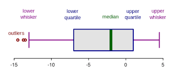
What are the components of a boxplot and what do they represent?
The median marks the exact middle of your data, which is something different than the mean. If you imagine a series of random numbers, e.g. 3, 5, 7, 12, 26, 34, 40, the median would be 12. But what if your data series comprises an even number of numbers, like 1, 6, 19, 25, 26, 55? You take the mean of the numbers in the middle, which is 22 and hence 22 is your median.
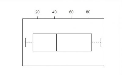
The box of the boxplot is divided in the lower and the upper quartile. In each quarter there are, obviously, a quarter of the data points. To define them, you split the data set in two halves (outgoing from the median) and calculate again the median of each half. In a random series of numbers (6, 7, 14, 15, 21, 43, 76, 81, 87, 89, 95) your median is 43, your lower quartile is 14 and your upper quartile 87.
The space between the lower quartile line and the upper quartile line (the box) is called the interquartile range (IQR), which is important to define the length of the whiskers. The data points which are not in the range of the whiskers are called outliers, which could e.g. be a hint that they are due to measuring errors. To define the end of the upper whisker, you take the value of the upper quartile and add the product of 1,5 * IQR.
Sticking to our previous example:
The IQR is the range between the lower (14) and the upper quartile (87), therefore 73.
Multiply 73 by 1,5 and add it to the value of the upper quartile: 87 + 109,5 = 196,5
For the lower whisker, the procedure is nearly the same. Again, you use the product of 1,5*IQR, but this time you subtract this value from the lower quartile: Here is your lower whisker: 14 – 109,5 = -95,5
And as there are no values outside of the range of our whiskers, we have no outliers. Furthermore, the whiskers to not extend to their extremes, which we calculated above, but instead mark the most extreme data points.
#boxplot for our random series of numbers 6, 7, 14, 15, 21, 43, 76, 81, 87, 89, 95

boxplot.example<-c(6,7,14,15,21,43,76,81,87,89,95)
summary(boxplot.example)

# minimum = 6
# maximum = 95
# mean = 48.55
# median = 43
# 1Q = 14.5
# 3Q = 84
# don't worry about the difference between our calculated quartile-values above and the values that were calculated by R. R works just a little more precisely here, but the approach we introduced above is a good approximation.

# with this information we can calculate the interquartile range
IQR(boxplot.example)
# IQR = 69.5

#lastly we can visualize our boxplot using this comment
boxplot(boxplot.example)
If you want to learn more about Boxplots, check out the entry on Histograms and Boxplots. Histograms are also very useful when attempting to detect the type of distribution in your data.
For more on data visualisation, check out the Introduction to statistical figures.
More forms of data distribution
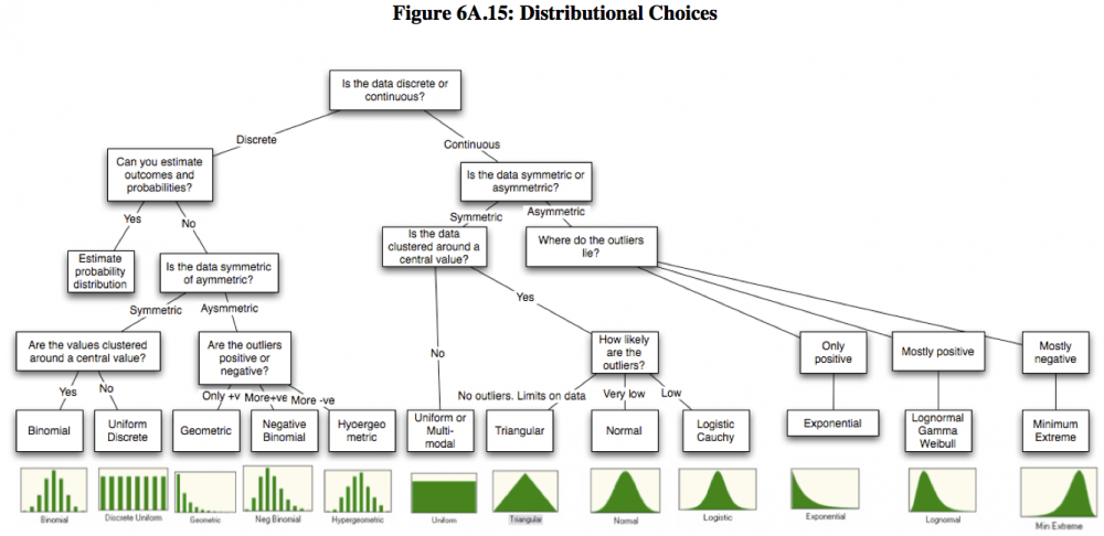
Of course, there are more types of data distribution. We found this great overview by Aswath Damodaran, which helps you investigate the type of distribution in your data.
External links
Videos
Data Distribution: A crash course
The normal distribution: An explanation
Skewness: A quick explanation
The Poisson distribution: A mathematical explanation
The Pareto Distribution: Some real life examples
The Boxplot: A quick example
Probability: An Introduction
Bayes theorem: A detailed explanation
Articles
Probability Distributions: 6 common distributions you should know
Distributions: A list of Statistical Distributions
Normal Distribution: The History
The Normal Distribution: Detailed Explanation
The Normal Distributions: Real Life Examples
The Normal Distribution: A word on sample size
The weight of nations: How body weight is distributed across the world
Non normal distributions: A list
Reasons for non normal distributions: An explanation
Different distributions: An overview by Aswath Damodaran, S.61
The Poisson Distribution: The history
The Poisson Process: A very detailed explanation with real life examples
The Pareto Distribution: An explanation
The pareto principle and wealth inequality: An example from the US
History of Probability: An Overview
Frequentist vs. Bayesian Approaches in Statistics: A comparison
Bayesian Statistics: An example from the wizarding world
Probability and the Normal Distribution: A detailed presentation
Compare your income: A tool by the OECD
The author of this entry is Henrik von Wehrden.
