Difference between revisions of "Treemap"
m (→Definition) |
m (→Definition) |
||
| (9 intermediate revisions by one other user not shown) | |||
| Line 7: | Line 7: | ||
== Definition == | == Definition == | ||
| − | Treemaps display hierarchical (tree-structured) data. They are composed of a series of nested rectangles (tiles) whose areas are proportional to the data they represent. Each branch of the tree is given a rectangle, which is then subdivided into smaller rectangles representing sub-branches. The conceptual idea is to break down the data into its constituent parts and quickly identify its large and small components. | + | Treemaps display hierarchical (tree-structured) [[Glossary|data]]. They are composed of a series of nested rectangles (tiles) whose areas are proportional to the data they represent. Each branch of the tree is given a rectangle, which is then subdivided into smaller rectangles representing sub-branches. The conceptual idea is to break down the data into its constituent parts and quickly identify its large and small components. |
| + | <br> | ||
<br/> | <br/> | ||
| − | |||
| − | |||
| − | |||
| − | |||
| − | |||
| − | |||
[[File:Switzerlandtreemap.png|400px|thumb|right|Fig.1: Switzerland imports in 2017. Source: commons.wikimedia.org]] | [[File:Switzerlandtreemap.png|400px|thumb|right|Fig.1: Switzerland imports in 2017. Source: commons.wikimedia.org]] | ||
| + | '''Treemaps are used:''' <br> | ||
| + | 1. To study data with respect to two quantitative values: <br> | ||
| + | – positive quantitative value standing for the size of the rectangle (area cannot be negative) and<br> | ||
| + | – second or categorical quantitative value standing for the color of the individual rectangles.<br> | ||
| + | 2. To display very large amount of hierarchial data in a limited space.<br> | ||
| + | 3. To make a quick, high-level summary of the similarities and differences within one category as well as between multiple categories (not precise comparisons). | ||
| + | <br> | ||
<br> | <br> | ||
The efficient use of physical space and the intelligent color management make treemaps powerful visualization technique applied to a wide variety of domains. They are used to display significant amounts of information in financial, commercial, governmental and similar fields. The treemap on Fig.1 shows Switzerland imports in 2017. | The efficient use of physical space and the intelligent color management make treemaps powerful visualization technique applied to a wide variety of domains. They are used to display significant amounts of information in financial, commercial, governmental and similar fields. The treemap on Fig.1 shows Switzerland imports in 2017. | ||
| Line 74: | Line 76: | ||
# https://www.nngroup.com/articles/treemaps/ | # https://www.nngroup.com/articles/treemaps/ | ||
# https://www.fusioncharts.com/resources/chart-primers/treemap-chart/ | # https://www.fusioncharts.com/resources/chart-primers/treemap-chart/ | ||
| + | |||
| + | ---- | ||
| + | [[Category:Statistics]] | ||
| + | [[Category:R examples]] | ||
| + | |||
| + | The [[Table_of_Contributors|author]] of this entry is Shahlo Hasanova. | ||
Latest revision as of 14:03, 13 June 2021
Note: This entry revolves specifically around Treemaps. For more general information on quantitative data visualisation, please refer to Introduction to statistical figures. For more info on Data distributions, please refer to the entry on Data distribution.
In short: A treemap is a rectangle-based visualization method for large, hierarchical data sets. Originally designed to visualize files on a hard drive and developed by Shneiderman and Johnson. They capture two types of information in the data: (1) the value of individual data points; (2) the structure of the hierarchy.
Definition
Treemaps display hierarchical (tree-structured) data. They are composed of a series of nested rectangles (tiles) whose areas are proportional to the data they represent. Each branch of the tree is given a rectangle, which is then subdivided into smaller rectangles representing sub-branches. The conceptual idea is to break down the data into its constituent parts and quickly identify its large and small components.
Treemaps are used:
1. To study data with respect to two quantitative values:
– positive quantitative value standing for the size of the rectangle (area cannot be negative) and
– second or categorical quantitative value standing for the color of the individual rectangles.
2. To display very large amount of hierarchial data in a limited space.
3. To make a quick, high-level summary of the similarities and differences within one category as well as between multiple categories (not precise comparisons).
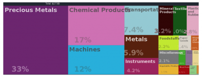
The efficient use of physical space and the intelligent color management make treemaps powerful visualization technique applied to a wide variety of domains. They are used to display significant amounts of information in financial, commercial, governmental and similar fields. The treemap on Fig.1 shows Switzerland imports in 2017.
Adding new Dimensions. With the intelligent use of colors, new dimensions can be added to the diagram. The usual practice is to use color in different rectangles to indicate a second categorical or quantitative value. If color is used to express a quantitative value, it’s strongly encouraged to use only one color (if all the numbers are positive) or two colors (one for negative and one for positive), and vary the intensity of the color to express precise value.
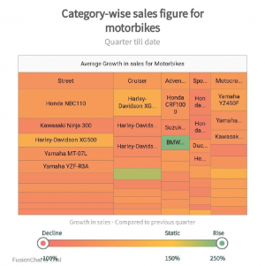
The following treemap (Fig.2) illustrates the category-wise (Street, Cruiser and etc.) sales figure for motorbikes. The size of the rectangles within each category indicates the relative number of sales. Different colors and color intensities show growth and declines of the motorbike sales. “Static” shows that sales neither grew nor declined. Very intense orange indicates a big shift downward, and very intense green indicates a big shift upwards.
From Fig.2 it can be concluded that appropriate use of color enables us to use tree maps to represent losses, declines in sales or other non-positive values. The second quantitative value is not represented by the area of the rectangle.
The way the rectangle is divided and arranged into sub-rectangles depends on the tiling algorithm used.
Many tiling algorithms have been developed and here are some of them:
Squarified - keeps each rectangle as square as possible. It also tries to order the consecutive elements of the dataset (blocks, tiles) in descending order from the upper left corner to the lower right corner of the graph.
Slice and Dice uses parallel lines to divide a root into branches (large rectangles). Then they are subdivided into smaller rectangles representing sub-branches again by using parallel lines. At each level of the hierarchy the orientation of the lines is switched (vertical vs. horizontal).
R Code
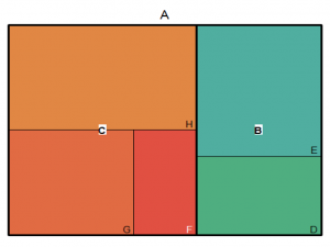
Imagine you have book A, consisting of 200 pages, which you use in your statistics course. This book contains of 2 main sections: B (80pages) and C (120pages). B section covers topics of Descriptive Statistics and C section covers topics of Inferential Statistics.
Topics of B section are: D(30pages) and E(50pages). D is about sample mean and sample standard deviation while E is about Skewness and Kurtosis.
Topics of C section are: F(20pages), G(40pages) and H(60pages). F is about Hypothesis Testing, G covers Confidence Intervals and H focuses on Regression Analysis.
You have tree-structured data and want to make a treemap for displaying the constituent sections of book and make comparisons of its
small and large components.
#Fig.3
library(treemap)
group = c(rep("B",2), rep("C",3))
subgroup = c("D","E","F","G","H")
value = c(30,50,20,40,60)
data= data.frame(group,subgroup,value)
treemap(data,index=c("group","subgroup"),
        vSize = "value",
        palette = "Set2",
        title="A",
        type="index",
        bg.labels=c("white"),
        align.labels=list(c("center", "center"),
                          c("right", "bottom")))
References and further reading material
- Ben Shneiderman (1992). “Tree visualization with tree-maps: 2-d space-filling approach”. ACM Transactions on Graphics. 11: 92–99.
- Ben Shneiderman, April 11, 2006, Discovering Business Intelligence Using Treemap Visualizations, http://www.perceptualedge.com/articles/b-eye/treemaps.pdf
- https://towardsdatascience.com/treemaps-why-and-how-cfb1e1c863e8
- https://www.nngroup.com/articles/treemaps/
- https://www.fusioncharts.com/resources/chart-primers/treemap-chart/
The author of this entry is Shahlo Hasanova.


