Introduction to Data Visualization with Python
Contents
Data visualization
Data visualization is an important part of data exploration and communication of results. To visualize your data effectively you need to choose suitable plots for your data formats [INSERT LINK]. Please refer to the Introduction to statistical figures for an overview of different figures and a guide on which figure to use depending on your data format (quantitative or qualitative) and the number of variables you want to visualize.
Here, you will learn how to make basic plots using the Python library Seaborn. After that, you learn to make use of Seaborn's functionalities to customize your plots and respect some good practices.
Seaborn
Seaborn is a Python library to create data visualizations. It was developed in order to facilitate the creation of the most common types of plots. Seaborn was built on top of Matplotlib.
To use Seaborn, we first need to import it, along with Matplotlib's pyplot. Futhermore, we need Pandas to work with dataframes.
# import libraries
import seaborn as sns
import matplotlib.pyplot as plt
import pandas as pd
We also need to import our data. As an example, we will use a modified and cleaned version of the Airbnb dataset from Kaggle. [INSERT LINK TO OUR CLEANED DATASET]. You can find the documentation with information about the columns here.
# import data (without some columns)
df = pd.read_csv('airbnb.csv', usecols = lambda x: x not in ["attr_index", "attr_index_norm", "rest_index", "rest_index_norm"])
df.head()
      realSum     room_type  room_shared  room_private  person_capacity  \
0  194.033698  Private room        False          True              2.0
1  344.245776  Private room        False          True              4.0
2  264.101422  Private room        False          True              2.0
3  433.529398  Private room        False          True              4.0
4  485.552926  Private room        False          True              2.0

   host_is_superhost  multi  biz  cleanliness_rating  \
0              False      1    0                10.0
1              False      0    0                 8.0
2              False      0    1                 9.0
3              False      0    1                 9.0
4               True      0    0                10.0

   guest_satisfaction_overall  bedrooms      dist  metro_dist      lng  \
0                        93.0         1  5.022964    2.539380  4.90569
1                        85.0         1  0.488389    0.239404  4.90005
2                        87.0         1  5.748312    3.651621  4.97512
3                        90.0         2  0.384862    0.439876  4.89417
4                        98.0         1  0.544738    0.318693  4.90051

        lat       city  weekend
0  52.41772  amsterdam    False
1  52.37432  amsterdam    False
2  52.36103  amsterdam    False
3  52.37663  amsterdam    False
4  52.37508  amsterdam    False
Basic plots
In the next examples, you will learn how to make basic plots using Seaborn. Note that you just have to pass your dataframe to the argument data of the plot function you want to use and the respective variables to the x- or y-axis arguments.
Countplot
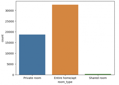
Countplot (sometimes also called barplot) is an example of a categorical plot. It is used to show the number of observations in each category of a categorical variable (e.g. room type).
# countplot of one categorical variable
sns.countplot(x='room_type', data=df)
<matplotlib.axes._subplots.AxesSubplot at 0x26f45f37e80>
In our example, we can see that entire homes/apartements occur most often in our data, followed by private rooms, then shared rooms.
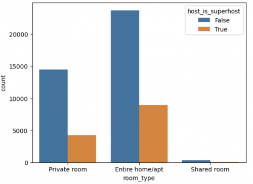
If you want to look at the relation of two categorical variables, you can use the hue parameter to add another categorical variable in a different color.
# countplot of two categorical variables
sns.countplot(x='room_type', hue='host_is_superhost', data=df)
<matplotlib.axes._subplots.AxesSubplot at 0x26f4600c1f0>
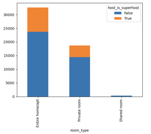
Showing the frequency or percentage with stacked bars is often more intuitive. Unfortunately, Seaborn does not provide a straightforward option to stack the bars, so we will use Matplotlib instead. We first need to create a table using crosstab with the frequency of each combination of categories.
# frequency table
table_freq = pd.crosstab(df['room_type'], df['host_is_superhost'])
display(table_freq)
host_is_superhost  False  True
room_type
Entire home/apt    23704   8944
Private room       14446   4247
Shared room          325     41
Then we can use the table to create a stacked countplot.
# stacked countplot with frequencies
table_freq.plot(kind='bar', stacked=True)
<matplotlib.axes._subplots.AxesSubplot at 0x26eae5c33d0>
This plot seems to show that entire homes/apartements are more often hosted by a superhost than private and shared rooms, but it is difficult to compare with absolute numbers.
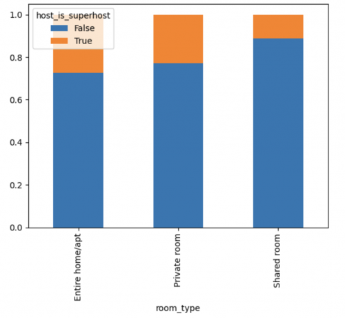
We can also show percentages instead of absolute numbers using the normalize parameter.
# percentage table
table = pd.crosstab(df['room_type'], df['host_is_superhost'], normalize='index')
display(table)
host_is_superhost     False     True
room_type
Entire home/apt    0.726048  0.273952
Private room       0.772803  0.227197
Shared room        0.887978  0.112022
# stacked countplot with percentages
table.plot(kind='bar', stacked=True)
<matplotlib.axes._subplots.AxesSubplot at 0x26f4601e070>
Now we can see that almost 30% of the entire homes/apartements are hosted by a superhost, whereas only 20% of private rooms are hosted by superhosts.
Histogram
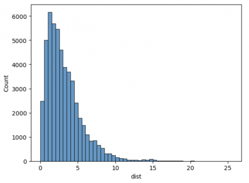
As opposed to a countplot which visulizes a categorical variable, a histogram shows the distribution of a continuous variable (e.g. the price). The data is grouped into bins and the number of observations in each bin is plotted on the y-axis. The binwidth can be changed with the binwidth parameter. You can read more about histograms here.
# histogram of a continuous variable
sns.histplot(data=df, x='dist', binwidth=0.5)
<matplotlib.axes._subplots.AxesSubplot at 0x27711413e80>
Here we see that most Airbnb offers are close to the city center and few are far away.
Barplot
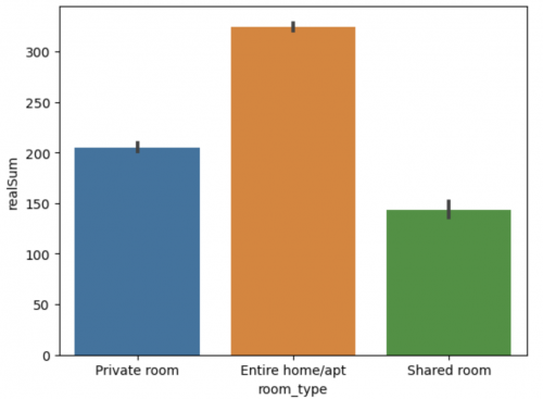
Barplots show an aggregate (mean, by default) of a quantitative variable (e.g. price) for each category of a categorical variable (e.g. room type). The grey vertical line represents the 95% confidence interval of the mean, which is automatically plotted by Seaborn. To turn off the confidence interval, set the argument errorbar = None.
# barplot
sns.barplot(x='room_type', y='realSum', data=df)
<matplotlib.axes._subplots.AxesSubplot at 0x27711e0dbb0>
This plot shows that the average entire home/apartement is more expensive than a private or shared room.
Boxplot
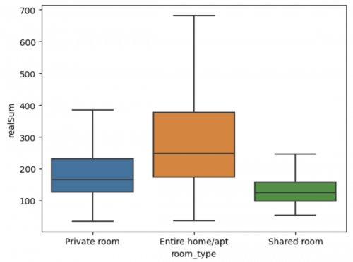
Boxplots show the distribution of quantitative data across categories. They are useful to compare the distribution of a quantitative variable (e.g. price) across groups of categorical variables (e.g. room type). The box in the middle represents the 25th to 75th percentile, the central line shows the median, and the whiskers give you an idea about the spread of the distribution. Outliers are represented by points. To omit outliers from the plot, set showfliers=False. You can read more about boxplots here.
# boxplot without outliers
sns.boxplot(data=df, x='room_type', y='realSum', showfliers=False)
<matplotlib.axes._subplots.AxesSubplot at 0x27711b63a90>
Just like the barplot above, this boxplot also shows that the average entire home/apartement is more expensive than a private or shared room. However, it provides more information. For example, we can see that the prices for entire homes/apartements vary a lot from offer to offer.
# boxplot with outliers
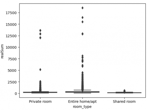
sns.boxplot(data=df, x='room_type', y='realSum')
<matplotlib.axes._subplots.AxesSubplot at 0x27711d6c130>
Here we can see that there are some private rooms and apartements that are very expensive.
Scatterplot
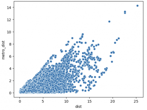
Scatterplots visualize the relation between two quantitative variables (e.g. distance to the city center and distance to the metro).
# scatterplot of two quantitative variables
sns.scatterplot(x='dist', y='metro_dist', data=df)
<matplotlib.axes._subplots.AxesSubplot at 0x27713c4e4f0>
Generally, the closer an Airbnb offer is to the city center, the closer it is to a metro station. However, there is also much variance.
Customizations
Customizing your plots is key to improve their readability and to focus interpretation on the main takeaways. Please read up on graphical etiquette in the Introduction to Statistical Figures [INSERT LINK] entry if you are not familiar with it.
Customizations that you will often need are hue, color palette, title and axes labels and changing the size of elements. You will learn about these in this chapter. For further plots and customization options you can refer to the Python Graph Gallery or Seaborn's Documentation.
Hue
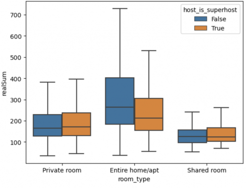
Most plots allow you to visualize an additional variable with a different color. You can pass the variable to the hue argument.
# boxplot with additional variable
sns.boxplot(data=df, x='room_type', y='realSum', hue='host_is_superhost', showfliers=False)
<matplotlib.axes._subplots.AxesSubplot at 0x1d5d8ab2940>
Color palette
Seaborn allows you to select preset color palettes. There are different palettes for different data formats:
- Qualitative palettes are used for categorical data (e.g. muted)
- Sequential palettes are used to emphasize a variable on a continuous or ordinal scale (e.g. Greys: gray scale, PuRd: purple to red)
- Diverging palettes are palettes where the two ends of the scale are opposites with a neutral point in the middle (e.g. RdBu: red to blue)
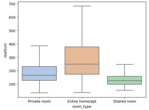
To select which color you want, you pass the palette name to the argument palette.
# boxplot with pastel colors
sns.boxplot(data=df, x='room_type', y='realSum',palette='pastel', showfliers=False)
<matplotlib.axes._subplots.AxesSubplot at 0x1d5d3477640>
Title and axes
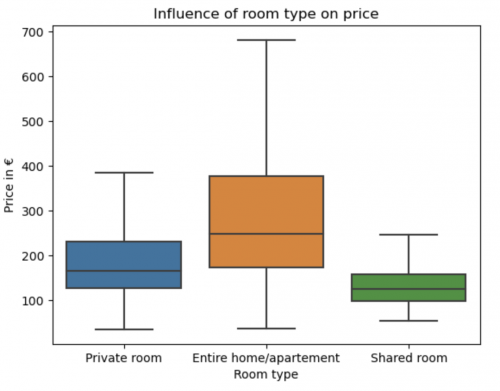
If you use the basic plots above an AxesSubplot is created each time. To set the title and the axis labels of an AxesSubplot, just use set() and pass the names to the arguments title, xlabel, and ylabel. You can also change the so-called xticklabels and yticklabels.
# boxplot with title and labels
axessubplot = sns.boxplot(data=df, x='room_type', y='realSum', showfliers=False)
axessubplot.set(xlabel='Room type', ylabel='Price in €', title='Influence of room type on price',
                xticklabels=['Private room', 'Entire home/apartement', 'Shared room'])
[Text(0, 0.5, 'Price in €'),
 [Text(0, 0, 'Private room'),
  Text(0, 0, 'Entire home/apartement'),
  Text(0, 0, 'Shared room')],
 Text(0.5, 0, 'Room type'),
 Text(0.5, 1.0, 'Influence of room type on price')]
Context
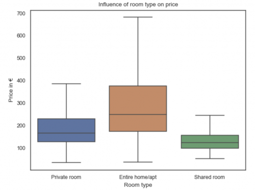
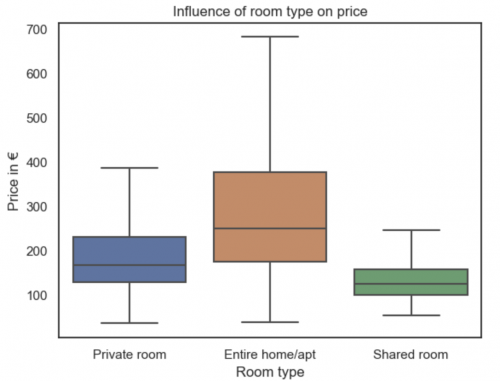
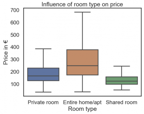
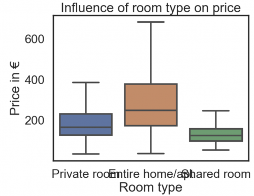
context allows you to change the font size of your plots according to the context you want to present them in. For that, you have the sizes 'Paper', 'Notebook', 'Talk', and 'Poster', which can be passed to the argument context of the function set_theme().
The example below shows histograms created using each one of the possible values for this argument.
context=['paper', 'notebook', 'talk', 'poster']
for i in context:
    sns.set_theme(style='white', rc={'figure.dpi': 100}, context=i)
    plt.figure()
    example_plot = sns.boxplot(data=df, x='room_type', y='realSum', showfliers=False)
    example_plot.set(xlabel='Room type', ylabel='Price in €', title='Influence of room type on price')
    plt.show()
Summary
- Different data formats require different visualizations.
- Seaborn is a Python library for creating data visualizations.
- Common plots are countplots, histograms, barplots, boxplots and scatterplots.
- To make beautiful plots you need to make customizations (e.g. hue, color palette, title and axes labels and changing the size of elements).
References
To be added soon
The author of this entry is Wanja Tolksdorf.
