Poster Design
From Sustainability Methods
Why & When
Goal(s)
Essential elements of a good poster
1. Clear message & Call-to-Action
If you design a poster for an event, there are questions that should be clearly and concisely answered:
 * What is the event about?
 * Why should I attend this?
 * When is it taking place?
 * Where is the venue?
 * How to attend the event (tickets info, etc.) / How to keep up with the event (social media portals, etc.)
 What is the event about?
 Why should I attend this?
 When is it taking place?
2. Know your audience
3. Color has meanings
- Each color creates a unique kind of energy that could reflect the poster’s message, may it be bold, subtle, agony or ecstasy. Choosing the right color scheme will set a tone for your statement to shine, help drawing attention from the audience from afar, create a subliminal association between then and the topic even before they start reading the text.
- The actual color shade is also very important. It may come to you as a surprise, but not only gray has (more than) fifty shade. The point is, it is important to take this into account when creating a color palette for your poster. Different shades combination will create different effects even though the rough colors stay them same.
4. Typography – It’s not just about the content
- Typography is an art itself. There is so much more you can convey with the use of fonts and arrangement of texts, sometimes incorporating illustrations and images. It is an integral part to the poster as a final product, and if done right, makes a unique lasting visual impact to the audience.

A poster for the movie "The Woman" (2008). Source: https://speckyboy.com/50-beautifully-designed-posters-with-amazing-typography/
5. Negative & White space – Things gotta breathe
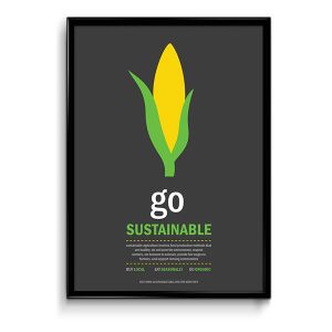
- A lot of times: less is more. With a poster you only have limited space, so deciding what’s making it there and what not is crucial. Negative space, or white space, is the area of the layout that is purposefully left empty. It serves as a breathing room for all other elements on the poster. As mentioned at the beginning, your message has to stand out. But if everything on the poster is so crowded in technicolor, your message becomes a leaf in the forest. That’s why it is important to selectively pick out some crucial elements and make them eye-catching, while creating a background with plenty of room for your message to pop.
(The use of negative space. Source: https://www.behance.net/gallery/2175431/Sustainability-Poster-Series)
6. Contrast – Make it pop
- High contrast between elements on a poster could help you catch the audience’s eyes with just a glance. Experimental, bold use of colors and images are encouraged, especially when your poster is among a dozen other ones, each trying to scream for attention.
7. Readable from a distance, but scalable
- When designing a poster, you need to make sure that people are able to read the key information with a glimpse of an eye. The font, size and arrangement of text are therefore critical. The headline should be the main (and biggest) text element on the poster, and you can play around of different fonts or typography ideas to make it as attractive as possible. Then come the detailed information as discussed above. They don’t need to be as dazzling, since the audience will come a bit closer to read them through if they decide that the poster is relevant. Still, the detailed information needs to be concisely and clearly displayed to make use of the short attention span an audience may have for your poster.
- Oftentimes you will want to scale down and hand out your poster in the form of flyers. Thus, the size ratio of the headline and the detailed information should not be too drastic, as scaling down would make the details unreadable.
