Difference between revisions of "Geographical Information Systems"
| Line 257: | Line 257: | ||
• Linked Data | • Linked Data | ||
Linked data refers to a set of best practices for publishing and interlinking structured data by enabling it to be accessible to machines and humans likewise. It started off as an initiative by Tim-Bernes-Lee (inventor of World Wide Web) and is increasingly becoming one of the most popular methods of online data publication. The reason for this enormous success can be attributed to it enabling interoperability and information exchange. Linked data allows us to discover more useful data through connections with other datasets, and to modify it or use it in more useful ways. Linked data uses web technologies such as HTTP, URIs, RDF to create different web-domains, and connect them using links, and builds a web of readable data. | Linked data refers to a set of best practices for publishing and interlinking structured data by enabling it to be accessible to machines and humans likewise. It started off as an initiative by Tim-Bernes-Lee (inventor of World Wide Web) and is increasingly becoming one of the most popular methods of online data publication. The reason for this enormous success can be attributed to it enabling interoperability and information exchange. Linked data allows us to discover more useful data through connections with other datasets, and to modify it or use it in more useful ways. Linked data uses web technologies such as HTTP, URIs, RDF to create different web-domains, and connect them using links, and builds a web of readable data. | ||
| + | |||
| + | '''Map Layouts''' | ||
| + | |||
| + | With the overgrowing civilization, our demands for the usability and application of maps have also grown and become more complicated. Maps can serve as a vital tool for local governments and planning organizations to visualize environmental and resource data, various national and international boundaries and much more. They are used daily by soil, geology, and water resource professionals in their work and planning. To perform their jobs, public utilities and engineering firms use technical maps. Land use maps are essential for planning the un-hindered growth of the city. Cadastral maps are an indispensable tool for tax collectors and city recorders. | ||
| + | Today's cartography, especially thematic mapping, is undergoing rapid transformation. Thematic mapping is maps based on the geographic pattern of a particular theme, such as land use, temperature variation, precipitation changes etc. Advances in computer hardware and software technology, improved Internet connectivity, and the availability of geographic information systems (GIS) software that can create a variety of maps have all had a significant impact on how maps are created and used (Peterson, 2003). Furthermore, local, state, and government entities are making a growing number of online maps and map data available. As a result, these institutions have become more responsive to the demands of map users, both public and private, across the country. Maps, in fact, empower people through their use (Arici et.al., 2019). | ||
| + | |||
| + | Types of maps: | ||
| + | |||
| + | Generally, maps can be categorized in two broad categories: | ||
| + | 1. Reference Maps | ||
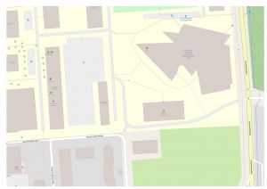
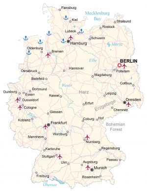
| + | Reference maps are also called general purpose maps as they are often used to represent selective information about a certain geographic location, such as a map showing only political boundaries, or a map showing only the most populated cities, etc. (Figure 1). | ||
| + | |||
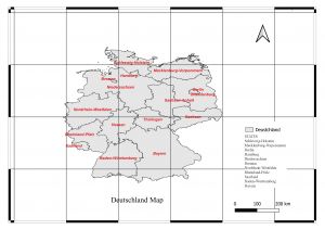
| + | [[File:Germany-Map.jpg|thumb|A map showing the major cities of Germany (source: Internet).]] | ||
| + | |||
| + | 2. Thematic Maps | ||
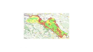
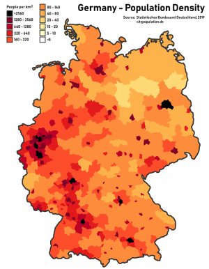
| + | The most widely and commonly used maps are thematic maps. They are used to show the relationship between a theme and geographical space (Figure 2). One can find various categories or types of thematic maps, such as isoline maps, cartogram maps, choropleth maps, graduated symbol maps, heat maps, dot-density maps, and flow-line definition maps are examples of these types. Each form of themed map serves a distinct function, and each has advantages and disadvantages. | ||
| + | |||
| + | [[File:Population density in Germany.png|thumb|A Choropleth displaying the population density of various location in Germany (source: internet).]] | ||
| + | |||
| + | The making of a good map: | ||
| + | |||
| + | What makes a good map? Visualization plays a crucial role in dissemination of information. For proper and easy dissemination of information, it is important to have clear and good visualization. Now, what makes a clear and good visualization for a map? When one can easily identify and understand all the attributes of a map. There are few attributes to make a good map: | ||
| + | 1. Interesting Symbology. | ||
| + | 2. Easy to understand and clear communication. | ||
| + | 3. Simply styled. | ||
| + | 4. Not overcrowded. | ||
| + | 5. Complete elements | ||
| + | |||
| + | A map consists of 6 major symbology’s: | ||
| + | |||
| + | 1. Title/Label | ||
| + | A title or label is the identity of our map. It represents the theme of the map, i.e., what are we seeing in the map. Is it a roadmap? Or is a choropleth? Numerous important themes are depicted in maps, the most common of which are the political and the physical. | ||
| + | |||
| + | 2. Scale | ||
| + | A scale represents the precise units of measurements used. Cartographers need to contextualize the map scale to accurately present the information on the map. A map can be ‘not to scale’ or ‘to the scale’ based on the information provided by the map scale’. A map can be physically and aesthetically diverse from other maps and still accurately depict the same relative amount of distance between each feature thanks to the inclusion of a map scale. The map scale often takes the form of a set of lines placed to the page in one corner along with a label identifying the precise units of measurement used. Each unit of distance on the scale is physically displayed next to or beneath this measurement, so that, depending on the size of the image, one inch on the map can correspond to one mile or even hundreds of miles. | ||
| + | |||
| + | 3. Legends | ||
| + | How do I read my map? Where is the key to all the symbols on my map? The description to all those symbols, how they work together, is represented by the Legends. They can be a list of several icons, colors, or words with a brief description alongside. Physical maps typically restrict the variety of symbols used in a single image for practical reasons. Political maps may display topographical elements as a point of reference, but their primary focus is on highways, cities, bridges, and borders, with the appropriate iconography identifying each in the map key. | ||
| + | |||
| + | 4. North Arrow | ||
| + | To align the map in the right direction or to provide accurate orientation to our map, we use north arrow to indicate the north of the map. | ||
| + | |||
| + | 5. Grid | ||
| + | A grid is very helpful in pinpointing location on a map. They visually divide the map into tiny square sections called grids. | ||
| + | |||
| + | 6. Metadata | ||
| + | All the extra information of a map which you don’t want to display but is also important to be saved alongside, consists of metadata of the map. It can be either in a document form, or a spreadsheet. | ||
| + | |||
| + | [[File:Ger.jpg|thumb|Example of a map with all the essential elements ]] | ||
| Line 311: | Line 360: | ||
'''References''' | '''References''' | ||
| − | + | ||
Further Information | Further Information | ||
| Line 320: | Line 369: | ||
• Another overview of raster and vector data by [https://gisgeography.com/spatial-data-types-vector-raster/ gisgeography.com]. | • Another overview of raster and vector data by [https://gisgeography.com/spatial-data-types-vector-raster/ gisgeography.com]. | ||
| + | |||
The authors of this article are [https://www.leuphana.de/institute/institut-fuer-oekologie/personen/henrik-von-wehrden.html Prof. Henrik von Wehrden] and [https://www.leuphana.de/en/institutes/institute-of-ecology/team/neha-chauhan.html Neha Chauhan]. | The authors of this article are [https://www.leuphana.de/institute/institut-fuer-oekologie/personen/henrik-von-wehrden.html Prof. Henrik von Wehrden] and [https://www.leuphana.de/en/institutes/institute-of-ecology/team/neha-chauhan.html Neha Chauhan]. | ||
Revision as of 14:03, 5 February 2024
| Method categorization | ||
|---|---|---|
| Quantitative | Qualitative | |
| Inductive | Deductive | |
| Individual | System | Global |
| Past | Present | Future |
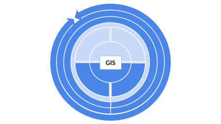
In short: Geographical information systems (GIS) subsume all approaches that serve as a data platform and analysis tools for spatial data.
Background
While Geographical Information Systems are typically associated with digital systems, the systematic creation of knowledge through the analysis of spatial data can be dated back long before the invention of modern computers. The first spatial analysis was focussed on the spread of Cholera in Paris (1832, "Rapport sur la marche et les effets du choléra dans Paris et le département de la Seine. Année 1832") and London (1854). While the map of Paris showed Cholera cases on a scale of the districts, John Snow showed in London the cases of citizens that died of Cholera as dots. This allowed for a clear representation of the spread of the disease. Since cases were clustered around a well, John Snow could infer that the water sources is the main spread vector of the disease. This is insofar remarkable, as is clearly highlights how knowledge could be derived inductively without any understanding of the deeper mechanics of Cholera, or let alone even the knowledge of bacteria.
At this time, topographic maps were already perfected as part of the Nation States creating inventories and understandings of their territories, and also of their colonies and their wealth. Topographic maps were increasingly able to depict different layers of information, as maps were printed in different colours that all represented different kinds of information, such as vegetation, thematic information, water, and more. With the rise of the computer age, this information was implemented into computers, and Canada created the first digital Geographical Information System in the 1960. This highlights how innovation of Geographical Information Systems was strongly driven by application, since such systems are of direct benefit in planning and governance. The main driver of innovation in early GIS development was however Howard T. Fisher from Harvard, who - with his team - developed important cornerstones that still serve as a basis for GIS, including different data formats and the general architecture of GIS systems. First commercial systems started to thrive in the 1970s and 1980s, yet only with the rise of personal computers and the Internet, Geographical Information Systems unleashed their full potential.
While simple vector formats were already widely used in the 1990s and even before, the development of a faster bandwidth and computer power proved essential to foster the exchange and usage of satellite data. While much of this data (NOAA, LANDSAT) can be traced back to the 1970s, it was the computer age that made this data widely available to the common user. Thanks to the 'Freedom of Information Act', much of the US-based data was quickly becoming available to the whole world, for instance through the University of Maryland and the NASA. The development of GPS systems that originated in military systems allowed for a solution to spatial referencing and location across the whole globe. Today, commercial units from around the millennium are implemented in almost every smartphone in a much smaller version. This wide establishment allows for the location of not only our technical gadgets, but also goods and transportation machines. An initial NASA system showed a strong resemblance to Google Earth in the early 2000s, and with the commercial launch of Google Earth and Google Maps, the tech giant built a spatial database that is to date almost unrivalled.
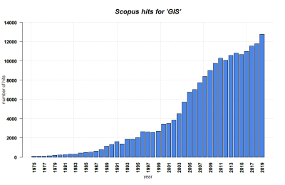
With the Smartphone age, this information became rapidly available to the wider public, and ever more complex growing databases and apps are today adding millions of spatial entries to the global databases. The early and often clumsy GIS software suits are more diversified and broadly available today, making GIS systems a common staple of many branches of science. Open street map data and QGIS prove that data and software solutions are possible beyond the commercial business sector. Geographical Information Systems, and with them geospatial data and complex analysis, have become one of the main branches of the Internet and indeed the Modern Age. Augmented Reality and self-driving cars showcase the potential of this technology for the future, but the potentially constant geotagging of all citizens that own a smartphone also highlights problems of data security and globalisation.
What is GIS?
With the rise of computers the processing, usage and analysis of spatial data has been playing a key role across all facets of our societies. Within science, diverse fields such as geography, spatial science, data science and many other fields have harnessed the use of information technology to access information sources and to integrate the processing, analysis and interpretation of spatial data. This development continuously unleashed new potential in how we observe, communicate, and evaluate the spatial patterns, processes and mechanisms that utilize but equally drive the internet and computerization. Within geographical information systems, a generalisation of the world is saved within diverse data formats, ultimately deriving a coarse version that represents the respective spatial phenomena. Geographical information systems -or short GIS- are computer systems for managing, analysing, and displaying data related to positions and geographic information. GIS can show many kinds of data on one map. A GIS facilitates diverse ways to visualize, analyse, and understand spatial patterns and processes. Since much of the data we utilize can be spatially referenced by a coordinate system, GIS data can be facilitated to analyse such spatially referenced information. For example, if we want to know about the number of students participating in different lectures taking place at Leuphana, a simple table cross-referenced with the respective lecture halls might suffice. Yet in order to enable a spatial representation of the location the students within those lecture halls, a geographical visualization is required. Illustration of this example?
There are diverse definitions available for geographic information system, e.g.
“GIS is an integrated system of computer hardware, software, and trained personnel linking topographic, demographic, utility, facility, image and other resource data that is geographically referenced. -------NASA
“In the strictest sense, a GIS is a computer system capable of assembling, storing, manipulating, and displaying geographically referenced information, i.e. data identified according to their locations. Practitioners also regard the total GIS as including operating personnel and the data that go into the system.” -------USGS
“A geographic information system (GIS) is a computer-based tool for mapping and analysing things that exist and events that happen on earth. GIS technology integrates common database operations such as query and statistical analysis with the unique visualization and geographic analysis benefits offered by maps.” -------ESRI
Examples of Applications of GIS:
GIS operate on various levels and typically serve multiple functions. The most basic level to operate GIS is cartography, which is commonly used to map making. GIS can also be used for spatial data analysis.
a. GIS Cartography Maps are an integral part of human development, and many cultures have utilized maps as crucial tools to navigate, explore, describe and explain. Early maps were essentially an attempt on story telling of distant voyages by cartographers. Cartographers performed the role of artists by creating images based on traveller knowledge, memories, and concerns. With the rise of mathematics, particularly trigonometrics, and the development of technology, maps evolved into digital forms that are now a part of our everyday life due to smartphones, which basically all integrate GIS for localisation and navigation.
Geographic Information Systems (GIS), which offer a visual interpretation of data, are mostly focused on mapping. GIS and cartography are being used for an increasing diversity of applications, including integration of Global Positioning System (GPS), remote sensing, global data bases, internet use, web mapping services, and diverse software applications.
b. Spatial Analysis
While most GIS applications are related to map making, the term GIS is increasingly being associated with spatial analysis and planning as well. Procedures such as the capturing, visualization, manipulation and analysis of geographic information are continuously evolving within GIS systems. Environmental management and spatial planning are two crucial fields of application for GIS along with agricultural value chain, public health and surveying (Masser and Wegener, 1996). GIS has become a standard tool within spatial planning. A broad variety of pre-programmed tools for spatial analysis are available in modern software solutions, such as ARC/GIS and QGIS. Finer scales are approached by architectural tools such as AutoCAD, and programming languages such as Python and R offer an array of tools for spatial analysis. These tools include network analysis, modelling of digital terrain, and spatial overlay. The ability to modify complex and intricate analysis of sequences using continuously evolving programming languages and data bases has become essential in all components of our daily lives. By linking spatial data to advanced analysis approaches the ability of GIS to allow for future predictions and adaptations has become a breakthrough in modern science.
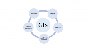
Elements of GIS: GIS can process both geographic and spatial information at the same time. This requires a variety of functional elements and components. There are five major components including hardware (computer systems, laptops), software (ArcGIS, QGIS, ERDAS etc.), human resources (people with ample knowledge of handling and applying GIS), datasets and analytical methods.
GIS also includes five major functional or procedural elements for successful operation or application. Those are namely: data acquisition, pre-processing, data management and manipulation, analysis and results generation.
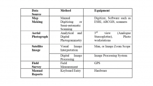
Data acquisition: It is the process of identifying and gathering new data by preparing maps, aerial photography and surveys. Following table shows few methods of data acquisition:
Preprocessing: It entails changing the data in a variety of ways before entering it into the GIS. Data format conversion and methodically locating objects in the source data are two of the main responsibilities of preprocessing. Extracting data from maps, photos, and printed records (such demographic reports) and then entering it in a computer database are common methods for changing the format of the original data. This process is often time-consuming and expensive exercise. This is especially true when one estimates the costs of moving sizable data volumes from an automated GIS based on computerized databases to paper maps and transparent overlays.
Data Management and Manipulation: The development and accession of the database itself are controlled by data-management operations. Data entry, consistent update, deletion, and retrieval are offered by these functions. The users of contemporary database management systems are shielded from the specifics of data storage. Users typically are not aware of well completed data management processes. Security considerations relate to data management. There must be procedures in place to give various users varying levels of access to the system and its database. Data manipulation consists of working with the database contents to derive new information.
Analysis: Analysis is often the system user's focus of attention. Many people mistakenly think that this module alone makes up a geographic information system. The analytical operators that use the database contents to generate new information are in this part of the system. We need specific facilities to be able to transfer data and information between systems because one system cannot provide the full range of analytical capabilities a user might conceive.
Results Generation: Final outputs from the GIS like statistical reports, maps, and graphics of various kinds are the parts of result generation.
Data formats in Geographical Information Systems
Geographical Information Systems contain in general two types of data: Vector and raster data.
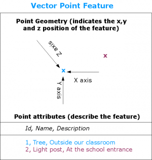
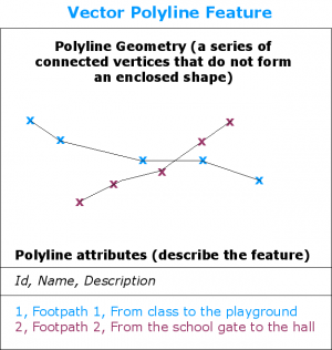
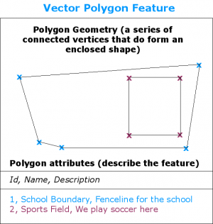
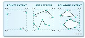
Vector Data: Vector data is the type of geographical data where dataset is stored in the form of collection of points, polyline, or polygons, and have attributes assigned to those features. Individual points are recorded as discrete geometric location known as coordinate pairs/vertices (x, y values). These coordinates define the shape of the spatial object. The placement and organization of the points determine the type of vector data i.e., polyline, point or polygon (Goodchild, 2011).
Points: When a feature’s geometry is represented by a single vertex, it is called point vector. Each point is defined by a single x, y coordinate. There can be many points in a vector point file. Examples of point data include sampling locations, the location of individual trees, or the location of light posts.
Polylines: When the geometry consists of two or more-point vertices, and the first and last vertex are not the same, it is called polyline feature. The points are connected. For instance, a road, stream, or a footpath may be represented by a line. This line is composed of a series of segments, each “bend” in the road or stream represents a vertex that has defined x, y location.
Polygons: When three or more vertices are involved and first and last vertex is the same, then the vertices form a polygon. The boundary of a school, sports field, lake, and states or countries are often represented by polygons.
Vector data as such has a high precision, as the localization of vectors can be accurate, if they were measured and georeferenced in a detailed way. Hence, vector data is as precise as the way it was digitalized and measured (Abubahia and Cocea, 2015). For instance, much cadaster data is measured in the field and then implemented through GPS measurements. An alternative way, also to implement historical data, is the scanning and digitalization of paper maps or other sources, which is a quite work-intense process.
Vector data in layers
Most GIS applications group the vector data features into layers. Features in the layer have the same attributes and geometry type. For example, if we are recording all the buildings in our university, the will usually be stored together ad shown as a single layer on GIS, making it convenient when to deal with all the features.
Editing vector data
You can build and alter the geometry data in a layer using the GIS application, a process known as digitizing. The GIS application will only let you build new polygons in layers that already include polygons (such as agricultural dams). Similarly, if you want to change the shape of a feature, the application will only allow you to do it if the changed shape is correct. For instance, it won't let you change a line such that it has just one vertex. As we mentioned previously when discussing lines, all lines must have at least two vertices. GIS's ability to create and manipulate vector data is crucial because it is one of the primary methods for generating personalized data for topics that interest you. Imagine that you are keeping an eye on river contamination, for instance. The GIS could be used to digitize every storm water drain outfalls (as point features). Another option is to digitize the river itself (as a polyline feature). Lastly, you may digitize the locations where you took pH readings along the river's path (as a point layer).
Advantages of vector data: • The creator can add all the important information about the dataset in the geometry. • The geometry structures hold information in themselves – for example, why choose point over polygon? • The geometry can carry multiple attributes instead of one, e.g., a database of country can have attributes for name, states, population, GDP etc. • Data storage can be very simple and efficient compared to rasters.
Disadvantages of vector data: • Potential loss of detail compared to raster • Potential bias in datasets – what did the creator miss? • Calculations involving multiple vector layers needs math on the geometry and the attributes, so can be slower.
Vector datasets have a wide diversity of use, such as various industries, geospatial fields. For instance, computer graphics are largely vector-based, although the data structures in use tend to join points using arcs and complex curves rather than straight lines. Computer-aided design (CAD) is also vector- based. The difference is that geospatial datasets are accompanied by information tying their features to real-world locations.
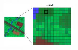
Raster data: Any pixelated (or gridded) data that has a defined geographic location assigned to each pixel is referred to as raster data. A pixel's value can be categorical/thematic (e.g., land use or forest cover) or continuous (for instance, elevation, temperatures) (Escobar et al., 2008). Raster datasets are abundantly used, examples are aerial photographs, satellite imagery, digital maps and images (Guo et al., 2016). Any given digital image is basically a raster image, since it consists of pixels. The only way a geographic raster differs from a digital image is if each location is linked with spatial information. The extent, cell size, number of rows and columns, and spatial reference system of the raster are all included as digital information.
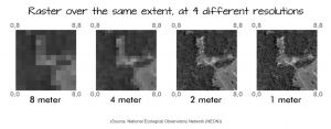
Raster data format can be used to represent phenomena closely resembling to real-world such as thematic data (also known as discrete) representing land-use data. Continuous data represents spectral dataset such as satellite imagery along with phenomena such as temperature or elevation. Although they can be displayed as data layers on your map alongside other geographic information, thematic and continuous rasters are frequently utilized as the primary material for spatial analysis with the GIS software (ENVI, QGIS, ArcGIS, etc.) Spatial Analyst extension. Picture rasters are frequently utilized as attributes in the ‘Attribute Table’ since they can convey additional map characteristics and can be displayed with geographic data. Examples of continuous rasters are: 1. Temperature map 2. Precipitation maps 3. Elevation maps Examples of categorical/thematic maps are: 1. Low, medium, and high temperature maps. 2. Land cover and utility maps Attributes of Raster data: 1. Spatial Resolution The cell size in the raster dataset and the proportion of screen pixels to image pixels at the map scale are the aspects of raster spatial resolution. One screen pixel, for instance, can be produced by down sampling nine picture pixels into one, or a raster resolution of 1:9. In this instance, the image is less clear and lacking details since each screen must display 9 raster cells. However, a spatial resolution of 1:1 means that each pixel is showing only 1 raster cell. Even after further zooming in, the details on the pixel remain identical.
2. Spatial Extent The spatial extent is the allowable range for the X and Y coordinates or m and z values. In simple words, it the geographic area which the raster covers, representing the edge or location that is furthest north, south, east or west.
“A raster at the same extent with more pixels will have a higher resolution (it looks more "crisp"). A raster that is stretched over the same extent with fewer pixels will look more blurry and will be of lower resolution.” Source: National Ecological Observatory Network (NEON) Despite such simple structure, Raster has a wide range of usability. Within GIS, raster usage can be categorized under four main parts: 1. Basemaps 2. Thematic maps 3. Surface maps 4. Attributes of a feature Rasters as Basemaps: Raster data is frequently used in a GIS as a background display for additional feature layers. For instance, the display of orthophotographs beneath other layers gives the map viewer or user supplementary information while also giving them reassurance that the layers are geographically aligned and reflect actual objects. Pictures from aerial photography, satellite imagery, and scanned maps are the primary sources of raster basemaps.
Raster as Thematic map: Thematic raster data is produced after analyzing other datasets. A common application of thematic data preparation is by classifying the satellite images into land use and land cover classes (Fig. B). Another example is results from combination of data from different sources such as vector, elevation models, and raster. For example one can use a geoprocessing model to create a raster data which shows map suitability for bike riders. A common type of thematic map is the choropleth map. In a choropleth map statistical data is aggregated into known geographical units. The first choropleth map was published by Baron Dupin in 1826, depicting educational levels in France by department. Recently choropleth maps came into use during the COVID19 pandemic showing number of COVID cases per country or district.
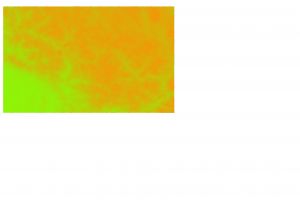
Rasters as Surface Maps: Rasters are ideal for representing data which evolves in real time across a territory (surface). They offer a practical way to represent the continuity of a surface. The most typical use of surface maps is for representing the elevation of various locations of planet’s surface, but datasets such as temperature, rainfall, sea-surface temperature (SST), and population density etc., can also be displayed using surface maps. Elevation map for the Himalayas is shown in the raster below using green cells to represent lower elevation with yellow showing a gradient towards higher elevation.
Attributes as a feature: Digital pictures scanned documents or drawings, with relation to geographic location forms the attributes of a feature in raster imagery. An attribute field type of raster stores the information alongside or within the geodatabase. E.g., we could take a photograph of the gray wolves in Yellowstone National Park as a keystone species. General Characteristics of Raster data: Every cell (pixel) in raster has a value associated with it which represents the event portrayed by the dataset, such as height, spectral value, magnitude, or category. Pixel values can be integers, floating point or negative, positive. Integer values best represent the categorical data and floating points represents the continuous surfaces. No Data represents the missing data. Height could represent the altitude, or distance from men sea level. Spectral values are the values representing the light reflectance and color from the aerial photography and satellite imagery. Magnitude might signify the values of temperature, precipitation etc. Examples are a forest, river, agriculture farm, buildings in case of land-use and land-cover raster.
Coordinate System
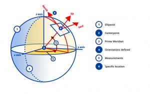
Working with GIS requires one to consistently identify the objects’ location on earth. This is achieved by a method called Coordinate system. A coordinate system uses numeric values to identify the location of a point on earth. All spatial data is defined using a coordinate system. A coordinate system consists of both horizontal and vertical values around a point of reference, called origin. The horizontal values indicate the distance between two points on earth’s surface i.e., it locates the data across the earth’s surface. The vertical value indicates the distance above or below the earth surface i.e., locating the relative height. But how does one display the points from the spherical earth surface on a flat surface? For that, we need projection systems. Projection system is a technique used to represent the earth’s curved surface on a planar surface using methodical mathematical transformations. Types of coordinate systems: There are various types of projection systems, some global, such as, Geographic coordinate system, projected coordinates system, universal transverse Mercator system, and some local such as., State Plane Coordinate System (USA), India Grid System (Indian Geodetic Datum) etc. Two most widely used types of coordinate systems are: 1. Geographic coordinate System 2. Projected Coordinate System Geographic Coordinate System (GCS): Location on the Earth surface is specified by using the Latitude and Longitude which specifies the angle between the point of interest and equator and angle between point of interest and prime meridian. A GCS consists of prime meridian (Greenwich, England), datum (Earth surface or precisely ellipsoid) and unit of measurement (degrees). The most widely used GCS is World Geodetic System (WGS 1984). The system utilizes the location shared by Global Positioning System (GPS).
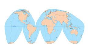
Projected Coordinate System: To understand Projected coordinate systems, we must first understand what a projection is. Let us assume that Earth is a massive sized orange. If you try to lie the orange flat on a surface, it is nearly impossible. But, when you peel the orange, the peel of the orange can now be laid down on a flat surface looking something like Figure 2.
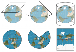
The shape of the peel varies based on the way we peel it, and so does the final projections. But, when we are making maps, we are not just peeling an orange. Our goal is to represent locations on Earth as precisely as possible, in 2D form based on 3D form of Earth. There are various kinds of projection methods used to preserve the originality as much as possible. The following figure describes three major peeling (projection) methods for Earth.
So, one could say that projected coordinate system is a flat representation of Earth’s spherical surface. Latitude and longitudes are converted to X, Y coordinates of two dimensions. X coordinate is the eastward direction and Y coordinate is the northward direction of the point of interest. This makes the projected coordinate system more suited to area and distance measurements. The geographical coordinates are converted using mathematical formulas (called map projections) as discussed above. Based on the projection method used, the spatial properties will appear distorted. You can see an example of this on The True Size, which allows us to see the extent of distortion experienced due to Mercator projection.
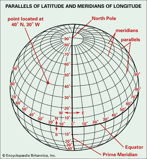
Latitude and Longitude: The imaginary parallel lines running from east to west direction on Earth surface are known as latitudes. The longest latitude is the equator, with their length decreasing as they get closer to the pole. The line running perpendicular to the latitudes, from pole to pole in north-south direction on earth surface are called the longitudes. They are also called the Meridians, with the longitude passing from Greenwich, England named the Prime Meridian. They are equal in length and are farthest at the equator with meeting at poles. The imaginary mesh formed on the Earth surface after the intersection of latitudes and longitudes is called a geographic grid, used to identify location on earth.
GPS: The Global Positioning System (GPS) with its equivalents (Beidou in China, Galileo in Europe, and GLONASS in Russia) have transformed the method of measurement of position, enabling individuals to know their location almost precisely anywhere on the surface of the Earth. The GPS is a complex system comprising of 24 satellites (and a few standbys), each of which travels in a separate orbit around the Earth every 12 hours at a height of 20,200 km while emitting radio pulses at precisely timed intervals. Using the satellite’ exact position and speed of light, a receiver can know the exact location by performing some calculations using the signals. Accuracy of positioning in three dimensions (latitude, longitude, and elevation) depends on the number of satellites above the horizon and their positions. A minimum of four satellites are required to be positioned above the horizon, whereas if elevation is not needed, then only three satellites need to be above the horizon. There are numerous variations of GPS, each with a unique level of accuracy.
Georeferencing
GIS has a plethora of options for gathering datasets. Even the pictures we click from our mobile phones can also be used as dataset in GIS software. But, to turn this raw imagery into usable raster/vector dataset for the GIS software, and to accurately display the imagery on a map, one must first add coordinates to the images. The process which allows us to create, add, edit or store new information that associates the position of raster cells on the images to the geometric elements of our maps, is known as Georeferencing. There are two types of georeferencing: 1. Raster Referencing When grids/cells from another satellite imagery are used to reference the digital images, this process is known as raster referencing. This can be done either by dividing images into grids and associating the coordinates with a grid cell. Another way to achieve raster referencing is by shift-register. 2. Vector Referencing In vector referencing, the features from other maps are using as the reference points for coordinates in the image. The common objects or places are identified and used as landmark for the referencing. Vector referencing is the commonly used method in georeferencing. Irrespective of the type of georeferencing, the process takes place in two steps (explained in detail in the tutorial below): 1. Adding ground control points (GCP or simply, control points) To put the imagery in geographic context, we must find a similar map or raster dataset with real-world coordinates. On the already georeferenced map, we add few ground control points on the specific locations which can be easily and precisely located on both the images. Road intersections, buildings, distinguished natural or artificial landmark, are few examples of locations used as GCPs. If you are using a raster image, you can also manually add the exact coordinates in the GCP list. These coordinates can later be used to perform georeferencing.
2. Select the transformation method (often called rubbersheeting method)
Although there are numerous potential methods for saving the georeferenced data, the pertinent coordinate transforms are commonly saved as the image file (such as GeoPDF and GeoTIFF). Basic map analysis is made possible via georeferencing in the digital file, which enables users to point and click on the map to get a location's coordinates, compute distances and areas, and find other data. Imagery: Any visual representation of the earth's surface, including aerial photographs, satellite images, and scanned maps which is valuable for GIS is considered imagery. GIS software can use these images to create maps, measure distances, and perform various analyses. Often, images taken from a satellite, or an aircraft are the photos utilized for GIS projects. These can be photographs that are preserved digitally or ones that were captured with a digital camera and printed on films. In addition, imagery includes printed topographic maps that have been digitally digitized. Imagery is especially useful in GIS because it provides a lot of information about an area in a single image. This can save time and resources when compared to collecting data on the ground. GIS software can also process imagery to extract information that is not visible to the naked eye, such as temperature or vegetation health. This information can be used to make important decisions about land use, resource management, and disaster response. Images are regarded as raster data in the context of the GIS data type. As a result, a grid of numbers that is organized into rows and columns makes up the basis of every GIS image. Each grid is referred to as a pixel, and each pixel is given a unique numerical value. The various values given to the pixels often correspond to elements like elevation, gradient slope, or spectral brightness of an area (Green et al., 2017). An image is created when all the pixels are added together. Overall, imagery is a crucial component of GIS that provides a wealth of information about the earth's surface. Its use in GIS can improve decision-making, save time and resources, and provide valuable insight into various aspects of our environment. Reprojection: When working on multiple sheets, sometime the sheets might have different projections, but required in a specific format for analysis and visualization. To bring all the sheets to same projection system, we ‘reproject’ the sheets to the specific format. In simple terms, reprojection involves changing the coordinates values of a dataset from one coordinate system to another. This involves applying a mathematical transformation of each geometry represented in the first coordinate system to be located by someone using another coordinate reference system. These transformations can be simple (e.g., translation, rotation) or more complex (e.g., warping). Reprojection is typically used to move from one cartesian 2D (XY) coordinate system to another cartesian 2D (projected) coordinate system. Projection (without RE) is used from a geographic coordinates system to a projected coordinate system. The main reasons to change the coordinate system include facilitating the computation of features, preserving properties of "real world" objects, and changing territory, as many coordinate reference systems are "locally" optimized for one state or country.
Data Management
Metadata in GIS:
Metadata is a set of data that describes and provides information about other data. In GIS (Geographic Information Systems), metadata is used to describe spatial data, such as maps, layers, and features. It provides information about the data's content, quality, accuracy, and other important characteristics that can help users understand and use the data effectively. Metadata in GIS can include information such as the data source, data format, coordinate system, projection, scale, accuracy, date created, and data owner. It can also include information about the data's limitations and restrictions, such as copyright or licensing information. In simple words, metadata is the:
Metadata is an essential component of GIS data management because it helps users determine the suitability of the data for specific purposes. It also facilitates the sharing and distribution of GIS data, as metadata can be used to promote data discovery and provide users with the necessary information to make informed decisions about using the data. Several metadata standards have been developed for GIS data, including the Federal Geographic Data Committee (FGDC) standards and the ISO 19115 standard. These standards provide guidance on how to create metadata that is consistent, complete, and interoperable with other GIS systems. Consider metadata as an information label for your data. In addition to these standards, there are also several tools and software programs available to help GIS professionals create and manage metadata. For example, ArcGIS and QGIS both include metadata editors that allow users to create and edit metadata directly within the software. In conclusion, metadata is an important aspect of GIS data management. It provides users with valuable information about the data and helps ensure that the data is used effectively and appropriately. By following metadata standards and using the available tools and software, GIS professionals can ensure that their data is interoperable and accessible to a wide range of users.
Metadata management:
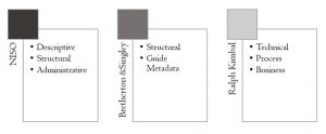
The logical sense tells us that metadata often would be enormous files, so, they govern the need for their management. Numerous categories of metadata have been created over the years for better management. There are several types of metadata, first and foremost being about the form and content of data. This was categorized as descriptive, structural, and administrative, developed first and foremost by NISO (by National Information Standard Organization). The following shows the major categories of metadata created by various organizations and scientists:
There are various standards to manage the metadata. For example, Global Statistical Geospatial Framework facilitates the upkeeping of standard of metadata in Europe. It provides a framework for describing geospatial data and promotes the sharing of data across different organizations and agencies. The standard includes guidelines for creating metadata for a variety of geospatial data types, including raster and vector data, imagery, and tabular data. Another example is, the ISO 19115 standard, which is an international standard that provides a framework for describing geographic information and services. It includes guidelines for creating metadata for both spatial and non-spatial data, as well as information about data quality and lineage. This standard is also widely used in Europe and other parts of the world. Metadata Storage and Sharing: • Relational Databases In traditional information systems, metadata is stored as fields in relational database tables. This collection of metadata is called a record. The design is based on appropriate normalization of the data tables to maximize storage efficiency, optimization, and query performance. The metadata in this scenario can be loaded in a batch through custom processes or manual entries through various user-interfaces. The software systems which want to share their metadata with others commonly do so by using API (Application Programming Interface).
• XML eXtensible Markup Language (XML) emerged as commonly used transferring, encoding, and occasional internal system storage mechanism for metadata in 2000s. XML stores metadata as set of files, XML documents. XML defines the tags, elements of the document to signify the values of stored data. An XML document is like a metadata tree where elements can have further elements inside them, like branching in trees.
• Linked Data Linked data refers to a set of best practices for publishing and interlinking structured data by enabling it to be accessible to machines and humans likewise. It started off as an initiative by Tim-Bernes-Lee (inventor of World Wide Web) and is increasingly becoming one of the most popular methods of online data publication. The reason for this enormous success can be attributed to it enabling interoperability and information exchange. Linked data allows us to discover more useful data through connections with other datasets, and to modify it or use it in more useful ways. Linked data uses web technologies such as HTTP, URIs, RDF to create different web-domains, and connect them using links, and builds a web of readable data.
Map Layouts
With the overgrowing civilization, our demands for the usability and application of maps have also grown and become more complicated. Maps can serve as a vital tool for local governments and planning organizations to visualize environmental and resource data, various national and international boundaries and much more. They are used daily by soil, geology, and water resource professionals in their work and planning. To perform their jobs, public utilities and engineering firms use technical maps. Land use maps are essential for planning the un-hindered growth of the city. Cadastral maps are an indispensable tool for tax collectors and city recorders. Today's cartography, especially thematic mapping, is undergoing rapid transformation. Thematic mapping is maps based on the geographic pattern of a particular theme, such as land use, temperature variation, precipitation changes etc. Advances in computer hardware and software technology, improved Internet connectivity, and the availability of geographic information systems (GIS) software that can create a variety of maps have all had a significant impact on how maps are created and used (Peterson, 2003). Furthermore, local, state, and government entities are making a growing number of online maps and map data available. As a result, these institutions have become more responsive to the demands of map users, both public and private, across the country. Maps, in fact, empower people through their use (Arici et.al., 2019).
Types of maps:
Generally, maps can be categorized in two broad categories: 1. Reference Maps Reference maps are also called general purpose maps as they are often used to represent selective information about a certain geographic location, such as a map showing only political boundaries, or a map showing only the most populated cities, etc. (Figure 1).
2. Thematic Maps The most widely and commonly used maps are thematic maps. They are used to show the relationship between a theme and geographical space (Figure 2). One can find various categories or types of thematic maps, such as isoline maps, cartogram maps, choropleth maps, graduated symbol maps, heat maps, dot-density maps, and flow-line definition maps are examples of these types. Each form of themed map serves a distinct function, and each has advantages and disadvantages.
The making of a good map:
What makes a good map? Visualization plays a crucial role in dissemination of information. For proper and easy dissemination of information, it is important to have clear and good visualization. Now, what makes a clear and good visualization for a map? When one can easily identify and understand all the attributes of a map. There are few attributes to make a good map: 1. Interesting Symbology. 2. Easy to understand and clear communication. 3. Simply styled. 4. Not overcrowded. 5. Complete elements
A map consists of 6 major symbology’s:
1. Title/Label A title or label is the identity of our map. It represents the theme of the map, i.e., what are we seeing in the map. Is it a roadmap? Or is a choropleth? Numerous important themes are depicted in maps, the most common of which are the political and the physical.
2. Scale A scale represents the precise units of measurements used. Cartographers need to contextualize the map scale to accurately present the information on the map. A map can be ‘not to scale’ or ‘to the scale’ based on the information provided by the map scale’. A map can be physically and aesthetically diverse from other maps and still accurately depict the same relative amount of distance between each feature thanks to the inclusion of a map scale. The map scale often takes the form of a set of lines placed to the page in one corner along with a label identifying the precise units of measurement used. Each unit of distance on the scale is physically displayed next to or beneath this measurement, so that, depending on the size of the image, one inch on the map can correspond to one mile or even hundreds of miles.
3. Legends How do I read my map? Where is the key to all the symbols on my map? The description to all those symbols, how they work together, is represented by the Legends. They can be a list of several icons, colors, or words with a brief description alongside. Physical maps typically restrict the variety of symbols used in a single image for practical reasons. Political maps may display topographical elements as a point of reference, but their primary focus is on highways, cities, bridges, and borders, with the appropriate iconography identifying each in the map key.
4. North Arrow To align the map in the right direction or to provide accurate orientation to our map, we use north arrow to indicate the north of the map.
5. Grid A grid is very helpful in pinpointing location on a map. They visually divide the map into tiny square sections called grids.
6. Metadata All the extra information of a map which you don’t want to display but is also important to be saved alongside, consists of metadata of the map. It can be either in a document form, or a spreadsheet.
Normativity
• This weakness of data security highlights that GIS information is not only presenting representations of the real world, but also represents generalisations that can be deeply normative. 'Gerrymandering' is an example where the spatial designation of US election districts is clearly altered by politicians to indirectly influence election results. Also, the visual representation of data in maps can be deeply normative, if not manipulative.
• Hardly any standards of representation of spatial data exist to date. Instead, there are many diverse and more or less aesthetically appealing maps and GIS-derived representations, and the number is growing. This complicates comparability, and increases the risk of falling for manipulative maps.
• Lastly, as any given empirical data source, a GIS system is only as good as the data that feeds it. Many wrong decisions and imperfection in planning as well as in spatially explicit science were made based on imperfect and limited GIS systems. Despite this known shortcoming, GIS-based analyses are often not amended by a limitation of the given analysis, but are instead simply accepted as is. More critical evaluations are needed to make GIS analysis not only clearly designated in terms of the content, but also the limitations. GIS systems would benefit from such a critical perspective.
Outlook
GIS-based analyses are one of the silent revolutions that came out of the new and interconnected systems that represent our postmodern reality. Spatial data will become even more important in the future, and this demands a pronounced recognition of the responsibility associated with this. There are ample examples how spatial data is used to maximise profit and to use users as a data source. While the technological potential of GIS system will surely increase in the future, the underlying ethical questions and standards will have to be matched to the wealth of data that will become available. It would have been hard to imagine for people twenty years ago how GIS systems are intertwined with our society as well as our realties today. In the next decades, we need to learn more about the possibilities and challenges that may yet arise out of Geographical Information Systems.
An exemplary study
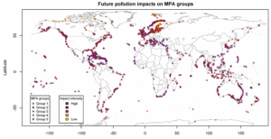
In their 2015 publication, Partelow et al. (see References) analyzed the extent of pollution exposure on global marine protected areas (MPAs). As a starting point, they characterized protected areas based on five different attributes that they considered critical in defining an MPA's biophysical signature, which were • distance from the shore, • amount of biodiversity, • bathymetry (= the ocean's depth relative to the sea level), • mean surface temperature, and • mean sea surface salinity.
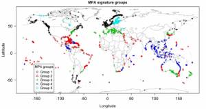
They projected each attribute as one layer of raster data into the ArcMAP software, and global marine protected areas as another layer. They selected 2,111 areas that fit their research intent of focusing on conservation, and exported all data into R for statistical analyses. Each MPA was now attributed with data for each of the five categories, based on which a cluster analysis was conducted. This led to the designation of five kinds of groups.
The five groups differ in terms of their biophysical characteristics, which is why the cluster analysis grouped them together. Group 1 is distinctive through lower mean sea surface temperatures and lower biodiversity levels. Group 2 represents MPAs with higher bathymetry and higher shore distances. Group 3 have mid-range biodiversity values and seasonal sea surface temperatures. Group 4 has very high biodiversity values and shallow waters. Group 5 has a significantly lower mean sea surface salinity.
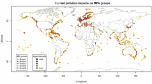
In the next step, the researchers added data on pollution in two forms. Current pollution data was gathered as secondary data from another study, representing current impacts on the MPAs such as shipping traffic frequency, fishing rates, invasive species and others. This data was projected as another raster layer in ArcMAP and attributed to the MPAs in R. Also, future pollution data was added as a layer regarding the impacts of change for UV light on the ocean surface, changes in ocean acidification rates, and sea surface temperature changes. This data was based on changes in these variables until today and was considered representative of which pressure exists on the ecosystems.
Based on their analysis of current and future pollution impacts on the MPAs, the authors concluded that:
• a majority of current MPAs is affected by pollution,
• current pollution is strongest in the global north, while future pollution may impact tropical marine ecosystems more strongly,
• future pollution will on average be higher, and have stronger effects, than current pollution for all MPA groups, and
• an increase in rates of future pollution may be less dependent on the biophysical characteristics of the MPAs than current pollution.
Based on their results, the authors propose diverse recommendations for conservation management. Overall, the study shows how spatial raster data can help assess the state of ecosystems and guide conservation management, both on a global and local scale.
Key Publications
• Snow, John. 1855. On the mode of communication of cholera. John Churchill.
References
Further Information
• Some information on the importance of Howard T. Fisher's work for GIS.
• A QGIS overview on vector data and raster data.
• Another overview of raster and vector data by gisgeography.com.
The authors of this article are Prof. Henrik von Wehrden and Neha Chauhan.
