Difference between revisions of "Data formats"
| Line 113: | Line 113: | ||
='''Back of the envelope statistics'''= | ='''Back of the envelope statistics'''= | ||
| − | Back of the envelope calculations are rough estimates that are made on the small piece of paper, hence the name. These are extremely helpful to get a quick estimate about the basic numbers for a given formula of principle, thus enable us to get her quick calculation with either the goal to check for the plausibility of the assumption, or to derive a simple explanation of the more complex issue. Back of the envelope calculations can be for instance helpful when you want to get a rough estimate about an idea that can be expressed in numbers. Prominent examples for back of the envelope calculations include the dominant character coding of the World Wide Web and the development of the laser. Back of the envelope calculations are fantastic within sustainability science, I think, because they can help us to illustrate complex issues in a more simple form, and they can serve as her guideline for a quick planning. Therefore, they can be used within other more complex forms of methodological applications, such as scenario planning. By quickly calculating different scenarios we can for instance make her plausibility check and focus our approaches on-the-fly. I encourage you to learn back of the envelope calculations in your everyday life, as many of us already do. I learned to love "Tydlig", which is one of the best apps I ever used, but unfortunately I only know her version for my Apple devices. It can however be quite helpful to break numbers down into overall estimates, as the video below illustrates. | + | [https://www.investopedia.com/terms/b/back-of-the-envelope-calculation.asp Back of the envelope calculations] are rough estimates that are made on the small piece of paper, hence the name. These are extremely helpful to get a quick estimate about the basic numbers for a given formula of principle, thus enable us to get her [https://www.stlouisfed.org/on-the-economy/2020/march/back-envelope-estimates-next-quarters-unemployment-rate quick calculation] with either the goal to check for the plausibility of the assumption, or to derive a simple explanation of the more complex issue. Back of the envelope calculations can be for instance helpful when you want to get a rough estimate about an idea that can be expressed in numbers. Prominent examples for back of the envelope calculations include the dominant character coding of the World Wide Web and the development of the laser. Back of the envelope calculations are fantastic within sustainability science, I think, because they can help us to illustrate complex issues in a more simple form, and they can serve as her guideline for a quick planning. Therefore, they can be used within other more complex forms of methodological applications, such as scenario planning. By quickly calculating different scenarios we can for instance make her plausibility check and focus our approaches on-the-fly. I encourage you to learn back of the envelope calculations in your [https://www.youtube.com/watch?v=bAU1MLRwh7c everyday life], as many of us already do. I learned to love "Tydlig", which is one of the best apps I ever used, but unfortunately I only know her version for my Apple devices. It can however be quite helpful to break numbers down into overall estimates, as the video below illustrates. |
| − | + | ='''External links'''= | |
| − | + | =='''Videos'''== | |
[https://www.youtube.com/watch?v=7p2a9B35Xn0 Intelligence Quotient]: Answering the question if the IQ really measures how smart you are | [https://www.youtube.com/watch?v=7p2a9B35Xn0 Intelligence Quotient]: Answering the question if the IQ really measures how smart you are | ||
| Line 130: | Line 130: | ||
[https://www.youtube.com/watch?v=mk8tOD0t8M0 Mode, Median, Mean, Range & Standard Deviation]: A good summary | [https://www.youtube.com/watch?v=mk8tOD0t8M0 Mode, Median, Mean, Range & Standard Deviation]: A good summary | ||
| − | ==='''Articles''' | + | [https://www.youtube.com/watch?v=bAU1MLRwh7c Back-of-envelope office space conundrum]: A real life example |
| + | |||
| + | =='''Articles'''== | ||
[https://www.factmonster.com/math-science/weights-measures/metric-weights-and-measures Measurement]: Reflecting upon different measurement systems across the globe | [https://www.factmonster.com/math-science/weights-measures/metric-weights-and-measures Measurement]: Reflecting upon different measurement systems across the globe | ||
| Line 149: | Line 151: | ||
[http://intellspot.com/descriptive-statistics-examples/ Descriptive Statistics]: A detailed summary | [http://intellspot.com/descriptive-statistics-examples/ Descriptive Statistics]: A detailed summary | ||
| + | |||
| + | [https://www.investopedia.com/terms/b/back-of-the-envelope-calculation.asp Back of the Envelope Calculation]: An explanation | ||
| + | |||
| + | [https://www.stlouisfed.org/on-the-economy/2020/march/back-envelope-estimates-next-quarters-unemployment-rate Estimates of Next Quarter’s Unemployment Rate]: An Example For Back of the Envelope Statistics | ||
Revision as of 09:33, 8 April 2020
(The author of this entry is Henrik von Wehrden.)
Contents
Data formats in statistics
The format of your data influences everything else you do further down the road. To paraphrase a proverb, data is in a format, and the format is the data. Therefore, it is essential to know which different data formats exist, and how these may be beneficial, and where you may encounter pitfalls.
An example of different data formats
Imagine you want to track your diet. Many people do this today, there are diet books and advice everywhere, much information has become available. Now you want to start and become more familiar with what you eat. How would you start? Counting calories? Differentiating between carbs, fat and greens? Maybe you just count every time you ate a Pizza? Or ice cream? Or too much? There are many ways to measure your diet. And these measurement can be in different data formats.
Continuous data
We are all familiar with continuous numbers. Much of our society is ruled by these numbers, and thus much of data analysed in statistics is represented by continuous numbers. Since much of modern measurement is automatically within a given predefined system, we often do not have to worry too much how data looks like. Take for instance weight or size. Within middle Europe, this is clearly measured in grams or Kilograms, and in Centimeters or Meters, respectively. However, if you move to the US, it becomes a whole different story, because of the metric system, or the lack thereof. Suddenly you are some feet tall, and you may weigh some "stones". Many diverse measurement systems exist, and one has to be aware of how these were measured. Take temperature, which I would measure in Celsius. However, my friends from the US are stuck with Fahrenheit, which to me is entirely counter-intuitive. I think the fact that water freezes at 0°C, and boils at 100°C makes Celsius almost divine; however looking at the lowest possible temperature (-273 °C) already showcases that Celsius may not be so divine after all. Hence these systems are constructs, and these constructs build on continuous numbers. Another prominent construct expressed in continuous numbers is the Intelligence Quotient. Being highly questionable from a research standpoint, it serves nevertheless as a basis to identify the elitist Mensa Members. With an IQ of 100, you are considered to be average. Yet, already the expression of what higher and lower numbers mean is widely disagreed upon. This showcases that continuous numbers are widely used to express data, but we have to be aware that this then still represents normative information.
Examples
- the number Pi: 3,14159265359...
- typical weigh of a naked mole-rat: 30 grams
- the height of the Empire State Building: 443,2m
- the melting temperature of dark choclate: 45-50°C
Ordinal data
Remember your school grades? A "1" is the best grade in the barman system, but is it twice as good than a "2"? Hardly. Such grades are ordinal numbers. These are a system of numbers that are ranked in some sense, but the numbers per se do not necessarily reflect a numeric system. In other words, they are highly normative and contested. A "2" might be a good grade for some, and a disaster for others. Ordinal formats are often clearly defined scales that allow people to grade, evaluate or rank certain information. One of the most prominent examples is the Likert scale that is often used in Psychology. In this case, the scaling is often not reflected in numbers at all, but in levels such as "Strongly agree" or "disagree". Such constructed scales may make a true statistician very unhappy, since these scales are hard to analyse, yet there is hardly any alternative since it also does not make any sense to ask: "How happy are you on a scale from 1 to 100?". Therefore, ordinal scales are often relevant in order to create a scaling system that allows for wide comparability or even becomes a norm, such as school grades. My advise would be to use ordinal scales when this is common practise in this branch of science. Read other studies in the field, and then decide. These are highly constructed scales, hence there needs to be clear reasoning on why you want to use them.
Nominal data
Whenever you have ordinal data that represents levels that cannot be ranked, it is called nominal data. An example would be different ethnicities, of different types of gender. This already highlights, that we are here confronted by often completely different worldviews, thus nominal data represents a stark case of a normative view of the world. Gender is a prominent example, since some people still define gender by a biological stereotype (Female/Male), which according to my worldview is clearly wrong. Nominal data formats hence demand an even clearer reflection than ordinal data, where at least you may say that a certain school grade is higher than another one. This is not the case for nominal data. Therefore, one has to be extra careful about the implications, that a specific constructed scale may imply.
Binary data
The most reduced data format is binary data, which basically consists of two levels. In computer science this may be a simple 0 and 1, but the great breakthrough of that dataset was early on in the insurance business as well as in medicine, where dead or alive are often the most fundamental questions. Binary information is clearly simplistic, but quite often this matches with a certain view of reality. Take the example of being able to play an instrument. If somebody asks you whether you can play the piano, you will probably say yes or no. You may most likely not qualify your answer by saying "I play better than a monkey, but worse than Horowitz". Some modest folks may say "I can play a bit", or "I am not very good", or "I used to be better", but very often people answer yes or no. Hence binary data allows for a simple view of reality, and this may often match with the world how we perceive it. But be aware: Other people may have a less simple view.
Choosing the right data format
You may wonder now how to choose the right data format. The answer to that is quite simple. Any data format should be as simple as possible, and as complex as necessary. Follow Occam's razor, and you will be fine. Of course this sounds appealing, but how to know what is too simple, and what is too complex. Here, I suggest you build on the available literature. Read other publications that examined a certain phenomenon before, these papers may guide you in choosing the right scale.
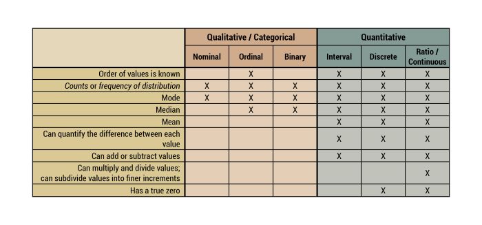
Overview about characteristics of some data formats
A word on indices in statistics
In economics and finance, an index is a statistical measure of change in a representative group of individual data points.
Descriptive statistics
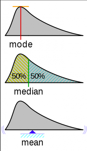
Descriptive stats are what most people think stats are all about. Many people believe that the simple observation of more or less, or the mere calculation of an average value is what statistics are all about. The median often shows us such descriptive statistics in whimsical bar plots or even pie charts. Hence many numbers can be compiled into descriptive statistics, which can help to gain an overview about simple understanding of more complex numbers. The emphasis is however, that this is not an analysis. Instead such a compilation of data can only aid some overview. In order to be versatile in this type of descriptive statistics, it is important to know some basics.
Mean
The mean is the average of numbers you can simply calculated by adding up all the numbers and then divide them by how many numbers there are in total.
Median
The medium is the middle number in assorted set of numbers. It can be substantially different from the mean value for instance, when you have large gaps or cover wide ranges within your data. Therefore, it is more robust against outliers.
Mode
The mode is the value that appears to most often it can be helpful in large datasets are when you have a lot of repetitions within the dataset.
Range
The range is simply the difference between the lowest and the highest value and consequently it can also be calculated like this.
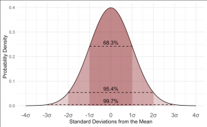
Standard deviation
#descriptive statistics using the Swiss dataset
swiss
swiss_data<-swiss

#we are choosing the column fertility for this example
#let's begin with calculating the mean
mean(swiss_data$Fertility)

#median
median(swiss_data$Fertility)

#range
range(swiss_data$Fertility)

#standard deviation
sd(swiss_data$Fertility)

#summary - includes minimum, maximum, mean, median, 1st & 3rd Quartile
summary(swiss_data$Fertility)
Back of the envelope statistics
Back of the envelope calculations are rough estimates that are made on the small piece of paper, hence the name. These are extremely helpful to get a quick estimate about the basic numbers for a given formula of principle, thus enable us to get her quick calculation with either the goal to check for the plausibility of the assumption, or to derive a simple explanation of the more complex issue. Back of the envelope calculations can be for instance helpful when you want to get a rough estimate about an idea that can be expressed in numbers. Prominent examples for back of the envelope calculations include the dominant character coding of the World Wide Web and the development of the laser. Back of the envelope calculations are fantastic within sustainability science, I think, because they can help us to illustrate complex issues in a more simple form, and they can serve as her guideline for a quick planning. Therefore, they can be used within other more complex forms of methodological applications, such as scenario planning. By quickly calculating different scenarios we can for instance make her plausibility check and focus our approaches on-the-fly. I encourage you to learn back of the envelope calculations in your everyday life, as many of us already do. I learned to love "Tydlig", which is one of the best apps I ever used, but unfortunately I only know her version for my Apple devices. It can however be quite helpful to break numbers down into overall estimates, as the video below illustrates.
External links
Videos
Intelligence Quotient: Answering the question if the IQ really measures how smart you are
Different data formats: An overview
Binary data: How our computer works
Descriptive Statistics: A whole video series about descriptive statistics from the Khan academy
Standard Deviation: A brief explanation
Mode, Median, Mean, Range & Standard Deviation: A good summary
Back-of-envelope office space conundrum: A real life example
Articles
Measurement: Reflecting upon different measurement systems across the globe
IQ: An explanation
Nominal vs. ordinal data: A comparison
Likert scale: The most popular rating scale
Ordinal data: Limitations
Nominal data: An explanation
Binary data: An explanation
Descriptive Statistics: An introduction
Descriptive Statistics: A detailed summary
Back of the Envelope Calculation: An explanation
Estimates of Next Quarter’s Unemployment Rate: An Example For Back of the Envelope Statistics


