Sankey Diagrams
Note: This entry revolves specifically around Sankey diagrams. For more general information on quantitative data visualisation, please refer to Introduction to statistical figures.
In short: Sankey diagrams show the flows, where a width of each flow is proportional to the quantity represented. The flows are called links. Links connect entities (called nodes) and may converge or diverge. Sankey diagrams help to understand a many-to-many mapping between two domains or multiple paths of data through a set of states. Since it is possible to see the considered entities / nodes and links between them, one can say, that there is an information about the structure of the defined system. The source node is the node where the flow originates. The target node is the node where the flow ends. The nodes are usually represented as rectangles with a label.
History
Sankey diagram is named after Irish engineer Matthew H. Sankey, who created a diagram of steam engine efficiency, that used arrows having widths proportional to heat loss. The illustration is dated to 1898. In the 20th century the Austrian mechanical engineer Alois Riedler began to apply flow charts to analyze the power and the energy losses of passenger cars. Also some government departments used it for financial goals, focusing on material and energy efficiency in the beginning of the 20th century.
Why do we use it?
There are many ways to use Sankey diagram. It can show data, energy, capacity, materials, costs, social and biological data (population, migration) and so on. Spheres, such as energy, facility, supply chain management, business, marketing analysis, apply these diagrams constantly. The use case examples can be found here.
Sankey diagram can be perceived intuitively. There is no standard notation of how the diagram should look, therefore, diverse options exist. The viewer may pay attention on the largest flow width, linked entities or notice the losses of the definite process.
R code
A package networkD3 has tools to build Sankey diagrams in R. To draw the plot, dplyrdplyr is also needed. Install packages, and then follow the code.
library(networkD3)
library(dplyr)

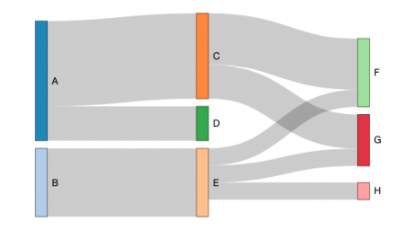
# Step 1: Define each piece of the diagram. One piece consists of source node, target node and width (value). Thus, we connect "A" node with "C" node, where the link quantity is 5. (Source, target and value may be specified by columns from your own table.)
links <- data.frame(
  source=c("A","A", "B", "C", "C", "E", "E", "E"),
  target=c("C","D", "E", "F", "G", "F", "G", "H"),
  value=c(5, 2, 4, 3, 2, 1, 1, 1)
)

# Step 2: Name the nodes to show it on the plot. We take unique names from the dataframe, defined on the step 1.
nodes <- data.frame(
  name=c(as.character(links$source), as.character(links$target)) %>% unique()
)

# Step 3: Take ID from node names. networkD3 doesn`t work with categorical data. The easiest way to "transform" to integer is getting ID of node with necessary name.
links$ID_source <- match(links$source, nodes$name)-1
links$ID_target <- match(links$target, nodes$name)-1

# Step 4: Define settings of the plot, using created links and nodes.
sankey_plot_example <- sankeyNetwork(Links = links, Nodes = nodes,
                   Source = "ID_source", Target = "ID_target",
                   Value = "value", NodeID = "name",fontSize = 12, height=300, sinksRight=FALSE #fontFamily = "sans-serif", nodePadding=40
)
# Step 5: Show the plot.
sankey_plot_example #Fig.1
Additional arguments for the plot settings can be found here.
On the plot it is possible to see detailed information about the link by holding the cursor on the flow. Furthermore, there is an opportunity to do a quick analysis of this data. In this case, “E” gets from “B” 4, but sends to “F”, “G” and “H” only 3 in total. 1 is missing. One can elaborate on it, depending on the data.
The author of this entry is Evgeniya Zakharova.
