How To Create Synthetic Data with CTGAN
THIS ARTICLE IS STILL IN EDITING MODE
Contents
Introduction
Working with data poses challenges such as limited datasets, privacy constraints, and biases. Synthetic data, distinct from fake data, addresses some of these issues by generating new data from existing datasets, aiming to approximate their statistical characteristics.
Synthetic datasets serve diverse purposes, particularly in overcoming challenges like limited exploratory analyses because of privacy constraints, underrepresentation or imbalance in datasets, especially crucial when expensive or challenging data generation hinders model`s development.
CTGAN, an extension of GANs (Generative Adversarial Networks), stands out as a recent advancement in synthetic data generation. Originally designed for image generation, CTGAN, or Conditional Tabular GAN, has expanded its application to tabular data. Unlike other methods, CTGAN excels in handling heterogeneous data, incorporating both numeric and categorical columns through its adversarial network approach.
The "Adversarial" portion of the network stems from the conceptual nature: we differentiate a generator, which creates the synthetic data and is aimed at fooling the discriminator - a second model that aims at differentiating synthetic and real data. The less successful the discriminator in this regard, the better the evaluation of the generator. But what are the actual intricacies of their combat?
In general, synthetic data generation requires a synthesizer G, that learns from a Table T to create Tsyn. T contains Nc continuous and Nd discrete columns that are considered random variables that follow some, for us unknown, joint distribution. One row can thus be considered as one observation from the said joint distribution. After learning from T, G samples rows to create Tsyn.
Dealing with tabular data comes with certain issues: The first challenge pertains to the lack of normal distributions, crucial for GAN networks. Subsequent layers in GAN networks assume normal distributions in their activation functions, a norm in pixel-related tasks. However, real-world data often exhibits multi-modal distributions with various peaks. CTGAN addresses this challenge through mode-specific normalization. In this method, data is normalized concerning a specific "peak" and represented as a one-hot vector. This vector encapsulates details about the normalization and identifies the mode to which an observation belongs (e.g. a value c belongs to peak 3 and has a normalized value of cn => c = [cn, 0, 0, 1]). This approach enhances the representation of the probability of a given datapoint, serving as the foundation for the sampling of new data.
To adress issues related to categorial variables, e.g. imbalances or their respective conditional relationship with other variables, CTGAN introduces conditional generation - data is not sampled at random, but always in regards to the manifestation of certain categorial variables - how likely is a given row with variable X being equal to k. The generator aims at reproducing those conditional probabilities. Returning back to the idea that a row in an obversation of the joint distribution of all datasets, we can deduce that:
where, the probability of a given row is reproduceable as the sum of the conditional probability of that row, given that the discrete column Di* has the value k*, multiplied with the general probability of of that value for Di* (based on the Bayesian Theorem). Source: Xu et al., 2019.
Python example
Let us now load data and train our synthesizer.
Loading and prepping data
!pip install sdv # this includes the CTGAN
!pip install sdmetrics  # for later evaluations
import pandas as pd
import seaborn as sns
import matplotlib.pyplot as plt
import warnings

filepath = r"your_filepath.csv"
data = pd.read_csv(filepath)
data = data.loc[:, ["HAEMATOCRIT", "HAEMOGLOBINS", "LEUCOCYTE", "AGE", "SEX", "SOURCE"]]

print(data.head(), data.info())
To differentiate between the discrete and continous variables, which is important as we have seen, we need metadata on our dataframe. For these purposes it is just a dictionary of the datatypes of each column.
from sdv.metadata import SingleTableMetadata

metadata = SingleTableMetadata()
metadata.detect_from_dataframe(data)
Synthesize Data
When creating a new instance of a CTGAN synthesizer, one needs to specify the number of epochs (iterations of a neural network). Each epoch prolongs the fitting of the model. For the present purposes we will go with a very high number, namely 2000 epochs. We would recommend however to start with 100 and use higher numbers based on the metrics we define later.
synthesizer_2000 = CTGANSynthesizer(
    metadata,
    enforce_rounding=False,
    epochs=2000,
    verbose=True
)
synthesizer_2000.fit(data)
Gen. (-0.62) | Discrim. (0.13): 100%|██████████| 2000/2000 [35:50<00:00, 1.08s/it]
Now, we sample the synthetic data. Specify the desired size of the sampled data.
synthetic_data = synthesizer_2000.sample(num_rows=len(data))
synthetic_data.head(4)
| HAEMATOCRIT | HAEMOGLOBINS | LEUCOCYTE | AGE | SEX | SOURCE | |
|---|---|---|---|---|---|---|
| 0 | 24.525854 | 8.879837 | 6.071217 | 73 | M | in |
| 1 | 38.406226 | 13.573502 | 2.424276 | 23 | F | out |
| 2 | 29.579414 | 12.275332 | 30.470946 | 1 | M | in |
| 3 | 28.512210 | 11.071905 | 10.630228 | 42 | M | in |
Plot the loss
The most important evaluation tool is the generator loss. The generator loss is adapted to force the generator to create a sample with the conditions laid out by the real data, e.g. certain joint distributions, certain column-pair relationships and so on. CTGAN penalizes deviations from these conditions by adding the cross-entropy error between the conditional vector and the generated sample to the loss term, which the generator aims at minimizing. This forces the produced samples to abide by the condition. To understand this loss function a bit better, we refer to the idea of the loss functions of the adversaries. Refer to this table:
| Neural Network | Score | Interpretation |
|---|---|---|
| Discriminator | Zero (or positive) | The discriminator is not good at telling apart the real vs. synthetic data. |
| Discriminator | Negative | The discriminator is able to easily tell apart the real vs. the synthetic data. |
| Generator | Zero (or positive) | The discriminator can tell that the synthetic data is synthetic — the generator cannot fool it. |
| Generator | Negative | The discriminator cannot tell that the synthetic data is synthetic — the generator is able to fool: it. |
As we can see, negative values in regards to our generator are positive. They indicate our G can fool D, that is mostly returning close to zero, but rarely negative. We want our loss functions thus to map as follows: the discriminator loss should oscillate at 0, indicating poor performance and our generator loss should stabilize within a negative interval, indicating good performance. It is important that we can see some sort of stability in the generator loss, otherwise, we run the risk that our CTGAN synthesizer might not have learned properly from the data. If the loss stabilizes early on in the epoch run, it is recommended then to limit the total number, as each epoche is resource-intensive. Let us now plot the losses.
losses = synthesizer_2000.get_loss_values()

losses['Generator Loss'] = losses['Generator Loss'].apply(lambda x: x.item())
losses['Discriminator Loss'] = losses['Discriminator Loss'].apply(lambda x: x.item())

plt.figure(figsize=(30, 8))
plt.plot(losses['Epoch'], losses['Generator Loss'], label='Generator Loss')
plt.plot(losses['Epoch'], losses['Discriminator Loss'], label='Discriminator Loss')
plt.xlabel('Epoch')
plt.ylabel('Loss')
plt.title('Generator and Discriminator Loss Over Epochs')
plt.legend()
plt.show()

Figure1: Generator and Discriminator Loss over epochs
We can tell that the Generator and Discriminator Loss are both formidable opponents, but towards the last epochs, our Generator seems to stabilize within its negative winning position. It might be interesting to see what happens, if we extend the number of epochs (more on that later).
Further metrics to estimate the fit of the synthetic data
Beyond epochs, it is important to also look at further qualities of the data. Most importantly, we are interested in the distributional comparison between both numerical and discrete columns and the relationships between them. Firstly, we need to make sure that our basic data structure and data validity is fully correct, i.e. we have the correct columns and types of data in those columns. For that, we utilize the diagnostic report of SDMetrics and expect a perfect score of 100%. Anything below that demands further scrutinity with get_details(property_name=…).
metadata_dict = metadata.to_dict()

from sdmetrics.reports.single_table import DiagnosticReport

diagnosticreport = DiagnosticReport()
diagnosticreport.generate(data, synthetic_data, metadata_dict)
Generating report ...
(1/2) Evaluating Data Validity: : 100%|██████████| 6/6 [00:00<00:00, 69.31it/s]
(2/2) Evaluating Data Structure: : 100%|██████████| 1/1 [00:00<00:00, 9915.61it/s]
Overall Score: 100.0%
Properties:
- Data Validity: 100.0%
- Data Structure: 100.0%
After that we can look at the quality report that returns an overall score for the underlying column shape (the distribution likeness) and the column pair trends (the relationships). They range from 0 (opposite quality) to 1 (identity matching). These scores will rarely be at 1/100%, but should be higher than 80%. It is recommended to take closer look at the correlations (get_details(..)) or visualize the results. In general, the quality is the mathematical match to the real data - the fidelity of Tsyn.
from sdmetrics.reports.single_table import QualityReport

qualityreport = QualityReport()

qualityreport.generate(data, synthetic_data, metadata_dict, verbose = False)

print(qualityreport.get_score()) # Out: 0.8906988469261656
print(qualityreport.get_properties())
# print(qualityreport.get_details("Column Pair Trends"))
| Property | Score |
|---|---|
| 0 Column Shapes | 0.938765 |
| 1 Column Pair Trends | 0.842632 |
The score is close to 90%, which is great and the subscores also seem satisfactory. Deeper looks into the differences that might be deemed disturbing could subsequently inform hyperparameter adjustments.
Let us now visualize the results.
data_corr = data.loc[:, ["HAEMATOCRIT", "HAEMOGLOBINS", "LEUCOCYTE", "AGE"]]
syn_corr = synthetic_data.loc[:, ["HAEMATOCRIT", "HAEMOGLOBINS", "LEUCOCYTE", "AGE"]]

corr_matrix_df1 = data_corr.corr()
corr_matrix_df2 = syn_corr.corr()

fig, axes = plt.subplots(nrows=1, ncols=2, figsize=(12, 6))

sns.heatmap(corr_matrix_df1, annot=True, fmt=".2f", cmap='coolwarm', cbar_kws={'label': 'Correlation'}, ax=axes[0])
axes[0].set_title('Correlation Matrix - Real Data')

sns.heatmap(corr_matrix_df2, annot=True, fmt=".2f", cmap='coolwarm', cbar_kws={'label': 'Correlation'}, ax=axes[1])
axes[1].set_title('Correlation Matrix - Synthetic Data')

plt.tight_layout()
plt.show() # Figure 2
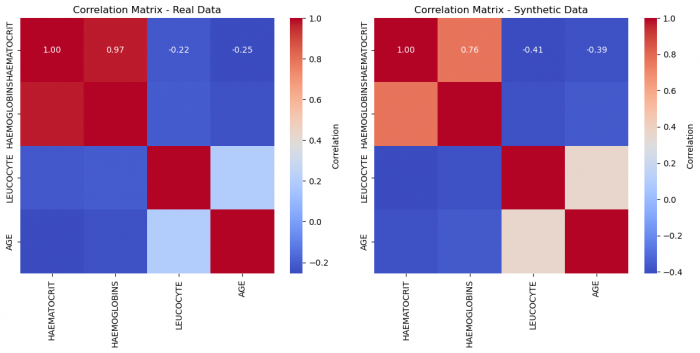
Figure 2: Correlation matrices of real and synthetic data, respectively
variables_to_compare = ["HAEMATOCRIT", "HAEMOGLOBINS", "LEUCOCYTE", "AGE"]
patterns = ['-', '--', ':', '-.']  # Add another pattern

warnings.filterwarnings("ignore")
plt.figure(figsize=(15, 8))

for i, variable in enumerate(variables_to_compare):
    sns.kdeplot(data[variable], label=f'{variable} - Real Data', shade=True, linestyle=patterns[i])
    sns.kdeplot(synthetic_data[variable], label=f'{variable} - Synthetic Data', shade=True, linestyle=patterns[i])

plt.xlabel('Variable Values')
plt.ylabel('Density')
plt.title('Distribution of Variables in Real and Synthetic Data')
plt.legend()
plt.show() # Figure 3
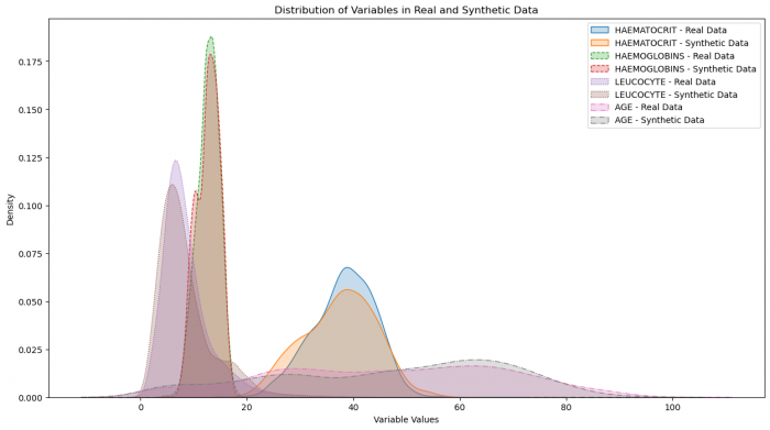
Figure 3: Distribution of variables in real and synthetic data
plt.figure(figsize=(10, 5))
plt.subplot(1, 2, 1)
synthetic_data['SEX'].value_counts().plot(kind='bar', title='Synthetic Data - SEX')

plt.subplot(1, 2, 2)
data['SEX'].value_counts().plot(kind='bar', title='Real Data - SEX')

plt.show() # Figure 4

plt.figure(figsize=(10, 5))
plt.subplot(1, 2, 1)
synthetic_data['SOURCE'].value_counts().plot(kind='bar', title='Synthetic Data - SOURCE')

plt.subplot(1, 2, 2)
data['SOURCE'].value_counts().plot(kind='bar', title='Real Data - SOURCE')

plt.show() # Figure 4
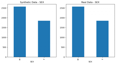
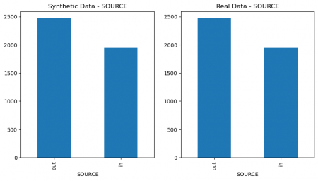
Figure 4: Columns` values comparison of real and synthetic data
data_subset = data[['HAEMATOCRIT', 'HAEMOGLOBINS', 'LEUCOCYTE', 'AGE']]
synthetic_data_subset = synthetic_data[['HAEMATOCRIT', 'HAEMOGLOBINS', 'LEUCOCYTE', 'AGE']]

data_subset['Dataset'] = 'Real Data'
synthetic_data_subset['Dataset'] = 'Synthetic Data'
combined_data = pd.concat([data_subset, synthetic_data_subset])

fig, axes = plt.subplots(nrows=1, ncols=4, figsize=(15, 5))

for i, variable in enumerate(['HAEMATOCRIT', 'HAEMOGLOBINS', 'LEUCOCYTE', 'AGE']):
    sns.boxplot(x='Dataset', y=variable, data=combined_data, ax=axes[i])
    axes[i].set_title(f'Box Plot - {variable} Comparison')

plt.tight_layout()

plt.show() # Figure 5

Figure 5: Comparison of features of real and synthetic data
The data distributions and relationships look very good, when we compare to the real data. This suggests that an epoch of 2000 definitely sufficed, but may still have been higher than necessary. But the opposite could also be argued since the loss stabilized later.
It is to be noted that each sampling of data is different and eventhough loss looks good, the data quality could vary. We would thus recommend trying different iterations on the same epoch number if you have good loss development but mediocre quality.
This bring us to the topic of hyperparameters: epochs is the best studied one in regards to CTGAN. There is however no further one-size-fits-all solution for the other optional hyperparameters detailed in the SDV documentation. It thus makes sense to try different variations and compare losses and further reports accordingly. It is expected that the number of epochs correlates with the quality of our data. Let us investigate that.
The importance of Epochs
synthesizer = CTGANSynthesizer(
    metadata,
    enforce_rounding=False,
    epochs=3000,
    verbose=True
)
synthesizer.fit(data)

losses = synthesizer.get_loss_values()

losses['Generator Loss'] = losses['Generator Loss'].apply(lambda x: x.item())
losses['Discriminator Loss'] = losses['Discriminator Loss'].apply(lambda x: x.item())

plt.figure(figsize=(30, 8))
plt.plot(losses['Epoch'], losses['Generator Loss'], label='Generator Loss')
plt.plot(losses['Epoch'], losses['Discriminator Loss'], label='Discriminator Loss')
plt.xlabel('Epoch')
plt.ylabel('Loss')
plt.title(f'Generator and Discriminator Loss Over Epochs, Epochs == {el}')
plt.legend()
plt.show() # Figure 6

from sdmetrics.reports.single_table import DiagnosticReport

diagnosticreport = DiagnosticReport()
diagnosticreport.generate(data, synthetic_data, metadata_dict, verbose=True)

from sdmetrics.reports.single_table import QualityReport

qualityreport = QualityReport()
qualityreport.generate(data, synthetic_data, metadata_dict, verbose = True)

Figure 6: Generator and Discriminator Loss over epochs
Generating report ...
(1/2) Evaluating Data Validity: : 100%|██████████| 6/6 [00:00<00:00, 293.99it/s]
(2/2) Evaluating Data Structure: : 100%|██████████| 1/1 [00:00<00:00, 125.38it/s]
Overall Score: 100.0%
Properties:
- Data Validity: 100.0%
- Data Structure: 100.0%
Generating report ...
(1/2) Evaluating Column Shapes: : 100%|██████████| 6/6 [00:00<00:00, 188.32it/s]
(2/2) Evaluating Column Pair Trends: : 100%|██████████| 15/15 [00:00<00:00, 33.55it/s]
Overall Score: 93.27%
Properties:
- Column Shapes: 95.62%
- Column Pair Trends: 90.91%
We can tell that the loss function properly stabilized beyond 2000, and the quality improved. Let us remember the quality at epochs = 2000:
| Metric | Score |
|---|---|
| Score | 0.8906988469261656 |
| Column Shapes | 0.938765 |
| Column Pair Trends | 0.842632 |
The Shape did not improve too much, but our correlations did. Let us look at the new correlation heatmap:
data_corr = data.loc[:, ["HAEMATOCRIT", "HAEMOGLOBINS", "LEUCOCYTE", "AGE"]]
syn_corr = synthetic_data.loc[:, ["HAEMATOCRIT", "HAEMOGLOBINS", "LEUCOCYTE", "AGE"]]

corr_matrix_df1 = data_corr.corr()
corr_matrix_df2 = syn_corr.corr()

fig, axes = plt.subplots(nrows=1, ncols=2, figsize=(12, 6))

sns.heatmap(corr_matrix_df1, annot=True, fmt=".2f", cmap='coolwarm', cbar_kws={'label': 'Correlation'}, ax=axes[0])
axes[0].set_title('Correlation Matrix - Real Data')

sns.heatmap(corr_matrix_df2, annot=True, fmt=".2f", cmap='coolwarm', cbar_kws={'label': 'Correlation'}, ax=axes[1])
axes[1].set_title('Correlation Matrix - Synthetic Data')

plt.tight_layout()
plt.show() # Figure 7
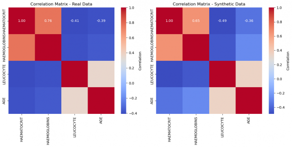
Figure 7: Correlation matrices of real and synthetic data, respectively
Even visually, we can deduce a much better fit! This suggests that for this given dataset, we needed a high number of epochs to attain a very good quality. This number will vary and with large enough datasets as inputs, the network demands less iterations. Trial and Error is the name of the game.
Limitations
- Optimizing hyperparameters for diverse datasets can be a challenging process that often involves trial and error.
- The model encounters difficulties with high-cardinality features, characterized by numerous unique categories.
- Skewed distributions or datasets with a substantial number of constant values pose challenges.
- In the case of small datasets, the accuracy of synthesis may decrease, demanding significant computational resources and time, especially for larger datasets.
Conclusion
The effectiveness of CTGAN in generating synthetic data is heavily reliant on both the quality and quantity of the training data. It particularly excels when dealing with categorical data and intricate distributions. Fine-tuning the synthesizer's parameters, including the number of epochs, is essential to tailor its performance to the specific characteristics of your dataset.
While CTGAN can effectively capture the overall data distribution, it may fall short in identifying crucial correlations. The model might struggle to capture nuanced information shared among different variables, rendering it imperfect in certain scenarios. It is thus important to be very diligent when investigating the properties of the synthetic dataset.
It can however be a very useful tool towards bridging some major gaps in work with data.
The author of this entry is Niket Kapoor.
