Time Series Data in Python
THIS ARTICLE IS STILL IN EDITING MODE
Contents
What is Time Series Data
Time series data is a sequence of data points collected at regular intervals of time. It often occurs in fields like engineering, finance or economics to analyze trends and patterns over time. Time series data is typically numeric data, for example the stock price of a specific stock, sampled at an hourly interval, over a time frame of several months. It could also be sensory data from a fitness tracker, sampling the heart rate every 30 seconds, or a GPS track of the last run. In this article, we will see examples from a household energy consumption dataset having data for longer than a year, obtained from Kaggle (Download date: 20.12.2022).
import numpy as np ## to prepare your data
import pandas as pd ## to prepare your data
import plotly.express as px ## to visualize your data
import os ## to set your working directory
It is important to check in which folder Python believes to be working in. If you have saved the dataset in another folder, you can either change the working directory or move the dataset. Make sure your dataset is in a location that is easy to find and does not have a long path since this can produce errors in setting the working directory.
##Check current working directory
current_dir = os.getcwd()
print(current_dir)
## Change working directory if needed
os.chdir('/path/to/your/directory')
df = pd.read_csv('D202.csv')
df.head()
By looking at the first few rows we can see that the electric usage is documented every 15 minutes. This means that one day has 4*24 data points. We can also see the different columns that provide further information about the electricity consumption. Next, let's choose the most relevant columns for our research:
## Let's choose the most relevant columns for our research:
df['start_date'] = pd.to_datetime(df['DATE'] + ' ' + df['START TIME'])
df['cost_dollars'] = df['COST'].apply(lambda x: float(x[1:]))
df.rename(columns={'USAGE': 'usage_kwh'}, inplace=True)
df = df.drop(columns=['TYPE', 'UNITS', 'DATE', 'START TIME', 'END TIME', 'NOTES', 'COST']).set_index('start_date')
We select DATE and START time to create a dataframe called start_date. These two columns are transformed to a date and time format. We then create the dataframe “cost_dollars” by creating the dataframe based on the COST column and transform it to float data. The USAGE column is then renamed and we drop a number of columns that are not needed.
The dataset contains about 2 years of data, we will only have a look at the first 2 weeks. For this we use iloc. iloc is an indexing method (by Pandas) with which you can chose a slice of your dataset based on their numerical position. Note that it follows the logic of exclusive indexing, meaning that the end index provided is not included. To select the slice we want we first specify the rows. In our case we chose the rows from 0 (indicated by a blank space before the colon) to the 4*14*24th row. This is because we want the first fourteen days and one day is 4*24 data points. We want all columns which is why we don't specify anything after that. If we wanted to, we would have to separate the row indexes with a comma and provide indexes for the columns.
df = df.iloc[:24*4*14]
df.head()
Challenges with Time Series Data
Often, time series data contains long-term trends, seasonality in the form of periodic variations and a residual component. When dealing with time series data, it is important to take these factors into account. Depending on the domain and goal, trends and seasonality might be of interest to yield important value, but sometimes, you want to get rid of the two, when most of the information is contained in the residual component. The latter is the case in an analysis from a group project of mine from 2020. In that project, we try to classify the type of surface while cycling with a smartphone worn in the front pocket and need to remove the periodicity and long-term trend to analyze the finer details of the signal. The analysis can be found at here. Unfortunately, it is only available in German.
Dealing with Time Series Data
Visualizing Data
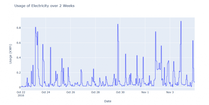
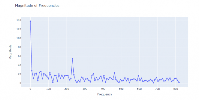
The first step when dealing with time series data is to plot the data using line plots, scatter plots or histograms. Line plots can visualize the time domain of the data, while scatter plots can be used to inspect the frequency domain obtained by a fast fourier transformation. It would exceed the scope to explain the fast fourier transformation, but it suffices to say that it can transform the data into different frequencies of electricity usage (x axis) and how many times this frequency occurred (y axis).
###Line Plot to visualize electricity usage over time
px.line(df, y='usage_kwh',
        title='Usage of Electricity over 2 Weeks',
        labels={'start_date': 'Date', 'usage_kwh': 'Usage (KWh)'}) ## uses the data from "start_date" called "Date", and the data of "usage_kwh" called "usage (KwH)"
Figure 1: Line Plot visualizing electricity usage over time
###Scatter plot to visualize the number of times certain frequency occurred
from numpy.fft import rfft, rfftfreq ## imports the needed fast fourier functions from the numpy package

transform = np.abs(rfft(df['usage_kwh'])) ## transforms into frequencies
frequencies = rfftfreq(df['usage_kwh'].size, d=15 * 60) ## fits the result into an array, d=15*60 determines that the time intervall is 15 minutes (15 * 60 seconds)

n = 100 ##plots the first 100 frequencies
px.line(x=frequencies[:n], y=transform[:n], markers=True,
           title='Magnitude of Frequencies',
           labels={'x': 'Frequency', 'y': 'Magnitude'}) ## creates plot with n=100 frequencies
Figure 2: Scatter plot visualizing the number of times a certain frequency of electricity usage occurred
Statistical Analysis
There are a multitude of statistical analysis methods that can be used to analyze time series data. While simple statistical tests like the t-test, ANOVA, and regression analysis can be used with time series data to identify relationships and dependencies in the data, there are also more specific methods to analyze time series data.
Decomposition
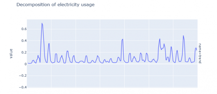
Time series data and be decomposed into three components: trend, seasonality, and the residuals. The trend represents the long-term direction of the data, the seasonality represents the repeating patterns in the data, and the residual represents the noise in the data. Decomposing the data in this way can help to better understand the underlying structure of the data and identify any patterns or trends.
from statsmodels.tsa.seasonal import seasonal_decompose ## imports the necessary functions from statsmodel

decomp = seasonal_decompose(df['usage_kwh'], model='additive', period=15)
## creates decomp which is the result of decomposing the electricity ##usage data to analyze seasonality, trend and residuals. "Period= ##15" indicates that data was collected every 15 minutes and ##"model=addtiive" makes the assumption that the three components add ##up linearly.

df1 = pd.DataFrame({'value': decomp.trend, 'name': 'trend'}) ## analyzes trend, so long-term direction
df2 = pd.DataFrame({'value': decomp.seasonal, 'name': 'seasonal'}) ##analyzes seasonal changes, so repeating patterns
df3 = pd.DataFrame({'value': decomp.resid, 'name': 'resid'}) ## analyzes residuals, so noise

full_df = pd.concat([df1, df2, df3]) ## combines all three data frames
fig = px.line(full_df, y='value', facet_row='name', title='Decomposition of electricity usage') ## creates plot
fig.update_layout(height=1000) ## adapts height so that all three plots can be seen
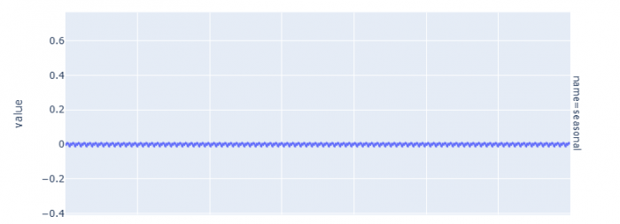
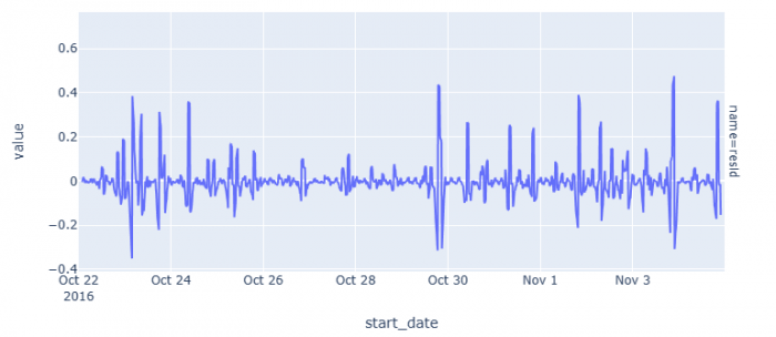
Figure 3: The graphs for the decomposition of trend, seasonality, and the residuals respectively.
No long-term direction or seasonal patterns can be detected. But we can see that there is a largae variance in the residuals, so quite a lot of noise.
Moving Average
When there is a lot of noise in the data, it can be useful to calculate the moving (or rolling) average. The moving average is a statistical measure that calculates the average of a window around a data point. It smooths out the data and helps identify patterns or trends that may not be immediately apparent.
df_full = pd.concat([
    pd.DataFrame({'value': df['usage_kwh'], 'name': 'raw'}), ## creates a dataframe the actual residuals
    pd.DataFrame({'value': df['usage_kwh'].rolling(window=24*4).mean(), 'name': 'day'}) ## creates a dataframe with the daily means ( 1 day time window, 24 hours times 4 measurements per hour (every 15 min)
]) ##the concat command combines these two dataframes
px.line(df_full, y='value', color='name',
        title='Usage vs. a 1-day moving average of usage',
        labels={'start_date': 'Date', 'value': 'Usage (KWh)'})
Figure 4: Electricity Usage with and without rolling average calculations
We can see larger electricity usage at the end and the beginning of the tmie period. However, no useful interpretation can be made. To explain this process, we might have to look at larger time frames or add other information, such as the hours spend at home (and when it is dark), days in home office, temperature (if heating requires electricity), and many other.
Autocorrelation
Autocorrelation measures the degree of similarity between a given time series and a lagged version of itself. High autocorrelation occurs with periodic data, where the past data highly correlates with the current data.
import statsmodels.api as sm ## needed to use the autocorrelation function
autocorr = sm.tsa.acf(df['usage_kwh'], nlags=24*4*2)## determines #autocorrelation with a lag of 15 minutes over 2 days (24 hours * 4 (every 15 min) * 2 for two days)
steps = np.arange(0, len(autocorr) * 15, 15) / 60 ## produces an ##array of the lenght of the autocorrelation data times 15 (so per #minute) and indicates that each lag is 15 minutes apart. By dividing it by 60, the values are converted from minutes to hours.
px.line(x=steps, y=autocorr, markers=True,
        title='Autocorrelation of electricity usage',
        labels={'x': 'Lag (hours)', 'y': 'Correlation'}) ## creates #plot of the autocorrelation function
Figure 5: Autocorrelation of electricity usage over two days
The autocorrelation largely ranges between -0.2 and 0.2 and considered to be a weak autocorrelation and can be neglected.
import matplotlib.pyplot as plt ## imports necessary functions to create plot
from statsmodels.graphics.tsaplots import plot_acf ## imports functions to calculate the confidence intervals (the so-called autocorrelation function)

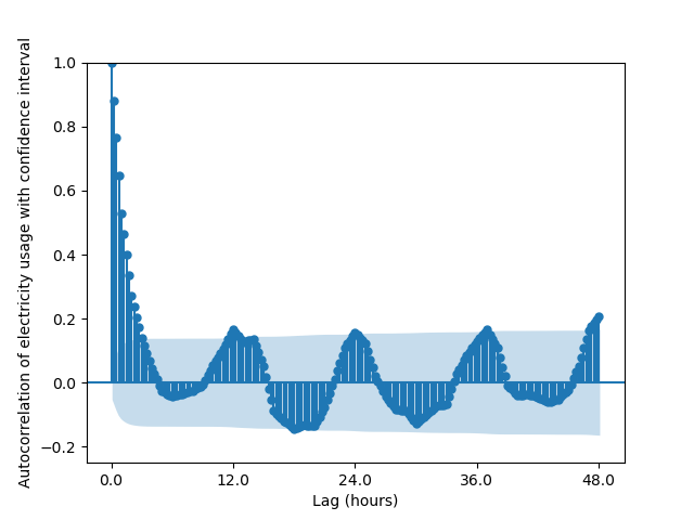
fig = plot_acf(df['usage_kwh'], alpha=.05, lags=24*4*2) ## creates plot for autocorrelation function of the electricity usage for two days (24*4 measurements per day (4 per hour) times 2)
label_range = np.arange(0, len(steps), 24*2) ## sets the range for the  days of the label
plt.xticks(ticks=label_range, labels=[x*15/60 for x in label_range]) ## determines the number of ticks on x axis
plt.xlabel('Lag (hours)') ## title x axis
plt.ylabel('Autocorrelation of electricity usage with confidence interval') ## title y axis
plt.title('') ## no plot title
plt.ylim((-.25, 1.)) ## sets the limit of the y axis
fig.show()
Figure 6: Autocorrelation of electricity usage over two days
Values in the shaded in the shaded region are statistically not significant, so there is a chance higher than 5% that there is no autocorrelation.
Detecting and Replacing Outliers
In time series data, there are often outliers skewing the distributions, trends or periodicity. There are multiple approaches to detect and deal with outliers in time series data. We will have a look at detecting outliers first: 1. Distribution based outlier detection: This detection method relies on the assumption that the data follows a certain known distribution. Then all points outside this distribution are considered outliers. (Hoogendoorn & Funk 2018) 2. Distance based outlier detection: This method computes the distance from one point to all other points. A point is considered “close” to another point when the distance between them is below a set threshold. Then, a point is considered an outlier if the fraction of points deemed close to that point is below a threshold. (Hoogendoorn & Funk 2018) 3. Local outlier factor (LOF): The local outlier factor (LOF) is a measure of how anomalous an object is within a dataset, based on the density of its local neighborhood. The LOF is computed by comparing the density of an object's neighborhood to the densities of the neighborhoods of its nearest neighbors. If the density of an object's neighborhood is significantly lower than the densities of its neighbors' neighborhoods, then it is considered an outlier (Hoogendoorn & Funk 2018).
1. is best to use when you have an idea of the distribution of your data, ideally if the data is normally distributed. This is especially the case for very large datasets.
2. Is best when you expect outliers spread across the distribution, but you don't know the distribution.
3. Is best when you want to identify outliers in clusters or in varying densities because you compares the data points to its neigbors. To decide, you can assess the distribution visually. For a better overview over the different approaches to handle outlier in general, see here. In general, many outlier detection methods are available ready-to-use in numerous python packages. This is an example of using the local outlier factor from the package scikit-learn:
import matplotlib.pyplot as plt ## imports the necessary packages for visualization.
from sklearn.neighbors import LocalOutlierFactor ## imports the function for the local outlier function

lof = LocalOutlierFactor(n_neighbors=20, contamination=.03)## considers 20 neighboured data points and expexts 3% of the data to be outliers (see contamination)
prediction = lof.fit_predict(df['usage_kwh'].to_numpy().reshape(-1, 1))## transforms the electricity usage colums to a NumPy array ("to_numpy()") and reshapes it to a single column ("reshape (-1, 1)"), fit.predict then predicts the outliers (outlier if the prediction = -1)
df['outlier'] = prediction == -1 ## creates a new column in the initial dataframe called outlier, with true or false, depending on whether it is an outlier or not

outliers = df[df['outlier']] ## creates  a column where only outliers are selected

plt.plot(df['usage_kwh']) ## plots the dataframe
plt.scatter(x=outliers.index, y=outliers['usage_kwh'], color='tab:red', marker='x') ## creates a scatter plot with the outliers, marked with a red x
plt.title('Outliers in the dataset (marked in red)') ## title of the plot
plt.xlabel('Date') ## titlex axis
plt.ylabel('Usage (KWh)')## title y axis
plt.show()
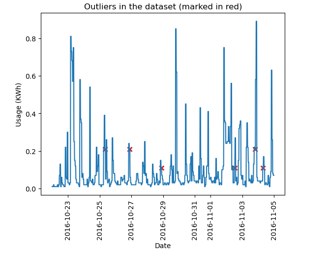
Figure 7: Outlier in the chosen part of the dataset (marked with red cross)
In this case, these are probably false-positive outliers. The dataset is already pretty clean and does likely not contain many outliers.
The imputation of missing values is the next challenge after detecting outliers. The naive solution to this problem is to replace a missing point with the mean of all points. While this approach will not skew the data distribution significantly, the imputed values might be far off from the actual value and make messy graphics. An alternative is applying regression models that use predictive models to estimate missing points.
A combined approach to both detects and replace outliers is the Kalman Filter, which predicts new points based on the previous points and estimates a noise measure for new points. Thus, when an anomaly is detected, it is replaced by the prediction from the model using historical data (Hoogendoorn & Funk 2018).
Forecasting Time Series Data
Forecasting time series data can be of tremendous value in information gain. Since this is a large topic, this article will only touch on one method for forecasting: AutoRegressive Integrated Moving Average models, or ARIMA for short. It consists of three parts:
- The autoregressive (AR) component, which models the autocorrelation of the time series
- The integrated (I) component, which models the non-stationary bits of the time series
- The moving average (MA) component, which models the noise or error in the time series.
Each component requires appropriate selection of parameters. Choosing the right parameters can yield a powerful model. However finding good values of the parameters can be difficult and requires further complicated techniques.
import statsmodels.api as sm ## needed to employ ARIMA

# Fit the model on all data expect for the last day (last 96 measurements). Order refers to the order of the different processes. The three numbers refer to the order of autoregression, the order of integration and the order of the moving average process, respectively. With this information, Python can correct for these issues and therefore optimize the forecasting results. freq='15T' indicates that the data has been collected every 15 minutes.
model = sm.tsa.ARIMA(df['usage_kwh'].iloc[:-96], order=(1, 0, 0), freq='15T')
model_fit = model.fit() ## estimates the best model

# Predict how the last day is going to be
forecast = model_fit.forecast(96)

full_df = pd.concat([
    pd.DataFrame({'value': forecast, 'name': 'forecast'}),
    pd.DataFrame({'value': df['usage_kwh'].iloc[-192:], 'name': 'existing'})## -192 to get the data for the last two days
])

px.line(full_df, y='value', color='name',
        title='Last day of electricity usage with prediction of the next 24 hours',
        labels={'index': 'Date', 'value': 'Usage (KWh)'}) ##produce plot
Figure 8: Forecast of the last day of the dataset compared to the actual values
ARIMA models struggle with seasonality and often predict the mean of a highly seasonal time series at a few steps ahead, just like in this example. Seasonal ARIMA (SARIMA) models take into account seasonality and are thus more suited for datasets that exhibit a strong seasonality (Hoogendoorn & Funk 2018). This would then be the next step to use another model, but this more simple example should suffice to show how forecasting with time series data generally works.
References
Hoogendoorn, Mark and Funk, Burkhardt (2018): Machine Learning for the Quantified Self: On the art of learning from sensory data. Cognitive Systems Monographs. Springer Cham.
The author of this entry is XX. Edited by Milan Maushart
