Conceptual Figures
| Type | Team Size | ||||||
|---|---|---|---|---|---|---|---|
| Collaborative Tools | Software | Personal Skills | Productivity Tools | 1 | 2-10 | 11-30 | 30+ |
What, Why & When
Conceptual figures - or "made-up figures", as we like to call them - are visualisations that do not represent data itself, but help illustrate a theoretical idea or a methodological design. They are often relevant for scientific publications, and can help improve presentations and pitches by making an idea or approach more understandable for the audience.
Goals
- Create better figures to explain concepts or methodological designs
- Expand on your text through visualisations
Getting started
Here are some initial recommendable ideas on how to make this type of figure:
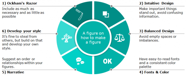
1) Follow Ockham's razor: just like for research designs - and much of life - Ockham's razor can guide your approach to developing a conceptual figure. It should include as much information as necessary, but as little as possible. Useless information that the figure does not benefit from should be avoided. Also, the information provided in the figure should be complementary to the text, not (entirely) identical, which would render the figure itself redundant. Good figures help us better understand the text that we read already, but do not take up space without providing anything new.
2) Make your figures intuitive to understand. A figure with a lot of complex information usually overwhelms the reader. You want your figure to stimulate further engagement with what it shows. A good figure is graspable at first sight, at least in terms of the core elements. This also means that there should usually be no more than 3 - 5 five core elements within the figure, although there can be accompanying smaller elements around those. It should be clear right away what is shown, and how parts of the figure relate to each other. Then, the information that lies within the figure should be easily accessible, even if it takes some time to engage with everything that is shown. Be aware that people (at least in Western culture) usually scan figures from the top-left to the bottom right - build your figures accordingly.
3) Avoid empty spaces or disbalances. A lot of blank space, or an unbalanced distribution of visual elements just feels off.
4) Use clear fonts and a balanced color palette. Fonts are certainly a matter of taste, but some fonts are just more adequate for scientific publications or presentations than others. The text should be readable at first glance (see 2), so choose a font that is easy to decipher and ideally fits to the rest of the document. We recommend sans serif fonts like Ariel or Courier, but you should find your own preference or get inspired by other publications. Colors, then, should first make a figure more visually appealing. This can be done by using colors that fit together, for example by relying on a Wes-Anderson-Color-Palette, which is obviously the best set of colors. However, the use of certain signal colors can help guide the audience's attention to specific details. Colors can also hold information. For example, a color gradient can represent a decrease or increase of some value, or different categories of things. Also, colors can be used recurringly, for example when a certain color represents a specific actor, element, topic or place in one figure, and the same color represents the same element in another figure, which supports continuity in your design and guides the reader through the document.
5) Create a narrative for the figure, and the figure as a narrative. A good figure can stand on its own, and represent something. It is alright if the full picture of the figure is only understandable with the help of the original text it expands upon. However, if you can show the figure to someone and (s)he'll understand what it is about, you are on the right track. For this, it is important to include all information necessary to understand what is shown (see 1). More importantly, a figure can give the reader information on how things relate to each other - focusing on temporal order, most commonly through the use of arrows or a timeline, or causal relations, often also done with arrows, although many more approaches are conceivable. What happens when, and what is a solution to, or consequence of, what? Also, proportions of information can contain information: if an element is smaller than others, it is maybe not as important.
6) Learn from other figures, and develop your own style. It is okay to steal from others. There are lots of great conceptual figures in science, and studying them with a focus on what makes them great - or not great - can help find ideas to improve your own design. Of course, you shouldn't simply adapt other people's figures, but take parts or approaches that might fit your own needs.
7) Some last tips:
- Decide on one software solution to implement your figure in, and learn what it can do.
- Acknowledge the expectations of your audience, or deliberately decide to break with their expectations when appropriate.
- Always keep in mind how your figure relates to the character and content of the document it is placed in.
- Follow your intuition: we all have our own ideas about what looks good, and we do our best work when we are convinced of what we are doing ourselves.
- Last but not least, however, get feedback from peers when in doubt. They will be able to tell you if everything is understandable, and overcome the tunnel vision that you might develop when you are deep in a topic.
Eventually, however, our main recommendation remains to keep it simple. Don't overburden the reader with information, but focus on what is really important. For more helpful tips on visualisations, please refer to the entry on Statistical Figures and Poster Design.
Examples
- Doughnut Economics

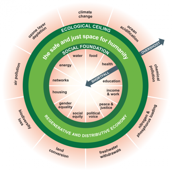
The famous Doughnut Economics figure is a good example for a great conceptual figure. It is understandable at first sight, with the doughnut itself limiting itself to three elements (ecological ceiling, social foundation, the safe and just space for humanity). This is what our eyes fall onto at first glance. The doughnut shape, due to the underlying planetary boundary concept, is akin to the shape of the globe, which is recognizable, and the arrows tell the main narrative of the figure. There is a lot of information here, but it is clearly divided into categories (social necessities, environmental boundaries) and rather easy to read, despite the cyclical arrangement. The colors support the narrative: red is a problem, dark green is okay, light green is ideal. The doughnut works as a figure on its own, despite it being part of a larger book that explains it in more detail (Doughnut Economics by Kate Raworth). It is a narrative by itself, and helps communicate an idea.
More Examples will be added
The authors of this entry are Matteo Ramin and Christopher Franz.
