Chord Diagram
Note: This entry revolves specifically around Chord Diagrams. For more general information on quantitative data visualisation, please refer to Introduction to statistical figures].
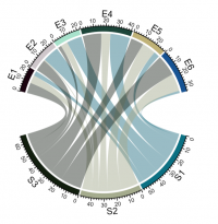
In short: A chord diagram represents flows or connections between several entities (called nodes). Each entity is represented by a fragment on the outer part of the circular layout. Then, arcs are drawn between each entities. The size of the arc is proportional to the importance of the flow.
Contents
Why use chord diagram?
Chord diagram is a good way to represent the migration flows. It works well if your data are directed and weighted like for migration flows between country. Chord diagrams can answer questions about your data, such as the following:
- What is the volume of flow between categories?
- Are there anomalies, differences, or similarities in the volume of flow?
Basic usage of making Chord diagram
In R, the circlize package is the best option to build it. The chordDiagram() function of the circlize package makes it a breeze to build chord diagrams.
First let’s generate a random matrix
install.packages("circlize")
library(circlize)

#Fig.1
set.seed(999)
mat = matrix(sample(18, 18), 3, 6)
rownames(mat) = paste0("S", 1:3)
colnames(mat) = paste0("E", 1:6)
mat
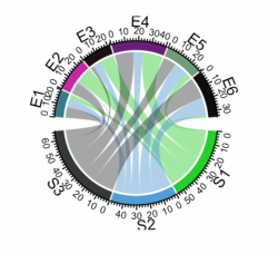
chordDiagram(mat)
## Output:
##
##    E1 E2 E3 E4 E5 E6
## S1  4 14 13 17  5  2
## S2  7  1  6  8 12 15
## S3  9 10  3 16 11 18
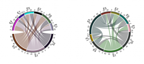
The default Chord Diagram consists of a track of labels, a track of grids (or you can call it lines, rectangles) with axes, and links. Sectors which correspond to rows in the matrix locate at the bottom half of the circle.In following code, S1, S2 and S3 should better be put together since they belong to a same group, which is same for E* sectors. Of course, you can give a order which mix S* and E*
par(mfrow = c(1, 2))
chordDiagram(mat, order = c("S2", "S1", "S3", "E4", "E1", "E5", "E2", "E6", "E3"))
circos.clear()
#Fig.2
chordDiagram(mat, order = c("S2", "S1", "E4", "E1", "S3", "E5", "E2", "E6", "E3"))
## NOTE: circos.clear() is used to reset the circular layout parameters
circos.clear()
Under default settings, the grid colors which represent sectors are randomly generated, and the link colors are same as grid colors which correspond to rows (or the first column if the input is an adjacency list) but with 50% transparency.
Adjust by circos.par()
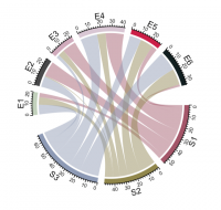
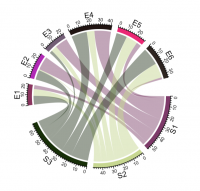
Since Chord Diagram is implemented by basic circlize functions, like normal circular plot, the layout can be customized by circos.par(). The gaps between sectors can be set by circos.par(gap.after = ...). It is useful when you want to distinguish sectors between rows and columns. Please note since you change default graphical settings, you need to use circos.clear() in the end of the plot to reset it.
#Fig.3

circos.par(gap.after = c(rep(5, nrow(mat)-1), 15, rep(5, ncol(mat)-1), 15))

chordDiagram(mat)
circos.clear()

# here is an example for how to add the gap between arcs
circos.par(gap.after = c("S1" = 5, "S2" = 5, "S3" = 15, "E1" = 5, "E2" = 5,
                         "E3" = 5, "E4" = 5, "E5" = 5, "E6" = 15))


#Fig.4
chordDiagram(mat)
circos.clear()


#Fig.5
chordDiagram(mat, big.gap = 30)
Set grid colors
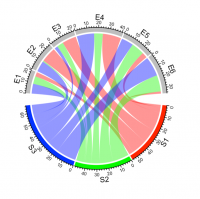
Grids have different colors to represent different sectors. Generally, sectors are divided into two groups. One contains sectors defined in rows of the matrix , and the other contains sectors defined in columns of the matrix. Thus, links connect objects in the two groups. By default, link colors are same as the color for the corresponding sectors in the first group.Changing colors of grids may change the colors of links as well. Colors for grids can be set through grid.col argument. Values of grid.col better be a named vector of which names correspond to sector names. If it is has no name index, the order of grid.col is assumed to have the same order as sectors.
#Fig. 6
grid.col = c(S1 = "red", S2 = "green", S3 = "blue",
             E1 = "grey", E2 = "grey", E3 = "grey",
             E4 = "grey", E5 = "grey", E6 = "grey")
chordDiagram(mat, grid.col = grid.col)
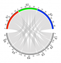
If you want colors to be the same as the sectors from the matrix columns or the second column in the data frame, simply transpose the matrix.
#Fig. 7
chordDiagram(t(mat), grid.col = grid.col)
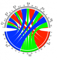
If you want to add radiant colors instead of transparent then you can use the transparency argument in the chordDiagram() function which value can be 1 or by default the value is set to be 0.5.
#Fig. 8
chordDiagram(mat, grid.col = grid.col, transparency = 0)
Link border
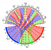
link.lwd, link.lty and link.border control the line width, the line style and the color of the link border. All these three parameters can be set either a single scalar or a matrix if the input is an adjacency matrix. If it is set as a single scalar, it means all links share the same style.
#Fig. 9
chordDiagram(mat, grid.col = grid.col, link.lwd = 2, link.lty = 2, link.border = "red")
Highlight links
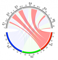
Sometimes we want to highlight some links to emphasize the importance of such relations. There are two ways to highlight links, one is to set different transparency to different links and the other is to only draw links that needs to be highlighted. We can highlight links which come from a same sector by assigning colors with different transparency by row.col argument.
#Fig. 10
chordDiagram(mat, grid.col = grid.col, row.col = c("#FF000080", "#00FF0010", "#0000FF10"))
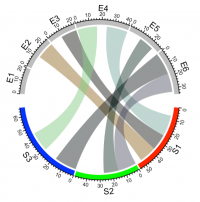
We can also highlight links with values larger than a cut-off. There are at least three ways to do it. First, construct a color matrix and set links with small values to full transparency. Since link colors can be specified as a matrix, we can set the transparency of those links to a high value or even set to full transparency. In following example, links with value less than 12 are set to #00000000.
#Fig. 11
col_mat = rand_color(length(mat), transparency = 0.5)
col_mat[mat < 12] = "#00000000"
chordDiagram(mat, grid.col = grid.col, col = col_mat)
