Kernel density plot
Note: This entry revolves specifically around Kernel density plots. For more general information on quantitative data visualisation, please refer to Introduction to statistical figures.
Kernel density plots
This entry aims to introduce kernel density plot and its visualization using R’s ggplot2 package. Density plot is used to plot the distribution of a single quantitative variable. It allows to see which score of a variable is more frequent and which score is relatively rare. The x-axis represents the values of the variable whereas the y-axis represents its density. The area under the curve equates to 1.
Packages used : gapminder, ggplot2
# Install and load the gapminder and ggplot2 packages
install.packages("gapminder")
library(gapminder)
library(ggplot2)
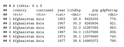
#A glimpse of the gapminder dataset
head(gapminder)
#?gapminder
#View(gapminder)
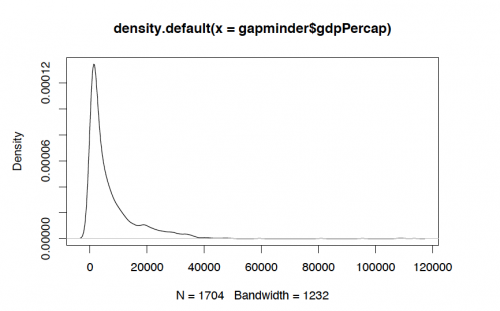
#Using the basic plot function of R to view the distribution of GDP per capita

plot(density(gapminder$gdpPercap))
Bandwidth determines the smoothing and detail of a variable. The bandwidth can be changed in the aes parameter of gemo_density() function. The default bandwidth can be viewed as:
bw.nrd0(gapminder$lifeExp)

#Output: [1] 2.624907
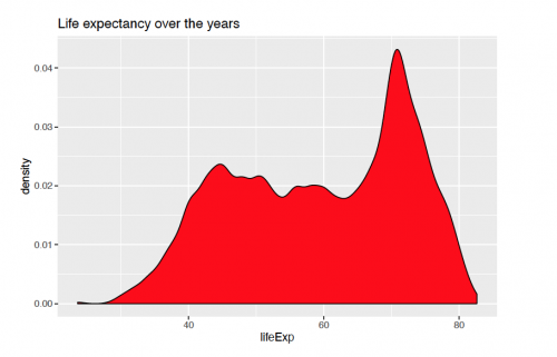
A basic density plot of life expectancy with ggplpot2() over the years can be viewed as:
ggplot(gapminder, aes(x = lifeExp))+
   geom_density(fill = "red", bw = 1)+
   labs(title = "Life expectancy over the years")
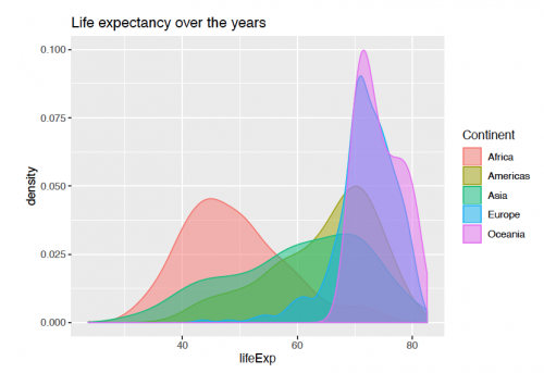
Representation of life expectancy for every continent can be further seen with using the "continent" variable for the fill parameter.
ggplot(gapminder, aes(x = lifeExp))+
    geom_density(aes(fill = continent, color = continent), alpha = 0.5)+
    scale_fill_discrete(name = "Continent")+
    scale_color_discrete(name = "Continent")+
    labs(title = "Life expectancy over the years")
Faceting
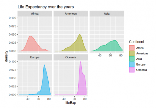
With facetting, the variable can be split into groups and viewed side-by-side for a better comparison. The code for viewing the plot below is the following:
ggplot(gapminder, aes(x = lifeExp))+
    geom_density(aes(fill = continent, color = continent),alpha = 0.5)+
    scale_fill_discrete(name = "Continent")+
    scale_color_discrete(name = "Continent")+
    labs(title = "Life Expectancy over the years")+
    facet_wrap(continent ~.)
Refernces:
- Lecture slides.
- "Histograms and Density Plots in Python" by Will Koehrson
- Kabacoff, R. (2018). Data visualization with R. EEUU: Wesleyan University.
The author of this entry is Archana Maurya.
