Difference between revisions of "Introduction to Seaborn"
| Line 11: | Line 11: | ||
my_plots.map(sns.histplot,"sepal_width") | my_plots.map(sns.histplot,"sepal_width") | ||
</syntaxhighlight> | </syntaxhighlight> | ||
| − | [[File:facetgrid1.png| | + | [[File:facetgrid1.png|900px]] |
Now we provide more complicated plot, which has all columns of the dataset and each histplot shows species, differentiated by color via parameter <syntaxhighlight lang="Python" inline>hue</syntaxhighlight>. However, some data preparation is needed. Pandas method <syntaxhighlight lang="Python" inline>melt()</syntaxhighlight> augments the dataset to a long format, so it will be easier to create a graph. More information can be found [https://pandas.pydata.org/pandas-docs/stable/reference/api/pandas.melt.html here]. | Now we provide more complicated plot, which has all columns of the dataset and each histplot shows species, differentiated by color via parameter <syntaxhighlight lang="Python" inline>hue</syntaxhighlight>. However, some data preparation is needed. Pandas method <syntaxhighlight lang="Python" inline>melt()</syntaxhighlight> augments the dataset to a long format, so it will be easier to create a graph. More information can be found [https://pandas.pydata.org/pandas-docs/stable/reference/api/pandas.melt.html here]. | ||
| Line 57: | Line 57: | ||
g.add_legend(title="Species", handles=[setosa_patch, versicolor_patch, virginica_patch]) | g.add_legend(title="Species", handles=[setosa_patch, versicolor_patch, virginica_patch]) | ||
</syntaxhighlight> | </syntaxhighlight> | ||
| − | [[File:facetgrid2.png| | + | [[File:facetgrid2.png|1000px]] |
Now we can compare the distribution of all species (divided by color) from each feature from the initial dataset. If you run the next code snippet, you will get a similar graph, however, some parameters had to be adjusted beforehand. This is another way to reproduce the grid by setting the subplots. Remember, you can always make a loop for the repetitive actions, for instance, for the long list of features. | Now we can compare the distribution of all species (divided by color) from each feature from the initial dataset. If you run the next code snippet, you will get a similar graph, however, some parameters had to be adjusted beforehand. This is another way to reproduce the grid by setting the subplots. Remember, you can always make a loop for the repetitive actions, for instance, for the long list of features. | ||
| Line 80: | Line 80: | ||
sns.pairplot(data=df) | sns.pairplot(data=df) | ||
</syntaxhighlight> | </syntaxhighlight> | ||
| − | [[File:pairplot.png| | + | [[File:pairplot.png|600px]] |
This graph contains pairwise scatterplots of features (columns) and the diagonal presents the distribution of each feature. The parameters for the style customization still can be utilized, including <syntaxhighlight lang="Python" inline>hue</syntaxhighlight>, <syntaxhighlight lang="Python" inline>markers</syntaxhighlight> and others. <syntaxhighlight lang="Python" inline>corner=True</syntaxhighlight> will remove the upper triangle of the plot. | This graph contains pairwise scatterplots of features (columns) and the diagonal presents the distribution of each feature. The parameters for the style customization still can be utilized, including <syntaxhighlight lang="Python" inline>hue</syntaxhighlight>, <syntaxhighlight lang="Python" inline>markers</syntaxhighlight> and others. <syntaxhighlight lang="Python" inline>corner=True</syntaxhighlight> will remove the upper triangle of the plot. | ||
| Line 96: | Line 96: | ||
g_joint.plot(sns.scatterplot, sns.histplot) | g_joint.plot(sns.scatterplot, sns.histplot) | ||
</syntaxhighlight> | </syntaxhighlight> | ||
| − | [[File:jointgrid1.png| | + | [[File:jointgrid1.png|400px]] |
You can create same simple plot via <syntaxhighlight lang="Python" inline>jointplot()</syntaxhighlight> and <syntaxhighlight lang="Python" inline>JointGrid()</syntaxhighlight> functions. On the one hand, jointplot uses default parameters for scatter- and histplot; on the other hand, JointGrid requires defining the grid and setting up the plots manually. Next example shows how to customize the joint plot (ax_joint), which refers to the center part of the entire graph and marginal top and right plots (ax_marg_x, ax_marg_y), which are specified with help of axes. Each section has own parameters / arguments to pass, but it is always important to remember about the overall picture. | You can create same simple plot via <syntaxhighlight lang="Python" inline>jointplot()</syntaxhighlight> and <syntaxhighlight lang="Python" inline>JointGrid()</syntaxhighlight> functions. On the one hand, jointplot uses default parameters for scatter- and histplot; on the other hand, JointGrid requires defining the grid and setting up the plots manually. Next example shows how to customize the joint plot (ax_joint), which refers to the center part of the entire graph and marginal top and right plots (ax_marg_x, ax_marg_y), which are specified with help of axes. Each section has own parameters / arguments to pass, but it is always important to remember about the overall picture. | ||
| Line 107: | Line 107: | ||
sns.boxplot(y=y, width=0.3, color="#bb88ff", ax=g_joint.ax_marg_y) | sns.boxplot(y=y, width=0.3, color="#bb88ff", ax=g_joint.ax_marg_y) | ||
</syntaxhighlight> | </syntaxhighlight> | ||
| − | [[File:jointgrid2.png| | + | [[File:jointgrid2.png|400px]] |
Diverse marginal plots may be beneficial, when we would like to see different data characteristics for each variables. These features, in turn, may have varying formats (e.g., continuous and discrete). Combining carefully the charts without overwealming the viewer is a key of this process. | Diverse marginal plots may be beneficial, when we would like to see different data characteristics for each variables. These features, in turn, may have varying formats (e.g., continuous and discrete). Combining carefully the charts without overwealming the viewer is a key of this process. | ||
Revision as of 07:14, 3 September 2024
Contents
Grid
We can do a comparison of different features, having them on a grid (multi-plot grid).
FacetGrid
We will present a grid, where many plots are located with respect to their positions. One of the ways to implement this is to use function FacetGrid(). In the following example, each species of one column will be shown separately. In order to put the plots on the grid, method map is called, it also determines the kind of the plot and includes its parameters.
my_plots = sns.FacetGrid(df, col="species")
my_plots.map(sns.histplot,"sepal_width")
Now we provide more complicated plot, which has all columns of the dataset and each histplot shows species, differentiated by color via parameter hue. However, some data preparation is needed. Pandas method melt() augments the dataset to a long format, so it will be easier to create a graph. More information can be found here.
df_melted = df.melt(id_vars=['species'], value_vars=['sepal_length', 'sepal_width', 'petal_length', 'petal_width'])
| species | variable | value | |
|---|---|---|---|
| 0 | setosa | sepal_length | 5.1 |
| 1 | setosa | sepal_length | 4.9 |
| 2 | setosa | sepal_length | 4.7 |
The column "variable" reflects the features from the initial dataset with connected values.
As the data is prepared, it is possible now to select columns and parameters for the graph. Thus, we define with parameter col='variable', that each column of the grid will represent each column (feature) of the initial dataset. Then the histplot for every subplot will contain the information about the distribution of values for each species.
This graph function does not assume the legend, therefore, we will create the legend ourselves, using the palette colors and module patches from matplotlib. It will allow us to place the legend on the graph.
First of all, it is necessary to understand, what kind of palette is used at the graph (in this case it is "pastel"). Use the documentation to explore more. The colors of the palette "pastel" are provided below.
print(sns.color_palette("pastel").as_hex())
['#a1c9f4', '#ffb482', '#8de5a1', '#ff9f9b', '#d0bbff', '#debb9b', '#fab0e4', '#cfcfcf', '#fffea3', '#b9f2f0']
After that, first three colors of this palette will be taken (because the column "species" has three catergories) and will be used for parameter handles in the method add_legend().
import matplotlib.patches as mpatches

# mapping each species to the color
setosa_patch = mpatches.Patch(color=sns.color_palette("pastel").as_hex()[0], label='setosa')
versicolor_patch = mpatches.Patch(color=sns.color_palette("pastel").as_hex()[1], label='versicolor')
virginica_patch = mpatches.Patch(color=sns.color_palette("pastel").as_hex()[2], label='virginica')
g = sns.FacetGrid(df_melted, col='variable')
g.map_dataframe(sns.histplot, x='value', hue="species", bins=10)
g.add_legend(title="Species", handles=[setosa_patch, versicolor_patch, virginica_patch])
Now we can compare the distribution of all species (divided by color) from each feature from the initial dataset. If you run the next code snippet, you will get a similar graph, however, some parameters had to be adjusted beforehand. This is another way to reproduce the grid by setting the subplots. Remember, you can always make a loop for the repetitive actions, for instance, for the long list of features.
fig, axes = plt.subplots(1, 4,figsize=(15, 3.5))
#create chart in each subplot
sns.histplot(data = df, x="sepal_length",hue='species',ax=axes[0], bins=10,legend=False)
sns.histplot(data = df, x="sepal_width",hue='species',ax=axes[1], bins=10,legend=False)
sns.histplot(data = df, x="petal_length",hue='species',ax=axes[2], bins=10,legend=False)
sns.histplot(data = df, x="petal_width",hue='species',ax=axes[3], bins=10)
for el in range(0,4):
    axes[el].set_ylim(0,45)
    axes[el].set_xlim(0,8)
Pairplot
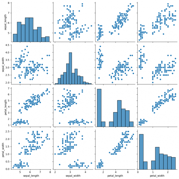
Pairplot is a subplot grid for showing pairwise relationships in a dataset. This is a high-level interface for PairGrid. The latter provides more flexibility and customization, while pairplot may help to save some time, using simple (one-line) commands for standard visulalizations.
sns.pairplot(data=df)
This graph contains pairwise scatterplots of features (columns) and the diagonal presents the distribution of each feature. The parameters for the style customization still can be utilized, including hue, markers and others. corner=True will remove the upper triangle of the plot.
Jointgrid
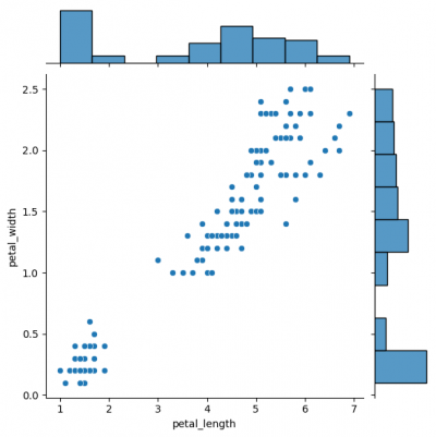
Jointgrid is used for drawing a bivariate plot with marginal univariate graphs. Jointgrid and jointplot have the same mechanism as pairgrid and pairplot. Let us now create the example with jointgrid, so we will provide better customization and more control.
# difference in syntaxes for jointplot and JointGrid

# sns.jointplot(data=df, x="petal_length", y="petal_width")

g_joint = sns.JointGrid(data=df, x="petal_length", y="petal_width")
g_joint.plot(sns.scatterplot, sns.histplot)
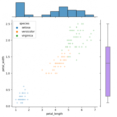
You can create same simple plot via jointplot() and JointGrid() functions. On the one hand, jointplot uses default parameters for scatter- and histplot; on the other hand, JointGrid requires defining the grid and setting up the plots manually. Next example shows how to customize the joint plot (ax_joint), which refers to the center part of the entire graph and marginal top and right plots (ax_marg_x, ax_marg_y), which are specified with help of axes. Each section has own parameters / arguments to pass, but it is always important to remember about the overall picture.
g_joint = sns.JointGrid()
x,y = df.petal_length, df.petal_width
sns.scatterplot(x=x, y=y, hue=df.species, marker="+", ax=g_joint.ax_joint)
sns.histplot(x=x, ax=g_joint.ax_marg_x)
sns.boxplot(y=y, width=0.3, color="#bb88ff", ax=g_joint.ax_marg_y)
Diverse marginal plots may be beneficial, when we would like to see different data characteristics for each variables. These features, in turn, may have varying formats (e.g., continuous and discrete). Combining carefully the charts without overwealming the viewer is a key of this process.


