Difference between revisions of "Why statistics matters"
| Line 76: | Line 76: | ||
==Presenting statistical results== | ==Presenting statistical results== | ||
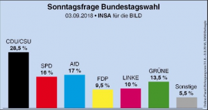
| − | [[File:Bildschirmfoto 2020-03-31 um 10. | + | [[File:Bildschirmfoto 2020-03-31 um 10.35.59.png|thumb|left|The "Sonntagsumfrage" in Germany asks on weekly basis which party citizens would vote for if there would be elections on Sunday. The results are always presented in barplots.]] |
| + | |||
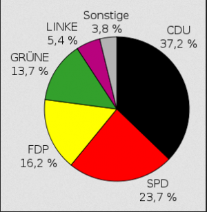
| + | [[File:Bildschirmfoto 2020-03-31 um 10.35.47.png|thumb|left|Another form of presenting election results is the pie charts. In this example it visualizes the results of the state election in Hessen in 2009.]] | ||
Within current media as well as the Internet most dominating forms of presenting statistical results are the barplot and the pie chart. The first can have some merit in illustrating simple numbers the second one is often considered to be misleading if not manipulative. However, these two graphics represent the current baseline of knowledge of civil society when it comes to the presentation of statistical results. Sometimes certain newspapers as well as the Internet present simple correlation plots that are rather intuitive and therefore also understandable for people with some background in science. A prominent example is the Economist, who due to its focus quite often relies on correlation plots. | Within current media as well as the Internet most dominating forms of presenting statistical results are the barplot and the pie chart. The first can have some merit in illustrating simple numbers the second one is often considered to be misleading if not manipulative. However, these two graphics represent the current baseline of knowledge of civil society when it comes to the presentation of statistical results. Sometimes certain newspapers as well as the Internet present simple correlation plots that are rather intuitive and therefore also understandable for people with some background in science. A prominent example is the Economist, who due to its focus quite often relies on correlation plots. | ||
Revision as of 08:40, 31 March 2020
(The author of this entry is Henrik von Wehrden.)
Contents
Statistics as a part of science
Science creates knowledge. This knowledge production follows certain principles. Being a statistician with all the experience I had the privilege to perceive to date, I recognize this as one of the biggest challenge of statistics. Many people, especially those new to statistics, feel a strong urge towards freedom. I think this is wonderful. Radical thinking moves us all forward. However, because of this urge for freedom already existing knowledge is often not valued, as the radical thought for the new is stronger than the appreciation of the already established. This is, in my experience, the first grave challenge that the field of statistics faces. People reject the principles of statistics out of the urge to be radical. I say, be radical, but also stand on the shoulders of giants.
The second grave challenge of statistics is numbers per se. Most people are not fond of numbers. Some are even afraid. Fear is the worst advisor. Numbers are nothing to be afraid of, and likewise, statistics are nothing to be afraid of either. Yet learning statistics is no short task, and this is the third obstacle I see.
Learning a scientific method, any scientific method, takes time. It is like learning an instrument or learning martial arts. Learning a method is not just about a mere internalisation of knowledge, but also about gaining experience. Be patient. Take the time to build this experience. Within this Wiki, I give you a basic introduction of how statistics can help you to create knowledge, and how you can build this experience best.
Occam's razor
"Entities should not be multiplied without necessity."
The Franciscan friar William of Occam almost single-handedly came up with one of the most fundamental principles to date in science. He basically concluded, that "everything should be as simple as possible, but as complex as necessary." Being a principle, it is suggested that this thought extends to all. While in his time it was rooted in philosophy or more specifically in logic, Occam's razor turned out to propel many scientific fields later on, such as physics, mathematics, biology, theology, mathematics and many more. It is remarkable how this principle purely rooted in theoretical consideration generated the foundation for the scientific method, which would surface centuries later out of it. It also poses as one of the main building blocks of modern statistics as William of Occam came up with the principle of parsimony. While this is well known in science today, we are up until today busy discussing whether things are simple or complex. Much of the scientific debate up until today is basically a pendulum swing between these two extremes, with some people oversimplifying things, while others basically saying that everything is so complex we may never understand it. Occam's razor concludes that the truth is in between.
Examples:
How to make a Curry.
I love Curry. I, who had the privilege to work in Nepal for sixth months, had the opportunity to enjoy some good curry. How does one make a good curry? I think this is an ideal case of Occam's razor. You need quite some ingredients, Chillies, Ginger, Garlic, Onions, some vegetables of your choice, coconut milk, etc. Do you need hundreds of things? Probably not. An ideal curry contains as many ingredients as one needs, but not more.
You have been Sherlocked
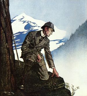
Many people are familiar with the fantastic Sherlock Holmes. His creator, Sir Arthur Canon Doyle was obviously a great admirer of Occam's razor. Hence, it surfaces a lot in Sherlock but can be also found in lots of other characters from fiction. Sherlock frequently comes up with explanation that seem implausible, but make perfect sense due to his keen observations in combination with a razor-sharp reasoning. Since reasoning is often seen differently in respective cultural setting, Holmes is often seen as a weirdo, yet his arguments are mostly very clear. He observes, reasons, deduces (really?) and thus derives a conclusion that presents the explanation where “When you have eliminated the impossible, whatever remains, however improbable, must be the truth."
The scientific method
The scientific method was a true revolution since it enabled science to test hypotheses through observation. Before, science was vastly dominated by theorizing -that is developing theories- yet testing theories proved to be more difficult. While people tended to observe since the dawn of humans, making such observations in a systematic way opened a new world in science. Especially Francis Bacon influenced this major shift, for which he laid the philosophical foundation in his "Novum Organon".
All observations are normative, as they are made by people. This means that observations are constructs, where people tend to see things through a specific "lens". A good example of such a specific normative perspective is the number zero, which was kind of around for a long time, but only recognised as such in India and Arabia in the 8th-9th century (0). Today, the 0 seems almost as if it was always there, but in the antique world, there was no certainty whether the 0 is an actual number or not. This illustrates how normative perspectives change and evolve, although not everybody may be aware of such radical developments as Arabic numbers.
A very short history of statistics
Building on Occam's razor and the scientific method, a new mode of science emerged. Rigorous observation and the testing of hypotheses became one important building block of our civilisation. One important foundation of statistics was probability theory, which kind of hit it off during the period known as Enlightenment.
Probability was important as it enabled differentiation between things happening by chance, or following underlying principles that can be calculated by probability. Of course, probability does not imply that it can be understood why something is not happening by chance, but it is a starting point to get out of a world that is not well understood. Statistics, or more importantly probability, was however not only an important scholar development during the enlightenment, but they also became a necessity. On of the first users of probability was Jan de Wit, leader in the Netherlands from 1652 to 1672. He applied the probabilistic theory to determine proper rates of selling annuities. Annuities are payments which are made yearly but back in the days states often collected them during times of war. He stated that annuities and also life insurances should be connected to probability calculations and mortality records in order to determine the perfect charge of payment.
Following the Peace of Westphalia, nations were formed at a previously unknown extent, effectively ending the European religious wars. Why is that relevant, you wonder? States need governance, and governance builds at least partly on numbers. Statistics enabled states to get information on demographics and economic development. Double-entry bookkeeping contributed as well. Numbers became a central instrument of control of sovereigns over their nations. People started showing graphs and bar charts to show off their development, something we have not quite recovered from ever since. For example in 1662 John Graunt estimated the population of London by using records on the number of funerals per year, the death rate and the average family size and came to the conclusion that London should have about 384 000 citizens. Statisticians were increasingly in demand to account for data, find relations between observations, and basically to find meaning in an increasing plethora of information. The setup and calculation of experiments created another milestone between the two world wars, effectively propelling modern agriculture, psychology, clinical trials and many other branches of science.
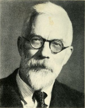
Hence, statistics became a launchpad for much of the exponential development we observe up until today. While correlation and the Analysis of Variance (ANOVA) are a bit like the daily bread and butter of statistics, the research focus of the inventor of the ANOVA -Ronald Fisher- on Eugenics is a testimony that statistics can also be misused or used to create morally questionable or repugnant assumptions. Despite these drawbacks, statistics co-evolved with the rise of computers and became a standard approach in the quantitative branch of science.
With computers, long-standing theories such as Bayes Theorem could be tested, and many new statistical methods developed. Development of statistics led also to new developments in science, as for instance, multivariate statistics paved the road to look at messy datasets, and machine learning revolutionised the way we approach information in the age of computers.
For another perspective on the history of statistics, we can highly recommend you the Radiolab Podcast about Stochsticity.
Key concepts of statistics
Models as simplifications
Statistics is about simplification of complex realities, or about finding patterns in more or fewer complex data. Such simplifications are often called models.
According to the statistician Box "..all models are wrong, but some models are useful. However, the approximate nature of the model must always be borne in mind." This famous quotation (Box and Draper 1987, page 424) is often misunderstood. Box talked about specific -in this case polynomial- models. These represent approximations or simplifications and are hence inherently all wrong. Still, some of these specific models can be useful. With this, Box highlights the previously known principle of parsimony.
The quote is, however, often used to reject the idea of models altogether, which is simply a mistake. There is another famous quote that is associated with Winston Churchill "I only believe in statistics that I doctored myself". Most likely this sentence was never said by Churchill but was associated with him by Goebbels to discredit him. This showcases that the discussion about the approximation of truth through statistics is a controversial one. Never forget that statistics can generate approximations of truths, but I would argue it cannot generate fundamental truths.
Is that a problem? NO! In most cases, approximations will do. In other words, it is quite easy to prove something as a fact, but it is much harder to prove that something is not a fact. This is what any good conspiracy theory is built upon. Try to prove that flying saucers do not exist. Yet if one would land in front of you, it is quite evident that there are flying saucers.
This debate about truths has preoccupied philosophy for quite some time now, and we will not bother ourselves with it here. If you look for generalisable truths, I advise going to philosophy. But if you look for more tangible knowledge, you are in the right place. Statistics is one powerful method to approximate truths.
Samples
If we would want to understand everything through statistics, we would need to sample everything. Clearly, this is not possible. Therefore, statisticians work with samples. Samples allow us to just look at a part of a whole, hence allowing to find patterns that may represent a whole.
Take an example of leaf size in a forest that consists of Beech trees. You clearly do not need to measure the leaves of all trees. However, your sample should be representative. So, you would want to sample maybe small trees and large trees, trees at the edge of the forest, but also in the center. This is why in statistics people tend to take a random sample.
This is quite important, since otherwise, your analysis may be flawed. Much in statistics is dealing with sample designs that enable representative samples, and there are also many analytics approaches that try to identify whether samples are flawed, and what could be done if this is the case. Proper sampling is central in statistics. Therefore, it is advisable to think early within a study about your sample design.
Analysis
Analysing data takes experience. While computers and modern software triggered a revolution, much can go wrong. There is no need to worry, as this can be avoided through hard work. You have to practise to get good at statistical analysis. The most important statistical test can be learned in a few weeks, but it takes time to build experience, enabling you to know when to use which test, and also how to sample data to enable which analysis.
Also, statistical analysis is made in specific software tools such as R, SPSS or Stata, or even programming languages such as Python or C++. Learning to apply these software tools and languages takes time. If you are versatile in statistical analysis, you are rewarded, since many people will need your expertise. There is more data than experienced statistical analysts in the world. But more importantly, there are more open questions than answers in the world, and some of these answers can be generated by statistical analysis.
Presenting statistical results
Within current media as well as the Internet most dominating forms of presenting statistical results are the barplot and the pie chart. The first can have some merit in illustrating simple numbers the second one is often considered to be misleading if not manipulative. However, these two graphics represent the current baseline of knowledge of civil society when it comes to the presentation of statistical results. Sometimes certain newspapers as well as the Internet present simple correlation plots that are rather intuitive and therefore also understandable for people with some background in science. A prominent example is the Economist, who due to its focus quite often relies on correlation plots.
Beyond that, most mainstream graphics that represent statistical results have more of an aesthetic value instead of a true representation of statistical results. When it comes to the actual numbers, only people with an education in science are more or less able to interpret such terms as significance, estimate or correlation, if at all. Here, it can be helped that the landscape will change in the mid-. Since the dawn of the personal computer and with a broader access to knowledge through our mobile phones and the Internet, many people have the possibility to explore statistical results, AT least in touch with statistical results, if indirectly.
While software for analysing statistical data was in the past widely restricted to experts, the computer revolution even offers open source solutions available to many people. Hence the proportion of people that are able to code, do statistical analysis, and understand the presentation of statistical results is dramatically increasing. If everybody would be able to interpret correlations and box plots, and would have clear understanding of statistical significance, we would be able to talk of progress.
Generalisations on statistics
"The map is not the territory" "The map is not the territory" basically means that maps are a generalisation and therefore reduce the detailed richness/the richness of details of the territory. It took me very long to get this sentence. While it simply suggests that reality is different from the representation in map, I think the sentence puzzled me because in my head it is kind of the other way around. The territory is not the map. This is how a statistician would probably approach this matter. Statistics are about generalisation, and so are maps. If you would have a map that would contain every detail of the reality how you perceive it, it would not only be a gigantic map, but it would be completely useless for orientation in the territory. Maps are so fantastic at least to me because they allow us through clever and sometimes not so clever representation of the necessary details to orientate ourselves in unknown terrain. Important landmarks such as mountains and forests rivers or buildings allow us to locate ourselves within the territory.
Many maps often coined thematic maps include specific information that is represented in the map and that follows again a generalisation. For example, land-use maps may contain information about agriculture pastures forests and urbanisation, but for the sake of being understandable do not differentiate into finer categories. Of course for the individual farmer this would not be enough in order to allow for nuanced and contextual land use strategy. However, through the overview we gain an information that we would not get if the map would be too detailed.
Statistics works kind of in the same way. If we would look at any given data point within a huge dataset we would probably be incapable of understanding general patterns. Likewise does statistics draw conclusion from the complicated if not complex data and are able to find meaning or explanations in the plateau of data. Hence I agree that if I want to get a feeling about a specific city that I visit then a map would probably not bring me very far in terms of absorbing the atmosphere of the city. Yet without a map it would be tricky to know where I would be going and how I find my way home again. Our individual data points are often very important to -you guessed it- individuals but the overall patterns are important to many of us. Or at least they should be, I think. But this is another matter. The map is not the territory, but the territory is also not the map.
Bibliography
History of statistics by Wikipedia
External links
Videos
Bayes Theorem Here you can watch one of the most popular examples of probabilistic theory
Ronald Fisher The video is about the life and work of one of the most famous statisticians
Different sampling methods This video explains the most common sampling methods
The map is not the territory This video explains what we think the world is, and why it is different from what the world really is.
Articles
More about the Quote "Standing on the shoulders of giants": Wikipedia, BBC
William of Occam: Life and Work by Wikipedia
How Occam's Razor Works: A comprehensive but well understandable treatise
What is the scientific method?: Step by Step
The "Baconian Method": A very brief overview
Francis Bacon and the Scientific Revolution: A historic perspective (brief)
0: Alarming news
History of our numerical system by Wikipedia
The Enlightenment by Wikipedia
Who was John Graunt?: A short biography
Han Solo and Bayes Theorem: An enjoyable explanation
One of the first clinical trials: The work by the statistician Austin Bradford Hill
Smoking cigarettes causes cancer and heart disease: A short paper
I only believe in statistics that I doctored myself: Being deceptive with statistics
All models are wrong. Some models are useful: A warning.
What is truth?: An insight into philosophy
Sampling: An explanation of different methods, types & errors
The map is not the territory: A very detailed article
The map is not the territory: Differences between belief and reality
The map is not the territory: A brief explanation


