Difference between revisions of "Stacked Area Plot"
(Created page with "'''Note:''' This entry revolves specifically around Stacked Area plots.. For more general information on quantitative data visualisation, please refer to Introduction to sta...") |
m (→Plotting in R) |
||
| (3 intermediate revisions by the same user not shown) | |||
| Line 1: | Line 1: | ||
| − | '''Note:''' This entry revolves specifically around Stacked Area plots | + | '''Note:''' This entry revolves specifically around Stacked Area plots. For more general information on quantitative data visualisation, please refer to [[Introduction to statistical figures]]. |
'''In short:''' | '''In short:''' | ||
| Line 41: | Line 41: | ||
Now, we will plot the Stacked Area Plot in R. We will need the following R packages: | Now, we will plot the Stacked Area Plot in R. We will need the following R packages: | ||
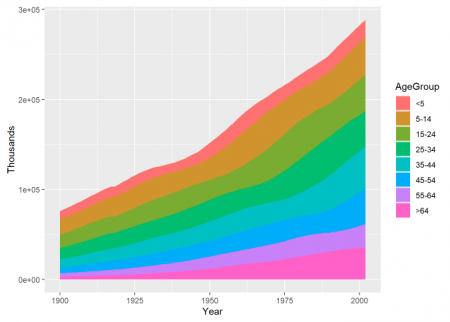
| − | + | [[File:stckarea.png|450px|thumb|right|Fig.1: An example of the stacked area plot.]] | |
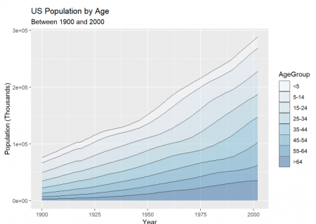
| + | [[File:stcharea.png|450px|thumb|right|Fig.2: Stacked area plot after customization.]] | ||
<syntaxhighlight lang="R" line> | <syntaxhighlight lang="R" line> | ||
library(tidyverse) #This package contains the ggplot2 needed to apply the function geom_area() | library(tidyverse) #This package contains the ggplot2 needed to apply the function geom_area() | ||
| Line 47: | Line 48: | ||
</syntaxhighlight> | </syntaxhighlight> | ||
| − | |||
Plotting the dataset <syntaxhighlight lang="R" inline>"uspopage"</syntaxhighlight> using the function <syntaxhighlight lang="R" inline>geom_area()</syntaxhighlight> from the <syntaxhighlight lang="R" inline>ggplot2 package</syntaxhighlight>: | Plotting the dataset <syntaxhighlight lang="R" inline>"uspopage"</syntaxhighlight> using the function <syntaxhighlight lang="R" inline>geom_area()</syntaxhighlight> from the <syntaxhighlight lang="R" inline>ggplot2 package</syntaxhighlight>: | ||
| Line 59: | Line 59: | ||
==Additional== | ==Additional== | ||
| − | |||
Additionally, we can play with the format of the plot. To our previous example, we will reduce the size of the lines, scale the color of the filling to different tones of “Blues”, and add labels. | Additionally, we can play with the format of the plot. To our previous example, we will reduce the size of the lines, scale the color of the filling to different tones of “Blues”, and add labels. | ||
| Line 80: | Line 79: | ||
[[Category:R examples]] | [[Category:R examples]] | ||
| − | The [[Table of Contributors|author]] of this entry is Jose Machuca. | + | The [[Table of Contributors|author]] of this entry is Maria Jose Machuca. |
Latest revision as of 07:29, 21 March 2022
Note: This entry revolves specifically around Stacked Area plots. For more general information on quantitative data visualisation, please refer to Introduction to statistical figures.
In short:
This entry aims to introduce Stacked Area Plot and its visualization using R’s ggplot2 package. A Stacked Area Plot is similar to an Area Plot with the difference that it uses multiple data series. And an Area Plot is similar to a Line Plot with the difference that the area under the line is colored.
Contents
Overview
A Stacked Area Plot displays quantitative values for multiple data series. The plot comprises of lines with the area below the lines colored (or filled) to represent the quantitative value for each data series. The Stacked Area Plot displays the evolution of a numeric variable for several groups of a dataset. Each group is displayed on top of each other, making it easy to read the evolution of the total. A Stacked Area Plot is used to track the total value of the data series and also to understand the breakdown of that total into the different data series. Comparing the heights of each data series allows us to get a general idea of how each subgroup compares to the other in their contributions to the total. A data series is a set of data represented as a line in a Stacked Area Plot.
Best practices
Limit the number of data series. The more data series presented, the more the color combinations are used.
Consider the order of the lines. While the total shape of the plot will be the same regardless of the order of the data series lines, reading the plot can be supported through a good choice of line order.
Some issues with stacking
Stacked Area Plots must be applied carefully since they have some limitations. They are appropriate to study the evolution of the whole data series and the relative proportions of each data series, but not to study the evolution of each individual data series.
To have a clearer understanding, let us plot an example of a Stacked Area Plot in R.
Plotting in R
R uses the function geom_area() to create Stacked Area Plots.
The function geom_area() has the following syntax:
Syntax: ggplot(Data, aes(x=x_variable, y=y_variable, fill=group_variable)) + geom_area()
Parameters:
- Data: This parameter contains whole dataset (with the different data series) which are used in Stacked Area Plot.
- x: This parameter contains numerical value of variable for x axis in Stacked Area Plot.
- y: This parameter contains numerical value of variables for y axis in Stacked Area Plot.
- fill: This parameter contains group column of Data which is mainly used for analyses in Stacked Area Plot.
Now, we will plot the Stacked Area Plot in R. We will need the following R packages:
library(tidyverse)  #This package contains the ggplot2 needed to apply the function geom_area()
library(gcookbook)  #This package contains the dataset for the exercise
Plotting the dataset "uspopage" using the function geom_area() from the ggplot2 package:
#Fig.1
ggplot(uspopage, aes(x = Year , y = Thousands, fill = AgeGroup)) +
  geom_area()
From this Stacked Area Plot, we can visualize the evolution of the US population throughout the years, with all the age groups growing steadily with time, especially the population higher than 64 years old.
Additional
Additionally, we can play with the format of the plot. To our previous example, we will reduce the size of the lines, scale the color of the filling to different tones of “Blues”, and add labels.
ggplot(uspopage, aes(x = Year, y = Thousands, fill = AgeGroup)) +
  geom_area(colour = "black", size = .2, alpha = .4) +
  scale_fill_brewer(palette = "Blues")+
  labs(title = "US Population by Age",
       subtitle = "Between 1900 and 2000",
       x = "Year",
       y = "Population (Thousands)")
References
- R Graphics Cookbook, 2nd edition by Winston Chang
The author of this entry is Maria Jose Machuca.

