Difference between revisions of "Principal Component Analysis"
Oskarlemke (talk | contribs) |
|||
| (16 intermediate revisions by 6 users not shown) | |||
| Line 1: | Line 1: | ||
| − | [[File: | + | [[File:Quan indu indi syst glob pres.png|thumb|right|[[Design Criteria of Methods|Method Categorisation:]]<br> |
| − | + | '''Quantitative''' - Qualitative<br> | |
| − | <br | + | Deductive - '''Inductive'''<br> |
| − | + | '''Individual''' - '''System''' - '''Global'''<br> | |
| − | + | Past - '''Present''' - Future]] | |
| − | + | '''In short:''' Principle Component Analysis is an unsupervised learning algorithm whose goal is to reduce the dimensionality of quantitative data to a low number of dimensions. | |
| − | |||
| − | |||
| − | |||
| − | |||
| − | |||
| − | |||
| − | |||
| − | |||
| − | |||
| − | |||
| − | |||
| − | |||
| − | '''In short:''' Principle Component Analysis is an unsupervised learning algorithm whose | ||
== Background == | == Background == | ||
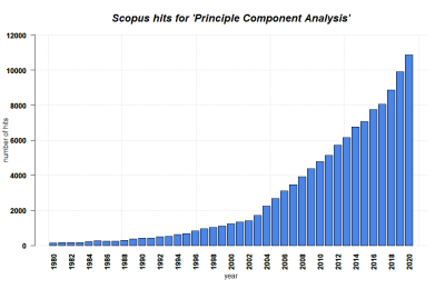
| + | [[File:PCA.png|400px|thumb|right|'''SCOPUS hits per year for Principle Component Analysis until 2020.''' Search terms: 'PCA', 'Principle Component Analysis' in Title, Abstract, Keywords. Source: own.]] | ||
| + | === Motivation === | ||
| − | + | Principal Component Analyses are helpful when you have a lot of different [[Glossary|data]] samples with a variety of variables. For example, the following dataset which contains different nutrient measurements in various pizzas from different pizza brands. | |
| − | |||
* brand -- Pizza brand (class label) | * brand -- Pizza brand (class label) | ||
| Line 37: | Line 25: | ||
=== Curse of dimensionality === | === Curse of dimensionality === | ||
| − | + | This term was coined by Richard R. Bellman, an American applied mathematician. As the number of features / dimensions increases, the distance among data points grows exponential. Things become really sparse as the instances lie very far away from each other. This makes applying machine learning methods much more difficult, since there is a certain relationship between the number of features and the number of training data. In short, with higher dimensions you need to gather much more data for learning to actually occur, which leaves a lot of room for error. Moreover, higher-dimension spaces have many counter-intuitive properties, and the human mind, as well as most data analysis tools, is used to dealing with only up to three dimensions (like the world we are living in). Thus, data visualization and intepretation become much harder, and computational costs of model training greatly increases. '''Principle Component Analysis helps to alleviate this problem'''. | |
| − | This term was coined by Richard R. Bellman, an American applied mathematician. As the number of features / dimensions increases, the distance among data points grows exponential. Things become really sparse as the instances lie very far away from each other. This makes applying machine learning methods much more difficult, since there is a certain relationship between the number of features and the number of training data. In short, with higher dimensions you need to gather much more data for learning to actually occur, which leaves a lot of room for error. Moreover, higher-dimension spaces have many counter-intuitive properties, and the human mind, as well as most data analysis tools, is used to dealing with only up to three dimensions (like the world we are living in). Thus, data visualization and intepretation become much harder, and computational costs of model training greatly increases. | ||
| − | |||
| − | |||
| − | Principle Component Analysis helps to alleviate this problem | ||
| − | |||
[[File: PCA_BiPlot.png|center|500px]] | [[File: PCA_BiPlot.png|center|500px]] | ||
| − | |||
== What the method does == | == What the method does == | ||
| Line 73: | Line 55: | ||
[[File: PCAEigenvector01.png|center|500px]] | [[File: PCAEigenvector01.png|center|500px]] | ||
| − | This prompts the questions: Can we find directly find the vector which already lies on this "widest spread direction". The answer is yes, with the help of eigenvectors. Simply put, eigenvectors of a certain matrix | + | This prompts the questions: Can we find directly find the vector which already lies on this "widest spread direction". The answer is yes, with the help of eigenvectors. Simply put, an eigenvectors of a certain matrix is a vector that, when transformed by the matrix, does not rotate. It remains on its own span, and the only thing that changes is its magnitude. This (constant) change ratio in magnitude corresponding to each eigenvector is called eigenvalue. It indicates how much of the data variability can be explained by its eigenvector. |
For this toy dataset, since there are two dimensions, we get (at most) two egenvectors and two corresponding eigenvalues. Even if we only plot the eigenvectors scaled by their eigenvalues, we will basically have a summary data (and its spreading). At this point, the eigenpairs are be viewed as the principle components of the data. | For this toy dataset, since there are two dimensions, we get (at most) two egenvectors and two corresponding eigenvalues. Even if we only plot the eigenvectors scaled by their eigenvalues, we will basically have a summary data (and its spreading). At this point, the eigenpairs are be viewed as the principle components of the data. | ||
| Line 111: | Line 93: | ||
<syntaxhighlight lang="R" line> | <syntaxhighlight lang="R" line> | ||
| − | data.pca <- prcomp(data[, mois:cal]), scale = | + | data.pca <- prcomp(data[, mois:cal]), scale = TRUE) |
</syntaxhighlight> | </syntaxhighlight> | ||
| Line 170: | Line 152: | ||
This is why standardization, or sometimes called feature scaling (scale data to mean 0 and standard deviation 1) is a crucial pre-processing step in many data analysis procedures and machine learning algorithms, including PCA. This allows the analysis to pay attention to all features equally, so that no variable dominates the others (equal importance). | This is why standardization, or sometimes called feature scaling (scale data to mean 0 and standard deviation 1) is a crucial pre-processing step in many data analysis procedures and machine learning algorithms, including PCA. This allows the analysis to pay attention to all features equally, so that no variable dominates the others (equal importance). | ||
| − | + | == Strengths & Challenges == | |
| − | == Strengths & | ||
'''Strengths''' | '''Strengths''' | ||
* Reduce complexity of data | * Reduce complexity of data | ||
| Line 178: | Line 159: | ||
* Enhance performance of algorithms | * Enhance performance of algorithms | ||
* Reduce overfitting | * Reduce overfitting | ||
| − | + | '''Challenges''' | |
| − | ''' | ||
* Principle components are created based on linear assumptions | * Principle components are created based on linear assumptions | ||
* The created principle components are hard to interpret | * The created principle components are hard to interpret | ||
* Information loss through reduction of dimensionality (oftentimes acceptable) | * Information loss through reduction of dimensionality (oftentimes acceptable) | ||
| − | |||
== Key Publications == | == Key Publications == | ||
| Line 189: | Line 168: | ||
* Jolliffe, I. T., & Cadima, J. (2016). Principal component analysis: a review and recent developments. Philosophical Transactions of the Royal Society A: Mathematical, Physical and Engineering Sciences, 374(2065), 20150202. | * Jolliffe, I. T., & Cadima, J. (2016). Principal component analysis: a review and recent developments. Philosophical Transactions of the Royal Society A: Mathematical, Physical and Engineering Sciences, 374(2065), 20150202. | ||
| − | |||
== See Also == | == See Also == | ||
| − | * [A simple visual explanation of PCA from StatQuest with Josh Starmer | + | * [https://www.youtube.com/watch?v=FgakZw6K1QQ&t A simple visual explanation of PCA] from StatQuest with Josh Starmer |
| − | * [An in-depth walkthrough of PCA and its mathematical root with Victor Lavrenko | + | * [https://www.youtube.com/watch?v=IbE0tbjy6JQ&list=PLBv09BD7ez_5_yapAg86Od6JeeypkS4YM&index=4 An in-depth walkthrough of PCA] and its mathematical root with Victor Lavrenko |
---- | ---- | ||
Latest revision as of 16:55, 29 July 2024
Quantitative - Qualitative
Deductive - Inductive
Individual - System - Global
Past - Present - Future
In short: Principle Component Analysis is an unsupervised learning algorithm whose goal is to reduce the dimensionality of quantitative data to a low number of dimensions.
Background
Motivation
Principal Component Analyses are helpful when you have a lot of different data samples with a variety of variables. For example, the following dataset which contains different nutrient measurements in various pizzas from different pizza brands.
- brand -- Pizza brand (class label)
- id -- Sample analysed
- mois -- Amount of water per 100 grams in the sample
- prot -- Amount of protein per 100 grams in the sample
- fat -- Amount of fat per 100 grams in the sample
- ash -- Amount of ash per 100 grams in the sample
- sodium -- Amount of sodium per 100 grams in the sample
- carb -- Amount of carbohydrates per 100 grams in the sample
- cal -- Amount of calories per 100 grams in the sample
How can you represent this data as concise and understandable as possible? It is impossible to plot all variables as is onto a flat screen/paper. Furthermore, high-dimensional data suffers from what is called the curse of dimensionality.
Curse of dimensionality
This term was coined by Richard R. Bellman, an American applied mathematician. As the number of features / dimensions increases, the distance among data points grows exponential. Things become really sparse as the instances lie very far away from each other. This makes applying machine learning methods much more difficult, since there is a certain relationship between the number of features and the number of training data. In short, with higher dimensions you need to gather much more data for learning to actually occur, which leaves a lot of room for error. Moreover, higher-dimension spaces have many counter-intuitive properties, and the human mind, as well as most data analysis tools, is used to dealing with only up to three dimensions (like the world we are living in). Thus, data visualization and intepretation become much harder, and computational costs of model training greatly increases. Principle Component Analysis helps to alleviate this problem.
What the method does
Principle Component Analysis is one of the foundational methods to combat the curse of dimensionality. It is an unsupervised learning algorithm whose goals is to reduce the dimensionality of the data, condensing its entirety down to a low number of dimensions (also called principle components, usually two or three).
Although it comes with a cost of losing some information, it makes data visualization much easier, improves the space and time complexity required for machine learning algorithms tremendously, and allows for more intuitive intepretation of these models. PCA can also be categorized a feature extraction techniques, since it creates these principle components - new and more relevant features - from the original ones.
The essence of PCA lies in finding all directions in which the data "spreads", determining the extent in which the data spreads in those directions, keeping only few direction in which the data spreads the most. And voila, these are your new dimensions / features of the data.
Road to PCA
Standardization
Oftentimes the features in the data are measured on different scales. This step makes sure that all features contribute equally to the analysis. Otherwise, variables with large range will trump thoses with smaller range (for example: a time variable that ranges between 0ms and 1000ms with dominate over a distance variable that ranges between 0m and 10m). Each variable can be scaled by subtracting its mean and dividing by the standard deviation (this is the same as calculating the z-score, and in the end, all variables with have the same mean 0 and standard deviation of 1).
Covariance matrix
The covariance matrix is a square d x d matrix, where each entry represents the covariance of a possible pair of the original features. It has the following properties:
- The size of the matrix is equal to the number of features in the data
- The main diagonal on the matrix contains the variances of each initial variables.
- The matrix is symmetric, since Cov(d1, d2) = Cov(d1, d2)
The covariance matrix gives you a summary of the relationship among the initial variables.
- A positive value indicate a directly proportional relationship (as d1 increases, d2 increases, and vice versa)
- A negative value indicate a indirectly proportional relationship (as d1 increases, d2 decreases, and vice versa)
Eigenvectors / Principle Components & Eigenvalues
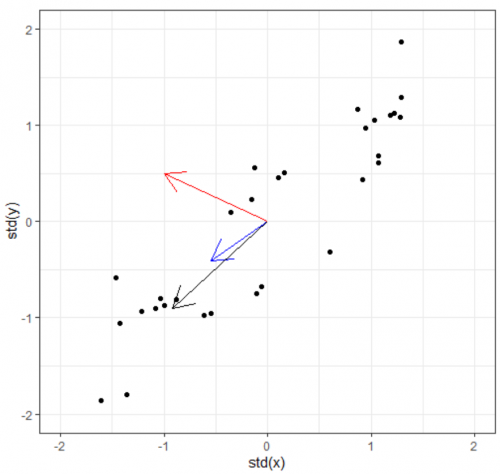
Now we have the covariance matrix. This matrix can be used to transform one vector into another. Normally when this transformation happens, two things happen: the original is rotated and get streched/squished to form a new vector. When an abitrary vector is multipled by the covariance matrix, the result will be a new vector whose direction is nudged/rotated towards the greatest spread in the data. In the figure below, we start with the arbitrary vector (-1, 0.5) in red. Multiplying the red vector with covariance matrix gives us the blue vector, and repeating this gives us the black vector. As you can see, the result rotation tends to converge towards the widest spread direction of the data.
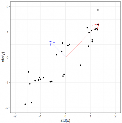
This prompts the questions: Can we find directly find the vector which already lies on this "widest spread direction". The answer is yes, with the help of eigenvectors. Simply put, an eigenvectors of a certain matrix is a vector that, when transformed by the matrix, does not rotate. It remains on its own span, and the only thing that changes is its magnitude. This (constant) change ratio in magnitude corresponding to each eigenvector is called eigenvalue. It indicates how much of the data variability can be explained by its eigenvector.
For this toy dataset, since there are two dimensions, we get (at most) two egenvectors and two corresponding eigenvalues. Even if we only plot the eigenvectors scaled by their eigenvalues, we will basically have a summary data (and its spreading). At this point, the eigenpairs are be viewed as the principle components of the data.
Ranking the principle components
As you may have noticed, the eigenvectors are perpendicular to each other. This is no coincidence. You can think of it this way: because we want to maximize the variance explained by each of the principle components, these components need to be independent from one another, therefore their orthogonality. Thus, to define a set of principle components, you find the direction which can explain the variability in the data the most: that is your first principle component (the eigenvector with the highest eigenvalue). The second principle compent will be percepdicular to the first, and explain most of what is left of the variability. This continues until the d-th principle component is found.
By doing so, you are also sorting the "importance" of the principle components in terms of the information amount it contains what is used to explain the data. To be clear, the sum of all eigenvalues is the total variability in the data. From here, you can choose to discard any PCs whose percentage of explained variances are low. In many cases, if around 80% of the variance can be explained by the first k PCs, we can discard the other (d - k) PCs. Of course, this is only one of the heuristics method to determine k. You can also use thr elbow method (the scree plot) like in k-means.
Summary
- PCA is a feature extraction technique widely used to reduce dimensionality of datasets.
- PCA works by calculating the eigenvectors and the corresponding eigenvalues of the initial variables in the data. These are the principle components. Number of PCs = number of eigenvectors = number of features.
- The PCs are ranked by the eigenvalues, and iteratively show the directions in which the data spreads the most (after accounting for the previous PCs).
- We can choose to keep a few of the first PCs that cummulatively explains the data well enough, and these are the new reduced dimension of the data.
- Standardization is a crucial step in data pre-processing to ensure the validity of the PCA results.
R Example
Going back to the example in the introduction, the dataset can be found here: https://www.kaggle.com/sdhilip/nutrient-analysis-of-pizzas
# Loading library
library(tidyverse) # For pre-processing data
library(factoextra) # For visualization
theme_set(theme_bw()) # Set theme for plots

# Load data
data <- read_csv("Pizza.csv")
head(data)
As shown here, there are seven measurements of nutrients for each pizza. Our goal is to reduce these seven dimensions of information down to only two, so that we can present the main patterns in our data on a flat piece of paper.
To conduct Principle Component Analysis in R, we use prcomp. From the original data, we only select the seven nutrient measurements as input for the function. In this function, we set scale = TRUE to perform scaling and centering (so that all variables will have a mean of 0 and standard deviation of 1). The result object is saved in data.pca
data.pca <- prcomp(data[, mois:cal]), scale = TRUE)
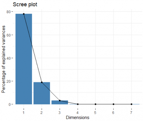
Now we can visualize and inspect the result of the analysis. We start off by looking at the contribution of each created principle component (PC) to the overall variance in the dataset. For this, we create a spree plot:
fviz_eig(data.pca)
Like I mentioned before, the number of PC created is equal to the number of input variables (in this cases, seven). Looking at the plot, the first two PCs combined can explain more than 90% of the dataset, an amazing number. This means this 7-dimensional dataset can be presented on a 2-dimensional space, and we still only lose less than 10% of the information. In other words, the first two PCs are the most important, and we can discard the other ones.
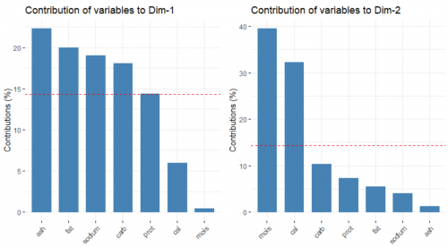
Next, we look at the contribution of the original variables to the building of the two PCs, respectively.
fviz_contrib(data.pca, choice = "var", axes = 1)
fviz_contrib(data.pca, choice = "var", axes = 2)
The red, dashed line refers to the case where all of the variable contribute equally. In the left plot, ash, fat, sodium and carbohydrates contribute substantially to the forming of the first PC. On the other hand, moisture and calories influence the second PC heavily, as seen in the right plot.
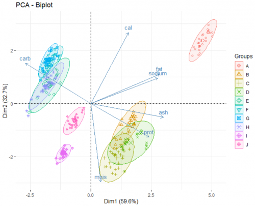
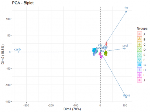
Finally, we look at the biplot of the analysis. This reveals the underlying patterns of the dataset:
fviz_pca_biplot(data.pca, label = "var", habillage = data$brand, axes = c(1,2), addEllipse = TRUE)
The two axes of this plot are the newly created PCs. There are two main part of information presented on the plot:
- The arrows show how the original variables correlate with the two PCs, and in turn, with each others. For example, from the way the moisture arrow presents itself we can infer a strong negative correlation of the variable and the second PC. Fat and sodium have a very strong positive correlation, and the more carbohydrates a pizza contains, the less protein it has. Adding argument
label = "var"in the function allows for the variable names to be printed. - The points show how each individual pizza is plotted on this new coordinate system. Here, we go a step further and grouping those pizza under different brands (a categorical variable) using the arguement
habillage = data$brand. By doing this, we unearth additional information about those brands. For example:- Brand A typically produce pizzas with a high level of fat and sodium.
- Pizzas from brand B, C, and D are rich in proteins and ash, as opposed to pizza from brand E, F, G, H which are high in carbohydrates.
- If you favorite pizza brand F goes out of business (for whatever reason), a pizza from brand E, G or H would be a good substitute in terms of nutritional value.
R Example: Is standardization that important?
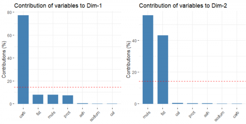
To answer this question, let us try an alternative scenario, where we conduct PCA without centering and scaling the variables.
data.pca <- data %>% select(mois:cal) %>% prcomp(scale = FALSE)
fviz_pca_biplot(data.pca, label = "var", habillage = data$brand, axes = c(1,2), addEllipse = TRUE)
Suddenly all that matters are only the carbohydrate, moisture and fat level of the pizzas. Why is that the case?
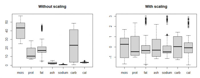
By plotting the distribution of the original data using boxplots (on the left), we can see that the value range of data for the variables are vastly different. For example, the variable carbohydrates has much higher mean and variance compared to calories. By nature, PCA tries to form PCs where there is a widest spread in the data, so it will always prefer those variables with high "absolute" variance. It's like comparing 1000 milliseconds and 5 kilometers and putting more weight on the 1000 milliseconds because 1000 is bigger than 5.
This is why standardization, or sometimes called feature scaling (scale data to mean 0 and standard deviation 1) is a crucial pre-processing step in many data analysis procedures and machine learning algorithms, including PCA. This allows the analysis to pay attention to all features equally, so that no variable dominates the others (equal importance).
Strengths & Challenges
Strengths
- Reduce complexity of data
- Allows for concise visualization of main patterns in data
- Remove correlated features
- Enhance performance of algorithms
- Reduce overfitting
Challenges
- Principle components are created based on linear assumptions
- The created principle components are hard to interpret
- Information loss through reduction of dimensionality (oftentimes acceptable)
Key Publications
- Wold, S., Esbensen, K., & Geladi, P. (1987). Principal component analysis. Chemometrics and intelligent laboratory systems, 2(1-3), 37-52.
- Jolliffe, I. T., & Cadima, J. (2016). Principal component analysis: a review and recent developments. Philosophical Transactions of the Royal Society A: Mathematical, Physical and Engineering Sciences, 374(2065), 20150202.
See Also
- A simple visual explanation of PCA from StatQuest with Josh Starmer
- An in-depth walkthrough of PCA and its mathematical root with Victor Lavrenko
The author of this entry is Chân Lê.
