Difference between revisions of "Graphical abstract"
(→Goals) |
(→Goals) |
||
| Line 37: | Line 37: | ||
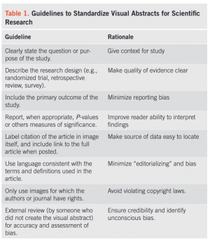
Table 1 shows a great summary example. | Table 1 shows a great summary example. | ||
| − | [[File:Guidelines to Standardize Visual Abstracts for Scientific Research.png|thumb|right| | + | [[File:Guidelines to Standardize Visual Abstracts for Scientific Research.png|thumb|right|Table 1, Source: (1)]] |
==Supporting software and literature== | ==Supporting software and literature== | ||
Revision as of 18:44, 22 May 2024

Deductive - Inductive
Individual - System - Global
Past - Present - Future
Contents
Introduction
Similarly to a written abstract, a graphical abstract of a scientific article is designed to inform the reader about the most relevant results of the article. A graphical abstract is often a single image combining various image objects and text pieces to illustrate and summarize the content and findings of the study at a glance. Graphical abstracts are a recent phenomenon and vary in appearance with the corresponding research field. In chemistry and medicine, graphical abstracts have been common since the 1970s (Ibrahim 2017). Graphical abstracts come in handy to communicate your simplified research findings via social media. The visual language depends on the requirements or general communication of the journal in which the article should be published. Not all research output qualifies for a graphical abstract. A graphical abstract can be part of a thesis.
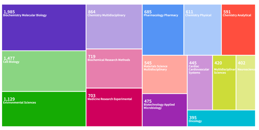
These research fields mostly use graphical abstracts as queried from web of science with 13.200 articles. Note that the articles where not quality checked and in some “graphical abstract” might appear yet a graphical abstract may not be part of the article.
Goals
Creating a graphical abstract is an excellent way of clearly communicating the main points of the research at a glance, yet it can be difficult to summarize months or years of work in a simple graphic in a way that the reader can understand the main results. There are 3 important points to bear in mind when creating a graphical abstract.
1. Keep it simple
Select fonts that are easy to read and consistent in size, with the most important points in larger or bolder text to draw attention. Avoid extensive text and too many colors. Arrange the components in a logical flow where the reader can follow the main message, leading naturally from the problem statement to the conclusions.
2. Focus on Key Findings
This is one of the most difficult parts because as scientists we usually want to show all results and and not even skip the smallest detail. Start by identifying the pivotal findings or conclusions of your research. The graphic should be built around these elements, making them the focal point of the abstract.
3. Avoiding Bias
Be vigilant about how data is visualized. Use abstract forms or symbols instead of human figures. This can include shapes, icons, or neutral figures that don’t specify race, gender, or other personal characteristics. Use gender-neutral language, avoid stereotypes and be mindful of cultural symbols and metaphors that may carry different meanings across different cultures. Educate yourself and your team on issues regarding diversity, equity, justice and inclusion (DEJI). Awareness and understanding of DEJI can greatly influence the design choices in scientific communications and help prevent unconscious biases from manifesting in your work.
Table 1 shows a great summary example.
Supporting software and literature
To create a graphical abstract, you may use a pen and paper yet software programs such as PowerPoint, Ilustrator or Keynote or probably the better choice. There are also browser-based whiteboard options such as draw.io, excalidraw.com or mural.co. You can make use of the figures created for the scientific article or create completely new figures and graphs. There are various platforms providing free icons, images or figures. Whenever you use open-source content make sure to check the copyright and cite your sources. Free icons are provided for example under icons8.com and a list of free images providers can be found here https://www.foleon.com/blog/best-free-business-stock-photo-websites. There are several examples and even templates to choose from: https://www.simplifiedsciencepublishing.com/resources/best-graphical-abstract-examples-with-free-templates
Examples
Key publications and References
- Table 1: Ibrahim, Andrew M MD, MSc1,2. Seeing is Believing: Using Visual Abstracts to Disseminate Scientific Research. American Journal of Gastroenterology 113(4):p 459-461, April 2018. | DOI: 10.1038/ajg.2017.268
- Jeyaraman, M., Ratna, H. V. K., Jeyaraman, N., Maffulli, N., Migliorini, F., Nallakumarasamy, A., ... & Ratna, H. V. (2023). Graphical Abstract in Scientific Research. Cureus, 15(9).
The author of this entry is Charlotte Gohr and Flávia De Souza Mendes.

