Difference between revisions of "Bubble Plots"
m |
m |
||
| (7 intermediate revisions by the same user not shown) | |||
| Line 38: | Line 38: | ||
A bubble plot can take three variables as the code below shows: two for both of the axis (x- and y-axis) and one for the bubble-size. In order to map the variables to the axis and the size the function <syntaxhighlight lang="R" inline>aes()</syntaxhighlight> is used. The function <syntaxhighlight lang="R" inline>geom_point()</syntaxhighlight> defines the overall type (“points”) of the plot. If there is no input to that function (leaving the brackets empty) the plot would just be a scatter plot. The command <syntaxhighlight lang="R" inline>aes(size = variable3)</syntaxhighlight> maps the third variable as the size of points within the function <syntaxhighlight lang="R" inline>geom_point()</syntaxhighlight>. That is all the magic! | A bubble plot can take three variables as the code below shows: two for both of the axis (x- and y-axis) and one for the bubble-size. In order to map the variables to the axis and the size the function <syntaxhighlight lang="R" inline>aes()</syntaxhighlight> is used. The function <syntaxhighlight lang="R" inline>geom_point()</syntaxhighlight> defines the overall type (“points”) of the plot. If there is no input to that function (leaving the brackets empty) the plot would just be a scatter plot. The command <syntaxhighlight lang="R" inline>aes(size = variable3)</syntaxhighlight> maps the third variable as the size of points within the function <syntaxhighlight lang="R" inline>geom_point()</syntaxhighlight>. That is all the magic! | ||
| − | [[File:bubbleplotmtcars.png| | + | [[File:bubbleplotmtcars.png|450px|thumb|right|Fig. 2: Cars' fuel consumption (miles/gallon), their weight (in 1000 lbs) and horsepower visualized with a bubble plot. Dataset: mtcars.]] |
<syntaxhighlight lang="R" line> | <syntaxhighlight lang="R" line> | ||
| Line 52: | Line 52: | ||
Of course this plot is missing proper labels. So far <syntaxhighlight lang="R" inline>ggplot</syntaxhighlight> used the column names of the data set to name the axis and the size. The function <syntaxhighlight lang="R" inline>labs()</syntaxhighlight> allows us to customize and add the labels and a title: | Of course this plot is missing proper labels. So far <syntaxhighlight lang="R" inline>ggplot</syntaxhighlight> used the column names of the data set to name the axis and the size. The function <syntaxhighlight lang="R" inline>labs()</syntaxhighlight> allows us to customize and add the labels and a title: | ||
| − | [[File:bubplotmtcars.png| | + | [[File:bubplotmtcars.png|450px|thumb|right|Fig. 3: mtcars bubble plot visualization with labels.]] |
<syntaxhighlight lang="R" line> | <syntaxhighlight lang="R" line> | ||
| Line 71: | Line 71: | ||
==Grouping by Colors== | ==Grouping by Colors== | ||
| + | [[File:colbubpl.png|450px|thumb|right|Fig.4: Cars' fuel consumption (miles/gallon), their weight (in 1000 lbs), horsepower and number of forward gears visualized with a bubble plot. Dataset: mtcars.]] | ||
| + | [[File:clrplt.png|450px|thumb|right|Fig.5: Overview of all color palettes in the package RColorBrewer]] | ||
If you took a look at the Gapminder data tool [https://www.gapminder.org/tools/#$chart-type=bubbles&url=v1 Bubbles], you might have noticed that the bubbles are colored to indicate the world regions. This type of color grouping can be easily implemented within our plot. We just add within the function <syntaxhighlight lang="R" inline>geom_point()</syntaxhighlight> the type <syntaxhighlight lang="R" inline>color</syntaxhighlight> in the function <syntaxhighlight lang="R" inline>aes()</syntaxhighlight>. By this we map another variable, in this case the number of forward gears, to the type <syntaxhighlight lang="R" inline>color</syntaxhighlight>. And last but not least, we can change the color palette with the function <syntaxhighlight lang="R" inline>scale_color_brewer()</syntaxhighlight>, if we do not like the default color palette. | If you took a look at the Gapminder data tool [https://www.gapminder.org/tools/#$chart-type=bubbles&url=v1 Bubbles], you might have noticed that the bubbles are colored to indicate the world regions. This type of color grouping can be easily implemented within our plot. We just add within the function <syntaxhighlight lang="R" inline>geom_point()</syntaxhighlight> the type <syntaxhighlight lang="R" inline>color</syntaxhighlight> in the function <syntaxhighlight lang="R" inline>aes()</syntaxhighlight>. By this we map another variable, in this case the number of forward gears, to the type <syntaxhighlight lang="R" inline>color</syntaxhighlight>. And last but not least, we can change the color palette with the function <syntaxhighlight lang="R" inline>scale_color_brewer()</syntaxhighlight>, if we do not like the default color palette. | ||
| − | |||
<syntaxhighlight lang="R" line> | <syntaxhighlight lang="R" line> | ||
| Line 90: | Line 91: | ||
print(customised_bubbleplot) | print(customised_bubbleplot) | ||
</syntaxhighlight> | </syntaxhighlight> | ||
| − | |||
| − | |||
An overview over all color palettes in the package <syntaxhighlight lang="R" inline>RColorBrewer</syntaxhighlight> can be displayed by running the following code: | An overview over all color palettes in the package <syntaxhighlight lang="R" inline>RColorBrewer</syntaxhighlight> can be displayed by running the following code: | ||
<syntaxhighlight lang="R" line> | <syntaxhighlight lang="R" line> | ||
| + | #Fig.5 | ||
library("RColorBrewer") | library("RColorBrewer") | ||
display.brewer.all(colorblindFriendly = TRUE) | display.brewer.all(colorblindFriendly = TRUE) | ||
Latest revision as of 20:21, 20 March 2022
Note: This entry revolves specifically around Bubble plots. For more general information on quantitative data visualisation, please refer to Introduction to statistical figures.
In short: A Bubble plot is a graphical representation of multivariate data table. One can think of it as an XY scatter plot with two additional variables. X and Y variables are numeric, and two additional variables, either continuous or categorical, can be represented by the bubble colour and bubble size.
Overview
This wiki entry will elaborate what a bubble plot is, how to implement such a plot and how to customize your own bubble plot.
A bubble plot is able to present up to four variables, without actually being a four dimensional plot. We can first start with trying to plot three variables. For that the input data should be a triplet (Note: the data should be quantitative and non-categorical). One variable is represented by the x-axis, another one by the y-axis and the third by the size of the data points. Therefore the data points differ in size which makes the plot look like an accumulation of bubbles. We will then incorporate the fourth variable as a color later in our example.
A lot of bubble plot examples can be seen online in the Gapminder data tool Bubbles. Check it out, it’s worth it!
Preliminaries
We will use ggplot to create the bubble plot. In order to use ggplot you need to install the packages gapminder and tidyverse (use the command install.packages(“name”)). Depending on your computer system you may also need to install other dependencies. More information on how to install packages can be found here. After installing the packages, we need to activate their libraries:
library(tidyverse)
library(gapminder)
If everything is set up you can choose and take a look at your data. I decided to use the mtcars data set, because it is well-known and common to use in examples.
#Fig.1
head(mtcars)
For further information on the variables and what this data set is about run the command ?mtcars.
Code
After installing and including the gapminder and tidyverse packages we are ready to create the plot. I decided to set the theme via theme_set() of the plot here. The theme is the overall design and background of your plot. An overview of ggplot themes can be found here.
#theme
theme_set(theme_linedraw())
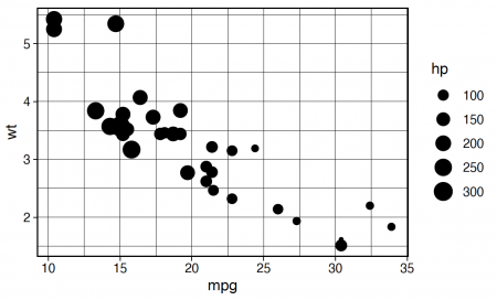
A bubble plot can take three variables as the code below shows: two for both of the axis (x- and y-axis) and one for the bubble-size. In order to map the variables to the axis and the size the function aes() is used. The function geom_point() defines the overall type (“points”) of the plot. If there is no input to that function (leaving the brackets empty) the plot would just be a scatter plot. The command aes(size = variable3) maps the third variable as the size of points within the function geom_point(). That is all the magic!
bubbleplot <- ggplot(data = mtcars, aes(x = mpg, y = wt)) + #variable 1 and variable 2
                                                            #(x,y-axis)
  geom_point(aes(size = hp)) #variable 3 (point size)

#Fig.2
#print the plot
print(bubbleplot)
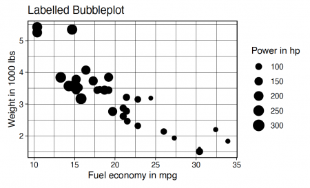
Of course this plot is missing proper labels. So far ggplot used the column names of the data set to name the axis and the size. The function labs() allows us to customize and add the labels and a title:
labelled_bubbleplot <- ggplot(data = mtcars, aes(x = mpg, y = wt)) +

   geom_point(aes(size = hp)) +

   labs(title = "Labelled Bubbleplot", #add labels and title
        x = "Fuel economy in mpg",
        y = "Weight in 1000 lbs",
        size = "Power in hp")

#Fig.3
print(labelled_bubbleplot)
Now anyone who does not know the data set can interpret and understand what we plotted.
Grouping by Colors
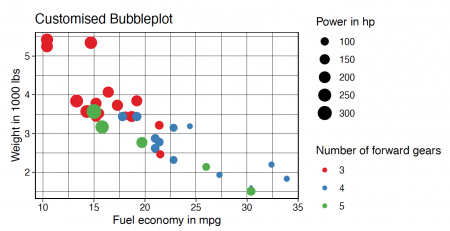
If you took a look at the Gapminder data tool Bubbles, you might have noticed that the bubbles are colored to indicate the world regions. This type of color grouping can be easily implemented within our plot. We just add within the function geom_point() the type color in the function aes(). By this we map another variable, in this case the number of forward gears, to the type color. And last but not least, we can change the color palette with the function scale_color_brewer(), if we do not like the default color palette.
customised_bubbleplot <- ggplot(data = mtcars, aes(x = mpg, y = wt)) +

    geom_point(aes(color = as.factor(gear), size = hp)) + #add colors to the bubbles
                                                          #with respect to gear
    labs(title = "Customised Bubbleplot",
         x = "Fuel economy in mpg",
         y = "Weight in 1000 lbs",
         size = "Power in hp",
         color = "Number of forward gears") +

    scale_color_brewer(palette = "Set1") #changing the color palette

#Fig.4
print(customised_bubbleplot)
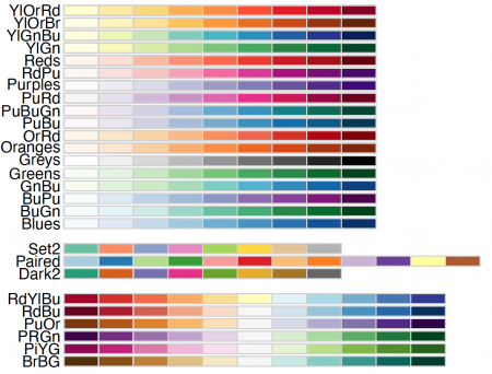
An overview over all color palettes in the package RColorBrewer can be displayed by running the following code:
#Fig.5
library("RColorBrewer")
display.brewer.all(colorblindFriendly = TRUE)
The author of this entry is Kira Herff.


