Difference between revisions of "Kernel density plot"
(Created page with "'''In short:''' This document aims to introduce kernel density plot and its visualization using R’s ggplot2 package. Density plot is used to plot the distribution of a singl...") |
m |
||
| Line 11: | Line 11: | ||
head(gapminder) | head(gapminder) | ||
</syntaxhighlight> | </syntaxhighlight> | ||
| − | [[File:File_2021-03-01_at_18.36.14. | + | [[File:File_2021-03-01_at_18.36.14.png|500px|frameless|center]] |
<syntaxhighlight lang="R" line> | <syntaxhighlight lang="R" line> | ||
Revision as of 18:03, 1 March 2021
In short: This document aims to introduce kernel density plot and its visualization using R’s ggplot2 package. Density plot is used to plot the distribution of a single quantiative variable. It allows to see which score of a variable is more frequent and which score is relatively rare. The x-axis represents the values of the variable whereas the y-axis represents its density. The area under the curve equates to 1.
Packages used : gapminder, ggplot2
# Install and load the gapminder and ggplot2 packages
install.packages("gapminder")
library(gapminder)
library(ggplot2)
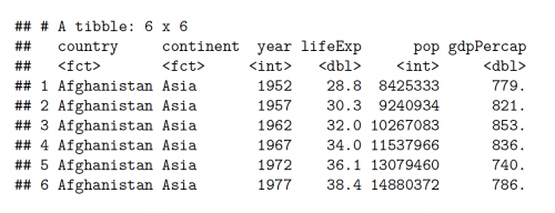
#A glimpse of the gapminder dataset
head(gapminder)
#?gapminder
#View(gapminder)
#Using the basic plot function of R to view the distribution of GDP per capita

plot(density(gapminder$gdpPercap))
Bandwidth determines the smoothing and detail of a variable. The bandwidth can be changed in the aes parameter of gemo_density() function. The default bandwidth can be viewed as:
bw.nrd0(gapminder$lifeExp)

#Output: [1] 2.624907
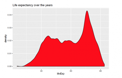
A basic density plot of life expectancy with ggplpot2() over the years can be viewed as:
ggplot(gapminder, aes(x = lifeExp))+
   geom_density(fill = "red", bw = 1)+
   labs(title = "Life expectancy over the years")
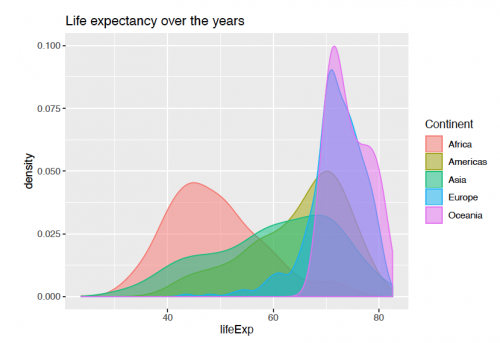
Representation of life expectancy for every continent can be further seen with using the "continent" variable for the fill parameter.
ggplot(gapminder, aes(x = lifeExp))+
    geom_density(aes(fill = continent, color = continent), alpha = 0.5)+
    scale_fill_discrete(name = "Continent")+
    scale_color_discrete(name = "Continent")+
    labs(title = "Life expectancy over the years")
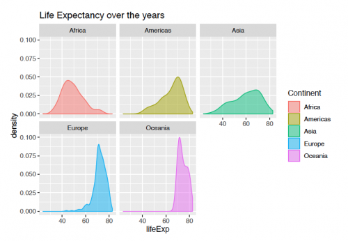
Faceting With facetting, the variable can be split into groups and viewed side-by-side for a better comparison. The code for viewing the plot below is the following:
ggplot(gapminder, aes(x = lifeExp))+
    geom_density(aes(fill = continent, color = continent),alpha = 0.5)+
    scale_fill_discrete(name = "Continent")+
    scale_color_discrete(name = "Continent")+
    labs(title = "Life Expectancy over the years")+
    facet_wrap(continent ~.)
Refernces:
- Lecture slides.
- "Histograms and Density Plots in Python" by Will Koehrson
- Kabacoff, R. (2018). Data visualization with R. EEUU: Wesleyan University.
The author of this entry is Archana Maurya.


