Poster Design
| Type | Team Size | ||||||
|---|---|---|---|---|---|---|---|
| Collaborative Tools | Software | Personal Skills | Productivity Tools | 1 | 2-10 | 11-30 | 30+ |
Why & When
Poster, usually a large sheet of paper with a designed combination of text, graphs, color, etc., is one of the cost-effective means used to convey information to a large audience. There are different types of poster for various settings, such as advertising, event, politics, for motivational and scientific uses and many more. You may encounter the need to create a poster for a presentation at University or at a Conference. Informative posters are oftentimes commercial ones of a product or services hung in front of stores, whereas formative ones are to raise awareness or speak for a good cause.
Goal(s)
- Crisp-and-clear conveyance of desired information
- Visually creative and appealing
- Ability to stand out from the background and attract attention
Essential elements of a good poster
1. Clear message & Call-to-Action
If you design a poster for an event, there are questions that should be clearly and concisely answered:
- What is the event about?
- Why should I attend this?
- When is it taking place?
- Where is the venue?
- How to attend the event (tickets info, etc.) / How to keep up with the event (social media portals, etc.)
2. Know your audience
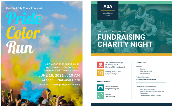
The target audience should be at the center when designing a poster, as not only the content itself but other elements in the poster can be tailor to best reach its recipients. An example compares two different posters both advertising for a fundraising event.

The poster on the left for the Pride Color Run event looks vibrant, lively and is targeted to a younger demographic. The right poster is made for a charity dinner and has a more structured and professional layout, which normally attracts the older, established audience. Many differences in color scheme, typography, layout, styling and image use can be spotted between these two posters of the same cause, which emphasizes the importance of identifying who a poster should speak to and how to effectively draw their attention.
As for educational and scientific posters, keep in mind that the audience can be roughly divided into three categories: your field of specialization, the fields closely related to yours, and unrelated fields (Woolsey, 1989). It is best to adjust your content accordingly and be mindful when using jargons and other field-specific vocabularies, unless you are sure that everyone in the audience can understand them.
3. Color has meanings
- Each color creates a unique kind of energy that could reflect the poster’s message, may it be bold, subtle, agony or ecstasy. Choosing the right color scheme will set a tone for your statement to shine, help drawing attention from the audience from afar, create a subliminal association between then and the topic even before they start reading the text.
- The actual color shade is also very important. It may come to you as a surprise, but not only gray has (more than) fifty shade. The point is, it is important to take this into account when creating a color palette for your poster. Different shades combination will create different effects even though the rough colors stay them same.
4. Typography – It’s not just about the content
- Typography is an art itself. There is so much more you can convey with the use of fonts and arrangement of texts, sometimes incorporating illustrations and images. It is an integral part to the poster as a final product, and if done right, makes a unique lasting visual impact to the audience.
5. Negative & White space – Things gotta breathe
- A lot of times: less is more. With a poster you only have limited space, so deciding what’s making it there and what not is crucial. Negative space, or white space, is the area of the layout that is purposefully left empty. It serves as a breathing room for all other elements on the poster. As mentioned at the beginning, your message has to stand out. But if everything on the poster is so crowded in technicolor, your message becomes a leaf in the forest. That’s why it is important to selectively pick out some crucial elements and make them eye-catching, while creating a background with plenty of room for your message to pop.
6. Contrast – Make it pop
- High contrast between elements on a poster could help you catch the audience’s eyes with just a glance. Experimental, bold use of colors and images are encouraged, especially when your poster is among a dozen other ones, each trying to scream for attention.
7. Readable from a distance, but scalable
- When designing a poster, you need to make sure that people are able to read the key information with a glimpse of an eye. The font, size and arrangement of text are therefore critical. The headline should be the main (and biggest) text element on the poster, and you can play around of different fonts or typography ideas to make it as attractive as possible. Then come the detailed information as discussed above. They don’t need to be as dazzling, since the audience will come a bit closer to read them through if they decide that the poster is relevant. Still, the detailed information needs to be concisely and clearly displayed to make use of the short attention span an audience may have for your poster.
- Oftentimes you will want to scale down and hand out your poster in the form of flyers. Thus, the size ratio of the headline and the detailed information should not be too drastic, as scaling down would make the details unreadable.
Links & Further reading
- Have a look at the entry on Conceptual Figures - while these are not the same as Posters, there are certain tips that may also be of relevance for your poster.
The author of this entry is Chân Lê.
