Geographical Information Systems

| Method categorization | ||
|---|---|---|
| Quantitative | Qualitative | |
| Inductive | Deductive | |
| Individual | System | Global |
| Past | Present | Future |
In short: Geographical information systems (GIS) subsume all approaches that serve as a data platform and analysis tools for spatial data.
Background
While Geographical Information Systems are typically associated with digital systems, the systematic creation of knowledge through the analysis of spatial data can be dated back long before the invention of modern computers. The first spatial analysis was focussed on the spread of Cholera in Paris (1832, "Rapport sur la marche et les effets du choléra dans Paris et le département de la Seine. Année 1832") and London (1854). While the map of Paris showed Cholera cases on a scale of the districts, John Snow showed in London the cases of citizens that died of Cholera as dots. This allowed for a clear representation of the spread of the disease. Since cases were clustered around a well, John Snow could infer that the water sources is the main spread vector of the disease. This is insofar remarkable, as is clearly highlights how knowledge could be derived inductively without any understanding of the deeper mechanics of Cholera, or let alone even the knowledge of bacteria.
At this time, topographic maps were already perfected as part of the Nation States creating inventories and understandings of their territories, and also of their colonies and their wealth. Topographic maps were increasingly able to depict different layers of information, as maps were printed in different colours that all represented different kinds of information, such as vegetation, thematic information, water, and more. With the rise of the computer age, this information was implemented into computers, and Canada created the first digital Geographical Information System in the 1960. This highlights how innovation of Geographical Information Systems was strongly driven by application, since such systems are of direct benefit in planning and governance. The main driver of innovation in early GIS development was however Howard T. Fisher from Harvard, who - with his team - developed important cornerstones that still serve as a basis for GIS, including different data formats and the general architecture of GIS systems. First commercial systems started to thrive in the 1970s and 1980s, yet only with the rise of personal computers and the Internet, Geographical Information Systems unleashed their full potential.
While simple vector formats were already widely used in the 1990s and even before, the development of a faster bandwidth and computer power proved essential to foster the exchange and usage of satellite data. While much of this data (NOAA, LANDSAT) can be traced back to the 1970, it was the computer age that made this data widely available to the common user. Thanks to the 'Freedom of Information Act', much of the US-based data was quickly becoming available to the whole world, for instance through the University of Maryland and the NASA. The development of GPS systems that originated in military systems allowed for a solution to spatial referencing and location across the whole globe. Today, commercial units from around the millennium are implemented in almost every smartphone in a much smaller version. This wide establishment allows for the location of not only our technical gadgets, but also goods and transportation machines. An initial NASA system showed a strong resemblance to Google Earth in the early 2000s, and with the commercial launch of Google Earth and Google Maps, the tech giant built a spatial database that is to date almost unrivalled.

With the Smartphone age, this information became rapidly available to the wider public, and ever more complex growing databases and apps are today adding millions of spatial entries to the global databases. The early and often clumsy GIS software suits are more diversified and broadly available today, making GIS systems a common staple of many branches of science. Open street map data and QGIS prove that data and software solutions are possible beyond the commercial business sector. Geographical Information Systems, and with them geospatial data and complex analysis, have become one of the main branches of the Internet and indeed the Modern Age. Augmented Reality and self-driving cars showcase the potential of this technology for the future, but the potentially constant geotagging of all citizens that own a smartphone also highlights problems of data security and globalisation.
What the method does
Geographical information systems implement diverse sources of spatial information within one software system. The general idea of GIS is to integrate and contextualize different sources of spatial information with each other. Thus, GIS systems can be 1) spatial data repositories, and 2) means of analysis to develop new knowledge related to spatial pattern recognition and analysis.
Data formats in Geographical Information Systems
Geographical Information Systems contain in general two types of data: Vector and raster data.


Vector data is - as the name indicates - a form of data storage that saves spatial data as mathematical vectors. These have a clear geographical referencing, called 'vertices' (or vertex in singular form), which describe a position in space using X and Y (and sometimes also z) coordinates. Typically, these vertices will use geoographical longitude and latitude. Depending on how many vertices the vector has, it can be
- points (= one vertex and thus no length),
- lines (= two or more vertices, where the last vertex is different from the first), or
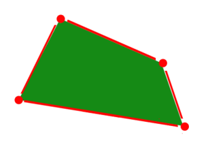
- polygons (= three or more vertices, where the last vertex is equal to the first - the vector practically returns to its origin).
Vector data as such has a high precision, as the localisation of vectors can be very precise, if they were measured and georeferenced in a precise way. Hence vector data is as precise as the way it was digitalised and measured. For instance, much cadastre data is measured in the field and then implemented through GPS measurements. An alternative way, also to implement historical data, is the scanning and digitalisation of paper maps or other sources, which is a quite work-intense process.

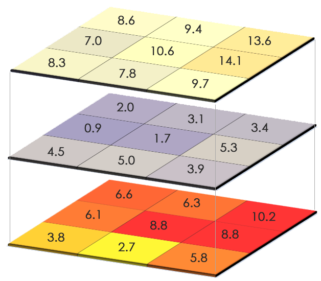
Raster data consists of pixel data that has a certain spatial resolution. Raster data is helpful to represent continuous data across an area. An example would be altitudinal data, where the prominent example is the SRTM data that has a resolution of 90 meters. In other words, for any place on the planet that is a flat surface and has a size of 90x90 meters, raster data would represent this area as a 'grid cell' and provide us with the information on the altitude of this area. More rugged and uneven terrains are averaged to this end.
Raster data can take the form of one of two data formats: quantitative or qualitative data. Quantitative data might represent an altitude, a level of precipitation or mean temperature, and is mostly displayed as continuous data which highlights that there may be gradual change. Qualitative data is distinct and represents for example types of land cover or soil. This data is also included in datasets as a number, most typically as a discrete number, but this number represents a thematic category.
Raster data has a defined resolution, and the size of the data is determined by this spatial size and the format of the data itself (e.g. integer numbers, factors). Raster data can be really large, and many datasets can block gigabytes if not terabytes of data space. Especially data obtained from satellites or airplanes - called 'remote sensing data' - can be often really large based on the spatial, spectral and temporal resolution. The easiest example of such data would be a Landsat satellite image that has a spatial resolution of about 30 meters, a spectral resolution of 7-8 channels, and a temporal resolution of 14 days. This means that all abject of 30x30 meters are one pixel, and this pixel has diverse spectral values. A forest would for instance look different than a meadow. Much of the spatial information is so-called 'mixed pixels' that contain diverse land-use types. Such satellite data is available for instance through NASA, and triggered a scientific revolution in itself. Today, our understanding of the dynamics of the globe is often created or at least enhanced by remote sensing data. A broad stream of literature is rooted in Geographical Information Systems, and a substantial part of this builds on remote sensing data. Conservation biology, patterns of land use as well as climate science are examples where large parts of scientific communities are built strongly around spatial analysis and pattern recognition. Likewise, the concrete planning sector is also build widely on Geographical Information Systems, down to a level of engineering and architecture. Civil society has also widely implemented GIS-driven systems into our daily lives, through our smartphones, navigation systems but also through the sheer fact that many of us became data sources in themselves.
Extrapolated data
Another important application of GIS systems is the extrapolation of spatial data. Take two data points where one shows a value of 100, and the other a value of 50. Extrapolation tells us that halfway between these points is a value of 75. Following this simple calculation, considering some correction algorithms that take terrain into account, we today have climate data for the whole globe on a one kilometre scale based on long-term measurements of climate records. The Worldclim dataset hence triggered a small scientific revolution in itself, and is an example how an open source dataset can become a staple of a whole scientific community, namely Macroecology. Equal data was derived for many biodiversity sets, and thus our understanding of global patterns of biodiversity has widely increased over the last decades, also thanks to spatial analysis and pattern recognition.

Other examples of GIS applications
Another strongpoint in GIS is the usage of simulated data. While simulations are often done in more powerful software i.e. directly within code, GIS serves often as an interface to illustrate simulated data. Climate change scenarios are often showing complex simulations that showcase specific futures based on the underlying assumptions. Equally, scenarios can also be based on spatially explicit assumptions and directly translated into GIS data, such as in the case of land-use data. Even qualitative information such as places of scenic beauty, or places of cultural values are implemented into GIS. Ecosystem services are examples where qualitative and quantitative information can be intertwined, as diverse information of spatially explicit data can be derived based on the ecosystem service framework. This readily provides a link between research and planning, and using ecosystem services as indicators has widely become more established over the last years.

Analysis of GIS data
A GIS system unleashes is fullest potential if the diverse layers of information are set in context to each other through analysis. A common example is the extortion of raster values from point data. This analysis can for instance extract the altitude for two specific GPS positions from a raster layer. 'Nearest neighbour analysis' can allow for the extraction of shortest travel path of an origin towards a goal based on terrain. A longer way through a valley may after all be easier compared to crossing a high mountain, even if the latter would be the shorter path. Such analyses are already so commonplace in our everyday life that we often do not even recognise the complex data and calculations behind this. Equally, many diverse raster datasets are utilised in diverse ways, for instance to classify vegetation maps, extrapolate pollution levels, or to measure coastal erosion over time. Uncountable and diverse applications of GIS analysis were established over the last decades, and became part of our everyday lives.
Strengths & Challenges
The map is not the territory. A GIS system is a generalisation of the natural world, but it does not match the level of detail and resolution of the part of the world it represents. Instead, it is a generalisation and omits details of the real territory. This is a good thing: if you had a map that contained every detail of the reality how you perceive it, it would not only be a gigantic map, but it would also be completely useless for orientation in the territory. Maps are so fantastic because they allow us through clever (and sometimes not so clever) representation of the necessary details to orientate ourselves in unknown terrain. Important landmarks such as mountains and forests, rivers or buildings allow us to locate ourselves within the territory. Many maps - often coined 'thematic maps' - include specific information that is represented in the map and that follows again a generalisation. An example are land-use maps which may contain information about agriculture pastures forests and urbanisation, but for sake of being understandable do not differentiate into finer categories. Of course for the individual farmer this would not be enough in order to allow for nuanced and contextual land use strategy. However, through the overview we gain information that we would not get if the map were too detailed. Hence I agree that if I want to get a feeling about a specific city that I visit then a map would probably not bring me very far in terms of absorbing the atmosphere of the city. Yet without a map it would be tricky to know where I would be going and how I find my way home again.
This generalisation allows us to do some pattern analyses, but can prevent us from revealing other patterns. The grain and grid size of our GIS very much determines what we can analyse, and what might be revealed through it. GIS systems are therefore often limited by computer resources, as data resolution can still exceed our current computer resources more often than not.
Lastly, GIS data is often confronted with a challenge when it comes to data security and ethics. The level of detail and information revealed by contemporary GIS systems is hardly matched with the consent of all the citizens that are - directly or indirectly - represented in these systems. We will have to catch up our ethical standards with the wealth of data that is already available, and this may still take us a long way, and we have hardly started.
Normativity
- This weakness of data security highlights that GIS information is not only presenting representations of the real world, but also represents generalisations that can be deeply normative. 'Gerrymandering' is an example where the spatial designation of US election districts is clearly altered by politicians to indirectly influence election results. Also, the visual representation of data in maps can be deeply normative, if not manipulative.
- Hardly any standards of representation of spatial data exist to date. Instead, there are many diverse and more or less aesthetically appealing maps and GIS-derived representations, and the number is growing. This complicates comparability, and increases the risk of falling for manipulative maps.
- Lastly, as any given empirical data source, a GIS system is only as good as the data that feeds it. Many wrong decisions and imperfection in planning as well as in spatially explicit science were made based on imperfect and limited GIS systems. Despite these known shortcoming, GIS-based analyses are often not amended by a limitation of the given analysis, but are instead simply accepted as is. More critical evaluations are needed to make GIS analysis not only clearly designated in terms of the content, but also the limitations. GIS systems would benefit from such a critical perspective.
Outlook
GIS-based analyses are one of the silent revolutions that came out of the new and interconnected systems that represent our postmodern reality. Spatial data will become even more important in the future, and this demands a pronounced recognition of the responsibility associated with this. There are ample examples how spatial data is used to maximise profit and to use users as a data source. While the technological potential of GIS system will surely increase in the future, the underlying ethical questions and standards will have to be matched to the wealth of data that will become available. It would have been hard to imagine for people twenty years ago how GIS systems are intertwined with our society as well as our realties today. In the next decades, we need to learn more about the possibilities and challenges that may yet arise out of Geographical Information Systems.
An exemplary study

In their 2015 publication, Partelow et al. (see References) analyzed the extent of pollution exposure on global marine protected areas (MPAs). As a starting point, they characterized protected areas based on five different attributes that they considered critical in defining an MPA's biophysical signature, which were
- distance from the shore,
- amount of biodiversity,
- bathymetry (= the ocean's depth relative to the sea level),
- mean surface temperature, and
- mean sea surface salinity.
They projected each attribute as one layer of raster data into the ArcMAP software, and global marine protected areas as another layer. They selected 2,111 areas that fit their research intent of focusing on conservation, and exported all data into R for statistical analyses. Each MPA was now attributed with data for each of the five categories, based on which a cluster analysis was conducted. This led to the designation of five kinds of groups.

The five groups differ in terms of their biophysical characteristics, which is why the cluster analysis grouped them together. Group 1 is distinctive through lower mean sea surface temperatures and lower biodiversity levels. Group 2 represents MPAs with higher bathymetry and higher shore distances. Group 3 have mid-range biodiversity values and seasonal sea surface temperatures. Group 4 has very high biodiversity values and shallow waters. Group 5 has a significantly lower mean sea surface salinity.
In the next step, the researchers added data on pollution in two forms. Current pollution data was gathered as secondary data from another study, representing current impacts on the MPAs such as shipping traffic frequency, fishing rates, invasive species and others. This data was projected as another raster layer in ArcMAP and attributed to the MPAs in R. Also, future pollution data was added as a layer regarding the impacts of change for UV light on the ocean surface, changes in ocean acidification rates, and sea surface temperature changes. This data was based on changes in these variables until today and was considered representative of which pressure exists on the ecosystems.


Based on their analysis of current and future pollution impacts on the MPAs, the authors concluded that:
- a majority of current MPAs is affected by pollution,
- current pollution is strongest in the global north, while future pollution may impact tropical marine ecosystems more strongly,
- future pollution will on average be higher, and have stronger effects, than current pollution for all MPA groups, and
- an increase in rates of future pollution may be less dependent on the biophysical characteristics of the MPAs than current pollution.
Based on their results, the authors propose diverse recommendations for conservation management. Overall, the study shows how spatial raster data can help assess the state of ecosystems and guide conservation management, both on a global and local scale.
Key Publications
- Snow, John. 1855. On the mode of communication of cholera. John Churchill.
References
(1) Partelow, S. von wehrden, H. 2015. Pollution exposure on marine protected areas: A global assessment. Marine Pollution Bulletin 100(1). 352-358.
Further Information
- Some information on the importance of Howard T. Fisher's work for GIS.
- A QGIS overview on vector data and raster data.
- Another overview of raster and vector data by gisgeography.com.
The author of this entry is Henrik von Wehrden.